

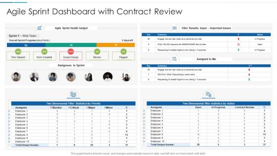
Agile sprint dashboard with contract review




Try Before you Buy Download Free Sample Product
 Impress Your
 Audience
 100%
100% Editable
 Save Hours
 of Time


Our Agile Sprint Dashboard With Contract Review are topically designed to provide an attractive backdrop to any subject. Use them to look like a presentation pro.
People who downloaded this PowerPoint presentation also viewed the following :
Agile sprint dashboard with contract review with all 6 slides:
Use our Agile Sprint Dashboard With Contract Review to effectively help you save your valuable time. They are readymade to fit into any presentation structure.





FAQs for Agile sprint dashboard
Start with your burndown chart and sprint velocity - those show real progress. Cycle time's huge for spotting bottlenecks too. WIP limits are obvious but actually track them. Here's something most people skip: mood tracking. Sounds fluffy but team sentiment predicts way more problems than velocity ever will. Also throw in your definition of done compliance and current blockers. Keep everything visual for standups. If it takes longer than 30 seconds to scan, you're overdoing it. I learned this the hard way after building dashboards nobody used.
Honestly, sprint dashboards are game-changers for cutting down all that "where are we on X?" noise. Your team can just glance at it instead of hunting through Slack threads or bothering each other constantly. Shows who's stuck, what's moving, the whole picture. Makes standups actually useful instead of just status updates that drag on forever. Set it up with your sprint goals, task progress, and blockers front and center. Stakeholders love it too since they can check progress without interrupting you mid-flow. Trust me, once people start using it regularly, you'll wonder how you ever managed without one.
Honestly, just go with whatever your team's already using - getting people to actually adopt it matters way more than picking the "perfect" tool. Jira's the gold standard if you're doing issue tracking anyway. Azure DevOps has really clean burndown charts, especially if you're already in Microsoft's world. Trello's great for smaller stuff but gets messy when projects grow (learned that one the hard way). You could build something custom in Tableau or Power BI, but that's probably overkill unless you need super specific metrics. Start simple and see what sticks.
Yeah, most sprint dashboards are pretty flexible - drag and drop widgets, add custom fields, filter by whatever your team cares about. Burndown charts, velocity, story points left, that kind of stuff. Honestly though? I've seen teams go overboard with like 15 different widgets and it's just visual noise. Stick to 3-4 things you'll actually check during standups. Oh and you can usually tweak time ranges and set up those automated reports (saves so much time). Start with what's bugging your team right now and build around that.
Oh man, don't cram every possible metric on there - you'll just confuse everyone. Stick to maybe 4-5 things that actually matter for sprint decisions. Burndown charts, velocity, blockers, that stuff. I swear I've seen dashboards that look like a data explosion happened. Real-time updates are crucial too, otherwise people just stop checking it. Skip the vanity metrics that make execs happy but don't help your team get better. Start basic with sprint essentials - you can always add more later if people bug you for it.
Dude, charts and burndown graphs are game-changers for sprint reviews. Your team can instantly see bottlenecks without digging through boring spreadsheets. Color-coded story cards? Chef's kiss. Stakeholders actually understand what's happening instead of glazing over during updates. Honestly, I think visual dashboards should be mandatory - they make standups so much better since everyone's staring at the same data. Set up some automated reports too, saves you from manually updating everything. It's literally like comparing a weather app to just... idk, feeling the air outside? Way more useful.
Your sprint dashboard is basically useless without good KPIs - they're what turn all that data into stuff you can actually act on. Velocity, burndown rates, cycle time... these help you catch bottlenecks early and see if you're hitting your goals. Plus they make retrospectives way more productive when you've got real numbers to discuss. My old team used to track like 10 different metrics and it was chaos - nobody knew what to focus on. Stick with 3-4 that match what your team's trying to accomplish. Trust me, less is more here.
Your sprint dashboard basically shows where stuff gets stuck - you'll see it visually when work piles up in certain stages. Like if "In Review" is overflowing but development looks empty, that's your problem right there. Those massive columns of cards just sitting there? Dead giveaway. I always check patterns across multiple sprints since one weird week doesn't tell the whole story. Set alerts when stages hit their limits, then use that data in retros to actually talk about what's slowing you down instead of just guessing.
You gotta catch problems early enough to actually do something about them. Day 3 your burndown shows you're behind? Perfect - adjust scope or move tasks around. Wait until the sprint's over and you're just documenting failure at that point. Your team won't trust outdated info anyway, and I don't blame them. They need current progress to decide what's next - should we pull in more stories, is someone stuck and needs backup? Daily dashboard checks beat waiting for standups. Real-time visibility lets you pivot while there's still time to save the sprint.
Get their input during sprint reviews and retros, then tweak your dashboard based on what they actually say. Burndown charts bore them? Try velocity trends or cycle time instead. Look, they'll ask for stuff that seems obvious to you, but they're not buried in tickets all day like we are. Your dashboard needs to answer their real questions about blockers and progress - not just show off pretty charts you think matter. Oh, and set up feedback sessions every couple sprints. Trust me, it's way better than guessing what executives want to see.
Honestly, just update it during standup or right after - makes it way easier to remember. Move your cards around as you actually work on stuff (in progress, review, done, whatever). I'm terrible at this but seriously don't let things sit in the wrong column for days. Your burndown should show real remaining work too, not just what's finished. Oh and if you get blocked or something changes? Update that right away so everyone knows what's up. The whole thing falls apart if it gets stale - better to have no dashboard than a completely wrong one.
Sprint dashboards are honestly game-changers for planning. Instead of guessing, you can see your team's actual velocity and where things usually get stuck. The burndown charts show you exactly when work tends to stall - way better than just remembering "last sprint felt rough." Before your next planning meeting, pull up the last few sprint dashboards and look for patterns. You'll spot which story types always take longer than expected. Makes your estimates way more realistic, and retrospectives become actual problem-solving sessions instead of just venting. Trust me on this one.
Honestly, the AI stuff is where sprint dashboards are getting really interesting. Predictive analytics can actually tell you if you'll hit your deadline before things go sideways. Real-time collaboration is way smarter now too - updates that understand context instead of just throwing data at you. Some dashboards even suggest process improvements based on your team's weird habits, which is pretty cool. Voice interfaces are showing up everywhere (though I still feel dumb talking to my computer). Interactive charts and custom widgets are basically expected at this point. Look for tools with predictive features - they'll save you from those late-sprint freakouts.
Honestly, most sprint dashboards are complete overkill - like half the ones I've worked with look like they're tracking rocket launches or something. Focus on what you actually check every day: burndown charts, where you're at in the current sprint, and any blockers. That's it. Don't go crazy with more than 5-7 metrics tops. Set them up so they match your standup flow, use colors that make sense, and put the critical stuff where people can see it right away. Test it out with your team and ask what's not working. The good ones are the dashboards people actually look at without being forced to.
Yeah, sprint dashboards are honestly pretty great for team morale. Everyone can actually see stuff getting done, which feels good - like watching those story points pile up gives you that little dopamine hit, you know? Plus you'll catch problems way earlier before they turn into disasters. The whole transparency thing helps redistribute work when someone's drowning. I've seen teams get way more excited about celebrating small wins when progress is right there on the screen. Just don't let managers turn it into some creepy surveillance tool or people will hate it. Use it for collaboration, not tracking who's slacking.
-
Excellent Designs.
-
Design layout is very impressive.