


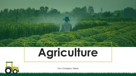
Agriculture Powerpoint Ppt Template Bundles


Try Before you Buy Download Free Sample Product
 Impress Your
 Audience
Editable
of Time


Our Agriculture Powerpoint Ppt Template Bundles are topically designed to provide an attractive backdrop to any subject. Use them to look like a presentation pro.
People who downloaded this PowerPoint presentation also viewed the following :
Agriculture Powerpoint Ppt Template Bundles with all 22 slides:
Use our Agriculture Powerpoint Ppt Template Bundles to effectively help you save your valuable time. They are readymade to fit into any presentation structure.


FAQs for Agriculture Powerpoint
For your agriculture PowerPoint, you'll definitely want good charts showing yield trends, weather patterns, that sort of thing. Earth tones and greens work great for the color scheme. Maps are super helpful for geographic stuff, and timeline layouts work well for seasonal planning. Comparison slides are perfect when you're looking at different farming methods. The visual side is huge though - get quality photos of farmland, equipment, crops. Stock photos usually look terrible, so try to find more authentic-looking ones if you can. Oh, and throw in some slides for comparing crop varieties too. Start with these basics and tweak as needed.
Honestly, start by ditching those stock crop photos for stuff that actually grows near you - cotton if you're down south, corn for midwest, whatever. Change up the colors to match what people see outside their windows too. The text part's pretty straightforward since templates usually have dummy content you just replace. But here's what really matters: swap out any generic farming stats with local numbers. People around here definitely know when something's off about the data. I'd pick your region's top 3-4 crops and just focus your whole thing around those. Way more authentic that way.
Dude, visuals are a game-changer for ag presentations. Nobody wants to stare at spreadsheets when you could show them a clean chart instead. Agriculture is already so visual anyway - fields, equipment, the whole deal. People connect way better when they can actually see what you're talking about. Charts and infographics make boring stats way more interesting too. Oh, and don't go overboard cramming everything onto one slide (I've totally done this before). Just use good quality images that actually back up your main points. Trust me, your audience will thank you for it.
Stick with earth tones for agriculture stuff - greens, browns, warm yellows work great. They just feel right for farming topics, you know? Browns and muted oranges are solid choices too. Skip the bright neons or those corporate blue colors since they'll look totally off-brand. Oh, and make sure your text pops against the background - I learned this the hard way when half my slides were unreadable on a crappy projector. Test everything on different screens beforehand. Trust me, there's nothing worse than squinting at invisible text during a presentation.
Charts showing crop yields over time are super helpful - people actually look at those. Bar graphs work great for harvest stats, and pie charts can break down farm expenses without making people's eyes glaze over. Maps with regional ag data are solid too. Interactive stuff is even better if you can swing it, like clickable breakdowns or those animated growth cycle things. Honestly, anything beats staring at paragraphs about soil pH (been there, it's rough). Earth tones obviously make sense for the color scheme. Just figure out your main data points first, then pick whatever format tells that story clearest for whoever you're presenting to.
Honestly, go with stuff that actually matters to your audience - crop yields, weather data, soil health, market prices. That kind of thing. Before/after comparisons are gold, especially showing how new methods boosted harvests. Here's the thing though - economic data grabs way more attention than technical specs (unless you're talking to agronomists obviously). Try to use local examples when you can since people care more about what's happening in their backyard. Charts showing seasonal trends work great, or maps of production areas. Oh and make sure whatever data you pick actually supports your main point or you'll lose them fast.
Look, people zone out when you hit them with spreadsheets and technical jargon - even farmers. Stories stick way better. Your template basically becomes your roadmap for this. Use those problem/solution layouts or before/after slides to build your narrative naturally. Visual consistency matters too because it keeps folks listening instead of wondering why slide 3 looks totally different from slide 2. I always start with whatever flow the template suggests, then throw in real examples from actual farms. Makes the boring data way more interesting, honestly.
Before/after photos work really well - show the actual changes in soil health and water conservation. I'd throw in some infographics with hard numbers like "30% less water usage" because sustainability sounds pretty vague otherwise. Icons are perfect for renewable energy and composting stuff. Real case studies from actual farms hit different than just theory, you know? The key is making it concrete - "50% reduction in pesticides" means way more than just saying "better for environment." End each section with actionable steps people can actually take to support these practices.
Those ag templates work pretty well for different setups - conference rooms, webinars, whatever. The colors and fonts usually show up fine on video calls even when the quality gets compressed. Big screens handle them great, though some of those ancient monitors in farm offices are honestly just painful to look at. You'll want to test everything beforehand on whatever platform you're actually using. Random formatting issues love to pop up at the worst times. Most templates are built with high contrast so they're readable whether you're projecting or sharing your screen online.
Definitely start with data viz slides - charts for yield comparisons, weather patterns, growth metrics, all that stuff. Image placeholders are key too, sized for field photos and microscopy shots. Timeline slides are perfect for seasonal cycles or longer studies. Oh and trust me, add a methodology template because formatting that section is always annoying. You'll need slides for statistical results since ag research is crazy data-heavy. Map slides for geographic data are useful too. That covers the basics - you can tweak everything later depending on your specific project.
Definitely focus on contrast first - those pretty farm photos can totally wash out your text. I learned this the hard way during a conference last year! Clean fonts only, nothing fancy or scripty. Body text should be 24pt minimum so people in the back can actually see it. Short sentences work better than long ones. Alt text is crucial for any charts or images you throw in there. Oh, and step back from your screen when you're done - if you can read everything from across the room, you're good to go.
Start with poll slides about farming challenges right off the bat. Q&A breaks after major sections work really well too. Before/after crop photos are gold - let people guess the outcomes first. Everyone goes crazy for myth vs fact slides, so definitely include one of those. Discussion prompts about local practices are smart since farmers actually love talking shop. Oh, and leave white space on your slides for jotting down audience ideas in real time. Don't just wing the interactive stuff though - plan where you'll pause beforehand or it gets awkward fast.
Honestly, font choice can totally make or break your ag presentation. Go with something clean like Arial or Calibri - your audience needs to actually read those crop yield numbers without squinting. Sans-serif works best on screens, trust me. I once sat through a presentation where someone used Comic Sans for soil data... awkward doesn't even cover it. Make sure it's big enough for people in back to see clearly. Oh, and pick one font and stick with it throughout - switching fonts mid-deck looks messy. Your farmers and researchers will thank you for keeping things readable instead of fancy.
So agriculture presentations are all about data storytelling now - interactive dashboards, drone footage, sustainability stats. You'll need templates that can show off precision farming tech and IoT sensor data. The whole look is way more tech-focused these days with clean designs and earth tones (thank god the corny farm clipart is dead). Honestly, the before/after comparison layouts work really well for this stuff. Make sure your template handles timeline infographics for crop cycles and has sections for environmental impact. You want something that balances technical data with actual visual storytelling that doesn't bore people to death.
So I actually did this last semester! First thing - ditch all the business jargon and swap in stuff kids will actually care about. Those green themes are perfect for science class honestly. Throw in some interactive slides, maybe quiz questions or spots where they can discuss. Visual stuff works great too - crop diagrams, before/after farming pics, that kind of thing. Keep charts super simple though. Kids zone out fast with complicated data. Start by picking slides that match what you're teaching, then just customize everything else. Oh, and definitely add some hands-on activities if you can!
-
Thank you SlideTeam for such an excellent service.
-
Mesmerized with the fantastic collection! Super sleek, relevant infographics.