


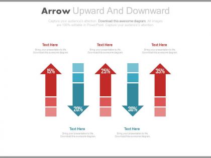
Arrow upward and downward with percentage chart powerpoint slides




Try Before you Buy Download Free Sample Product
 Impress Your
 Audience
 100%
100% Editable
 Save Hours
 of Time


It's hard to find a flaw with our Arrow Upward And Downward With Percentage Chart Powerpoint Slides. We are driven to get it correct.
People who downloaded this PowerPoint presentation also viewed the following :
Arrow upward and downward with percentage chart powerpoint slides with all 4 slides:
Inspire your team with our Arrow Upward And Downward With Percentage Chart Powerpoint Slides. Let the force of your ideas flow into their minds.

FAQs for Arrow upward and downward with percentage
Effective arrow chart components include clear directional flow, concise text labels, consistent color schemes, logical sequence positioning, and appropriate sizing for readability. These elements work together by guiding audience attention through complex processes, highlighting key decision points, and creating visual hierarchy, with many presenters finding that well-designed arrow charts significantly enhance comprehension and engagement.
Arrow charts enhance complex data understanding by providing visual direction, highlighting key trends, showing cause-and-effect relationships, and simplifying multi-step processes through intuitive flow indicators. These visual elements streamline audience comprehension by transforming abstract data into clear pathways, with many organizations finding that directional charts significantly improve stakeholder engagement and decision-making speed during critical business presentations.
Best practices for designing arrow charts in PowerPoint include using consistent arrow styles, strategic color coding, clear labeling, appropriate sizing, and logical directional flow. These elements enhance visual communication by creating intuitive pathways, highlighting key relationships, and minimizing cognitive load, with many organizations finding that well-designed arrow charts significantly improve presentation effectiveness and audience comprehension.
Arrow charts excel at displaying sequential processes, directional relationships, workflow progressions, cause-and-effect scenarios, and timeline-based data flows. These visualizations streamline complex organizational hierarchies, project phases, and decision trees by creating clear pathways, enhancing audience comprehension, and enabling stakeholders to track progress systematically, ultimately delivering improved presentations and strategic communication outcomes.
Color schemes in arrow charts can convey urgency through red tones, growth through green gradients, process stages through blue progressions, and priority levels through contrasting combinations like orange and gray. Strategic color application enables organizations to communicate complex data narratives more effectively, with many corporate presentations finding that consistent color coding across departments enhances audience comprehension and decision-making speed.
Common pitfalls include overcrowding with excessive text, using inconsistent arrow styles, poor color contrast, misaligned elements, and unclear directional flow. These design missteps confuse audiences and dilute messaging effectiveness, with many organizations finding that streamlined arrow charts with consistent formatting, strategic white space, and clear visual hierarchy significantly enhance presentation impact and stakeholder comprehension.
Animated arrow charts in PowerPoint enhance audience engagement by creating visual momentum, directing attention to key data points, and transforming static information into dynamic storytelling elements. These animations help presenters guide viewers through complex processes, highlight progression and growth trends, and maintain focus during lengthy presentations, with many business professionals finding that strategic animation timing significantly improves message retention and audience participation.
Arrow charts excel when demonstrating directional movement, process flows, growth trajectories, and cause-and-effect relationships that bar and line graphs cannot effectively convey. These visual tools streamline complex sequential processes, strategic roadmaps, and transformation journeys, with many organizations finding that arrow charts enhance stakeholder understanding of progression paths, ultimately delivering clearer communication and improved decision-making outcomes.
Arrow charts enable presenters to visualize market trajectories through directional indicators, trend lines, comparative growth patterns, seasonal fluctuations, and predictive forecasting elements. These visual tools streamline complex market data by highlighting upward momentum, decline phases, and pivot points, with financial analysts and market researchers finding that arrow-based presentations enhance stakeholder comprehension while delivering clearer strategic insights.
Adobe Illustrator, Canva, Lucidchart, Visio, and Google Drawings complement PowerPoint arrow chart design through enhanced graphic capabilities, collaborative features, and specialized diagramming tools. These platforms streamline complex visualizations by offering advanced vector editing, real-time collaboration, and template libraries, with many organizations finding that strategic software combinations ultimately deliver more polished presentations and improved stakeholder engagement.
Arrow charts effectively depict project progression through visual timelines, milestone tracking, phase transitions, status indicators, and dependency mapping. These visual tools enable project managers to communicate complex workflows, highlight critical path elements, and track deliverable sequences, while teams can quickly identify bottlenecks, accelerate decision-making, and maintain stakeholder alignment throughout project lifecycles.
Creative variations of traditional arrow charts include curved arrows for dynamic flow, branching arrows for multiple pathways, zigzag arrows for stepped processes, circular arrows for cyclical workflows, and 3D arrows for dimensional impact. These innovative designs enhance audience engagement by visualizing complex business processes, strategic roadmaps, and decision trees more effectively, with many organizations finding that creative arrow variations significantly improve presentation clarity and stakeholder comprehension.
Presenters can weave compelling narratives through arrow charts by framing each stage as a story element, using progressive disclosure to build suspense, incorporating real customer journeys or transformation cases, and connecting data points to human experiences. These storytelling approaches transform static processes into engaging narratives, with many executives finding that audiences retain information significantly better when arrow charts illustrate relatable scenarios, ultimately delivering stronger message impact and stakeholder buy-in.
Arrow charts integrate cohesively when they maintain consistent color schemes, typography, and sizing with surrounding slides, while serving specific narrative purposes like showing process flows or directional relationships. Strategic placement between data-heavy slides and text sections creates visual breathing room, with many presenters finding that arrows work best when they complement rather than compete with other visual elements, ultimately enhancing audience comprehension and maintaining professional slide deck unity.
High-quality arrow chart PowerPoint templates are available through SlideTeam, Microsoft's template gallery, premium design platforms like GraphicRiver, and professional presentation resources such as SlideModel and PresentationGo. These platforms deliver professionally designed, customizable templates with varied arrow styles, color schemes, and layouts, enabling organizations across sectors like consulting, marketing, and project management to streamline workflow presentations while maintaining visual consistency and professional credibility.
-
Excellent Designs.
-
The Designed Graphic are very professional and classic.