


Pitch deck template for entrepreneurs powerpoint presentation slides





Try Before you Buy Download Free Sample Product
 Impress Your
 Audience
 100%
100% Editable
 Save Hours
 of Time


Raise money for your start-up with this professionally designed pitch deck template for entrepreneur’s PowerPoint Presentation Slides. A pitch deck is a brief presentation given by entrepreneurs to angel investors and venture capitalists for raising money for the start-up. A pitch deck presentation usually follows a format that makes it easier to sell the idea to VCs. The pitch deck template for entrepreneurs PPT starts with a business problem slide that your new business is trying to solve. We have problem and market gap opportunity templates to clearly outline the need for your product or service in the market. Also showcase the solution or value proposition delivered to your customers through this investor deck. Find professional, ready-to-use designs for business model, go to market plan, go to market strategy, market segmentation, channel strategy, marketing strategy, and a number of competitor analysis templates. Lastly, show your management team, financial projections and use of funds to instill confidence in investors. Raise a million dollars for new start-up venture with a professional pitch deck template like ours!. Halt errors from happening with our Pitch Deck Template For Entrepreneurs Powerpoint Presentation Slides. Highlight and improve on existing flaws.
People who downloaded this PowerPoint presentation also viewed the following :
Content of this Powerpoint Presentation
Slide 1: This slide presents Pitch Deck Template For Entrepreneurs. State your company name and begin.
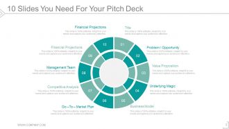
Slide 2: This slide shows 10 Slides You Need For Your Pitch Deck which contains- Title, Problem / Opportunity, Value Proposition, Underlying Magic, Business Model, Go –To – Market Plan, Competitive Analysis, Management Team, Financial Projections, Financial Projections.
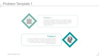
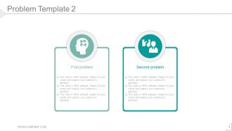
Slide 3: This is Problem displaying slide. State business problems etc. here.
Slide 4: This is also a Problem slide to state.
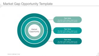
Slide 5: This slide shows Market Gap Opportunity Template in a circular form with text boxes to describe.
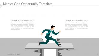
Slide 6: This slide also shows Market Gap Opportunity Template with relevant imagery and text boxes to describe.
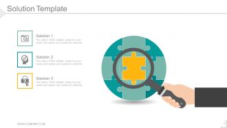
Slide 7: This slide showcases a Solution Template to state possible business solutions.
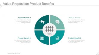
Slide 8: This slide states Value Proposition Product Benefits in a circular form with icon imagery.
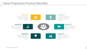
Slide 9: This slide also states Value Proposition Product Benefits. Add them here.
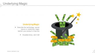
Slide 10: This slide shows Underlying Magic with imagery. Describe the technology, secret sauce or underlying magic behind your product or service.
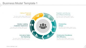
Slide 11: This slide presents the first Business Model Template with the following constituents- Construction Excellence And Efficiency, Outstanding Design, Targeted Land Buying And Effective Planning, Innovative Sales And Marketing, Industry Leading Customer Experience, Deliver Financial Results.
Slide 12: This slide presents the second Business Model Template with the following sub points- Price Compare, Book, Research & Plan, On The Trip.
Slide 13: This slide presents the third Business Model Template with the following sub points- Key Resources Key Activities Customer Relationships Channels Customer Segments Key Propositions Key Partners Revenue Streams Cost Structure
Slide 14: This slide shows Go To Market Plan with- What, Who, How, Get Strategy, Customized Value Propositions.
Slide 15: This slide presents a Go-to-Market Strategy Roadmap showcasing- Key Question, Focus, Inputs/ Tasks, Outcomes, Provocation, Discovery, Diagnostic, Design, Recommendation.
Slide 16: This slide also shows Go-to-Market Strategy Roadmap with empty text boxes. Fill in as per your need.
Slide 17: This slide also shows Go-To-Market Strategy-Market Segmentation.
Slide 18: This slide shows the Channel Strategy with the following points- Customer, Sale Person, Retailer, Distributor, OEM, You, E- Commerce, Direct Personal Selling, Retail (On/ Offline), Indirect, Component Or Private Label.
Slide 19: This slide shows Marketing Strategy particularly Digital Marketing Strategy with the following components- Email Marketing, Analytics & Reporting, Paid Advertising, Social Media, Blog, Website Design, Search Engine Optimization.
Slide 20: This slide shows Marketing Strategy Template with- Objectives, Strategies, Tactics.
Slide 21: This is first slide showing Competitive Analysis Template.
Slide 22: This is second slide showing Competitive Analysis Template.
Slide 23: This is third slide showing Competitive Analysis Template with SWOT Analysis.
Slide 24: This is fourth slide showing Competitive Analysis Template in a Scatter Chart/Radar Chart form.
Slide 25: This is fifth slide showing Competitive Analysis Template with a Comparison Table.
Slide 26: This is sixth slide showing Competitive Analysis Template in a Scatter Chart form.
Slide 27: This is seventh slide showing Competitive Analysis Template in a Bubble Chart form.
Slide 28: This is eighth slide showing Competitive Analysis Template in a Matrix Chart form.
Slide 29: This slide shows Management Team Template with name, designation and image boxes.
Slide 30: This slide presents the second Management Team Template with name, desigantion and image boxes.
Slide 31: This slide shows the third Management Team Template with name, desigantion and image boxes.
Slide 32: This slide shows the fourth Management Team Template with name, desigantion and image boxes.
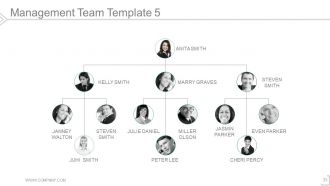
Slide 33: This slide presents the fifth Management Team Template with name, desigantion and image boxes.
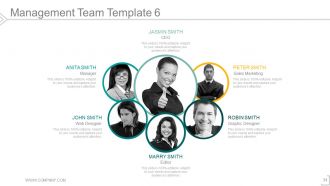
Slide 34: This slide presents the sixth Management Team Template with name, desigantion and image boxes.
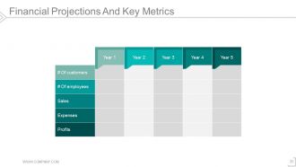
Slide 35: This slide shows Financial Projections And Key Metrics in number of years.
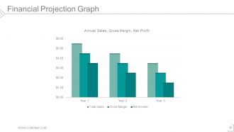
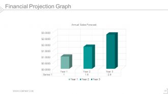
Slide 36: This slide shows Financial Projection Graph to present data etc.
Slide 37: This is also a Financial Projection Graph slide showing Annual Sales Forecast.
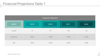
Slide 38: This slide shows Financial Projections Table.
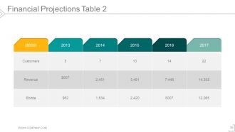
Slide 39: This is another slide showing Financial Projections Table.
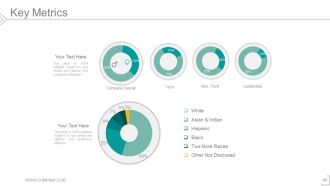
Slide 40: This slide displays Key Metrics with Donut Chart to show data/ information such as- Company Overall, Tech, Non -Tech, Leadership,
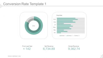
Slide 41: This slide shows a Conversion Rate Template for displaying GROSS REVENUE, NET REVENUE.
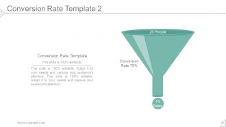
Slide 42: This slide also shows Conversion Rate Template in a funnel form to show data, information etc.
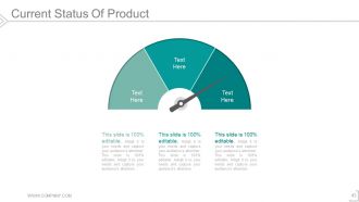
Slide 43: This slide shows Current Status Of Product with metric scale imagery.
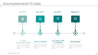
Slide 44: This slide shows Accomplishments To Date presented in a timeline form. State your accomplishments here such as- Demo Completed, Live Testing With 5 Companies, Beta Release, Product Development Began etc. You can also alter these as per your requirement.
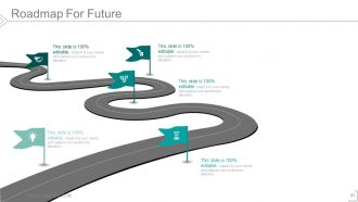
Slide 45: This slide displays a Roadmap For Future to mark growth, highlighting factors etc.
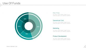
Slide 46: This is Use Of Funds slide. Show where you will utilize your funds in this slide such as- New Hires, Operational Cost, Marketing, Product Development etc. You can also alter/ modify these as per your requirement.
Slide 47: This slide is titled Additional Slides to proceed forward. Alter/ modify content as per need.
Slide 48: This is an About Us slide. State team/ company specifications here.
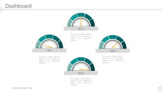
Slide 49: This is a Dashboard slide to state KPIs, metrics etc.
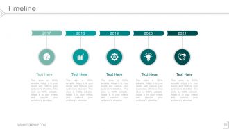
Slide 50: This is a Timeline slide to present important dates, journey, evolution, milestones etc.
Slide 51: This slide presents a Newspaper image with text boxes to flash company news, position etc.
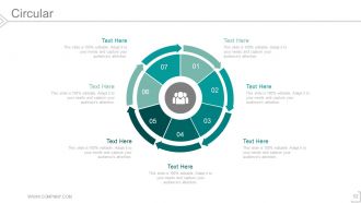
Slide 52: This is a Circular image slide. State information, specifications etc. here.
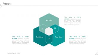
Slide 53: This is a Venn diagram image slide to show information, specifications etc.
Slide 54: This is a Matrix slide to show information, comparison specifications etc.
Slide 55: This is a Silhouettes slide to show people related information, specifications etc.
Slide 56: This slide presents Swimlanes to show information, comparison specifications etc.
Slide 57: This slide shows a Magnifying Glass image with text boxes.
Slide 58: This slide displays a Funnel image. State information, funneling aspects etc. here.
Slide 59: This is a Thank You slide with Address# street number, city, state, Contact Numbers, Email Address.
Pitch deck template for entrepreneurs powerpoint presentation slides with all 59 slides:
Get to the bottom of their fears with our Pitch Deck Template For Entrepreneurs Powerpoint Presentation Slides. Correctly identify any insecurities.
-
Pitch Deck Template for Entrepreneurs
-
Pitch for Entrepreneurs Sl
-
Problem Template 1
-
Problem Template 2
-
Market Gap Opportunity Template
-
Market Gap Opportunity Template
-
Solution Template
-
Value Proposition Product Benefits
-
Value Proposition Product Benefits
-
Underlying Magic
-
Business Model Template 1
-
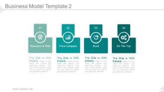
Business Model Template 2
-
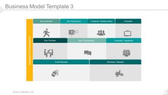
Business Model Template 3
-
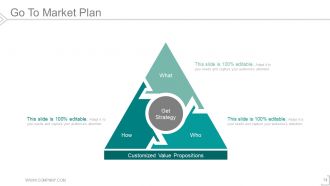
Go To Market Plan
-
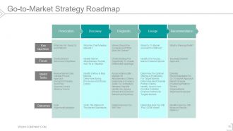
Go to Market Strategy Roadmap
-

Go to Market Strategy Roadmap
-
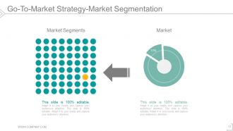
Go To Market Strategy Market Segmentation
-
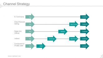
Channel Strategy
-
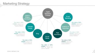
Marketing Strategy
-
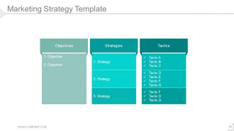
Marketing Strategy Template
-
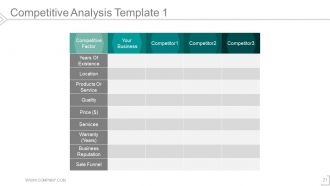
Competitive Analysis Template 1
-
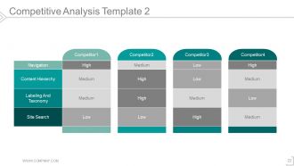
Competitive Analysis Template 2
-
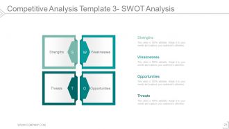
Competitive Analysis Template 3 SWOT Analysis
-
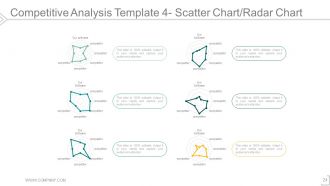
Competitive Analysis Template 4 Scatter Chart Radar Chart
-
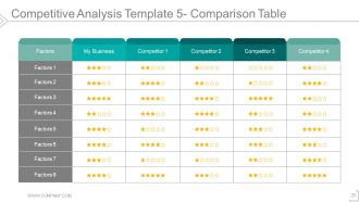
Competitive Analysis Template 5 Comparison Table
-
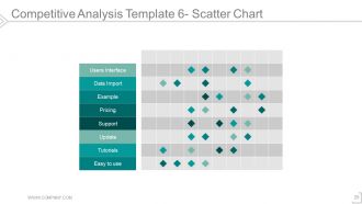
Competitive Analysis Template 6 Scatter Chart
-
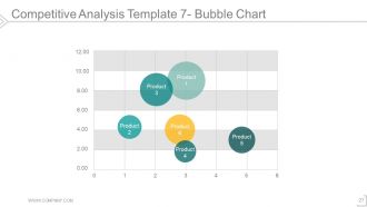
Competitive Analysis Template 7 Bubble Chart
-
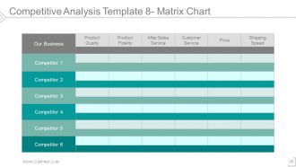
Competitive Analysis Template 8 Matrix Chart
-
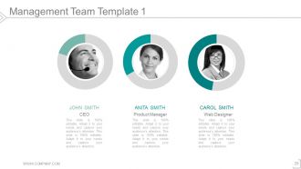
Management Team Template 1
-
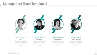
Management Team Template 2
-
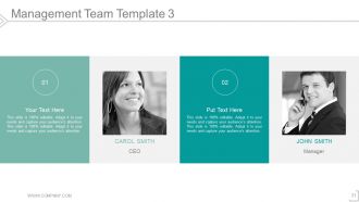
Management Team Template 3
-
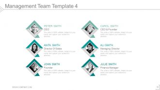
Management Team Template 4
-
Management Team Template 5
-
Management Team Template 6
-
Financial Projections And Key Metrics
-
Financial Projection Graph
-
Financial Projection Graph
-
Financial Projections Table 1
-
Financial Projections Table 2
-
Key Metrics
-
Conversion Rate Template 1
-
Conversion Rate Template 2
-
Current Status Of Product
-
Accomplishments To Date
-
Roadmap For Future
-
Use Of Funds
-
Additional Slide
-

About Us
-
Dashboard
-
Timeline
-
News Paper
-
Circular
-
Venn
-
Matrix
-
Silhouettes
-
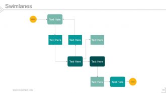
Swimlanes
-
Magnifying Glass
-
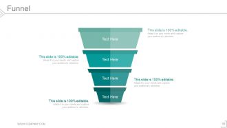
Funnel
-

Thank You Slide
FAQs for Pitch deck template for entrepreneurs
For your pitch deck, hit these slides: problem, solution, market size, business model, traction, competition, team, financials. So many founders dive straight into their "genius" solution without explaining the actual problem first - drives me nuts. Tell a story that connects the dots naturally. One focused message per slide, visuals beat text blocks every time. Practice the 10-minute version since investors love interrupting. Oh, and don't forget a clear ask at the end with specific next steps. You got this!
Honestly, most pitch decks are just boring feature lists that put everyone to sleep. Make yours tell a story instead! Frame the problem as your villain - show real people actually struggling with this stuff. Your solution becomes the hero swooping in to fix everything. I swear, adding specific customer examples makes such a huge difference. Build some tension too - what happens if nobody solves this problem? Structure it like a mini-movie with conflict and resolution. Way more engaging than another data dump that makes investors check their phones.
Honestly, less is more with slide design. Stick to 2-3 fonts max and pick a color scheme that doesn't make people's eyes bleed. Don't cram everything together - white space actually makes your slides look professional. One thing that drives me crazy? Tiny fonts that no one past the front row can read. Use decent images, keep layouts simple, and put just one main point per slide. Your design should support what you're saying, not compete with it. Oh, and definitely test it on a few different screens first - I've learned that one the hard way when formatting went completely haywire during a presentation.
Dude, you've gotta keep your branding consistent throughout the whole deck. Same colors, fonts, logo spots - all of it. I've seen so many pitches that look like five different people made random slides and just mashed them together. It's honestly painful to watch. Investors notice that stuff immediately and it makes you look sloppy or disorganized. My advice? Build one master template first, then use that for every slide. Sounds boring but it works. The visual consistency actually makes your content hit harder because everything feels intentional and professional.
Dude, the text thing is brutal - I've seen investors literally lean back in their chairs when slides are packed with paragraphs. Skip that entirely. Also, tons of people jump straight into their "revolutionary solution" without explaining what problem they're fixing. Like, slow down and set it up first. Financial projections are usually fantasy numbers (we've all been there), and most pitches drone on about features when investors want to hear about market size. Oh, and have a specific ask amount ready. The best pitches feel like stories - start with a problem people actually lose sleep over, then show how you solve it.
Lead with that big market size - pie charts work great for this. Honestly, investors eat up those huge numbers right off the bat. Don't cram more than 3-4 key points per slide though. Nobody's squinting at microscopic text during your pitch. Growth trends are solid gold, especially if you've got real survey data backing up customer pain points. For competitors, just do a simple comparison table - nothing fancy. The whole thing should tell a story, not feel like you're throwing random stats at people. Oh, and definitely cite sources at the bottom. Makes you look legit.
Look, that financial slide is basically where investors decide if you actually know what you're doing. You've got to show you understand your business model and aren't just making up numbers. Hockey stick charts are cool and all, but you better have solid unit economics backing them up. Investors will use your projections to see if your valuation request is reasonable - and honestly, if you can't defend your assumptions, you're toast. Be optimistic but don't go crazy unrealistic. I've seen pitches die instantly because founders threw out numbers that made zero sense for their market size.
Honestly, you gotta totally switch up your pitch depending on who you're talking to. VCs want to hear about massive markets and how they'll get their 10x return - they're thinking way bigger picture. Angels though? They care more about you as a person and whether they can actually help with their expertise. Sometimes they even become customers which is pretty rad. Focus heavy on growth numbers for VCs. With angels, tell more personal stories and talk about hitting those near-term goals. Oh and definitely stalk their LinkedIn first - customize that deck every single time.
One main point per slide, max. Use bullet points - nobody's reading paragraphs during a pitch. Honestly, I'd cap it at 10-12 slides total. Practice what you'll actually SAY so you're not just reading everything word for word. Here's the thing - explain stuff like you're talking to your grandma, even the technical bits. Biggest mistake? Cramming everything on there because you're worried you'll forget something. Less really is more though. Each slide should have one clear takeaway. Oh, and prep backup slides for the detail questions afterward - you'll definitely get them.
Dude, seriously – charts and visuals are game changers for investor pitches. Nobody wants to stare at walls of text or endless spreadsheets. Your brain just glazes over, you know? A clean graph showing market growth hits way harder than three paragraphs explaining the same thing. Plus visuals keep everyone on the same page instead of wandering off mentally. I'd swap out at least half your text slides for charts and diagrams, especially the financial stuff. Honestly, I've seen too many great ideas die because the presentation was just... boring as hell.
Your final slide needs to be crystal clear about what you want - specific funding amount, meeting date, whatever. I always throw in some killer visual or stat they'll remember walking out. Address their biggest concerns upfront and show them why saying yes benefits them too. Honestly, the Q&A after is where deals actually happen, so don't rush through your close. Practice it till it sounds natural, not like you're reading a script. Oh, and create some urgency around timing - nobody acts on "whenever works."
Honestly, the best way to know is watching their reactions during your pitch. Did they ask follow-ups? Want your deck afterward? Those are gold. Also pay attention to response times - if you're getting radio silence after following up, that's usually your answer right there. I'd track how many people actually move from first pitch to second meeting too. That conversion rate tells you everything. One thing that really helps - take notes on which slides confused people or sparked the most questions. Then you can tweak those parts for next time. At the end of the day, you want conversations that go deeper than just "thanks, we'll be in touch."
Honestly, less is more with animations. I stick to basic slide transitions and maybe fade-ins for bullet points - that's it. Quick effects only, like 0.5 seconds max. I've sat through presentations where the spinning graphics made me legitimately nauseous, so don't be that person lol. Simple "appear" effects work great. If people remember your animations more than what you actually said, you've gone overboard. Oh, and definitely test everything beforehand because animations have this annoying habit of completely breaking right when you're presenting to your boss.
Dude, definitely get other people to look at your pitch deck first. You're way too close to it and will miss obvious problems. I always send mine to like 4-5 people for honest feedback - they'll tell you when something doesn't make sense or sounds too technical. Fresh eyes catch stuff like unclear value props or slides that just kill the whole vibe. Your story might seem super logical to you but confusing to everyone else. Oh and they'll spot those random weak slides that somehow always sneak in. Trust me, you don't want to find out your deck sucks during the actual pitch.
Canva's probably your best bet to start - their free templates are solid. PowerPoint and Google Slides work too if you're already comfortable with them. Beautiful.ai has some nice investor-focused stuff, though it costs a bit. Oh, and definitely look up Guy Kawasaki's 10/20/30 rule for structure. Honestly? I've watched people spend way too much time making things pretty when their actual story was weak. Pick a tool and stick with it - template paralysis is real. Slidebean's decent if you want something more automated. Focus on getting your narrative right first, then worry about making it look clean.
-
Awesome use of colors and designs in product templates.
-
Very unique, user-friendly presentation interface.