


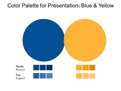
Color palette for presentation blue and yellow




Try Before you Buy Download Free Sample Product
 Impress Your
 Audience
 100%
100% Editable
 Save Hours
 of Time


Emerge as a global figure with our Color Palette For Presentation Blue And Yellow. Establish a footprint across continents.
People who downloaded this PowerPoint presentation also viewed the following :
Color palette for presentation blue and yellow with all 2 slides:
Attract investors with our Color Palette For Presentation Blue And Yellow. Give them assurance of huge gains.
FAQs for Color palette for presentation
Start with your audience and setting - corporate presentation? Stick to professional colors. Creative pitch? You can have more fun with it. Just avoid those awful rainbow slides that burn your retinas lol. Brand colors matter for client stuff obviously. Accessibility is huge too - good contrast so everyone can actually read your text. Room lighting will totally mess with how colors look, especially with projectors. I always test mine beforehand on whatever screen I'm using. Two or three colors max is my rule, keeps things clean.
Okay so warm colors like red and orange? They're great for energy and getting people hyped up. Blues and greens do the opposite - super calming and trustworthy vibes. I totally used to stress about this way more than I needed to lol. The simple stuff actually works though! Just think about what emotion you're going for first. Then grab 2-3 colors that match that feeling. Oh and don't forget cultural stuff matters too - red can mean good luck or danger depending on where you are. But honestly? Pick what feels right for your main emotion and test it out with real people.
So monochromatic is everywhere right now - super clean and nothing clashes. Earth tones and muted pastels are big too, they just feel more chill. Oh, and high contrast is back! Like navy with bright yellow. I'm totally into warm neutrals lately (maybe I'm basic lol). But match your vibe - financial stuff needs minimal grays with one pop of color. Creative presentation? Go wild. Keep it to 3-4 colors max though. And definitely test how they look projected first - learned that one the hard way when my "perfect" green turned into weird swamp color on screen.
You want your text to actually pop against the background, right? Dark text on light backgrounds works great - or flip it with white text on something deep like navy. I swear half the presentations I see make me squint because the contrast is garbage. When you nail the contrast, people's eyes naturally go where you want them to. Use it to make your key points stand out. Here's what I do: back away from your screen a few feet. Can you still read everything easily? If yeah, you're good to go.
Coolors.co is my go-to - you can generate random palettes or upload photos to pull colors from them. Adobe Color's solid too if you want something more polished. Figma and Sketch both have decent palette tools built right in, which is convenient. I always end up going down a rabbit hole on Pinterest looking at color inspo though, probably not the most efficient method lol. Dribbble's great for seeing how palettes actually work in real designs. Just start with Coolors since it's free and you can export everything to whatever you're designing in.
Dude, colors are way trickier than you'd think when going global. In China, red screams good luck and money. But here? Danger, debt, all the bad stuff. White's pure and clean to us, mourning color in parts of Asia though. Blue seems safe until you realize it means sadness in some places instead of trustworthy. I totally bombed a campaign once because of this - learned my lesson fast! You'll want to dig into what colors actually mean in each market first. Or honestly? Just partner with local creatives who already know this stuff inside and out.
Oh man, this is so important! About 8% of guys and 0.5% of women can't see colors normally - that's way more people than you'd think. Don't just use red/green for good/bad data because some people literally can't tell the difference. I made this mistake in a presentation once and felt terrible. High contrast is your friend, plus throw in some icons or patterns alongside the colors. Here's a weird trick - check your slides in grayscale mode first. If they still make sense, you're golden. Stark and Color Oracle are decent tools for testing this stuff beforehand.
Build your gradients from whatever base colors you're already using - don't just grab random shades or everything looks messy. Take each primary color and make 3-5 variations by tweaking lightness and saturation. Darker ones work great for text and borders. Lighter versions are perfect for backgrounds. Honestly, the biggest mistake people make is not testing colors together early enough. Something that looks amazing solo can clash horribly when you combine it. I'd create a simple grid showing your base colors with all their shade families so you can see the whole system at once.
Keep it simple - stick to 3-4 colors tops. Pick one main color that fits your content's vibe, then use the 60-30-10 rule. Your dominant color covers 60%, secondary gets 30%, accent takes 10%. I used to make these crazy rainbow disasters before learning this trick! Make sure your colors have similar saturation so nothing looks weird together. Oh, and test everything against white backgrounds since most templates are white anyway. If you're totally stuck, just grab a ready-made palette from Adobe Color or Coolors - way easier than starting from scratch.
Honestly, stick to like 2-3 colors max. Your slides will look way more put-together instead of... well, a hot mess. I used to go crazy with colors and my presentations looked like a 5-year-old's art project lol. Pick one main color, maybe an accent color, then keep everything else neutral. It's not just about looking professional though - when you're not throwing every color at people, they'll actually focus on what you're saying. You can use your chosen colors to highlight the important stuff too. Trust me, less is definitely more here. Your audience will thank you for not burning their retinas!
Monochromatic is super safe - same color family, so nothing clashes. Works great for professional stuff or when you want things to feel calm. Complementary colors (opposites on the color wheel) have way more punch, which is awesome for grabbing attention. But honestly? They can look pretty awful if you mess up the balance. I learned that the hard way once. For presentations, I'd probably use monochromatic on your data slides since they're already busy enough. Then throw in complementary colors when you really need something to pop.
Pick 3-5 colors max and actually stick to them - I learned this the hard way after making presentations that looked like a rainbow threw up. Use your brand colors plus maybe one accent. Most presentation software has custom color themes you can save, which is honestly clutch because who remembers hex codes? Create a quick style guide too. Write down which colors go where - headers, backgrounds, whatever. Then when you're building slides later, just reference that doc. Saves so much time and your stuff will look way more professional.
Oh man, don't use too many colors at once - like 3-5 max. I made this mistake last year and it looked awful. The worst is when you pick colors that are all the same brightness... everything just blends into this muddy mess. Also avoid putting super bright colors right next to each other because they literally hurt to look at. Actually gives people headaches, no joke. Pick one main color first, then add others that contrast well with it. Trust me on this one - less is definitely more with color palettes!
For corporate stuff, you can't go wrong with navy blues and grays - seriously, they're like the safe jeans of color palettes. Muted tones keep people focused on your actual data instead of questioning your design choices. But creative pitches? Go wild. Bright oranges, deep purples, whatever matches your vibe and grabs attention. I learned this the hard way after using lime green in a budget presentation once - yikes. Match your colors to what your audience expects. When you're unsure about corporate presentations, blues and grays will never make you look unprofessional.
Oh man, lighting totally screws with your colors! Those warm office fluorescents make blues look gross and muddy. Cool LEDs are even worse - they wash out all the reds and make everything look like a hospital. Natural light's your friend when possible. But honestly? Test your slides in the actual room first if you can swing it. I learned this the hard way when my "perfect" yellow text completely vanished under warm lights. Pale colors are basically invisible in those rooms. Keep a backup version with way more contrast - trust me on this one.
-
Much better than the original! Thanks for the quick turnaround.
-
Innovative and attractive designs.