

Dashboard presentation examples





Try Before you Buy Download Free Sample Product
 Impress Your
 Audience
 100%
100% Editable
 Save Hours
 of Time


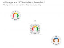
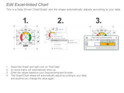
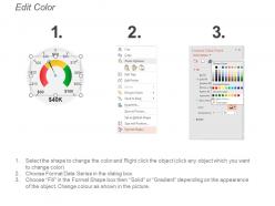
Display information from multiple data sources with the help of this Dashboard Presentation Examples. This dashboard template is effectively used for information management and business intelligence. Use this progress report PPT visual to organize and store important information and to give a view of key performance indicators relevant to a business process. Analyze the performance of your business and see where you stand in comparison to your competitors using this business meter design PowerPoint layout. Utilize this speed infographic to show the growth of your industry or sales of a specific product. This performance Dashboard slide allows you to track the current performance of your business by simplifying the complex data sets. You can incorporate a large number of details without any drill-downs and identify trends that can influence future decision making. Visualize strategic data for your organization and gain valuable insight by incorporating this business dashboard PPT graphic. Now download this dashboard PowerPoint presentation to analyze your team performance in an efficient way.
People who downloaded this PowerPoint presentation also viewed the following :
Dashboard presentation examples with all 5 slides:
Explain the important benefits folks have got with our Dashboard Presentation Examples. It helps highlight iconic achievements,

FAQs for
Focus on visual hierarchy first - put your most important KPIs right up top where people look. Tell a story with the data instead of just dumping every metric you can track. Colors should be consistent, and honestly, less text is always better. People need to get the main point in like 30 seconds or they'll bounce. Your eye should flow naturally from top-left down to bottom-right, kind of like reading a good presentation. Oh, and sketch it out on paper before you build anything - I learned that the hard way after rebuilding dashboards like three times. Supporting details matter, but only if your audience actually cares about them.
So visual hierarchy is basically your eye's roadmap to what matters. Make your biggest KPIs huge and bold at the top - like, really make them pop with size and color. Then tuck the supporting stuff below in smaller fonts or grayer colors. It's the same way you scan Instagram or whatever - your brain naturally looks for the biggest, brightest things first. Honestly, most dashboards I see are just walls of equally-sized numbers that make my head spin. Pick your top 3 metrics and let those be the stars. Everything else can stay in the background.
Honestly, color choice can make or break your dashboard. Too many colors and it's just chaos - nobody knows what to focus on. I'd stick with maybe 3-4 colors tops. Use contrast to highlight the stuff that actually matters, and yeah, the classic red/green thing works for good/bad data. Just remember some people can't see those colors properly, so don't rely on them alone. Oh, and test it on the actual screen you'll present on! I learned that one the hard way when my beautiful blues turned into muddy gray on the projector.
Dude, interactive dashboards are a game changer. People get bored watching you click through static slides, but when they can actually mess around with the data themselves? Totally different story. They'll filter stuff, drill down into details, hover around - basically stay way more engaged. I swear it's like letting someone actually play the video game instead of just watching. You know how people always ask "what if we looked at just the northeast region?" Well now they can just do it themselves. Honestly, even adding just 2-3 basic features like dropdown menus or clickable charts makes a huge difference.
Think about who's actually going to look at this thing - what do they need to decide? Group similar stuff together and make the important bits pop out first. Show the big picture upfront, then let people dig deeper if they want. I swear, half the dashboards I've seen look like someone threw every possible chart at the wall. Nobody wants that mess. Keep colors simple, ditch the corporate buzzwords for labels people actually understand. Oh, and test it with real users first - you'll be surprised what confuses them. Better to have fewer metrics that actually get used than a beautiful disaster that sits there collecting digital dust.
So basically you want to tailor your dashboard to what each group actually needs to do their job. Executives just want the big picture stuff - KPIs, trends, strategic insights. They honestly don't have time for every single metric you've collected. Operational teams need the nitty-gritty daily numbers they can actually act on right away. Tech people? Go ahead and get super detailed with breakdowns and methodology - they love that stuff. Before building anything, ask yourself "what decisions will these people make with this data?" Then build around that instead of just throwing everything at them.
Dude, try the problem-solution thing first - show what's broken, then boom, here's your data fixing it. Before and after comparisons work amazing with trend charts. Oh, and that three-act structure is clutch: set the scene, reveal the mess in your numbers, then show the win. You can also do this layer-by-layer reveal thing that builds suspense (probably overkill for most meetings but whatever). Don't just throw data at people though - lead with your biggest insight first, then use everything else to back it up. Makes such a difference.
Yeah, animations can definitely make dashboards more engaging, but don't go overboard. I've seen some that are basically digital fireworks shows – totally kills the point. Use them to guide people's attention when you're switching views or revealing new data. Quick transitions work best, like under 300ms or whatever. The Vegas slot machine effect is real and it's annoying. Focus on being subtle about it. Your audience should follow the story in your data, not get distracted by fancy effects. Think smooth and purposeful, not flashy.
Honestly, I'd go with **Tableau** or **Power BI** first. Tableau's got these gorgeous interactive visuals that just work. Power BI's perfect if you're already using Microsoft stuff - the integration is seamless. **Looker Studio** is worth checking out too since it's totally free (can't beat that). Oh, and **D3.js** is amazing for custom web dashboards, but you'll need to code everything from scratch. Probably overkill unless you're comfortable with JavaScript. I'd start with Power BI or Tableau though. Both have solid templates so you can look like a data wizard pretty quickly without actually being one.
Honestly, the best way is tracking if people actually use it and make decisions faster. Check how long it takes users to find answers - that's your time-to-insight metric. Also look at adoption rates because I've literally seen gorgeous dashboards just sitting there collecting digital dust lol. Survey your users or just ask them directly if they're getting what they need. The real proof? Whether stakeholders stop bugging you with follow-up questions and start making quicker calls. Before-and-after decision speed tells the whole story. Beautiful design means nothing if it's not driving actual business outcomes.
Dude, don't cram everything onto one screen - that's like dashboard design 101. Use colors that actually mean something instead of just making it look "pretty." Make your fonts big enough that people aren't squinting from across the room. Oh, and skip those spinning 3D charts - they look cool but nobody can read them lol. Put your most important number in the top left since that's where eyes go first. Then work down by priority so people know what matters. Honestly, clean and simple beats flashy every time.
Start with clean data sources and be upfront about where everything comes from. Slap those timestamps, sample sizes, and limitations right on the dashboard - honestly, people respect the transparency. Get someone else to check your math because you'll miss the dumbest mistakes. Don't cherry-pick timeframes that just look pretty. Show real trends over periods that actually matter and explain any weird spikes. I learned this the hard way - your reputation tanks fast if you're trying to make data say what you want instead of what it actually shows.
Focus on visual hierarchy first - make your most important metrics bigger and use colors that actually pop. Group similar KPIs together so it's not just random numbers everywhere. Always add context like "vs last month" or target goals, otherwise people won't know if 47% is amazing or terrible. I swear, half the dashboards I see are basically number soup with zero meaning. Keep the text super minimal. Start with your top 3-5 metrics and don't try to cram everything in at once - you'll just overwhelm people.
So you'll want to hook your dashboard straight into live data sources using APIs or database connections. Tools like Tableau and Power BI make this pretty straightforward - just set your refresh intervals based on what you need. Every minute sounds cool but honestly can be overkill for most stuff. The real headache is making sure your data pipeline doesn't crash under all those constant queries. Oh, and definitely keep a static backup version for presentations because nothing's worse than your live feed dying right when you're trying to impress someone. Test everything beforehand though.
Okay so first - make your text WAY bigger than feels normal, trust me on this. High contrast colors are key, but don't just rely on color alone. Throw in some icons or patterns too. Keep charts super simple with clear labels. Oh and definitely prepare to say your key data points out loud for anyone using screen readers. Each slide shouldn't be packed with tons of stuff either - cognitive overload is real. I learned this the hard way when my aunt couldn't follow my presentation at all. Test it on different devices beforehand because what looks good on your laptop might be tiny on the projector.
-
Illustrative design with editable content. Exceptional value for money. Highly pleased with the product.
-
Easily Editable.