


Economies of scale and diseconomies of scale


Try Before you Buy Download Free Sample Product
 Impress Your
 Audience
Editable
of Time


Everyone begins to feel the energy due to our Economies Of Scale And Diseconomies Of Scale. The excitement becomes infectious.
People who downloaded this PowerPoint presentation also viewed the following :
Content of this Powerpoint Presentation
Description:
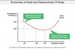
The image is a PowerPoint slide titled "Economies of Scale and Diseconomies Of Scale". It includes a graph that depicts the relationship between the average cost per unit and the quantity of output. There are two key areas on the graph: one where the average cost is falling, labeled as "Economies of Scale", and another where the average cost is rising, labeled as "Diseconomies of Scale". The x-axis represents the quantity of output (Q1, Q2, Q3), and the y-axis represents the average cost per unit (£). Two average cost lines (AC1 and AC2) suggest different cost levels at certain output points. This visual is useful for explaining how costs change as a company scales its production.
Use Cases:
This slide can be utilized in various industries for educational or strategic planning purposes, including:
1. Manufacturing:
Use: Explaining production scaling implications.
Presenter: Operations Manager.
Audience: Production Team, Management.
2. Education:
Use: Teaching economic principles.
Presenter: Economics Professor.
Audience: Students, Researchers.
3. Consulting:
Use: Advising on business growth strategies.
Presenter: Business Consultant.
Audience: Business Owners, CEOs.
4. Financial Services:
Use: Analyzing cost management.
Presenter: Financial Analyst.
Audience: Investors, Financial Planners.
5. Retail:
Use: Strategy development for scaling operations.
Presenter: Retail Manager.
Audience: Store Managers, Stakeholders.
6. Technology:
Use: Illustrating scalability in tech development.
Presenter: CTO.
Audience: Development Team, Investors.
7. Energy Sector:
Use: Understanding cost implications in energy production.
Presenter: Energy Analyst.
Audience: Policy Makers, Energy Company Executives.
Economies of scale and diseconomies of scale with all 5 slides:
Be awarded the hamper with our Economies Of Scale And Diseconomies Of Scale. Their fabulous designs are difficult to beat.


FAQs for Economies of scale and
So basically when you make more stuff, each thing costs less to produce. Fixed costs like equipment get spread across way more units. Plus suppliers give you better deals on bulk orders - that's how Costco works. Amazon does this too, which is honestly pretty genius when you think about it. For your business, try to boost volume whenever you can. As you grow, push for better rates from vendors. Sometimes investing in bigger capacity upfront pays off. The math just works better at scale - your per-unit costs drop and you can actually compete with the big guys.
So basically, fixed costs are where economies of scale come from. Your rent, equipment, salaries - that stuff stays the same whether you're making 100 widgets or 10,000. More units means those costs get spread thinner per item. Variable costs like materials don't really help here since they just go up with production anyway. Here's the thing though - bigger companies crush smaller ones on pricing for exactly this reason. If you're scaling up, invest in things with high fixed costs but low variable ones. That's where you'll see real savings kick in. Makes total sense once you think about it.
So basically you want to spread your fixed costs across as many units as possible - that's what drives down your cost per unit. Amazon's a perfect example with their warehouses. Huge upfront investment, but once they're processing millions of orders, the math works beautifully. You can either beat competitors on price or keep your margins and pump more money into R&D and marketing. The trick is figuring out which costs are actually fixed vs variable (honestly this part trips up a lot of people). Map out your biggest fixed expenses first. Then see where you can push way more volume through those same cost structures.
Car companies and power grids crush it with economies of scale - they've got insane upfront costs but each extra unit gets way cheaper. Software's even crazier though. Netflix can add a million users without their costs exploding proportionally. Airlines nail this too, which is probably why they can afford to give you stale pretzels for free (but still charge for decent food). Manufacturing, utilities, tech platforms - they all follow the same playbook. High fixed costs, low cost to make one more thing. That's where the magic happens.
Yeah totally, you just gotta be smart about where you focus. Pick maybe one or two spots where buying more actually saves you money - bulk materials, shipping consolidation, that kind of stuff. You'll never beat Amazon obviously, but that's not the point. Team up with other small businesses to get better bulk rates, or find shared facilities for things like packaging. I've seen this work really well when people actually do the math first. Figure out which volume thresholds make sense, then work toward hitting those numbers. Short bursts of focused effort beat trying to scale everything at once.
Okay so global supply chains are basically how big companies get crazy economies of scale. You spread your fixed costs across tons more production instead of building separate facilities everywhere. Makes way more sense financially. Plus you can source from the cheapest suppliers worldwide - and those suppliers have their own scale benefits too, which is kinda wild when you think about it. The real magic happens with bargaining power though. When you're buying massive volumes globally, suppliers actually compete for your business. My old boss used to say consolidating your supplier base strategically was like having a cheat code for costs.
Look, scaling sounds great until you're stuck with processes that take forever to change. Fixed costs become a nightmare when demand drops - you're still paying for all that capacity you don't need. Your company gets less nimble too, which honestly might be the worst part. Everything needs approval from like 15 different teams. Sometimes you just get too big for your own good and hit that sweet spot where bigger actually means worse performance. My advice? Make sure you can still pivot quickly before you commit to massive growth. Markets change fast and you don't want to be the dinosaur that can't adapt.
Dude, tech is like a cheat code for scale economies. You drop money upfront on automated systems or software, then those fixed costs become absolute monsters in the best way. Netflix is perfect here - they built one streaming platform that serves millions instead of shipping physical DVDs everywhere (what a nightmare that must've been). Short version: big tech investment spreads across way more customers without your costs exploding. I'd honestly focus on anything digital that won't need tons of extra resources as you grow. Those marginal costs stay tiny while revenue goes crazy.
Regulations can totally make or break your economies of scale. Tax breaks and easy permits? Great - you'll spread those fixed costs way better. But then there's the annoying stuff like data localization rules that basically chop up your market into tiny pieces. Suddenly you're running these dinky operations everywhere instead of one efficient beast. I've seen companies get absolutely wrecked by not checking regulatory requirements first. Map out the rules early so you can actually work with them instead of fighting uphill battles later.
So basically, when companies get huge, they can throw way more money at R&D because they're spreading those costs across millions of products. Like spending $50M on new tech? No big deal when you're making that much volume. Big companies can also gamble on crazy experimental stuff - some projects bomb but the hits make up for it. They snag the best talent too since they can actually pay for it. Oh and here's the thing most people miss - don't just pocket those savings from getting bigger. Pour them back into innovation. That's honestly where the real competitive advantage comes from.
Here's the thing - when companies get bigger, customers actually split into two camps. Some people absolutely love the convenience and cheaper prices that come with scale. Others? They'll actively avoid you because you feel too corporate and impersonal now. Look at Amazon - half the world can't live without it, the other half boycotts it entirely. Same exact dynamic. Your size becomes part of your brand whether you planned it or not. Companies either double down on being the efficient option, or they work overtime to keep that personal touch even when they're huge.
Ok so internal economies are things you can actually control in your own business - like getting cheaper costs per unit when you produce more, or buying supplies in bulk for better deals. External ones though? That's when you benefit from being around other similar companies. Silicon Valley's a perfect example - all those tech companies there get access to the same talent pool and suppliers without even trying. Honestly, it's pretty cool how location matters that much. The main thing is you can influence internal economies through your decisions, but external ones just sorta happen around you. I'd focus on the internal stuff first since that's where you actually have some power.
Cost per unit is your bread and butter here - watch that number drop as you ramp up. Fixed cost absorption rates matter too, plus your overall margins. Numbers can get messy but honestly it's worth figuring out. Production time, waste rates, capacity utilization - these tell the real story of whether scaling is actually working. I'd compare before and after stats to see if you're moving the needle. Pick maybe 2-3 metrics that actually make sense for your business and check them monthly. Don't go overboard tracking everything under the sun.
Oh man, there's so many examples of this! Quibi burned through $1.75 billion thinking they could take on YouTube and TikTok with short videos. Spoiler alert: they couldn't. WeWork's whole thing was renting office space and subleasing it everywhere, but somehow they never figured out the math doesn't magically work at scale. MoviePass is probably my favorite disaster though - they were literally paying more for movie tickets than customers paid them. The whole point of scaling should be that your costs per customer get better, not worse. Otherwise you're just lighting money on fire faster.
Honestly, you've got three main things to nail down. Automate the repetitive stuff first - way cheaper to serve more customers when you're not paying people to do manual tasks. Your data becomes gold as you grow too. More users means better algorithms, which makes your product better for everyone (it's actually pretty cool how that works). Oh, and try building features where users help each other out - like marketplace vibes or community stuff. I'd start by looking at what you're doing now and asking "could this handle 10x more people without completely falling apart?"
-
Understandable and informative presentation.
-
Much better than the original! Thanks for the quick turnaround.