


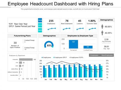
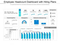
Employee headcount dashboard with hiring plans





Try Before you Buy Download Free Sample Product
 Impress Your
 Audience
 100%
100% Editable
 Save Hours
 of Time


Our Employee Headcount Dashboard With Hiring Plans are explicit and effective. They combine clarity and concise expression.
People who downloaded this PowerPoint presentation also viewed the following :
Employee headcount dashboard with hiring plans with all 2 slides:
Give your audience a fulfilling experience. They will find our Employee Headcount Dashboard With Hiring Plans elevating.
FAQs for Employee headcount dashboard
Start with the basics: headcount, new hires, departures, turnover rates. Break those down by department and role level - that's where the interesting patterns show up. Net headcount change is huge because you might think you're hiring like crazy but actually shrinking overall. Time-to-fill is good too, plus retention by manager (seriously, some managers are just turnover machines). Oh and make sure you can slice the data different ways - monthly, quarterly, whatever. Headcount vs budget tells you if you're on track or going rogue with hiring.
Dude, you'll actually see what's happening with your team *right now* instead of staring at some crusty monthly report from three weeks ago. Like if your customer service team is getting slammed and you're short two people - boom, you know instantly. Same with turnover weirdness or when you've got too many people standing around. Way better than those nightmare Excel sheets we all pretend to understand. The dashboard thing is pretty sweet for making quick moves - hiring someone ASAP, shuffling people between departments, whatever. Oh and set up those alert thingies so it pings you when numbers hit certain levels. Saves you from bigger headaches later.
Honestly, those visual dashboards are game-changers for spotting diversity gaps without drowning in endless spreadsheets. Leadership eats up the pretty charts too – makes your presentations actually look professional. You can quickly see which departments need attention and catch retention red flags before they blow up. The real trick is setting up alerts when metrics hit certain levels, so you're not scrambling later. I learned that one the hard way lol. Time tracking gets way easier when everything's visual, and you'll notice demographic trends that would've taken forever to find manually.
Honestly, these dashboards are game-changers for spotting trends you'd totally miss otherwise. Charts show you stuff like hiring spikes or when turnover suddenly jumps in certain departments - way clearer than drowning in spreadsheets. You might notice your engineering team always loses people after performance reviews, or that sales hiring peaks right before Q4. The visual aspect just makes patterns obvious, you know? Plus you can actually catch problems early instead of realizing months later that half your team bailed. Trust me, it's so much better than trying to piece together what's happening from random reports.
Tableau or Power BI are your best bets for this - both hook up straight to whatever HRIS you're running. Google Data Studio works too if budget's tight. I'd probably go Power BI since most HR folks already know their way around Microsoft stuff anyway. Just make sure your data's actually clean first or you'll be pulling your hair out later. Oh, and definitely figure out what metrics people actually want to see before you get carried away building cool charts. Half the time they just want basic headcount trends, not some elaborate breakdown by department and tenure and whatever else.
So first, pick the metrics that actually matter to you - department sizes, turnover, hiring speed, diversity stats, whatever fits your priorities. Most platforms these days have drag-and-drop stuff that's pretty easy to figure out. You can set different time periods and create views where managers only see their teams but executives get everything. Honestly, the automated alerts are clutch - set them up for things like when headcount hits certain thresholds. Oh, and definitely test a few layouts with your team first. There's no point building something fancy if nobody's gonna use it.
Honestly, headcount dashboards are game-changers for D&I work. You get this clear picture of who's where across departments and levels - makes it super obvious where you're lacking diversity. Like, maybe your engineering team is fine but leadership? Yikes. Way better than guessing or digging through old spreadsheets every quarter. Real-time data means you can actually see if your hiring pushes are working or if people are just leaving faster than you're bringing them in. I'd start by finding your worst gaps first, then track whether things improve month by month.
Honestly, the worst thing you can do is mess up your data definitions - like one department counts contractors, another doesn't. Super confusing. Also don't overload the dashboard with every possible metric because execs will just tune out. Match your refresh schedule to what people actually need too. Weekly payroll data being called "real-time" is kinda misleading, you know? Short sentences work better than long ones. Oh and definitely test it with real users first - I learned that one the hard way. Keep time periods consistent and label everything clearly.
Honestly, daily or weekly updates work best for headcount dashboards. If you're hiring like crazy or people are leaving left and right, go daily - stale numbers will screw you over when making decisions. Weekly's totally fine for stable teams though. Monthly? Eh, only if your workforce never changes (which, let's be real, rarely happens). The main thing is being consistent with whatever schedule you pick. Match it to how fast your business moves. And seriously, automate the data pulls if you can. Nobody wants to mess with spreadsheets constantly.
Honestly, you can't make good hiring or budget calls without solid headcount data - it's like flying blind. Monthly reviews help you spot patterns early instead of panicking later. Look for seasonal shifts, which departments are growing fast, turnover hotspots across teams. I've seen too many companies scramble during budget season because they weren't tracking this stuff regularly. Your dashboard becomes super useful for forecasting future needs and identifying skill gaps. Plus having actual numbers makes it way easier to argue for more resources when you need them. Trust me, start reviewing monthly.
Honestly, headcount dashboards are a lifesaver for compliance stuff. Set up automated alerts for when you hit those regulatory thresholds - trust me, you don't want to miss WARN Act requirements or OSHA headcount limits. The real-time data pulls work great for EEO-1 reports and ACA tracking too. I'd configure mine to export everything in whatever weird formats the government wants (why can't they just use Excel like normal people?). You can track diversity metrics and workforce changes automatically. Creates audit trails for inspections without all that manual spreadsheet nonsense. Makes reporting season actually manageable.
Make it interactive first - add filters for departments, time ranges, job levels so people can actually explore what they care about. Charts showing hiring trends help way more than boring spreadsheet dumps (honestly those just make people's eyes glaze over). Color-code your key metrics and throw in some alerts when headcount shifts dramatically. Brief explanations of what numbers actually mean goes a long way too. Oh, and ask your power users what specific questions they're trying to answer - they'll tell you exactly what's missing. Visual storytelling beats data dumps every single time.
So predictive analytics in headcount dashboards? Game changer. You'll spot turnover trends and skill gaps way before they bite you. Instead of scrambling for talent when everyone else is too, you're already three steps ahead. Budget planning becomes actually strategic instead of just guesswork. My old boss used to say it was like workforce fortune-telling - cheesy but honestly pretty accurate. Start with whatever's causing you the biggest headaches in planning, then dig into your historical data for patterns. The insights you'll find are wild.
Honestly, multi-year headcount data is like a goldmine. Seasonal hiring jumps out immediately - plus you'll catch growth spurts during your busy periods. Economic downturns? Company pivots? They leave clear fingerprints on staffing levels. Some departments always seem to expand while others stay weirdly static (usually a red flag). The patterns help predict future hiring needs, and you can spot retention problems brewing before they explode. I'd probably check these trends quarterly - sounds boring but it actually saves your butt when planning gets crazy.
Honestly, the real-time visibility is a game changer - you can catch overspending or staffing gaps way before they blow up your budget. No more drowning in spreadsheets every month (thank god). You'll spot hiring trends and attrition patterns that actually matter for planning ahead. Set up budget threshold alerts so you're not scrambling when someone asks about headcount costs. The forecasting piece helps too - makes it easier to figure out where you need new hires versus where you should pump the brakes. Way more accurate than guessing at salary projections.
No Reviews