


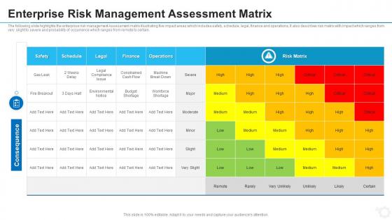
Enterprise risk management assessment matrix


Try Before you Buy Download Free Sample Product
 Impress Your
 Audience
Editable
of Time


Our Enterprise Risk Management Assessment Matrix are topically designed to provide an attractive backdrop to any subject. Use them to look like a presentation pro.
People who downloaded this PowerPoint presentation also viewed the following :
Enterprise risk management assessment matrix with all 6 slides:
Use our Enterprise Risk Management Assessment Matrix to effectively help you save your valuable time. They are readymade to fit into any presentation structure.


FAQs for Enterprise risk
So basically you're plotting risks on a grid - probability vs impact. Each risk gets mapped based on how likely it'll happen and how badly it'd mess things up. Think of it like a heat map for all the stuff that could go wrong. Red zones = deal with these NOW. Lower priority stuff? Just keep an eye on them for now. Honestly, I'd grab your worst 3-5 risks from that high-impact, high-probability corner and start there. Makes the whole decision process way less overwhelming when you can actually see everything laid out visually.
Map out your industry's specific risks first - regulatory stuff, operational hazards, market swings, whatever applies to you. Healthcare orgs obviously care way more about patient safety than financial hits. Manufacturing? Equipment failures and safety incidents are huge. Honestly, the customization is where this gets interesting. Tweak the probability scales - maybe quarterly instead of annual. Adjust impact categories like reputational damage or compliance issues. Even change how you score things based on what actually matters in your field. Start with industry standards if they exist, then modify from there. Works way better than generic templates.
So basically you need three main things: probability, impact, and how you rate the overall risk. Probability is just how likely something bad will happen. Impact covers how much damage it'd actually cause your project. Then you combine those into ratings - most people do the whole red/yellow/green thing because it's easier to scan quickly. Make sure everyone knows what "high risk" means though, otherwise you'll get wildly different answers. Oh, and don't overthink the grid size at first. Start with something simple like 3x3, then adjust the wording so it actually makes sense for your team's situation.
Look at two things: how likely each risk is and how bad it'd mess things up if it actually happens. I usually just do a simple 1-5 scale for both. Then multiply those numbers together - boom, that's your priority order. Start with the highest scores since those are your biggest headaches waiting to happen. The tricky part is you can't just set it and forget it. Risk stuff changes constantly (honestly more than I expected when I first started doing this), so you've got to revisit your rankings pretty regularly or you'll be caught off guard.
Dude, risk matrices are clutch because they stop all those stupid arguments about what "kinda risky" actually means. Instead of people going in circles, you just point at the box and boom - everyone sees it's medium risk. The color coding is perfect too - red stuff gets handled first, yellow can wait. I swear these things save so much time in meetings where everyone's usually talking over each other. Your leadership team will love it since they can actually see priorities at a glance instead of trying to decode everyone's random opinions about what's urgent.
Think of it like a grid - probability on one side, damage on the other. You plot each risk based on how likely it is vs how bad it'd be if it actually happens. High chance + high damage = deal with this now. Low chance + low damage = probably fine to ignore. The tricky part is defining what "high" and "low" actually mean for your situation first, otherwise you're just guessing. It's honestly pretty similar to those urgent/important charts, except you're mapping out potential disasters instead of your to-do list.
Look, once a year is the bare minimum but honestly that's kinda useless. Big operational changes? New regulations drop? Major incident happens? You gotta jump on updating it right away. The stuff that looked harmless six months ago could be a total nightmare now - business moves way too fast to ignore that. I'd probably set up quarterly reviews for the high-priority stuff and catch anything sketchy before it blows up. Oh, and those quarterly check-ins are way less painful than scrambling when something goes sideways unexpectedly.
Don't make your scales super vague like "high, medium, low" - you need actual definitions or everyone rates stuff differently. People love cramming everything into the middle because it feels safer, but honestly? You're just lying to yourself about the real nasty risks. Define what each level actually means with specific criteria. Oh, and here's the thing - most teams build these matrices once then totally forget about them. Risks shift constantly, so you've got to schedule regular check-ins. Otherwise you're working off old info that doesn't match reality anymore.
Ditch those static spreadsheets - you can automate data collection and get real-time updates instead. Dynamic dashboards pull live info from your systems, so risk levels change automatically when conditions shift. AI spots patterns you'd probably miss, which is honestly kind of wild when you see it find connections between random risk factors. Set up automated alerts for when risks hit certain levels too. That way your team isn't stuck monitoring everything manually (been there, it sucks). Just start with something simple that works with what you've already got.
Start with a half-day workshop on basic risk management - probability vs impact scoring stuff. Your facilitators need deeper training though, especially for handling disagreements (which happen constantly, honestly). PMI has good resources, or check industry associations and Coursera. The real trick is getting everyone aligned on your company's risk appetite and scoring criteria. Do a practice round first with an old project - way easier than jumping into current risks blind. That calibration step saves so much headache later. Makes the whole process actually useful instead of just another meeting people dread.
So the matrix thing is basically a visual grid that plots probability against impact - way better than just listing risks in a spreadsheet. You can instantly spot the dangerous stuff in the "red zone." SWOT analysis? Too broad. Bow-tie analysis gets into all the nitty-gritty causes but honestly, who has time for that complexity? The matrix keeps things straightforward. Stakeholders love it because they can see priorities at a glance. Perfect when you need quick decisions about what deserves your attention first. There's something weirdly satisfying about plotting everything out visually too.
So basically, a risk assessment matrix is like your decision-making cheat sheet - shows you exactly where to put your energy first. You'll spot the high-priority stuff that needs fixing ASAP versus things you can just keep an eye on. Makes explaining your choices to higher-ups way simpler too, since you've got actual data backing you up instead of just "trust me on this one." Honestly, I wish more people used these things. When you're stuck between different options, just map out each one's risks and compare. Game changer for sorting through competing priorities without losing your mind.
Color coding is your best friend here - red for high risks, yellow for medium, green for low. People get it instantly without squinting at spreadsheets. Heat maps are seriously satisfying to look at (maybe that's just me being weird?) and they show risk clusters super clearly. Icons work great for different risk types too. You can play around with sizing things differently or adding arrows to make the scary stuff pop. Honestly, the whole point is making it foolproof - like, your boss's boss should be able to glance at it and know exactly what's on fire without asking questions.
Yeah, those low-probability disasters will absolutely wreck you if you ignore them. Cyberattacks, natural disasters - stuff you think "won't happen to us" but then BAM, your whole operation's down. I've seen companies go under from things they never planned for. The unlikely events are actually the most dangerous ones because nobody's ready. Black swan events, they call them. Honestly? Even if there's like a 2% chance, throw it on your risk matrix anyway. At least sketch out some basic backup plans. Better to feel slightly paranoid than completely screwed later.
So basically treat your risk matrix like it's actually alive - update it during sprint retros in Agile, or at those phase gate reviews if you're stuck with waterfall. PMI people eat this up, just connect your risks to the work breakdown and mention updates in status meetings. Don't let it become some dusty document though. I learned that the hard way on a project last year. Set quarterly calendar reminders and definitely pull it out when stakeholders start changing their minds about priorities. Makes you look way more prepared than you probably are.
-
Awesome use of colors and designs in product templates.
-
Wonderful templates design to use in business meetings.