

Excel hourly timeline chart ppt sample presentations




Try Before you Buy Download Free Sample Product
 Impress Your
 Audience
 100%
100% Editable
 Save Hours
 of Time


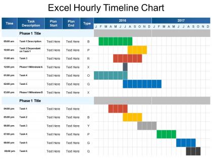
Get this Excel hourly timeline chart PPT sample presentations to plan upcoming work and track the details of present work. Determine the time that will be needed to accomplish a task. Divide it on an hourly basis using our hourly timeline PPT slide. Set an organized timeline to meet the targets using this timeline PPT template. You can show key activities hour by hour to update the easy execution of the project. Highlight specific phases of work that need to be covered in time. Project and assign the duration of the task to your team members effortlessly. Strategize the efficient working of your business with this hourly schedule PowerPoint template. Give stakeholders a visual overview of future targets and releases. Roadmaps focus on the goals the upcoming releases provide. Use this hourly roadmap PPT visual illustration to make your presentation effective. A professionally designed presentation is just few clicks away. Invest less amount of time and make a hassle-free, high quality presentation using this timeline template PPT slide. Act now to make your next presentation flawless. Compelling Excel Hourly Timeline Chart Ppt Sample Presentations design is on hand for every business need.
People who downloaded this PowerPoint presentation also viewed the following :
Content of this Powerpoint Presentation
Description:
The image depicts an "Excel Hourly Timeline Chart" PowerPoint slide, used for project management and scheduling. It features a timetable for tasks, with columns for time, task description, plan start and end dates, and a Gantt-like chart showing the duration of each task across two years. Each task is color-coded for easy reference, and the timeline spans from January 2016 to December 2017, allowing for long-term planning and tracking.
Use Cases:
This timeline chart is a versatile tool for project management, useful in industries that require meticulous scheduling and time tracking.
1. Construction:
Use: Scheduling phases and tasks of construction projects
Presenter: Project Manager
Audience: Construction Team, Contractors
2. Event Planning:
Use: Outlining preparation milestones for events
Presenter: Event Coordinator
Audience: Vendors, Event Staff
3. IT Development:
Use: Tracking software development and release cycles
Presenter: IT Project Lead
Audience: Development Team, Stakeholders
4. Marketing:
Use: Planning marketing campaigns and related activities
Presenter: Marketing Director
Audience: Marketing Team, Creative Agencies
5. Film Production:
Use: Detailing shooting schedules and post-production
Presenter: Production Manager
Audience: Film Crew, Producers
6. Pharmaceutical:
Use: Managing drug development and trial phases
Presenter: R&D Manager
Audience: Research Team, Regulatory Affairs
7. Education:
Use: Organizing academic year and curriculum implementation
Presenter: Academic Planner
Audience: Faculty, Administrative Staff
Excel hourly timeline chart ppt sample presentations with all 5 slides:
Feel in harmony with our Excel Hourly Timeline Chart Ppt Sample Presentations. Your thoughts acquire coherent expression.

FAQs for Excel hourly timeline chart
So you'll need your data in two columns - time in one (9:00 AM, 10:00 AM, whatever), values in the other. Line charts work way better than columns for this kind of thing, trust me. Create your chart, then right-click the bottom axis to format how often the time labels show up. Every hour, every two hours - depends on your data really. Oh and definitely add a proper title and label your axes or people will just stare at it confused. If it looks weird, try switching chart types until something clicks.
Right-click any data series and hit "Format Data Series" - that's where you can change colors, patterns, borders, whatever. You can also click individual bars to customize them separately, which is honestly super useful for highlighting specific periods. The "Fill & Line" tab is your best friend for colors, though I sometimes mess around in "Effects" for shadows if I'm bored. Oh, and there's the Chart Design tab on the ribbon for overall styling. One thing I learned the hard way - make a custom color palette first so everything matches. Trust me, it'll save you time later when you're scrambling to make three different charts look cohesive.
Hourly charts are clutch when you've got data that shifts throughout the day. Website traffic is a classic example - same with call center volumes or production numbers. Honestly, I probably overuse them, but they're great for temperature readings and energy stuff too. You need enough data points to actually see patterns though. Short bursts won't tell you much. Social media engagement works well since people are way more active at certain hours. Really depends what you're trying to figure out - if timing matters for your thing, then hourly tracking probably makes sense.
Oh this is actually pretty straightforward! Create a second data series for your milestones - I always use diamond shapes since they stand out better than triangles. Put the milestone dates in a separate row and give them all the same value (like 1 or whatever fits your scale). Then overlay it as a scatter plot on your timeline. Different colors are key so they don't blend in with everything else. Oh and definitely add data labels - otherwise people just see random diamonds and have no clue what they mean. Trust me, it'll look way more professional than you'd expect.
Conditional formatting is a game changer - you can color-code different time periods and it makes everything so much easier to read. I'm weirdly obsessed with getting the colors just right lol. Data bars are awesome too, they create these clean horizontal bars inside the cells. Custom number formats let you display times however you want them to look. Oh and if you're doing actual charts, mess around with the formatting options there too. Clean fonts make a huge difference. Some subtle gridlines help but don't go overboard.
Oh totally! Just right-click any data point and hit "Add Data Labels" - they'll pop right up. Then you can mess with what shows by right-clicking the labels again and picking "Format Data Labels." Shows values, names, whatever you want really. Honestly though, if it starts looking messy (which happens fast with hourly data), just delete some of the labels manually. I usually keep the important peaks and dips. Try the basic setup first and see how crazy it gets!
Oh man, the time formatting thing will drive you crazy if you don't get it right. Excel gets super confused between actual time format (like 14:00) versus text that just looks like time. Sort your data chronologically first - I literally forgot this last week and spent way too long wondering why my chart looked insane. Don't go overboard with data points either. I've seen charts trying to show every 5 minutes for an entire day and it's just a mess. Stick to reasonable intervals and you'll actually be able to read the thing.
Put each overlapping event on its own row - don't try cramming everything into one timeline, trust me. I spent way too much time making charts that looked like a toddler's art project before figuring this out. Use horizontal bars or conditional formatting to show the time blocks. Different colors help distinguish event types too. Got a million overlaps? Group similar stuff together or just grab a Gantt chart template instead. List all your events vertically first, then map out when they happen horizontally. Way cleaner approach.
Honestly, SEQUENCE and TIME functions are gonna save you so much headache here. Use SEQUENCE(24,1,0,1/24) - it'll automatically create 24 rows starting at 0 and bump up by one hour each time. Wrap that in TEXT with "h:mm AM/PM" formatting and boom, clean time intervals. For pulling your actual data, INDEX/MATCH works perfectly, or XLOOKUP if you're feeling fancy. Don't forget IFERROR since your timeline probably has gaps anyway. Trust me, once you try SEQUENCE instead of typing out hours manually, you'll wonder why you ever did it the hard way.
Hey! So for mobile Excel charts, bump up your font sizes to at least 14pt - trust me on this one. Also try going vertical instead of horizontal since phones are tall and narrow. High contrast colors are your friend too. Oh and definitely cut down on how much data you're showing or it'll look like a hot mess on small screens. I always check mine on my phone before presenting now after one disaster meeting where nobody could read anything lol. You can export as a high-res image if Excel's being weird about formatting.
Yeah totally doable, but honestly it's a bit of a pain to set up. You'll want to hit Data > Get Data and connect to whatever source has your live info - could be a database, web data, APIs, whatever. Just heads up though, Excel's "real-time" isn't actually real-time. More like every few minutes if you're lucky. I've had better luck with Power Query for pulling data automatically. If you really need instant updates, you might have to mess around with VBA scripts or just bite the bullet and switch to Power BI instead.
Stick to consistent time intervals and don't go crazy with colors - 3 or 4 max. Your axis labels need to be big enough that people can actually read them (learned this the hard way). Clear data markers are clutch, and throw in trend lines if they actually add to your story. Titles should be descriptive but short, and always include your units. When you're presenting, go through it chronologically so everyone can follow along naturally. Oh, and test how it looks from the back of the room first - trust me on this one.
Excel gets really cranky with massive datasets - learned that the hard way when I tried cramming like 10,000 hourly points into one chart. What saved me was using pivot tables to roll everything up by day first, or just filtering to the specific weeks I actually cared about. Sometimes I'll sample the data too, like showing every 6th hour instead of every single one. The patterns still show up fine. Oh, and definitely start small with maybe a month's worth of data to get your chart looking right, then expand from there. Way less frustrating than watching Excel freeze up on you.
Go to File > New and search "timeline" - Excel's got some decent built-in options. The Gantt charts and project timeline templates work pretty well for this stuff. I'd probably start with the basic project timeline template since it's not too cluttered. If those don't work, try Vertex42 or Template.net for free downloads. They usually have better designs anyway. Just swap out the daily/weekly intervals for hourly ones and you should be set. Takes like two seconds to customize once you find one you like.
Just right-click your chart and go Insert > Text Box - then you can drop those wherever you need to explain stuff. I always add little arrows pointing to the weird spikes too, otherwise people just stare at your chart confused. Data labels work great if you're only highlighting one specific time period. Oh, and don't write a novel in there - keep annotations short but clear enough that anyone looking at it gets what happened during those crazy hours. Nobody wants to decode your timeline like it's some puzzle.
-
Commendable slides with attractive designs. Extremely pleased with the fact that they are easy to modify. Great work!
-
Much better than the original! Thanks for the quick turnaround.