Executive summary ppt infographics example introduction
Try Before you Buy Download Free Sample Product
Audience
Editable
of Time
Ensure control over your expenses with our Executive Summary Ppt Infographics Example Introduction. It helps curtail costs.
People who downloaded this PowerPoint presentation also viewed the following :
Content of this Powerpoint Presentation
Description:
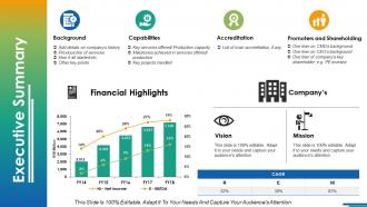
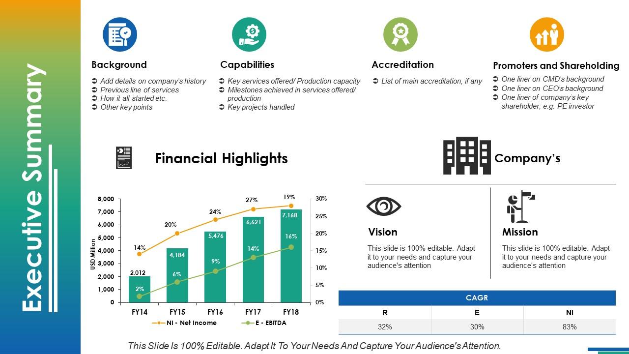
This image is a professional executive summary slide from a corporate presentation deck designed to concisely provide key information on a company. It is sectioned into four main content areas and includes a financial highlights graph.
1. Background:
This section prompts the addition of the company's history, primary lines of services, how the company started, and other important historical or foundational details.
2. Capabilities:
Here, the presenter would outline the key services offered or production capacity, milestones achieved in service or production, and any major projects the company has successfully handled.
3. Accreditation:
This area is reserved for listing any main accreditations the company has achieved, signifying recognized standards and qualifications they hold.
4. Promoters and Shareholding:
Information on key figures like the CMD (Chairman and Managing Director) and CEO, as well as an outline of major shareholders such as private equity investors, are to be summarized here.
Centered in the slide is a bar graph labeled "Financial Highlights," showing the progression of Net Income (NI) and Earnings Before Interest, Taxes, Depreciation, and Amortization (EBITDA) over several fiscal years (FY14 to FY18).
On the right, there are placeholders for the company's Vision and Mission statements, which should encapsulate the long-term plans and ongoing purpose of the organization respectively.
At the bottom, there are three growth figures represented as CAGR (Compound Annual Growth Rate) for Revenue (R), Earnings (E), and Net Income (NI), showcasing the company's financial growth rates in these areas.
Usec Cases:
Now, let's identify seven industries where this slide can be effectively utilized:
1. Financial Services:
Use: Presenting company performance and strategy
Presenter: CFO or Financial Analyst
Audience: Investors, Shareholders, or Analysts
2. Pharmaceuticals:
Use: Outlining company capabilities and growth trajectory
Presenter: CEO or Senior Executive
Audience: Investors, Partners, Regulatory Bodies
3. Technology:
Use: Sharing innovation accomplishments and future outlook
Presenter: CTO or Innovation Manager
Audience: Investors, Stakeholders, Employees
4. Manufacturing:
Use: Demonstrating production capabilities and market positioning
Presenter: Operations Director or Plant Manager
Audience: Shareholders, Clients, Industry Analysts
5. Retail:
Use: Briefing on company expansion and financial health
Presenter: Retail Manager or Strategy Director
Audience: Franchisees, Investors, Retail Analysts
6. Energy:
Use: Reporting on financial performance and strategic targets
Presenter: CEO or Energy Sector Specialist
Audience: Government Regulators, Investors, Environmental Groups
7. Education:
Use: Showcasing institutional growth and accreditation status
Presenter: University President or Dean
Audience: Accreditation Bodies, Investors, Educational Stakeholders
Executive summary ppt infographics example introduction with all 5 slides:
Employ our Executive Summary Ppt Infographics Example Introduction for any introduction. It ensures instant interest.
FAQs for Executive summary ppt
So you'll want a catchy headline first - that's what grabs attention. Then put your main findings right up front, don't bury them. Clean charts help too, but honestly? Less is more with the data points. I've seen so many exec summaries that look like someone threw up spreadsheets everywhere. Pick a simple color scheme and leave tons of white space. Oh, and don't forget clear next steps - they need to know what you want from them. The goal is 30-second scanning. If your boss has to squint, you've already lost.
Honestly, visuals are a game changer for exec summaries. People's eyes just glaze over when they hit a wall of text - I've seen it happen in so many meetings. Charts show trends way faster than paragraphs ever could. Use icons or color coding so readers can scan sections quickly. Infographics force you to cut the fluff and get to the point. I'd swap out like 30% of your text for visuals. Oh, and graphs are perfect for comparisons that would take forever to explain otherwise. Trust me, you'll see people actually engage with your summary instead of skimming past it.
Honestly, executives scan these things in like 30 seconds max, so hierarchy is everything. Put your biggest takeaways right at the top and make them the largest elements on the page. White space is your friend - don't cram stuff together. Stick to maybe 2-3 colors total. Bullets work way better than paragraphs since nobody's reading full sentences anyway. I'd step back when you're done and see if the main points literally jump out at you. If you're squinting to find them, it's too cluttered. Oh, and resist the urge to include everything - less really is more with exec dashboards.
Dude, color schemes can totally make or break your exec summary. Stick with your brand colors but keep it simple - like 2-3 max. Too many bright colors and executives will think you're not taking it seriously enough for the boardroom. I learned this the hard way once lol. Use contrast to make your key numbers pop, but here's the thing - always check if it looks decent in black and white because someone's definitely gonna print it out. Also test it on different backgrounds since you never know if they'll throw it up on a random projector or screen.
Dude, go with the basics - bar charts, pie charts, line graphs. Executives need to get it instantly, like within 5 seconds max. I learned this the hard way when my boss just stared blankly at my fancy dashboard last year. Simple icons work great for showing progress too. Skip anything complex that'll make them squint or think too hard. Line graphs are perfect for trends, bars for comparisons. The whole point is immediate impact, so whatever supports your main message without confusing anyone. Trust me, boring charts that actually communicate beat pretty ones that don't.
So basically, you've got to switch up everything depending on who's looking at it. Executives want clean stuff with ROI numbers - they don't have time for clutter. Technical people actually like the detailed charts and nitty-gritty implementation details. Marketing teams are totally different though - they want bright colors and customer stats because honestly, they're just wired that way. Your tone needs to shift too. Board meetings = formal language, but with your own team you can be way more casual. The trick is figuring out what each group actually cares about first, then design around those specific things that keep them up at night.
Honestly, the worst thing you can do is cram everything onto one slide - execs will just tune out. Stick to maybe 3-4 main points tops. Give everything room to breathe with white space, and for the love of god, don't use those cheesy stock icons that look ancient. I see people making slides that are basically art projects when really you just need clean, bold headers and info they can digest in 30 seconds. Skip the tiny fonts and rainbow color schemes too. Think less "look how creative I am" and more "here's what you need to know."
Start with the problem, then walk them through your data like a story. Think mini movie trailer for your business! Connect each stat to show cause and effect instead of just throwing numbers around. Use arrows or timelines so execs can follow along easily. Honestly, the character-driven stuff works great too - sections like "customer pain points" or "team wins" stick way better than generic headers. Don't just dump everything at once. End with your solution or what's next. Before you design anything, ask yourself: what's the ONE story I want them walking away with?
Honestly, just start with Canva - their business templates are solid and you won't spend hours figuring out basic stuff. If you're feeling fancy and know your way around design software, Adobe Illustrator gives you way more control. PowerPoint sounds boring but execs eat that stuff up, plus it's dead simple for layouts. Oh, and Figma's clutch if multiple people need to work on it together. Piktochart's your best bet when you've got tons of charts and data to work with. I'd probably mess around in Canva first, see how it looks, then maybe graduate to something fancier if needed.
Okay so I'd say aim for like 70% visuals, 30% text - that ratio works really well. Executives literally have zero patience for walls of text, trust me. They'll scroll right past it. Your charts and icons should tell most of the story while text just fills in the gaps. I actually bombed a presentation once because I crammed way too much writing on each slide. Nobody even bothered reading it! Start with your visuals first, then sprinkle in just enough words to connect the dots. Keep text super minimal - think of it like adding salt to a dish, not drowning everything in it.
Think of icons as your secret weapon for making executives actually *want* to read your stuff. Dense paragraphs are death - but a little lightbulb next to your innovation section? That catches attention. Use them to mark different business areas or key metrics so people can scan quickly. Honestly, I've seen reports where smart icon placement saved meetings because everyone could follow along. Just don't go overboard with the decorating. Pick one style and stick with it. Each icon should actually mean something, not just look pretty. Charts are cool, but sometimes simple visual cues work better for busy executives who're skimming through your presentation.
Honestly, infographics are genius because our brains just eat up visuals way faster than walls of text. Think about it - you can scan a chart in like 3 seconds vs. reading through paragraphs forever. Executives especially love this stuff since they're always rushing between meetings anyway. A good visual hierarchy basically draws their eye exactly where you want it to go. I've noticed people remember charts and graphs way better than whatever was buried in some dense summary. Oh, and here's the thing - even if your data isn't groundbreaking, presenting it visually makes it feel more important somehow. Next time, just pick your top 5 numbers and turn them into simple visuals.
Hey! Three main things to nail down: color contrast, alt text, and how you structure everything. Grab a free contrast checker online - trust me, it's worth doing upfront. Don't forget alt text for images, plus maybe include the main points as actual text somewhere. Use proper headings so screen readers can navigate easily. Oh, and please don't use tiny fonts - they're honestly terrible for everyone, not just people with vision issues. If you can test it with a screen reader, do it. Otherwise find someone who actually uses accessibility tools to give it a quick look.
Honestly, I'd update the design every 6-12 months max - or whenever your brand changes obviously. Content though? That's different. You'll probably need to swap out data quarterly, maybe monthly. Most teams get way too caught up in redesigning constantly when really the story matters more. But if it starts looking ancient next to your competitors... yeah, time for a refresh. Here's what I do - calendar reminder every quarter to just look at it and think "does this still feel like us?" Works pretty well. The template itself can stay put way longer than people think.
Check your engagement first - shares, comments, how long people actually look at it. Click-throughs matter if you want them doing something after. Downloads show if it's worth saving. But here's the thing - I've watched beautiful infographics crash because they were confusing as hell. Send quick surveys asking if people got your main points. That's honestly more important than pretty design. Also track if it comes up in meetings later. That's gold right there. Don't go crazy measuring everything though. Pick 2-3 things that match what you're trying to accomplish.
No Reviews