


Project conclusion ppt infographics outfit




Try Before you Buy Download Free Sample Product
 Impress Your
 Audience
 100%
100% Editable
 Save Hours
 of Time


Display courage in the face of adversity with our Project Conclusion Ppt Infographics Outfit. Demonstrate that you have the heart for it.
People who downloaded this PowerPoint presentation also viewed the following :
Content of this Powerpoint Presentation
Description:
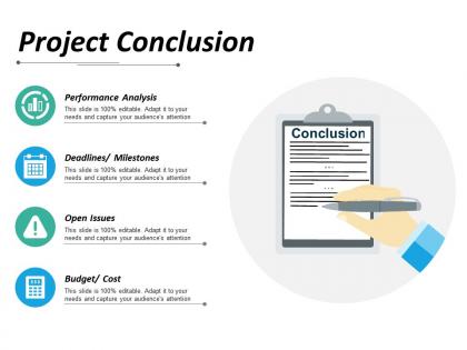
The image shows a PowerPoint slide titled "Project Conclusion" with an illustrative design. This slide serves as a template for presenting the wrap-up of a project, touching upon four key elements.
1. Firstly, "Performance Analysis" is accompanied by a graph icon, suggesting a review of project outcomes against objectives. The text indicates the slide is entirely customizable, to adapt to the specific needs of the presentation and to engage its viewers better.
2. Secondly, "Deadlines/Milestones" is represented by a calendar icon, indicating a summary of the project's timeline and how it is aligned with set goals or phases within the project.
3. Thirdly, "Open Issues" is denoted with an exclamation mark symbol, meant to identify any outstanding problems or unaddressed points that may need attention going forward.
4. Lastly, "Budget/Cost" is shown alongside a stack of coins, suggesting a financial review of the project, including total costs incurred and how they compare to the budgeted amounts.
Use Cases:
These elements are typical in project review meetings where stakeholders analyze if project goals were met efficiently. Various industries can apply such slides to conclude a variety of projects.
1. Information Technology:
Use: Review of software development projects
Presenter: Project Manager
Audience: Stakeholders and Development Team
2. Construction:
Use: Summary of building project outcomes
Presenter: Lead Contractor
Audience: Clients and Investors
3. Marketing:
Use: Finalization of advertising campaign results
Presenter: Marketing Director
Audience: Marketing Team and Brand Managers
4. Education:
Use: Reporting on educational program initiatives
Presenter: Program Coordinator
Audience: Academic Staff and Funding Bodies
5. Healthcare:
Use: Conclusion of healthcare improvement projects
Presenter: Healthcare Administrator
Audience: Medical Professionals and Hospital Staff
6. Non-profit Organizations:
Use: Wrap-up of community service initiatives
Presenter: Project Leader
Audience: Volunteers and Sponsors
7. Manufacturing:
Use: Post-production project analysis
Presenter: Operations Manager
Audience: Production Team and Supply Chain Partners
Project conclusion ppt infographics outfit with all 5 slides:
Derive accurate inferences with our Project Conclusion Ppt Infographics Outfit. Closely examine all the data.
FAQs for Project conclusion
Definitely lead with your biggest win or most impressive number - that hooks people right away. Then cover your main outcomes, success metrics (or what you learned from failures), and timeline highlights. Don't forget stakeholder quotes if you have them - they're surprisingly powerful. Oh, and include team photos! People connect with faces. Visual hierarchy matters a lot here. Use colors and font sizes to pull eyes toward your biggest achievements first. Since it's an infographic, keep text super minimal. I'd also add what's coming next for the project. Honestly, the testimonials are what I always skip but they make such a difference in credibility.
Lead with your biggest wins - bold numbers and eye-catching visuals right at the top. Charts work way better than walls of text (trust me, nobody reads those). Show before/after comparisons or timeline stuff to tell the story. Bullet points are your friend here. The whole thing should flow from problem → solution → results. I'd honestly aim for someone to "get it" in like 30 seconds of looking. Short phrases that hit the "so what" factor. Don't overthink it - clean visuals and clear impact metrics will do most of the heavy lifting for you.
Honestly, less is more with these things. Your key wins should jump out immediately - don't bury them under a bunch of random graphics. Stick with colors and fonts that actually match your project (seems obvious but you'd be surprised). Flow should go problem → solution → results, pretty straightforward. Charts and icons beat text walls every single time. Your biggest numbers or outcomes? Make those the visual stars. Oh, and definitely sketch it out first before you touch any design software. Saved me like 3 hours of back-and-forth last time I did this.
Canva's probably your best bet to start - crazy easy to use and they have a million project summary templates. PowerPoint actually works too if you're already used to it (I know, I know, sounds basic but people make decent stuff on there). Adobe Illustrator is obviously the gold standard but honestly? Such a pain to learn unless you've got time to kill. Piktochart sits somewhere in between and it's built for this exact thing. I'd just mess around in Canva first, get your layout sorted, then maybe upgrade later if you need something fancier.
Honestly, visuals are a game-changer for getting your point across. People's eyes just glaze over when you dump a bunch of numbers on them. Charts and graphs? They get it immediately. I swear, stakeholders would rather look at one good infographic than read through pages of text any day. Plus some folks just process visual stuff better anyway - that's how their brain works. Make yourself a simple dashboard showing your top 3-5 findings with charts backing them up. Way more impact than paragraphs of explanation.
Honestly, colors and fonts can make or break your whole infographic. Use colors to grab attention and create that visual hierarchy - warm ones feel energetic, cool ones seem more trustworthy. Font choice matters too (please don't use Comic Sans for anything serious lol). Stick to 2-3 fonts max and make sure there's good contrast between your text and background. Once you pick your palette and fonts, be consistent throughout the whole thing. Oh, and definitely test it on different screens - what looks great on your laptop might be terrible on mobile. Have someone else take a look before you're done.
Honestly, infographics are a game-changer for project data. Dense spreadsheets make everyone's brain hurt, but visual charts and icons? People actually get it. I've watched presentations where folks are scrolling their phones, then boom - put up a good infographic and suddenly they're paying attention. Works for executives who want the overview AND your detail-oriented team members. Pick your 3-4 main points first, then build everything around those. Oh, and don't overcomplicate it - sometimes simple beats fancy every time.
So basically you want to tell a story - start with the problem, then show your journey to solving it. Timelines and flowcharts work great for this. Before/after comparisons are honestly my favorite because they're so dramatic. Don't forget to spotlight the people who actually did the work - team members, stakeholders, whoever. Pick a visual theme and stick with it throughout (like a roadmap or whatever). The key thing is making sure your data actually supports the story instead of just being random pretty charts. I'd sketch out the whole narrative first, then worry about which visuals fit each part.
Oh man, don't cram everything onto one page - that's the worst thing you can do. Pick like 3-5 main points max. Tiny fonts are death, nobody squints at infographics. Use visuals that actually mean something, not just random charts because they look pretty. Here's what I learned the hard way: always explain why people should care. The "so what" part is huge. Keep colors consistent and test if it looks decent in black and white (printers, you know?). Before you finalize anything, show it to someone who doesn't know your project inside out. They'll catch stuff you missed.
Pre/post surveys are your best bet - ask stakeholders to explain the key outcomes before and after seeing your infographic. That'll show if they actually get it better. Also track the usual stuff: viewing time, downloads, shares within teams. Honestly, I've seen so many pretty infographics that nobody remembers a week later. The real win? When people can clearly articulate the project benefits afterward. Quick follow-up interviews work great too. Ask what stuck with them most. You want proof that your visual actually made complex project stuff stick in their heads.
Numbers are your best friend here - show budget vs what you actually spent, whether you hit your deadlines, and any measurable wins you delivered. Executives eat up ROI data and user adoption stats because that's concrete proof you didn't just burn money. But honestly? Don't throw every metric at them. Pick 4-6 really strong ones that connect back to what you promised at the start. You'll want at least one killer stat that makes them go "damn, that's impressive." Keep everything scannable since these people have zero attention span for dense reports.
First thing - dig up your brand style guide and stick to it religiously for colors, fonts, logo placement, all that stuff. I'd also bring your marketing team into this early because they're weirdly good at catching brand inconsistencies you'll totally miss. Match your company's usual tone too - if you're normally casual, don't suddenly go corporate-speak. Here's what works: make a quick brand checklist just for infographics so you're not reinventing the wheel every time. Before you call it done, compare it side-by-side with other recent branded stuff. Trust me, those little details matter more than you think.
Honestly, PDF is your best bet for the main version - works great for emails and keeping in document folders. PNG or JPEG are perfect for dropping into Slack, Teams, or whatever project management tool you're using. LinkedIn's actually pretty good for showing off project work externally, but definitely run that by your stakeholders first (learned that one the hard way). You could also do something interactive with Canva if you're presenting it live. Keep a high-res PDF as your master copy, then just convert it to whatever format each platform wants. Way easier than recreating everything multiple times.
Think newspaper headlines - biggest, boldest stuff should be your main points. I like putting the key takeaway right at the top where it can't be missed. Then work your way down with smaller supporting details. White space is honestly underrated - gives your eye somewhere to rest between sections. Colors and positioning matter too, but don't go crazy with it. Here's a trick that actually works: squint at your design. If the important stuff still jumps out when everything's blurry, you're golden. The whole thing should flow naturally from "must know" to "nice to have."
Spotify's "Wrapped" campaigns are absolutely brilliant - they turned boring user data into something people actually want to share. Check out NASA's Mars Rover milestone visualizations too, plus Airbnb's host community reports. The secret sauce? They don't just dump numbers on you. Instead, they focus on the "wow" moments and tell an actual story. Spotify nailed the marketing angle honestly. What works is showing progress over time and including those surprising insights that make people go "oh cool!" Start by figuring out your project's biggest wins first, then build around those.
No Reviews