


Flow Chart For Food Production Operation At Restaurant




Try Before you Buy Download Free Sample Product
 Impress Your
 Audience
 100%
100% Editable
 Save Hours
 of Time


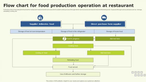
Following slide showcasing the flowchart for restaurant meal production process which assist in entire process through which raw resources are transformed into finished goods . It passes through various phases such as storage, reheating, cooling ,etc.
People who downloaded this PowerPoint presentation also viewed the following :
Flow Chart For Food Production Operation At Restaurant with all 6 slides:
Use our Flow Chart For Food Production Operation At Restaurant to effectively help you save your valuable time. They are readymade to fit into any presentation structure.





FAQs for Flow Chart For Food Production
So basically you've got five main stages: receiving your raw materials, prepping/processing them, the actual cooking or manufacturing part, packaging everything up, and getting it out for distribution. Quality control checkpoints are super important throughout - that's honestly where you catch most problems before they blow up. Temperature control and sanitation matter at every step, plus you'll need solid documentation. The exact flow depends on what you're making, obviously. My advice? Map out your specific process first, then figure out where your critical control points are. That's where you really need to watch things closely.
So basically, when you map out your whole production process visually, the bottlenecks jump out at you right away. Like if one station processes 50 units/hour but the step before cranks out 80 - boom, there's your problem. Honestly changed everything when we first did this at my old job. Short sentences make the slow spots super obvious. Equipment maxed out? Understaffed? Bad process design? You'll see it all. The visual just makes sense in a way spreadsheets don't. Then you can figure out which bottlenecks are worth fixing first based on cost vs. impact.
So you want QC everywhere - raw materials coming in, during processing, packaging, the whole deal. Think of it like having checkpoints that catch disasters before they happen. Honestly, it seems boring as hell until you realize it's what keeps you from getting recalls or making people sick. I always tell people to map out where things can go really wrong first, then build your quality checks right into those spots. Don't just tack them on later. Your flow chart should show exactly where these checkpoints live. Trust me, way better than dealing with lawsuits.
Honestly, tech makes such a huge difference for flow chart accuracy. IoT sensors automatically track temps, timing, quantities - way better than hoping people remember to write stuff down correctly. RFID tags and barcode scanners catch ingredient mix-ups before they happen. Digital dashboards show what's happening right now instead of finding out about problems hours later. The audit trail thing is pretty cool too - you'll spot weird bottlenecks you never saw coming. I'd start small, maybe just temperature monitoring? You'll be shocked how much manual logging was screwing things up.
So basically you've got rectangles for your main processes - mixing, cooking, whatever. Diamonds are where you make decisions. Start and stop points? Those are circles. Arrows show which direction everything flows, obviously. Parallelograms handle your inputs and outputs like ingredients or final products. Quality checks get those circle symbols with lines through them - kinda weird looking but whatever. Don't stress about memorizing all this stuff though. Most software already has templates with everything built in. Just make sure someone can actually follow your chart without getting lost halfway through.
So basically, think of a flow chart as your visual map of the entire production process - raw materials all the way to your finished product. It helps you pinpoint exactly where contamination might sneak in. Honestly, I wish more people realized how much easier this makes HACCP planning! You can see everything at once instead of trying to keep it all in your head. When auditors show up, you've got solid proof that you actually know your process. Map out what you're doing now first, then mark where temp checks, cleaning, and quality stuff happens. Way less overwhelming than it sounds.
Okay so basically you'll want to map out inputs, what happens during each step, outputs, and where stuff could mess up quality-wise. Raw materials going in, the actual process, what comes out. Temperature and timing are huge - seriously, those will make or break you. Also throw in who's responsible for what and any compliance stuff because auditors eat that up. Oh and don't forget the critical control points where things typically go sideways. The whole point is someone should be able to grab your chart and actually do the process without playing guessing games about the important details.
Honestly, flowcharts are super helpful because everyone can look at the same visual and immediately get it. No more endless email chains trying to explain stuff! Your team can literally point and say "we're stuck here" or "this part broke." Handovers between shifts become so much smoother. Plus different departments finally see how their work affects everyone else - cuts down on all those annoying miscommunications about timing. When something goes wrong, you can trace it back through the steps way faster than hunting through a bunch of random documents. Game changer for sure.
Honestly, flow charts are a lifesaver for compliance stuff. They show inspectors exactly how you're hitting all your HACCP requirements and critical control points - way better than drowning them in paperwork. Your staff will actually thank you too since following a visual chart beats reading boring regulatory manuals any day. When audit time rolls around, you've got solid proof your processes match FDA standards. I'd start by sketching out what you're already doing, then check it against the regs to catch any missing pieces. Trust me, auditors eat this visual documentation up.
Honestly, update those flow charts the second you change anything - new equipment, tweaked recipes, different suppliers, whatever. Don't wait around for some scheduled review meeting. I've watched companies get absolutely roasted during audits because their documentation was like 3 months behind reality. The auditors basically said "this chart shows you doing X but you're actually doing Y" - nightmare scenario. Set up something simple where whoever makes changes has to ping the chart person within a day or so. Your charts need to match what's actually happening on the floor, not what you were doing last quarter.
Honestly, flow charts are pretty clutch for food production. They make it super obvious where your bottlenecks are happening and where you need quality checkpoints. Way better than drowning in spreadsheets - I learned that the hard way. New employees pick up visual stuff so much faster too. When something breaks down or you're ready to scale up, you've got this clear map of everything. Oh, and don't overthink it at first. Just sketch out your main process, then you can add all the nitty-gritty details later. Makes troubleshooting way less of a headache.
Honestly, flowcharts are like having a cheat sheet for training new people. Instead of dumping a huge manual on them (which let's be real, nobody reads), they can actually see each step laid out visually. New hires get how their job connects to everything else happening. The visual thing really works - people remember sequences way better when they can see it. You can highlight the critical stuff like safety points and quality checks too. Oh, and definitely laminate copies for the floor so they don't get destroyed after one shift!
Start by mapping out each processing step and where things could go wrong quality-wise. Raw and cooked stuff can't cross paths - learned that the hard way! Temperature controls are huge, plus you need proper storage and cleaning between each step. Don't forget allergens if that's relevant to your products. Honestly, I'd sketch it out first then actually walk through your space. Your equipment limits will probably dictate more than you think. Walking through helps catch those weird bottlenecks that look fine on paper but are total nightmares in real life.
Honestly, flow charts are perfect for this - they show you exactly where you're losing food in production. Map out your current process first, then mark waste spots in red or whatever. It's wild how obvious the patterns become once you see it visually. Like maybe you're losing way more during prep than packaging, but you never noticed before. The cool part is you can also sketch out potential fixes right on the chart to see how they'd mess with your whole workflow. My team always has those "oh duh" moments when we do this exercise.
So data analytics turns your flow chart into something that actually works for you instead of just sitting there looking pretty. Track where stuff gets stuck, see patterns in when machines break down, figure out which steps actually matter. No more guessing what's broken - the data shows you. Honestly, half the steps in most processes are just wasting time anyway. Once you spot the real bottlenecks, you can redesign everything to cut waste and move faster. Just pick one messy area and track it for a week. You'll probably find some weird stuff you never noticed.
-
Use of icon with content is very relateable, informative and appealing.
-
Graphics are very appealing to eyes.