


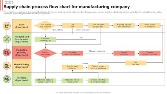
Supply Chain Process Flow Chart For Manufacturing Company




Try Before you Buy Download Free Sample Product
 Impress Your
 Audience
 100%
100% Editable
 Save Hours
 of Time


Following slide showcases supply chain process flow chart used by business to deliver product to customers in time. It involves various departments such as sales departments, research and development department, production department, manufacturing department and purchase department
People who downloaded this PowerPoint presentation also viewed the following :
Supply Chain Process Flow Chart For Manufacturing Company with all 6 slides:
Use our Supply Chain Process Flow Chart For Manufacturing Company to effectively help you save your valuable time. They are readymade to fit into any presentation structure.





FAQs for Supply Chain Process Flow Chart
So basically you want to map out the main stuff first - sourcing, manufacturing, warehousing, distribution, then delivery. Pretty straightforward flow there. But here's the thing - don't just draw boxes and arrows. You need those decision points where things can go sideways, plus inventory checks and quality control spots. The supporting stuff matters too, like how you're moving things around and what systems you're using. Oh, and supply chains aren't actually linear even though we draw them that way. There's tons of feedback between stages, which honestly makes the whole thing way more complicated than it looks on paper. Just start simple and add layers as you go.
Honestly, flow charts are a game changer for this stuff. You map out each step and suddenly the problem spots are staring right at you - like when one process hogs 5 days while everything else wraps up in hours. Multiple inputs cramming into one checkpoint? Super obvious now. I've seen people spot redundant steps they never noticed before, plus all those annoying delays when work passes between teams. The visual just makes it click, you know? Then you can figure out which bottlenecks are actually worth fixing first based on how much they're screwing up your whole operation.
Honestly, just start with Draw.io since it's free and actually pretty good. Visio's the old standby if your company already pays for Microsoft stuff, but it's kinda overkill most of the time. Lucidchart's solid too - web-based so easy to share with people. There's also SmartDraw if you want something built more for supply chain stuff specifically. I keep going back to Draw.io though. You'll figure out whichever one you pick pretty fast anyway, they're all pretty intuitive once you mess around with them for like 20 minutes.
So basically, the more visibility you want in your supply chain, the messier your flow chart gets - but in a good way. You'll end up adding tons of checkpoints and data collection spots everywhere. I always tell people to figure out what info your stakeholders actually care about first (trust me, they'll have opinions). Then build those monitoring points right into your process. It's kinda like - oh, random thought - adding security cameras around your house. You need those visibility spots planned from the start. Otherwise you're just drawing pretty boxes that don't actually track anything useful.
Rectangles are for processes, diamonds for decisions, circles for start/end points. Arrows show the flow direction - pretty straightforward stuff. Parallelograms represent inputs/outputs, and triangles are sometimes used for storage or inventory. Fair warning though: every team seems to have their own spin on these symbols, which honestly drives me crazy when you're trying to keep things consistent. The basics I mentioned will work for most supply chain stuff. Oh, and definitely add a legend to your charts. Half the people in meetings won't remember what the shapes mean anyway, so it saves you from explaining everything twice.
Dude, flow charts are seriously clutch for onboarding supply chain people. New hires can actually see the whole process instead of drowning in those awful training manuals nobody reads. What's cool is they show how departments connect - like, your newbie finally gets why procurement talks to logistics talks to whoever. I mean, supply chain has so many moving parts anyway. You can make different versions for each role too. Short sentences work better than cramming everything together. People will reference them later when they're confused about something.
Look, risk management is basically your safety net for the whole supply chain. You gotta build assessments into every major stage - supplier vetting, logistics, inventory, all that stuff. Map out your biggest vulnerabilities first and create backup plans. Honestly feels like way too much work until something breaks and you're scrambling. Then you'll thank yourself for doing it. Oh, and don't try to tackle everything at once - that's overwhelming. Pick your top 3 risks and document solid contingency plans for those. The rest can wait.
Dude, flow charts are honestly a game changer for getting teams aligned. Picture this: your suppliers, logistics people, and internal teams all staring at the same diagram instead of playing telephone with processes. Those awkward handoff moments? Gone. You can literally point at the screen during meetings like "see, THIS is where we're getting stuck." Different people get it too - doesn't matter if they're super technical or not. I always throw the chart up first thing now when we're trying to figure out who's supposed to do what. Saves so much back-and-forth confusion.
Oh man, supply chain flow charts are actually pretty sweet for tracking stuff. Cycle times, inventory levels, lead times - all the basics. But here's the thing that's really useful: spotting bottlenecks becomes so obvious when it's mapped out visually. You can see exactly where things get stuck or costs start adding up. I'd start simple though - maybe pick 3 metrics that are causing you the biggest headaches right now. Could be supplier performance, quality checks, whatever's keeping you up at night. Then just build from there. Way better than trying to track everything at once and getting overwhelmed.
Honestly, I'd update it quarterly at minimum - but really depends how crazy your operations get. New suppliers or big process changes? Update it right away. Monthly check-ins work well for most places, though if you're in something super volatile maybe more often. The thing is, so many teams use charts that are completely out of date and it just creates chaos. Like, what's the point if it doesn't match what's actually happening? Set a calendar reminder or you'll totally forget - trust me on that one. Better to have it reflect reality than some ideal version that doesn't exist.
Honestly, the worst thing you can do is overcomplicate it from the start. Don't try cramming every tiny decision into one massive diagram - nobody can follow that mess. Talk to the people who actually do the work first, even if you think you've got it figured out (spoiler: you probably don't). Keep your arrows consistent and label stuff clearly. Those weird fancy symbols? Skip them. I learned this the hard way on my last project. Start with just the main steps, then break out the complicated parts into separate charts later. Way easier to read and you won't hate yourself when you need to update it.
Okay so process flow charts are actually super helpful for demand forecasting - they show you where info gets stuck or lost between suppliers, production, and customers. Map out your current process first. Then look for those key spots where demand data should be collected and shared with everyone. You'll start seeing patterns and bottlenecks that mess with your forecasting accuracy. Lead times become way clearer too. Oh and don't forget to mark where you can set up early warning systems for demand changes. I swear it's one of those "why didn't I think of this sooner" moments once you see everything laid out visually.
Honestly, go with something cloud-based like Miro or Lucidchart so everyone can jump in and edit together. Google Drawings works too if you're keeping it simple. Just make sure the text isn't microscopic - I've been on way too many calls where people are like "can you see that?" and nobody can read anything. Set up your permissions right so only certain people can mess with it. Walk through the chart together during team meetings instead of just dropping it in Slack and hoping for the best. Oh, and save a PDF backup because servers go down at the worst times. The whole point is making it actually collaborative.
Look, lean principles are all about cutting the fat from your supply chain maps. Focus on what actually adds value and ditch the rest. Map out where stuff gets stuck or sits around too long - that's your waste right there. Honestly, trying to chart every tiny step just makes things messy. Short sentences work better than those crazy detailed flowcharts anyway. You want to see the flow, not get bogged down in batch thinking. Start with how things work now, then sketch out what it'd look like without all the obvious problem spots. Way clearer that way.
So instead of guessing or waiting for someone to manually update stuff, IoT sensors just track everything automatically - inventory, shipments, you name it. Then AI spots patterns and actually predicts problems before they hit. Your flow charts show what's happening right now, not last week's data that Steve forgot to enter (we all know a Steve). Pick one process to start with though - don't go crazy trying to digitize everything at once. The combo is honestly pretty amazing for keeping tabs on your whole operation.
-
A big thanks to SlideTeam! An incredible and diverse library of templates helped me with my business project presentation.
-
I have been using SlideTeam for the past six months. Very happy and satisfied!