


Iso 9001 quality management system dashboards




Try Before you Buy Download Free Sample Product
 Impress Your
 Audience
 100%
100% Editable
 Save Hours
 of Time


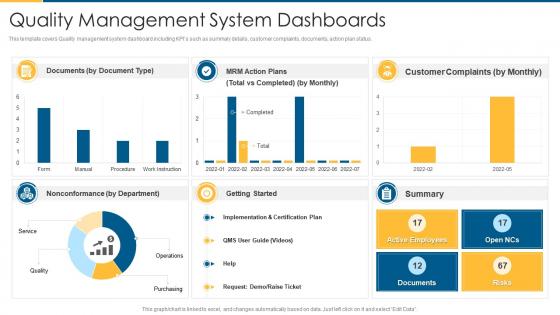
This template covers Quality management system dashboard including KPIs such as summary details, customer complaints, documents, action plan status.
People who downloaded this PowerPoint presentation also viewed the following :
Iso 9001 quality management system dashboards with all 7 slides:
Use our Iso 9001 Quality Management System Dashboards to effectively help you save your valuable time. They are readymade to fit into any presentation structure.





FAQs for Iso 9001 quality
So honestly, pick metrics that actually matter - customer satisfaction, non-conformance rates, how fast you close corrective actions, audit results. Supplier quality stuff too. Don't go crazy though, maybe 6-8 max or you'll drown in data. Training completion rates are solid since auditors eat that up. Process performance indicators are clutch depending on your industry. Really though, it comes down to what your leadership team actually cares about during reviews. Start basic then tweak based on what gets attention in meetings - no point tracking stuff nobody looks at.
Honestly, an ISO 9001 dashboard is a game changer. You get all your quality stuff - customer complaints, audit findings, process performance - right there in one spot instead of digging through endless spreadsheets (which we both know is the worst). It catches problems before they blow up into bigger headaches. When your auditor shows up, boom - everything's organized and ready. Makes decisions way faster too since your whole team can actually see what's working and what isn't. Real-time data just hits different when you're trying to improve things.
Traffic light indicators are your best friend - red/yellow/green makes compliance status super obvious. Trend lines show performance over time, and progress bars work great for audit completion rates. Simple percentage displays for customer satisfaction and defect rates are clutch. Heat maps are perfect for spotting risk areas across processes. Bar charts let you compare departments easily. Keep colors consistent and make sure everything updates in real-time. Honestly, executives tune out with fancy stuff - simpler wins every time. Oh, and contractions feel more natural when people actually read these things.
Honestly, weekly is the bare minimum but daily's way better if you can swing it. Fresh data is everything - otherwise what's the point of having a dashboard? Customer complaints and non-conformances definitely need frequent updates so you can catch problems early. Production stuff might need real-time tracking, but things like training records? Weekly's probably fine. I'd start with whatever metrics your team actually uses to make decisions - those are your priority. Stale numbers just sitting there looking official doesn't help anyone.
Oh man, the data thing is brutal - you'll have info scattered everywhere and nothing talks to each other properly. Getting people on board is harder than the tech stuff honestly. Half your team will resist any changes, plus you need to train everyone. KPIs are tricky too since different departments care about totally different metrics. Oh and integration between systems? Good luck with that mess. Start with just one department though, get their data sorted first. Way easier to expand from there than trying to boil the ocean right away.
Look, real-time data integration is what makes your ISO 9001 dashboard actually work instead of being fancy decoration. You'll catch problems before they explode when quality metrics and audit findings update automatically. Too many companies have dashboards showing last month's disasters while today's issues pile up - honestly drives me nuts. Your team can jump on non-conformances immediately and watch quality objectives progress live. Set up alerts so critical stuff hits your phone right away. Makes all the difference between reacting and preventing.
Dude, you absolutely need stakeholder buy-in for your ISO dashboard or it'll just collect digital dust. Talk to management, process owners, auditors - basically anyone who'll actually use the thing. Ask what metrics they care about and how they want to see the data. I can't tell you how many dashboards I've seen flop because someone just built what seemed logical without asking around first. Their input helps you pick the right KPIs and visual formats. Honestly, the interview step is way more important than people think - do that before you start building anything or you'll probably end up redoing half of it.
You gotta match the metrics to what each department actually gives a damn about. Sales cares about customer satisfaction and how fast complaints get handled. Production's all about defect rates and efficiency stuff. HR goes crazy for training completion percentages - they eat that data up, I swear. Engineering needs to track corrective actions and design changes. The trick? Ask each department head what's driving them nuts day-to-day, then find ISO metrics that actually connect to those pain points. Don't just dump generic requirements on everyone and expect magic to happen.
Power BI and Tableau are solid choices if you've got the budget - both handle live data feeds pretty smoothly. Excel with Power Query works too, just more hands-on work. Google Data Studio is free and I've honestly seen some really nice setups there. The main thing is connecting it to your QMS so it pulls non-conformances, audit stuff, corrective actions automatically. Oh, and don't go crazy at first. Pick maybe 4-5 key metrics to start with. You can always add more later once you get the hang of it.
Dude, ISO 9001 dashboards are actually clutch for training new people. Way better than handing them a stack of boring policy docs nobody wants to read. Show them the visual metrics instead - they'll get how quality works way faster. Real-time data helps them connect what they're doing to actual results, which is pretty cool. You can even pull up old dashboard data to run through "what would you do" scenarios. Oh, and set up their access so they only see stuff relevant to their job - otherwise it's just information overload.
Don't try to cram everything onto one screen - that's how you get dashboards nobody looks at. Pick maybe 5-7 metrics that actually matter for ISO 9001 stuff like customer satisfaction and nonconformities. People get way too caught up making things look perfect when honestly, simple charts work better. Oh and definitely don't pick metrics just because they're easy to track. That's pointless. Focus on what ties back to your quality goals and helps people actually make decisions. I'd test it with real users first before rolling it out - saves you from building something pretty but useless.
Start by tracking what you're spending now - manual reporting time, rework costs, how long audits take. That's your baseline. After the dashboard goes live, measure how much those numbers drop. Don't forget revenue gains from happier customers too. The math isn't rocket science once you have real numbers. Look at defect rates, cycle times, compliance response before and after. Time savings times hourly rates, plus direct cost cuts. Honestly, set up monthly tracking from day one or leadership won't believe the results later. I've seen too many good projects fail because nobody documented the wins.
Honestly, visual indicators are your best friend here - think red/yellow/green lights for each audit area. Nobody wants to squint at walls of tiny text when they walk by your dashboard. Trend lines help too since you'll spot patterns way faster that way. Break everything down by department or process, then track stuff like non-conformities, pending actions, and closure timelines. Oh, and make sure the metrics actually tell a story - days to closure is way more useful than just "number of audits completed" or whatever. The whole point is instant clarity about whether you're crushing it or things are falling apart.
So basically you take your historical quality data and use it to spot patterns before stuff goes wrong. Customer complaints, supplier issues, audit results - all that becomes predictive gold. Start with your biggest pain points and track things like defect rates or compliance scores. The dashboard can flag when you're probably heading for trouble, which honestly saves so much headache later. Set up alerts for when trends look sketchy. Don't overcomplicate it at first though - pick maybe 2-3 critical processes and build your predictions from there.
Dude, you absolutely need customer feedback metrics on your ISO dashboard. Think about it - the whole standard revolves around meeting customer requirements, so their input is everything. Without it, you're basically flying blind hoping your processes work. Plus auditors want to see you're actually improving based on real data, not just internal assumptions. Track satisfaction scores and dig into the feedback themes too - that combo helps you catch problems early before they spiral. Honestly, I've seen companies nail their internal metrics but still have grumpy customers. Don't be that company.
-
Easily Understandable slides.
-
Awesome presentation, really professional and easy to edit.