


Ratios de eficiencia operativa Diapositivas de presentación en PowerPoint





Try Before you Buy Download Free Sample Product
 Impress Your
Audience
 100%
Editable
 Save Hours
of Time


Ratios de eficiencia operativa Las diapositivas de presentación de PowerPoint son ideales para presentar la eficiencia de la gestión de la empresa. En el competitivo mercado mundial de hoy, los gerentes deben realizar un seguimiento del desempeño sin pasar por un montón de papeleo, nuestras diapositivas profesionales pueden ayudarlos a revisar las operaciones de una manera visual y fácil. La plantilla de PowerPoint de eficiencia de gestión es una presentación útil para los profesionales de negocios que contiene diapositivas como índices de inventario, objetivo de la empresa, tablero de ventas, cronograma comercial, índice financiero, índice operativo, etc. Todos ellos están organizados en el diseño de aspecto profesional. El tablero que se proporciona en esta plataforma se puede utilizar para presentar indicadores críticos interrelacionados. Este diseño de PowerPoint de índice de eficiencia financiera también encaja bien con conceptos comerciales como análisis de índices, liquidez y rentabilidad, gestión financiera y muchos más. Descargue la plataforma completa de PowerPoint del índice de rotación para comparar los gastos operativos con las ventas netas. La gente se siente jovial debido a nuestras diapositivas de presentación de PowerPoint de índices de eficiencia operativa. Presenta proporciones aburridas de una manera nueva y creativa.
People who downloaded this PowerPoint presentation also viewed the following :
Contenido de esta presentación de Powerpoint
Diapositiva 1 : Esta es una diapositiva introductoria para los índices de eficiencia operativa.
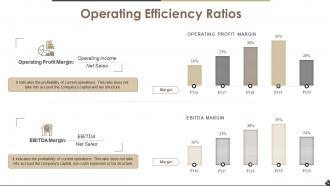
Diapositiva 2 : Esta diapositiva presenta los Índices de eficiencia operativa con los siguientes subtítulos: Margen de utilidad operativa, Margen EBITDA.
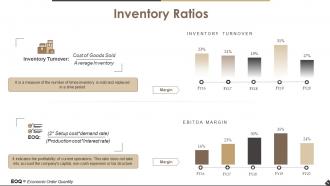
Diapositiva 3 : Esta diapositiva muestra los índices de inventario con rotación de inventario y EOQ (cantidad económica de pedido).
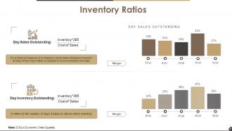
Diapositiva 4 : Esta diapositiva muestra los índices de inventario con los subtítulos de Ventas diarias pendientes e Inventario diario pendiente.
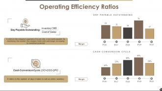
Diapositiva 5 : Esta diapositiva muestra los índices de eficiencia operativa con los siguientes subtítulos: Día pendiente de pago y ciclo de conversión de efectivo.
Diapositiva 6 : Esta es una diapositiva de Coffee Break para detener.
Diapositiva 7 : esta diapositiva se titula Diapositivas adicionales para avanzar.
Diapositiva 8 : Esta es una diapositiva de Cotizaciones. Indique cualquier factor de resaltado, valores a través de Cotización.
Diapositiva 9 : Esta diapositiva presenta a Nuestro equipo con nombres, imágenes y cuadros de texto.
Diapositiva 10 : Esta es la diapositiva de Nuestra Visión que muestra la Visión, la Misión y las Metas. Indíquelos aquí.
Diapositiva 11 : Esta es una diapositiva Acerca de nosotros. Indique aquí el equipo de su empresa, los aspectos básicos de la empresa, los aspectos más destacados, etc.
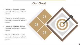
Diapositiva 12 : Esta es una diapositiva de Nuestro objetivo. Indique sus metas aquí.
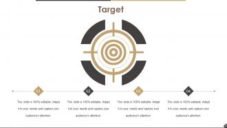
Diapositiva 13 : Esta es una diapositiva de destino. Indique sus objetivos, etc. aquí.
Diapositiva 14 : esta diapositiva muestra una bombilla o una idea. Indique aquí los aspectos creativos, innovadores, etc.
Diapositiva 15 : Esta es una diapositiva del diagrama de Venn. Muestra información, etc. aquí.
Diapositiva 16 : esta es una diapositiva del Panel de control. Presente aquí los aspectos Alto, Bajo y Medio, etc.
Diapositiva 17 : Esta es una diapositiva de línea de tiempo para mostrar el crecimiento de la empresa / producto, posición, hitos, etc.
Diapositiva 18 : Esta es una diapositiva de encabezado titulada Gráfico de barras. Edite según sus necesidades.
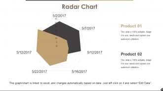
Diapositiva 19 : Este es un gráfico de radar para mostrar la comparación de productos.
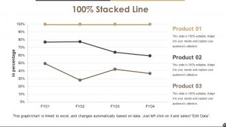
Diapositiva 20 : Esta diapositiva muestra una línea apilada para el rendimiento del producto, etc.
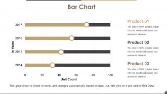
Diapositiva 21 : Este es un gráfico de barras para mostrar la comparación de productos.
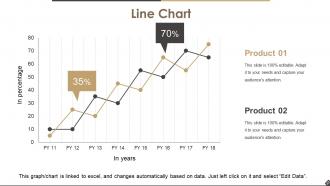
Diapositiva 22 : Esta diapositiva presenta un gráfico de líneas para mostrar el crecimiento del producto / empresa, etc.
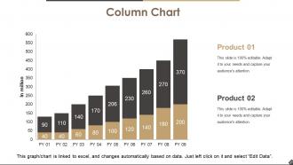
Diapositiva 23 : Esta diapositiva muestra un gráfico de columnas para comparar productos, etc.
Diapositiva 24 : Esta es una diapositiva de agradecimiento con dirección: # Número de calle, ciudad, estado, número de contacto, dirección de correo electrónico.
Proporciones de eficiencia operativa Diapositivas de presentación de PowerPoint con las 24 diapositivas:
Amplíe la base de datos con nuestras diapositivas de presentación en PowerPoint sobre índices de eficiencia operativa. Obtenga un mayor ancho de banda para elegir.









FAQs for Operational Efficiency Ratios
Okay so the big ones you wanna track are inventory turnover, receivables turnover, payables turnover, and asset turnover. These are different from profit margins or cash flow stuff - they actually show how well you're running day-to-day operations. Are you sitting on too much inventory? Collecting payments fast enough? Getting decent returns from your assets? That kind of thing. Honestly, they're way more practical than some of the fancy financial metrics people obsess over. Start by comparing yours to industry averages so you know where you stand.
Look, these efficiency ratios are basically your way to catch where you're hemorrhaging cash or wasting time. Track stuff like inventory turnover and how well you're actually using your assets - the data will call out problems even when everything seems fine on the surface. I'd honestly just pick 2-3 ratios that match your biggest pain points and check them weekly. Compare against industry standards and your own past numbers to figure out what needs fixing first. The whole point is turning those numbers into actual fixes, not just staring at fancy charts all day.
Look, operational efficiency ratios are basically your report card for how you're doing against competitors. You take metrics like asset turnover, inventory turnover, receivables turnover - then see where you're winning and where you're getting beat. Pretty straightforward stuff. Just make sure you're comparing apples to apples though - a tech startup's ratios will look totally different from some massive manufacturing company. Honestly, I'd grab financials from your top 3-5 competitors and run the same calculations you do internally. That'll show you exactly where you stand.
Honestly, just focus on 3-4 ratios each month - inventory turnover, receivables turnover, and asset turnover. They'll show you exactly where your cash is getting stuck. Don't overthink the tools at first; a basic spreadsheet works fine (I learned this the hard way after buying expensive software too early). Compare your numbers to industry standards and your own past performance. The real value comes when you actually act on what you find - maybe you need less inventory sitting around, or tighter payment terms. Some months will be better than others, but consistency is what matters. Keep it simple and you'll spot problems way earlier.
Here's the thing - those ratios only show internal stuff. Great inventory turnover? Cool, but what if customers hate you and you're losing market share? The ratios won't reveal that mess. They're also backward-looking, so you're basically driving by checking your rearview mirror. Plus they miss the soft stuff - like whether your team actually wants to work there or if you've got any decent ideas in the pipeline. Honestly, I'd use them alongside customer data and some forward-looking metrics. Don't rely on them alone.
Hey! So operational efficiency ratios are basically your company's report card - they show where money's going and if you're getting good bang for your buck. Look at stuff like inventory turnover, how fast you collect receivables, asset usage, that kind of thing. When these start dropping or you're way behind competitors, that's when you know something's off. Honestly, I think of it like getting bloodwork done - catches problems early. Calculate the main ones every month, then focus on whatever looks worst first. That's usually where the biggest savings are hiding anyway.
Tech upgrades are amazing for operational ratios once they're running smoothly. Your asset turnover and inventory numbers will look way better with automated processes and fewer screw-ups. Here's the catch though - they'll actually make your ratios worse at first. All that upfront spending plus your team figuring things out creates a temporary mess. I learned this the hard way at my last job. Most companies bounce back strong after 6-12 months once everyone gets comfortable with the new systems. Honestly, just track everything monthly during rollout so you know when you've turned the corner.
Monthly at minimum, but weekly's way better if you can swing it. Most places I know do deep monthly reviews plus quick weekly check-ins on their most critical stuff. Efficiency problems have this annoying habit of spiraling fast when you're not watching. Honestly? I'd rather check too often than get blindsided by something major. Set up automated reports if you can - total lifesaver timewise. Maybe start monthly and then bump up the frequency for anything that directly hits your revenue or makes customers unhappy.
Don't fall into the trap of comparing your ratios to random industries - like, your inventory turnover will obviously suck next to a grocery store if you're making heavy equipment. That's just how it works. Single period numbers are pretty useless too, especially for seasonal businesses that swing all over the place. Here's what really gets people: they see a dropping asset turnover ratio and panic, but maybe you just bought new equipment that'll pay off later. I always tell people to stick with industry benchmarks and track trends over several quarters instead of freaking out over one snapshot.
Manufacturing companies need tons of inventory and heavy equipment, so their inventory turnover is usually high but asset turnover? Not so much. Service businesses are the opposite - consulting firms can make serious money without owning much physical stuff, so their asset turnover rocks. Receivables turnover tends to be higher too. Honestly, comparing a factory to a consulting firm is pretty pointless. You'll get way better insights if you stick to comparing your ratios against similar companies in your industry. Otherwise you're just setting yourself up for confusion.
Look, operational efficiency ratios are basically your reality check when everything's going sideways. They'll show you if your inventory turnover is crashing or if you're burning through working capital way too fast. I always tell people to compare current numbers against pre-crisis levels first - gives you the clearest snapshot of what's actually broken. These ratios don't sugarcoat anything when the world feels chaotic. You can figure out which operations need cutting and where to throw your limited resources. Asset utilization dropping? Working capital disappearing? The math will tell you before your gut does.
Honestly? Just build them into your monthly dashboards like any other KPI. Pick maybe 3-4 ratios that actually matter for your business - asset turnover, inventory turnover, whatever fits. Most companies calculate these once for some report and never look again, which is nuts. Track them monthly, set real targets, and - here's the key part - break them down by department so managers can see how their stuff affects the big picture. I'd tie executive bonuses to hitting efficiency targets too. Oh, and definitely benchmark against competitors when you can. It's way more useful than people think for spotting where you're bleeding money.
Honestly, start with the boring stuff that's killing your time - automate whatever repetitive tasks you can. Then check if you're staffing things weird, like having too many people in one spot while another team is drowning. It really is like organizational Tetris, which sounds dumb but it's true. Get your team leads tracking the important numbers weekly instead of waiting months to see what's happening. That's where you'll actually catch problems before they spiral. Performance reviews of your key metrics should be regular too - trends are way easier to fix early.
Look, these ratios are basically your early warning system for when stuff's going sideways. If inventory turnover starts tanking, you know to either speed up sales or stop buying so much crap. Asset utilization shows whether your warehouses and equipment are actually earning their keep - and trust me, the results can be pretty shocking. Receivables turnover? That tells you if customers are being slow payers, which screws up your cash flow when it's time to pay suppliers. I check mine monthly now. Catching trends early means you can tweak supplier deals or inventory levels before small problems turn into budget nightmares.
Yeah, there's definitely a connection there. Better operational efficiency usually means happier customers - makes sense when you think about it. Faster inventory turnover and smoother processes = shorter wait times and fewer "sorry, we're out of stock" moments. I've seen this play out where companies fix their backend stuff and boom, customer satisfaction scores jump up too. It's almost predictable at this point. The trick is tracking both metrics side by side since they tend to move together. Oh, and definitely dig into which specific efficiency issues are causing your biggest customer headaches first.
-
Very unique, user-friendly presentation interface.
-
Really like the color and design of the presentation.