
Opportunities and challenges success graph powerpoint slide show


Try Before you Buy Download Free Sample Product
 Impress Your
 Audience
Editable
of Time


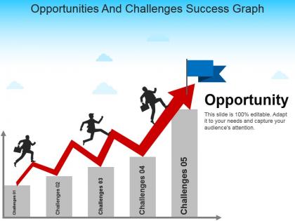
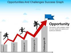
The challenges and solution PowerPoint slide is perfect for presentation on overcoming hurdles in business. The opportunity and challenges template consist of line chart and it shows that after overcoming a variety of challenges you get opportunities. The opportunities and challenges PPT slide help a user to present the solution against every challenge while achieving any target. Further, the management opportunities challenges and solutions template is suitable for presentation related to problem resolution. The presenter can discuss hurdles and risks are an integral part of every business and venture by taking help of the opportunities and challenges faced by MNCs presentation template. However, overcoming these hurdles needs a strategic move. Hence, the challenges & solutions PowerPoint aids to translate ideas in the presentation. The opportunities challenges presentation template is a generic template which enables a user from a wide range of industries to present their viewpoint. The challenges and opportunities PowerPoint template is a suitable slide deck for brainstorming sessions. To take input from the viewers on the risks, opportunities and how to overcome these complications. The user can increase or decrease the challenge and opportunities in this template. Need a quick design boost for your next presentation? Thousands of Opportunities And Challenges Success Graph Powerpoint Slide Show are at your fingertips right now!.
People who downloaded this PowerPoint presentation also viewed the following :
Opportunities and challenges success graph powerpoint slide show with all 5 slides:
Make your ideas stand out in the crowd. Opportunities And Challenges Success Graph Powerpoint Slide Show are ready for your individual needs.
FAQs for Opportunities and challenges success graph
Honestly, it comes down to three things - staying consistent, learning from when you mess up, and actually changing what isn't working. Track metrics that matter, not just the pretty numbers that make you feel good. Most people quit right when they're about to break through, which is crazy to me. Quick iterations help a ton. Small improvements compound like crazy over time - I've seen it happen with my own stuff. Pick one metric to track this week and actually check it regularly. That's where things start shifting for real.
Graphs are honestly a game-changer for goal setting because they make your progress super visual. You'll actually see patterns you'd totally miss otherwise – like how I discovered I'm basically useless every Tuesday afternoon for some reason. Weird but helpful! The visual aspect keeps you way more motivated than just writing stuff down. Also, when you're consistently crushing or bombing your targets, you can tweak things quickly instead of waiting months to realize something's off. Start with tracking one thing for two weeks. You'll be surprised how much it changes your daily decisions.
Honestly, you can't build reliable success graphs without good data analytics - it's what transforms your messy business data into trends that actually mean something. Pretty charts might impress people in meetings, but they're useless if the underlying analysis is garbage. Analytics shows you which metrics are worth tracking and helps clean up all that messy data you've got sitting around. It catches patterns you'd miss otherwise, plus spots weird anomalies that could throw everything off. Start with automated data collection, then stick to consistent analytical methods. That way your graphs tell you what's really happening instead of just what you want to see.
Track both hard numbers and the softer stuff. Revenue, customer growth, completion times - that's your quantitative side. Then add employee surveys, customer feedback, brand perception for the qualitative piece. Most teams obsess over just the numbers because it feels more legit, but honestly? You're missing half the story that way. Numbers tell you what's happening, but the qualitative data explains why. Pick maybe 2-3 metrics from each bucket that actually connect to what you're trying to accomplish. Otherwise you'll drown in data that doesn't matter.
Honestly, the worst thing you can do is cram too much stuff onto one graph - it just looks messy. Don't mess with your y-axis scale either to make tiny changes look huge. People aren't dumb, they'll call you out and you'll lose all credibility. Pick colors that actually work together too, none of that neon green on bright red nonsense. Oh, and this should be obvious but apparently isn't - label your axes clearly! I've seen way too many graphs where I'm sitting there like "what am I even looking at?" Include your time periods so people know what success actually means here.
For success graphs, track stuff that actually matters - weekly revenue, monthly users, quarterly wins. Don't fall into the vanity metrics trap (I've made that mistake before). Pick 3-5 data points max so the trend jumps out immediately. Always start your y-axis at zero or you'll accidentally mislead people. Short sentences work. Longer ones help show the flow between different time periods you're measuring. Add little notes for big events that affected your numbers. Honestly, most graphs I see are either too cluttered or measuring completely useless things. Keep it straightforward and you'll be good.
Honestly, Tableau and Power BI are your best bet if you want something that'll really wow people - super interactive and polished looking. Excel's actually pretty solid too, way better than most people think if you put in a bit of effort. Google Sheets works fine for quick team stuff. Python with matplotlib is cool if you're into that whole coding thing (probably overkill though). Oh, and Canva's surprisingly decent for making things look pretty. My take? Just start with whatever you already know how to use, then worry about getting fancy once you figure out what story you're trying to tell.
Okay so benchmarks are like your reference points - otherwise you're just staring at random numbers that don't mean anything. They help you figure out where you started, how you stack up against everyone else, and what's actually realistic to aim for. It's like... imagine trying to celebrate losing 10 pounds but you never knew your starting weight? Doesn't make sense. Same thing here. That upward trend might look cool but could just be normal ups and downs. I'd grab 3-5 benchmarks that actually matter for what you're trying to do, then build your graph around those.
So success graphs are pretty flexible - tech companies obsess over user growth and engagement, retail focuses on sales conversions and customer lifetime value. Healthcare tracks patient outcomes instead. The framework stays the same, just swap in your industry's data points. Honestly, don't just steal what everyone else is doing though. Figure out your top 3-5 critical success factors first, then build around those specific metrics. Works way better than trying to force someone else's setup. Oh and make sure it actually makes sense for your business - sounds obvious but you'd be surprised how many people mess this up.
So basically, success graphs show stakeholders how your product actually impacts users over time - not just what you shipped. Way better than listing features! You can see if that new thing you built is moving important metrics or if it's just... there. Honestly, the shift from "look what we made" to "here's the value we delivered" hits different. Numbers trending up? Great for getting more resources. Trending down? Time to pivot. I've seen teams use these to justify decisions they made months ago, which is pretty smart.
Dude, success graphs are honestly a game-changer - you can spot trends that would be totally invisible in boring spreadsheets. Like, you'll suddenly notice "oh crap, our sales always tank in March" or see how conversion rates spike right after newsletters. The visual stuff just clicks better than staring at rows of numbers, you know? I actually kicked myself for not using them earlier because now I catch problems way before they become disasters. Seasonal patterns become super obvious, plus you'll see growth spurts and weird recurring cycles. Start tracking your main metrics weekly - trust me on this one.
Definitely go with bold colors and clear trend lines - they'll grab way more attention. Green's the obvious choice for growth, but blues or oranges work great too if they match your vibe. I'd add callouts for big milestones so people can spot those key moments. Seriously though, gray charts are the worst - they're just boring. Keep your labels simple and stick to consistent time intervals. Oh, and make sure someone can get your main point in like 3 seconds of looking at it. If they can't, you probably need to simplify things.
Honestly, it's all about reading the room. Executives want the big picture stuff - clean charts, key metrics, none of the nitty-gritty details. Your analytics team though? They're weird and actually want to see how you got the numbers (I mean that in the best way). When you're presenting to clients, focus on outcomes that hit their goals and use their language. Technical people can handle complex graphs with tons of layers. Everyone else needs simple visuals that tell a clear story. Bottom line - always start with whatever matters most to whoever's sitting across from you.
Just be honest about what your data actually shows. Don't mess with scales or cherry-pick dates to make things look better. I've seen way too many graphs that aren't technically lying but are super misleading - drives me crazy! Always include context like sample sizes and what you're measuring. Start your y-axis at zero for percentages, label everything clearly. If there are weird quirks in your data, mention them. Think about whether someone could get hurt if they make decisions based on your chart. Honestly, just ask yourself: would I want my boss making a major call using this graph?
Just add your failure data right on the same timeline as your success metrics - makes it way easier to spot when things are connected. I usually throw failure spikes on a secondary axis or use error bars. Honestly, you'll probably notice failure jumps happen right before your success tanks (been there way too many times). Try creating some kind of combined score that factors in both wins and losses. Way better than just looking at the good stuff and pretending everything's fine. Start simple though - just plot both on your existing graph and see what patterns jump out.
-
Professional and unique presentations.
-
The content is very helpful from business point of view.