

Organization Chart Security Services Business Profile Ppt Download


Try Before you Buy Download Free Sample Product
 Impress Your
 Audience
Editable
of Time


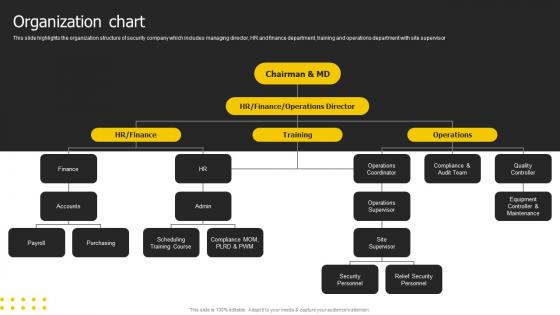
This slide highlights the organization structure of security company which includes managing director, HR and finance department, training and operations department with site supervisor.
People who downloaded this PowerPoint presentation also viewed the following :
Organization Chart Security Services Business Profile Ppt Download with all 6 slides:
Use our Organization Chart Security Services Business Profile Ppt Download to effectively help you save your valuable time. They are readymade to fit into any presentation structure.


FAQs for Organization Chart Security Services Business
You'll want clear reporting lines and accurate job titles - that's the foundation. Group people by department so it makes sense. Include contact info because honestly, that's what people actually use it for most of the time. Show the hierarchy so everyone knows who's whose boss. Keep the formatting consistent or it'll look messy. Photos help a ton if you can swing it - way easier to remember faces than names. Oh, and this is crucial: assign someone to update it regularly. I've seen too many org charts become completely useless after six months because nobody maintained them.
Honestly, org charts are clutch for avoiding that whole "I thought YOU were handling this" mess. Everyone can see exactly who reports to who and what their actual responsibilities are. Super helpful when things get crazy busy - people aren't stepping on each other's toes or assuming someone else has it covered. The visual makes it really obvious if there are weird gaps or too much overlap happening. Oh, and definitely update it every few months or so, otherwise people get confused when Sarah from marketing suddenly starts doing finance stuff. Trust me, it saves so many headaches.
Basically, hierarchical charts have tons of layers - CEO, VPs, directors, managers, regular employees. It's like a pyramid where everyone knows their place. Flat structures? Way fewer levels, maybe just executives and everyone else. Flat can be less bureaucratic but honestly gets confusing about who's responsible for what. Had a friend at a startup like that - nobody knew who made final decisions lol. Your company size matters here. Small teams can do flat structures no problem. Bigger companies though? They usually need more hierarchy or things get messy fast.
Oh man, org charts used to be such a pain! Now you can just use something like Lucidchart or Visio - even HR software that syncs with your employee database. When people get promoted or quit, you update one thing and the whole chart fixes itself. No more chasing down random PDFs that nobody updated from like 2019. The interactive ones are pretty cool too - click on someone's box and see their job description or contact info. Honestly, just pick whatever connects to your HR system so it updates automatically. Way less headache for everyone.
Honestly, most people overthink these things and make them way too complicated. Like, nobody wants to stare at a chart full of tiny boxes and weird dotted lines everywhere. Keep the reporting stuff simple and don't try to cram every single detail into each box - that's just annoying. Oh, and here's the thing - actually talk to your team when you're building it. Otherwise you'll end up with some fantasy version that looks nothing like how work actually happens. The biggest trap though? Creating it once and never touching it again. You've gotta review it every few months or it becomes totally useless.
Yeah, so different industries totally flip their org charts around. Tech goes super flat with those cross-functional teams, but manufacturing? They stick with rigid hierarchies for safety reasons. Healthcare is honestly a nightmare - you've got medical staff, admin people, and support all reporting to different places. It's like solving a puzzle that keeps changing. Creative agencies usually organize around clients instead of normal departments. Finance adds a million oversight layers because of all the regulatory stuff they deal with. Honestly, just look at what successful companies in your space are doing and steal the good parts that fit your team size.
Org charts are honestly game-changers for workforce planning. They show you exactly where you're missing people or have too many managers (happens more than you'd think). Employees get excited seeing clear career paths mapped out - keeps them from jumping ship. You'll spot succession planning opportunities way easier too. When someone's ready to move up, it's right there visually. I'd say audit yours every quarter to figure out who to hire next and where people can grow. Makes budgeting headcount less of a headache.
So an org chart shows who reports to who and how teams connect. You can skip all that email bouncing around trying to find the right person - just check the chart first. Honestly saves so much time, especially when you're new or dealing with other departments. You'll see the decision-making flow too, which helps figure out who actually matters for your project. Oh and keep yours updated! I learned this the hard way after messaging someone who'd left months ago. Quick glance at the chart before reaching out = way fewer "oops wrong person" moments.
Honestly, dynamic org charts are so much better than those static PDF nightmares. You can actually click through and see who reports to who without zooming in like crazy. Updates happen automatically when people switch roles or leave - no more awkward "wait, does Sarah still work here?" moments. The filtering thing is clutch too, especially if you're remote and need to find someone in a specific department or location. Most show contact info and photos right there, which beats digging through Slack profiles. Worth setting up if your company changes a lot, though I'll admit the initial setup can be a bit of a pain.
Honestly, update it whenever people leave or join, plus anytime someone switches roles or teams get reshuffled. Even if nothing big happens, I'd check it every quarter because those little changes pile up quick - suddenly you're looking at something from like 2019 lol. The whole point is making sure new hires and outside people can actually figure out who's responsible for what. Maybe set a calendar reminder to review it, or just give someone in HR the job of keeping it current as stuff happens. Way easier than scrambling to fix it later.
Make sure your hierarchy flows logically with clean connecting lines - nobody wants to decode some visual puzzle just to find their manager. Keep fonts readable and use consistent shapes for each level. White space is your friend here, otherwise it'll look like organizational chaos. I'd definitely color-code by department since that makes navigation way easier. Job titles should be short but actually tell you what someone does. Don't cram everything into tiny boxes though - let people click or hover for details. Oh, and test it on mobile because everyone's gonna pull this up during meetings anyway.
Org charts are honestly a game-changer for new people. Walk them through it their first week so they know who handles what - saves everyone from those awkward "wait, who do I ask about this?" moments. Plus it shows career paths and keeps people from accidentally bothering executives about random stuff (learned that one the hard way lol). I'd give them both digital and print versions. The digital one's obviously more practical, but having something physical at their desk? Super handy when they're still figuring everything out.
Honestly, your culture should drive how you set up that org chart. Flat, collaborative vibes? Go with fewer layers and show those cross-team connections. More traditional places usually need those clear reporting lines - you know, the pyramid thing that everyone complains about but secretly understands. Here's what I'd do: map out how work actually flows first, then figure out who reports to whom. Because there's nothing worse than a chart that looks pretty but has zero connection to how things really work. Decisions and communication patterns matter way more than some theoretical hierarchy that exists only on paper.
Org charts are honestly a game-changer for succession planning. You get this clear picture of who reports to who and can instantly see where you're screwed if someone quits tomorrow. Plus they're way better than staring at boring spreadsheets all day. Mark your critical roles first, then figure out who could actually step into those shoes. Career paths become super obvious too - like that marketing coordinator can see exactly how to climb to director level. The visual thing just clicks better in your brain, you know? Work backwards from your key positions and you'll spot the gaps pretty fast.
Yeah, remote work totally breaks down those old-school hierarchies. Can't just pop over to your boss's office anymore, right? So companies are switching to more cross-functional teams and matrix setups instead of those rigid department silos. Some places are going full "network" mode - like, teams just form around whatever project needs doing. It's pretty wild how different it looks now. The pod structure thing is huge too. Just gotta make sure people still know who's responsible for what, even when everything's more flexible. Way better than those pyramid charts from the 90s honestly.
-
Unique research projects to present in meeting.
-
The PPTs are extremely simple to modify. Thank you for providing the slides that are ready to be used. They assist me in saving a lot of time.