


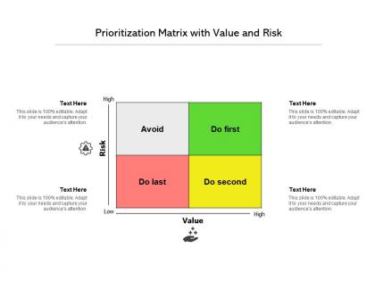
Prioritization matrix with value and risk


Try Before you Buy Download Free Sample Product
 Impress Your
 Audience
Editable
of Time


Our Prioritization Matrix With Value And Risk are explicit and effective. They combine clarity and concise expression.
People who downloaded this PowerPoint presentation also viewed the following :
Prioritization matrix with value and risk with all 2 slides:
Give your audience a fulfilling experience. They will find our Prioritization Matrix With Value And Risk elevating.

FAQs for Prioritization matrix with
So basically it's this grid where you plot tasks based on different factors - usually impact vs how much work they'll take. Super helpful when you've got a million things on your plate and can't figure out what to tackle first. The visual part is clutch because you can literally show your boss why you're doing X instead of Y. Honestly saved my butt so many times when stakeholders were all over the place with requests. Start simple with a 2x2 setup first. You can always make it more complex later, but don't overcomplicate it right away.
Honestly, prioritization matrices are clutch when you've got way too much on your plate and need to make decisions fast. Perfect for tight deadlines or when everyone's pulling you different directions. I always pull one out during project planning - saves so much back-and-forth arguing about what comes first. The visual element cuts through all the office politics too, which is nice. Use it when gut feeling isn't cutting it anymore or you need to actually defend your choices to higher-ups. That scoring system makes everything feel less subjective, keeps the whole team on the same page.
Honestly, both are solid but depends what you're dealing with. Eisenhower Matrix rocks when you're totally swamped - helps sort urgent from actually important stuff. MoSCoW's better for project planning though. You categorize everything as Must-have, Should-have, Could-have, Won't-have (kinda weird names but whatever). Daily tasks? Go Eisenhower. Project roadmaps? MoSCoW wins hands down. I'd just try both for like a week and see which one doesn't make you want to throw your laptop out the window. Some people's brains click with one more than the other.
You'll need four main things in your template: evaluation criteria (impact, effort, cost - whatever matters to your project), a scoring system, clear descriptions of what you're ranking, and columns for totals. Oh, and definitely add a notes section. Trust me on that one - you'll want somewhere to jot down random thoughts later. Pick criteria that actually match your goals instead of just grabbing whatever template looks pretty online. Define your scoring upfront too, like "5 means huge impact, 1 means barely matters." Start with just 3-4 criteria so people don't get overwhelmed. You can always add more once everyone gets the hang of it.
You know what's crazy? Prioritization matrices actually work because everyone has to use the same scoring criteria. No more of those "but MY project is critical!" arguments. Everyone evaluates stuff against the same factors - impact, effort, whatever you pick. Have people score independently first, then compare notes. The visual layout makes it obvious which projects should win. I was skeptical at first honestly, but it cuts through all the usual back-and-forth pretty fast. Worth trying in your next planning meeting - you'll probably reach decisions way quicker than normal.
Pick criteria that actually connect to your business goals - revenue impact, customer happiness, how much time/money you'll need, that kind of stuff. Honestly, people overthink this way too much. Stick to 3-5 factors max or your team will just get stuck debating forever. Make sure everyone knows what you mean by "high impact" vs "low impact" for each one. I'd start by figuring out what winning looks like first. Then work backwards to see what'll actually get you there. Oh and keep it measurable - vague criteria are useless when you're trying to make real decisions.
Yeah, prioritization matrices work great for remote teams! Google Sheets is honestly my go-to, though Miro's pretty slick if you want something fancier. Set clear scoring rules first - otherwise everyone interprets "high impact" totally differently. I usually let people add their scores async before we meet, saves tons of time. Oh and seriously, don't let the discussion spiral into those never-ending Slack threads where nothing gets decided. Start simple with a 2x2 matrix so people get comfortable with the whole digital thing first. Once they're used to it, you can get more sophisticated.
You really need stakeholder feedback for your prioritization matrix - otherwise you're just guessing. Get their input on how you're weighting criteria and scoring items. I've watched teams crash and burn because they worked alone and totally missed what actually mattered to the business. Your stakeholders know the real deal about customer impact and resource limits that you'd never figure out internally. Oh, and don't just ask one group - hit up different stakeholders early on, not after you've already built the whole thing. They'll catch blind spots you didn't even know existed.
Honestly, data analytics is a game-changer for prioritization matrices. You're basically swapping gut instincts for real numbers - pull actual performance data, customer feedback scores, revenue projections instead of just winging the impact ratings. The cool part is spotting patterns you'd totally miss otherwise, like certain project types that always bomb or run way over schedule. I've seen teams completely change their approach after tracking whether their old prioritization calls actually panned out. Quick win: just look around for metrics your company already tracks that could feed into your scoring system.
Don't overcomplicate the scoring criteria - you'll waste hours arguing if something's a 7 vs 8. Politics always tries to sneak in where people pump up scores for their favorite projects (guilty as charged lol). Get the right people involved early, not just whoever talks loudest. Your matrix will change when new info pops up, so don't treat it like it's carved in stone. Honestly, half the battle is just staying objective about what matters. Keep the whole thing simple and actually follow through on what the scores tell you.
Colors and icons are total game-changers for priority matrices. Red items scream "urgent" instantly. Flame icons work too. I've sat through way too many meetings staring at boring black-and-white grids that look like death. Different shapes and sizes help your eye find what matters fast. During presentations, stakeholders get it right away - no explaining needed. Quick tip though: stick with the same color scheme across all your matrices. Your team will start recognizing patterns without thinking about it. Honestly beats squinting at endless rows of text any day.
Honestly? Excel or Google Sheets are my go-to for basic 2x2 stuff - they're just so damn flexible. Miro and Lucidchart are nice if you want something prettier. Notion's great too if you're already living in there for project docs. For product prioritization specifically, ProductPlan and Roadmunk are solid choices. Asana and Monday.com have built-in prioritization that syncs with your tasks, which is pretty convenient. Oh, and here's the thing - whatever your team's already using is probably your best bet. The fanciest tool means nothing if nobody actually updates it.
Yeah, totally update that thing regularly! Deadlines shift, new people join the team, capacity changes - all that stuff matters. I'd say monthly reviews work well, or whenever something major happens. Honestly, I've watched teams use the same old matrix for months and then complain their priorities feel completely wrong. Don't tweak every tiny detail constantly though - that's annoying. Set up quarterly check-ins at minimum. And if your project goals totally change? Scrap the whole criteria structure and start fresh. Better to rebuild than force outdated priorities.
Dude, prioritization matrices actually work in the real world. Google's OKR system helped them nail Gmail and Android launches. During Apollo, NASA used impact-effort grids to figure out which mission components mattered most. Southwest still does this stuff for route planning - pretty smart honestly. Toyota's my go-to example though. They rank quality problems by how bad and how often, then fix accordingly. You can literally trace major wins back to these decisions. Just try it on your next project backlog. The clarity you'll get is kind of amazing once you see it working.
Here's what I'd do: grab those same metrics from your prioritization matrix - ROI, impact scores, whatever you used - and check them against reality. Monthly or quarterly reviews work pretty well for this. Most teams honestly just... forget this step? Which is wild after all that planning work. Track 3-4 key metrics per project on a simple dashboard. Short bursts work better than overthinking it. The real question is whether your "high priority" stuff actually moved the needle like you thought it would. That's how you'll get better at picking winners next time.
No Reviews