


Problèmes et solutions Diapositives de présentation PowerPoint





Try Before you Buy Download Free Sample Product
 Impress Your
 Audience
 100%
100% Editable
 Save Hours
 of Time


Présentez les problèmes et les solutions dans une seule diapositive avec les diapositives de présentation PowerPoint sur les problèmes et les solutions. Mettez en évidence les risques et les menaces qui causent l'exécution du processus à l'aide d'un diaporama de présentation PowerPoint de problèmes et de solutions. Présentez les défis et identifiez la cause principale des problèmes. Effectuez une analyse des risques et des analyses SWOT. Notez les défis qui ralentissent la croissance de l'entreprise. Présentez diverses opportunités et risques avec des modèles de présentation PPT de problèmes et de solutions. Surmontez les obstacles et présentez les solutions à divers problèmes commerciaux tels que les ressources, la gestion financière, la surveillance des performances, la technologie, les produits, les services, le service client, etc. Ce jeu comprend diverses diapositives conçues par des professionnels montrant les problèmes et les solutions. Vous pouvez choisir le modèle selon vos besoins. Les entrepreneurs, les gestionnaires, les étudiants et les universitaires peuvent utiliser ce deck PowerPoint pour répertorier les problèmes et leurs solutions. Téléchargez des diapositives de présentation PowerPoint sur les problèmes et les solutions conçues par des professionnels pour déterminer les opportunités d'atteindre les objectifs commerciaux. Accrochez-vous avec nos diapositives de présentation PowerPoint sur les problèmes et les solutions. Prenez les commandes en main.
People who downloaded this PowerPoint presentation also viewed the following :
Contenu de cette présentation Powerpoint
Diapositive 1 : Cette diapositive présente les problèmes et les solutions avec une image de puzzle créative.
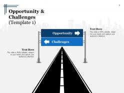
Diapositive 2 : Il s'agit d'une diapositive Opportunités et défis avec une image de route descriptive avec des zones de texte de chaque côté.
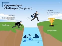
Diapositive 3 : Il s'agit d'une autre diapositive sur les opportunités et les défis avec les images humaines, terrestres et d'obstacles avec des zones de texte.
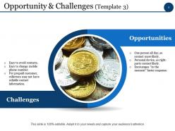
Diapositive 4 : Cette diapositive présente les opportunités- (Une personne toute la journée, donc contact plus probable, Appareil personnel, donc contact probable avec la partie droite, Encourage une réponse plus rapide « sur le moment »). Défis (contacts faciles à éviter, numéro de téléphone portable facile à changer, pour les clients prépayés, les collectionneurs peuvent ne pas avoir d'informations de contact fiables).
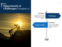
Diapositive 5 : Cette diapositive affiche les défis et les opportunités avec des zones de texte et une image d'humains sur une colline.
Diapositive 6 : Cette diapositive affiche les opportunités et les défis avec des images d'icônes de poignée de main et de limitation.
Diapositive 7 : Cette diapositive présente l'opportunité avec l'image cible et les défis avec l'image d'obstacle et les zones de texte.
Diapositive 8 : Cette diapositive affiche les opportunités et les défis avec une image cible et une icône de limitation accompagnées de zones de texte.
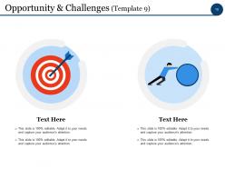
Diapositive 9 : Cette diapositive affiche les opportunités et les défis avec la cible respective et l'humain faisant rouler une image de roche.
Diapositive 10 : Cette diapositive montre une autre opportunité et défis avec des images et des zones de texte.
Diapositive 11 : Cette diapositive affiche la pause-café pour l'arrêt.
Diapositive 12 : Il s'agit d'une diapositive d'icônes de problèmes et de solutions.
Diapositive 13 : Cette diapositive s'intitule Charts & Graphs pour aller de l'avant.
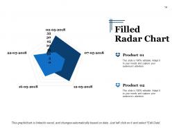
Diapositive 14 : Cette diapositive montre un graphique radar rempli pour la comparaison de deux produits.
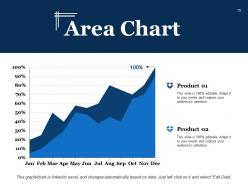
Diapositive 15 : Cette diapositive présente un graphique en aires pour afficher la croissance de deux produits concurrents.
Diapositive 16 : Cette diapositive s'intitule Diapositives supplémentaires pour continuer.
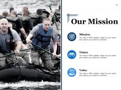
Diapositive 17 : Voici notre diapositive Mission, Vision, Valeur, Mission.
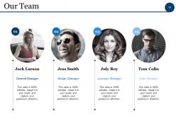
Diapositive 18 : Cette diapositive présente notre équipe avec son nom et sa désignation.
Diapositive 19 : Ceci est une diapositive À propos de nous où vous pouvez montrer les aspects professionnels, créatifs ou talentueux de votre entreprise.
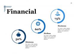
Diapositive 20 : Cette diapositive présente le score financier en termes de Minimum Moyen Maximum.
Diapositive 21 : Ceci est une diapositive Notre objectif. Énoncez vos objectifs ici.
Diapositive 22 : Il s'agit d'une diapositive de remerciement avec l'adresse n° numéro de rue, la ville, l'état, l'adresse e-mail et les numéros de contact.
Problèmes et solutions Diapositives de présentation Powerpoint avec les 22 diapositives :
Gagnez une appréciation instantanée avec nos diapositives de présentation PowerPoint sur les problèmes et les solutions. Il génère des applaudissements immédiats.







FAQs for Problems And Solutions
Oh man, the worst part is always cramming too much stuff onto each slide - like, why do we do this to ourselves? Your fonts and colors will be all over the place too, which looks super messy. Then there's the inevitable tech meltdown where nothing works right and your animations just... die. Start with your main point first, that's honestly the only way I stay focused. Keep slides clean and simple. Also maybe have a backup ready because projectors hate us all. The storytelling flow thing is huge too - slides should actually connect to each other, not just exist randomly.
Honestly, you've gotta make it feel more like a conversation than a lecture. Ask questions throughout - not the boring "any questions?" at the end, but stuff like "how many of you deal with this?" or "what would you do here?" Stories work way better than bullet points too. Eye contact feels super awkward at first but it makes a huge difference. Oh, and pause sometimes to check if people are actually following along - I learned that one the hard way. Just try adding one interactive thing next time and see how it goes.
Honestly, Canva's your best bet if you want something that looks decent without much effort. Figma's cool too but more complex - depends how fancy you wanna get. Oh, and PowerPoint's Designer thing is actually not trash anymore if you're already using Microsoft stuff. Before diving into any tool though, map out your content first in Notion or Google Docs. Trust me on this one - I've wasted way too many hours dragging text boxes around because I didn't plan ahead. Start with the outline, then worry about making it pretty. You'll thank me later.
Honestly, just pick ONE key thing your audience needs to walk away with. That's your anchor. Then add maybe 2-3 supporting points max - anything else is just noise. I used to be terrible at this btw. Would write these massive posts thinking more = better. Wrong. Break stuff up with bullets and short paragraphs so people don't get that wall-of-text feeling. Oh, and read it out loud - if you're gasping for air mid-sentence, it's too long. Your readers have like zero attention span these days, so respect that.
Honestly, the biggest thing is just letting them finish talking before you jump in. I used to interrupt all the time thinking I knew what they were asking - bad move. If someone throws you a curveball, just say you don't know instead of rambling. Way better than looking like you're making stuff up on the spot. Oh, and repeating tricky questions back works great - gives you time to think plus shows you're actually listening. When people get aggressive, I usually acknowledge what they're worried about first, then pivot to the actual facts. Always have a couple backup topics ready too because someone will definitely ask something completely random. That "great question, let me think" line? Total lifesaver.
White space is everything - don't cram stuff together. One idea per slide, max 6-8 words per line. Clean fonts only (please, for the love of god, no Comic Sans). High contrast colors so people can actually see what you wrote from the back row. Make your main point the biggest thing on there. Images should back up what you're saying, not just fill space. Quick test: glance at your slide for like 3 seconds. If you can't get the point immediately, it's too busy. I learned this the hard way after bombing a presentation with cluttered slides. Short sentences work better than long ones.
Dude, high-quality images only - blurry screenshots are the worst and everyone will hate you for it. One concept per slide, don't throw five charts together like some kind of data monster. Test your videos beforehand because tech WILL break when you need it most. Keep videos short, maybe 2 minutes max since people zone out fast. Always have backups ready. Size your images big enough so people in back can actually see them. Oh and add alt text if you're sharing digitally. Quick tip: screenshot your own slides first to see how terrible they'll look when projected - saves embarrassment later.
Honestly, just ask people what they thought! Send a quick survey about what made sense and what didn't. During your talk, watch for engagement - nobody scrolling their phone is a good sign. Did you actually get what you wanted from it though? Like, if you needed approval or action items, did that happen? I started keeping notes after presentations (sounds nerdy but whatever) about what worked and what bombed. You'll notice patterns way faster than just winging it every time. Body language tells you everything too - way more than people being polite afterward.
Ugh presentations are the worst but here's what actually helped me. First thing - drill your opening lines until you could say them in your sleep. Those first 30 seconds are everything. Definitely do the whole deep breathing thing beforehand (sounds dumb but it works). Show up early so you can mess with the tech and get comfortable in the space. Here's the thing though - literally nobody cares as much as you think they do. Half the room's probably scrolling Instagram anyway lol. When you screw up (and you will), just pause for a sec and keep going. Oh and record yourself practicing at home first! Trust me on this one.
Honestly, it's all about reading the room before you even walk in. I always creep on LinkedIn to see who's coming (judge me all you want). Executives? Hit them with business impact right away - they'll zone out if you get too granular. Technical folks are the opposite. They want proof, data, all the nitty-gritty stuff. Mixed crowds are trickier - you've got to layer things so both groups stay engaged. Don't use jargon with non-experts, but absolutely speak their language with specialists. I usually throw out a few questions upfront to gauge what people actually know.
Dude, stories are total game-changers for presentations. People actually *care* when you give them characters and conflict instead of just rattling off bullet points. Like, they'll remember your customer story way longer than whatever stats you threw at them. Here's the thing - stories make weird abstract stuff suddenly click. You're basically showing your solution in action rather than just talking about it. Even something super quick works. Just grab a 30-second customer experience or something that happened to you, then connect it back to your main point. Honestly beats the hell out of another boring slide deck.
So definitely go with high-contrast colors and bigger fonts - like 18pt minimum. Alt text for images is a must. If you've got videos, captions are your friend. Here's something I literally always mess up: making sure the slide order actually makes sense when a screen reader goes through it. Don't jam-pack your slides either - cognitive overload is real and honestly just makes everyone zone out. Oh, and skip the fancy jargon for simple language. My best advice? Run it through accessibility tools first or grab someone to give it a once-over. Trust me, catching issues beforehand beats scrambling later.
Honestly, talking to yourself in the mirror helps way more than you'd think - I felt ridiculous at first but whatever works, right? Slow down when you speak because anxiety makes you race through everything. Record yourself on your phone to catch all those "ums" - you'll be shocked how many you use without realizing. Strong openings and endings matter most since that's what sticks with people. If there's a Toastmasters group nearby, go for it. The feedback is solid. Start with smaller presentations first to build up your confidence before tackling the scary ones.
Don't wait until everything's perfect before getting feedback - seriously, that's a trap. Ask super specific questions though, like "does slide 3 make sense?" instead of just "thoughts?" Trust me, you'll get way better answers. When people give you feedback, bite your tongue and actually listen instead of defending everything. Three people saying the same thing? Yeah, they're probably right. Test changes in small chunks so you know what's working. Oh, and definitely circle back with people to show how you used their input - they'll be way more helpful next time.
Okay so basically don't mess with your data or use sketchy chart tricks to make things look better than they are. Your audience isn't dumb. Also never share confidential stuff without permission - seriously, I've watched people's careers implode over this. Give credit where it's due if you're borrowing ideas or research. Try to use inclusive language so everyone feels welcome. Oh, and don't cherry-pick stats just because they support your argument better. Here's my test: would you feel totally fine explaining every single slide to your grandma? If not, fix it.
-
Easily Understandable slides.
-
Great designs, really helpful.