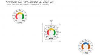
Project Status Kpi Dashboard Snapshot Showing Completed Tasks And Task In Progress
Try Before you Buy Download Free Sample Product
Audience
Editable
of Time
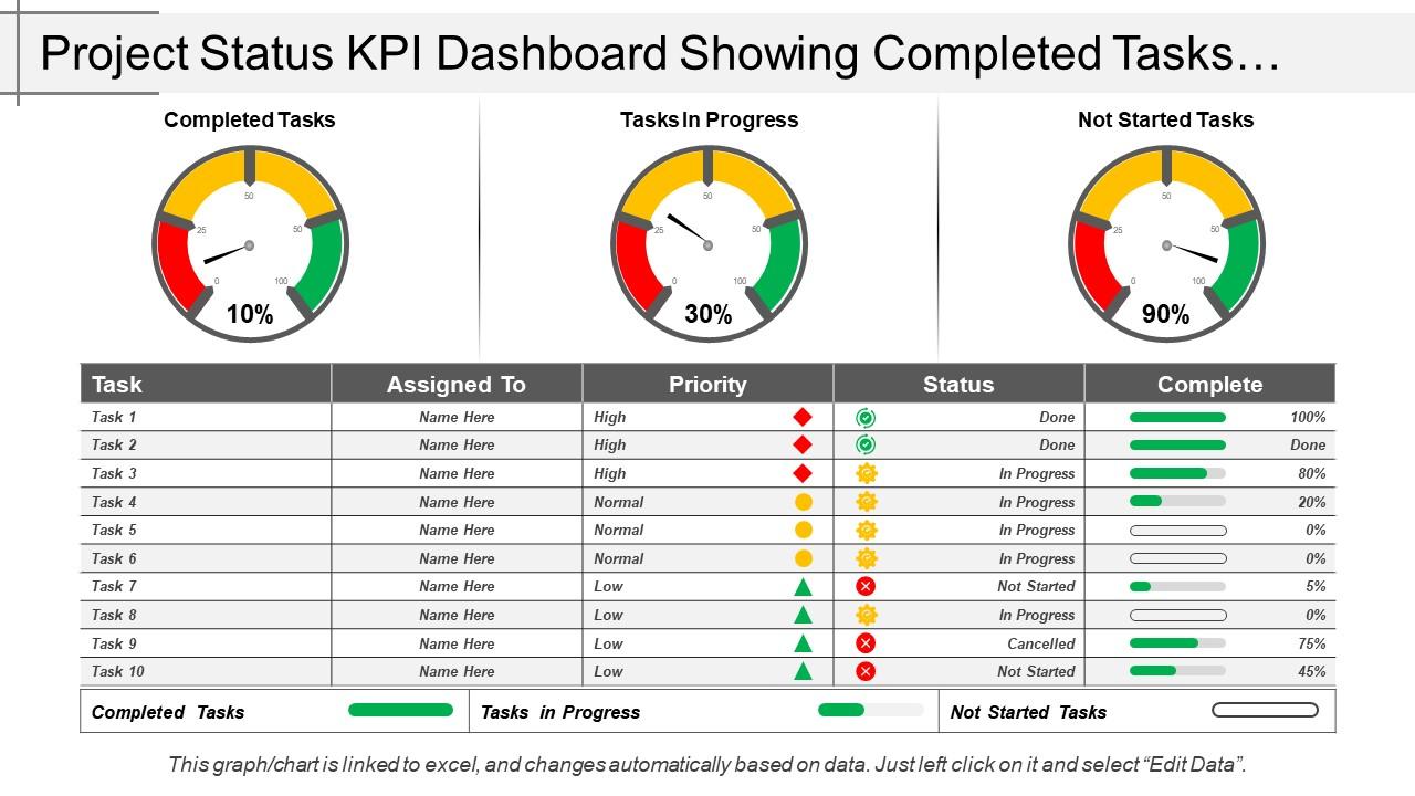
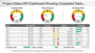
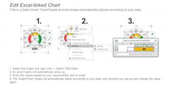
Present with our project status Kpi dashboard snapshot showing completed tasks and task in progress, if you are looking for an appealing business presentation to fetch the attention of your audience. Graphic of project performance and project status is displayed here with three performance indicators showing, completed tasks, tasks in progress and not stated tasks. You can prioritize your status for completion of your tasks through this kpi PPT deck and craft your outcome. This PowerPoint template is equipped with various tremendous characteristic features that can serve the best out of your presentation and improve the vision of your Company. It’s a contentious market today thus it becomes important to include the foremost services and schemes in your business and marketing strategies in order to stay at the summit. Just switch on the download button and get started. They will be the perfect fit for the biggest of concepts. Initiate action to improve infrastructure with our Project Status Kpi Dashboard Showing Completed Tasks And Task In Progress. Be an enabler for industry.
People who downloaded this PowerPoint presentation also viewed the following :
Project Status Kpi Dashboard Snapshot Showing Completed Tasks And Task In Progress with all 6 slides:
Our Project Status Kpi Dashboard Snapshot Showing Completed Tasks And Task In Progress conjure up a beautiful blend. An array of colors to charm any beholder.
FAQs for Project Status Kpi Dashboard Snapshot Showing Completed Tasks And
So for your dashboard, stick to the basics that actually matter. Schedule performance shows if you're hitting deadlines. Budget variance tells you where the money's going. Milestone completion rates are pretty self-explanatory. Resource utilization is critical - you'll see if people are swamped or sitting around. Quality stuff like defect rates matter too, plus any major risk indicators. Here's the thing though - I've worked with teams that track literally everything and it becomes useless noise. Maybe 6-8 KPIs max? Each one should help someone make an actual decision, not just look pretty on a screen.
Honestly, charts and graphs are a game-changer for project stuff. Your brain just processes visuals way faster than scrolling through endless spreadsheet rows. Red/yellow/green status dots, progress bars, trend lines for budget - that kind of thing tells the whole story at once. Stakeholders love it because they don't have to dig into the weeds (and let's be real, nobody wants to). I always focus on whatever metrics actually matter to whoever's asking. The trick is picking visuals that make the patterns super obvious. Like, if something's trending badly, it should jump out immediately. Makes those status meetings so much smoother.
Pick metrics that actually matter for your project goals and what stakeholders care about. I'd stick with 3-5 key ones - timeline progress, budget burn rate, scope completion, quality stuff like that. Too many dashboards look fancy but are basically useless for knowing if you're screwed or not. Focus on things that would make you panic if they turned red. Your data needs to be solid and easy to refresh - honestly, an outdated dashboard is more annoying than having nothing at all. Run it by your team first to see what clicks with them.
Honestly, automate everything you can - manual updates are where things go sideways fast. I presented totally wrong budget numbers to my boss once because someone forgot to update a spreadsheet... not my finest moment lol. Connect your dashboard straight to whatever tools you're already using - project management stuff, time tracking, budgets, all of it. Have different people own specific data chunks and check them weekly. Oh, and set up some kind of alert system that catches weird numbers or gaps before anyone else sees them. Trust me, catching errors yourself beats having stakeholders point them out in meetings.
Dude, you NEED real-time updates or your dashboard is basically useless. I'm talking live data that refreshes automatically - none of this once-a-day nonsense that leaves you scrambling when things blow up. The whole point is catching problems early, not finding out about disasters after they've already wrecked your timeline. Manual updates? Don't even go there - someone will forget and suddenly your "current" data is from three weeks ago. Set up those automated feeds and actually watch your project's pulse in real time. Trust me, you'll thank yourself when you can pivot fast instead of playing catch-up.
Honestly, just figure out what each person actually needs first. Interview your stakeholders about their daily decisions - that's where you start. Executives want the big picture trends, but your dev team? They literally only care about sprint burndowns and bug counts. Don't show them budget stuff. Set up different permission levels so everyone sees their relevant data only. Some people are visual and want charts, others prefer boring tables (weird, but whatever). Project managers need the detailed task progress and resource stuff. Build dashboards that actually support how people work, not just pretty displays that look impressive but nobody uses.
Depends on your budget honestly. Power BI and Tableau are great if your company already pays for them - otherwise they're pricey. Google Data Studio is free and does most things you'd need for project tracking. Don't sleep on Excel or Sheets either, sometimes a clean spreadsheet is way better than some fancy dashboard that nobody understands. Oh and if you're already using project tools like Monday or Asana, check their built-in reports first. I'd just start with whatever you can access now and see how it goes.
Dude, you literally can't skip this part. Your KPIs have to connect to your actual project goals, otherwise you're just tracking random busy work. I've watched teams obsess over pretty dashboards that measured absolutely nothing meaningful - such a time sink. Start with your objectives first, then figure out which numbers actually tell you if you're succeeding. The whole point is answering "are we hitting our targets?" not just "look how much we're doing!" Work backwards from what you're trying to achieve and pick metrics that'll show real progress toward those outcomes.
Honestly, the worst thing you can do is cram everything onto one screen - I've seen dashboards that look like airplane cockpits. Pick maybe 5-7 metrics that actually matter to whoever's using it. Don't fall into the vanity metrics trap either, like those pretty charts that just sit there collecting digital dust. Your data needs to be reliable and fresh enough to be useful. Before you build anything though, figure out what decisions this thing actually needs to support. Test it with real users first - saves you from building something nobody wants. Keep it simple, seriously.
Weekly or bi-weekly is usually the way to go - keeps everyone sane while still tracking progress. Daily feels way too intense unless something's on fire. I tried monthly once but honestly, by then it's too late to fix anything that's going sideways. My old team burned out hard when we went daily for like three months straight, total nightmare. Start with weekly and see how it feels. Some projects need more attention, others can coast a bit longer. Really depends on your deadlines and how much your stakeholders are breathing down your neck.
Honestly, digital dashboards are a game-changer because everything updates automatically. No more outdated printouts that nobody remembers to bring anyway (we've all been there). You can filter by teams, drill into specific metrics, and stakeholders can check progress whenever they want instead of bugging you constantly. Real-time alerts are clutch too - they'll ping you when numbers hit certain thresholds. Everyone accesses the same current info from anywhere, which beats sitting through another PowerPoint presentation. Start simple with something like Tableau or Power BI. Way easier than you'd think to set up.
Add comment boxes next to each KPI and throw in some thumbs up/down buttons - super simple stuff. Pop-up feedback forms work too when people click metrics. Honestly, most teams ignore these features if they're clunky, so don't overcomplicate it. Set up alerts that ping for input when numbers hit certain thresholds. Oh, and include a "flag this data" button for when something looks off - I've found that's actually useful. The trick is making feedback feel seamless, not like another task on their plate. Start small with one feature and build from there based on what people actually use.
Dude, historical data totally changes the game with KPI dashboards. Instead of just seeing "we're 15% behind schedule," you'll know if that's normal or actually worth panicking about. Trends become super obvious. You can catch problems before they wreck your timeline, benchmark against old projects, and show stakeholders real proof things are getting better. Honestly, it turns your dashboard from a boring snapshot into an actual story - which sounds cheesy but it's true. I'd say grab at least 3-6 months of past data for your main metrics to start.
So basically a KPI dashboard shows everyone the same info about your project. No more playing telephone with updates. Your team can check real progress instead of constantly asking "where are we on this?" Those meetings where nobody knows the actual numbers? Yeah, those become way less awkward. When problems show up, people spot them fast and can help out right away. Honestly saves so much time. Just don't forget to keep it updated - I've seen too many teams let theirs get stale and then wonder why nobody uses it.
Okay so when your KPIs start tanking, don't panic but move quick. Dig into the data first - what's actually broken here? Talk to your team leads too, they usually know what's up. Once you figure out the real problem (not just symptoms), write it down and tell your stakeholders ASAP with a solid plan. Honestly, the communication part is huge - people hate surprises way more than they hate problems. You'll probably need to shift your timeline and maybe resources around. Set up closer monitoring for whatever's acting up. The whole thing sucks but transparency keeps everyone sane.
-
Very unique and reliable designs.
-
Easily Editable.