


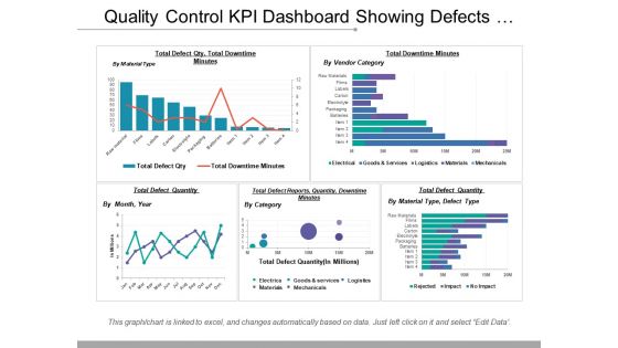
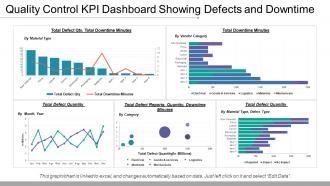
Quality control kpi dashboard showing defects and downtime





Try Before you Buy Download Free Sample Product
 Impress Your
 Audience
 100%
100% Editable
 Save Hours
 of Time


Drive expectations with our Quality Control Kpi Dashboard Showing Defects And Downtime. Give them belief they can achieve big.
People who downloaded this PowerPoint presentation also viewed the following :
Quality control kpi dashboard showing defects and downtime with all 6 slides:
Benefit future generations with our Quality Control Kpi Dashboard Showing Defects And Downtime. Advocate an eco friendly approach.

FAQs for Quality control kpi dashboard showing
Defect rate is honestly where I'd start - super easy to track and gets management moving fast. First-pass yield and customer complaints are the other big ones you can't ignore. Cost of quality is massive too, shows you whether you're bleeding money on fixes or actually preventing problems upfront. Scrap rate matters, plus on-time delivery since quality screwups always seem to tank your schedule somehow. My old boss used to obsess over like 12 different metrics and we'd spend more time in meetings about the data than fixing anything. Stick to maybe 3-5 tops or you'll go crazy trying to track everything.
Honestly, most companies screw this up by only checking stuff at the very end. Set up checkpoints throughout your whole production line where workers can log issues as they happen. First though, you gotta define what actually counts as a defect for each product - sounds obvious but trust me on this one. Calculate your defect rate with this basic formula: (defective units ÷ total units) × 100. Track it daily and weekly so you catch trends early. The biggest thing? Make reporting defects super easy for your team. Nobody should feel like they're throwing someone under the bus for flagging problems.
So KPIs are like your reality check for quality stuff. Track things like defect rates, customer complaints, first-pass yield - that kind of data shows you what's actually happening vs what you think is happening. The key is picking maybe 3-5 metrics that your customers actually care about and checking them weekly. Honestly, I've seen too many teams just collect numbers and never do anything with them. You gotta use those insights to tweak your processes and set real targets. Otherwise you're just making fancy spreadsheets for no reason.
Honestly, you gotta ditch the typical manufacturing stuff and think about what actually matters in your field. Healthcare? Track infection rates, readmissions, med errors - way more relevant than defect counts. Service work is all about customer satisfaction scores, first-call resolution, delivery times. Manufacturing KPIs are kinda useless for people-focused jobs, if I'm being real. Figure out what "quality" means for YOUR users first. What do they actually complain about? Then build your metrics around fixing those specific problems. Makes way more sense than forcing generic numbers that don't tell you anything useful.
Just use the basic formula: (Units passed first time / Total units entering) × 100. Track it at each step though, not just the final output - that's how you actually find where things go wrong. Don't overthink the weighted averages stuff people do, at least not yet. Be super clear about what counts as "first pass" vs rework or you'll mess up your data. I calculate mine daily and weekly to catch issues early. Oh and start with just one process that matters most, get that dialed in, then add others. Way easier than trying to do everything at once.
Track customer satisfaction scores after deliveries - they're honestly your best early warning system. When scores dip, that usually means quality issues are brewing before they explode into bigger problems. The trick is figuring out which specific production runs or process changes caused the drop. Set up regular surveys and watch the trends over time. Both overall satisfaction and quality-specific questions matter here. Once scores hit certain thresholds, that should automatically trigger quality reviews. I've noticed way too many companies completely miss this obvious connection, which is kinda nuts when you think about it.
OEE rocks as a dashboard number - rolls availability, performance, and quality into one clean metric. Makes comparing shifts or lines dead simple. Operators love it because the math isn't rocket science. But that's also where it gets tricky. Your OEE drops to 75%? Cool, something's broken. Which thing though? Could be downtime, speed issues, or quality problems - you're still hunting through data either way. Honestly, I've seen people get obsessed with the number and miss the actual root causes. Perfect for tracking trends, but you'll want those detail metrics close by when things go sideways.
Mix hard numbers with the story behind them - like defect rates plus what customers actually think. Numbers show you *what's* happening (error rates, cycle times), but qualitative stuff explains *why*. I've watched teams obsess over spreadsheets and completely miss what's really going on. Maybe 60-70% should be trackable metrics for spotting trends. Then do customer calls, team check-ins, quality reviews - whatever gets you the context. Honestly, most dashboards are pretty useless without that human element. Pick 2-3 metrics from each side and review monthly together.
Honestly, there's a bunch of ways to handle this. Most companies go with quality management software - MasterControl, ETQ, Intelex are the big names. They're pricey but handle everything from defects to compliance stuff. Excel or Google Sheets work fine too if you're on a tight budget, just need some decent dashboards. Power BI and Tableau sit somewhere in the middle - pretty visualizations without the crazy cost. Here's what I'd do though: start with whatever you already have access to. Get your process figured out first, then upgrade once you know what features actually matter to you.
Honestly, I'd do it monthly if possible, but quarterly at the bare minimum. Things change so damn fast - what worked three months ago might be totally irrelevant now. I've watched teams cling to metrics that stopped making sense ages ago. The trick is actually sticking to whatever schedule you pick, not letting it slide when work gets crazy (which it always does). Maybe block out a couple hours next month? Just sit down and ask yourself if your current KPIs are actually pushing people toward the right stuff. Markets shift, processes get better, customers want different things.
So culture totally changes how QC metrics work in real life. Teams interpret data differently based on their background, and some cultures won't even report problems if they're worried about blame. Individual vs. collective responsibility? That completely shifts how defect tracking plays out. Risk tolerance varies too - what's acceptable in one region might be way too loose for another. Honestly, I've seen this mess up so many global rollouts. You gotta adapt your framework to local norms while keeping some core standards consistent. Start by just asking your teams how they actually feel about the current metrics.
Honestly, those KPI reports are what stop management from making decisions based on hunches. You're giving them actual data on defect rates, customer complaints, process efficiency - stuff they can act on. Visual dashboards are a lifesaver because executives won't sit through spreadsheet hell. They can quickly spot trends and figure out if they need new equipment, more training, or process changes. Focus on the metrics that actually matter and give context with your numbers. Raw data without explanation is pretty useless - learned that the hard way. Your reports basically drive resource allocation and strategic decisions.
Your team definitely needs training on the basics first - control charts, standard deviations, trend spotting. Make sure they actually understand what each KPI measures and why it matters for quality goals. Data visualization helps a ton because honestly, staring at spreadsheets sucks. Train them on your quality management system too, plus how to tell the difference between real insights and just random data noise. The whole point is connecting KPI trends to actual production problems. I'd start with a half-day workshop covering fundamentals, then maybe do monthly check-ins to keep things fresh.
Honestly, these dashboards are a lifesaver for catching quality issues early. You'll get alerts the second defect rates jump or complaints roll in - way better than waiting around for monthly reports that tell you what happened weeks ago. Real-time data means you can actually fix problems instead of just documenting them after the fact. The trick is keeping it simple though. Start with maybe 3-5 metrics that actually matter to your team. I made the mistake once of tracking everything and nobody looked at it because there was just too much noise. Set up those automated alerts for your critical stuff and you're golden.
Honestly, the worst thing you can do is track everything - you'll just get buried in numbers that don't mean anything. Skip the vanity metrics too. I worked with this one team that was obsessed with bug counts while their customers were totally miserable, which was pretty backwards if you ask me. Pick metrics you can actually measure and make sure someone's responsible for each one. Otherwise you're just collecting data nobody looks at. Don't set crazy unrealistic goals either - that just kills morale. Start with maybe 3-5 solid ones tied to real business stuff, then add more later.
-
Best Representation of topics, really appreciable.
-
Use of icon with content is very relateable, informative and appealing.