


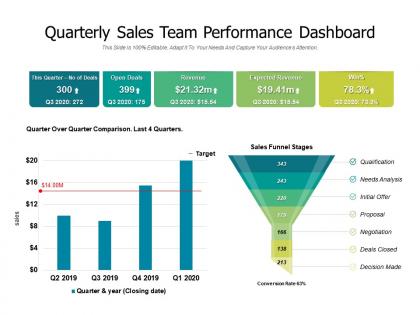
Quarterly sales team performance dashboard




Try Before you Buy Download Free Sample Product
 Impress Your
 Audience
 100%
100% Editable
 Save Hours
 of Time


Convince folks that conditions are better than expected with our Quarterly Sales Team Performance Dashboard. It will drastically alter impressions.
People who downloaded this PowerPoint presentation also viewed the following :
Quarterly sales team performance dashboard with all 2 slides:
Folks begin to check back with you due to our Quarterly Sales Team Performance Dashboard. Establish the datum for further assessment.
FAQs for Quarterly sales
Essential sales KPIs include conversion rates, revenue per lead, sales cycle length, pipeline velocity, and customer acquisition costs. These metrics enable sales teams to identify bottlenecks, optimize resource allocation, and accelerate deal closure, with many organizations finding that comprehensive dashboards ultimately deliver improved forecasting accuracy and enhanced team performance.
Data visualization enhances sales performance dashboard effectiveness by transforming complex metrics into intuitive charts, graphs, and heat maps that enable instant comprehension of trends, patterns, and outliers. Through interactive visualizations, sales managers can quickly identify top performers, spot declining territories, and track pipeline progression, while teams gain immediate insights into quota attainment and conversion rates, ultimately accelerating decision-making and strategic adjustments.
Real-time data enables immediate visibility into sales metrics, pipeline changes, deal progressions, and team performance, allowing managers to identify trends and address issues as they occur. This immediate access streamlines decision-making and enhances forecasting accuracy, with many sales organizations finding that real-time monitoring ultimately delivers faster course corrections and improved revenue outcomes.
**INPUT**: Which software tools are most effective for creating a sales performance dashboard? **OUTPUT**: Effective sales performance dashboard tools include Tableau, Power BI, Salesforce Analytics, HubSpot, and Zoho Analytics, each offering robust visualization capabilities and CRM integration. These platforms streamline sales tracking by automating data collection, providing real-time insights, and enabling customizable reporting, with many organizations finding that comprehensive dashboards ultimately enhance decision-making and accelerate revenue growth. **Word count: 57 words**
Sales performance dashboards can be customized through role-specific metrics, adjustable time frames, personalized KPI selections, team-based filtering options, and flexible visualization formats. Different teams, such as inside sales focusing on call volumes and lead conversion while field sales teams emphasize territory management and client relationships, can tailor their dashboards to highlight relevant performance indicators, ultimately enabling more targeted strategies and improved accountability across diverse sales functions.
Common challenges include data integration from multiple systems, selecting relevant KPIs without overwhelming users, ensuring real-time accuracy, and balancing comprehensive insights with visual clarity. These obstacles often result in dashboards that lack actionable intelligence, with many sales organizations finding that strategic planning around user needs, automated data workflows, and intuitive design ultimately delivers better adoption rates and improved decision-making capabilities.
Sales performance dashboards should be updated in real-time or daily for maximum accuracy, with weekly summaries for trend analysis and monthly deep-dives for strategic planning. Through automated data integration, sales teams can monitor KPIs, track pipeline changes, and adjust strategies immediately, while managers gain visibility into performance patterns, ultimately enabling faster decision-making and improved revenue outcomes.
Predictive analytics can be integrated through forecasting models, lead scoring algorithms, churn prediction tools, opportunity probability assessments, and trend analysis capabilities. These technologies enhance dashboards by identifying high-value prospects, predicting revenue outcomes, and flagging at-risk accounts, with many sales organizations finding that predictive insights ultimately accelerate deal closure and improve resource allocation.
Sales managers can effectively use dashboards by monitoring real-time KPIs, identifying underperforming areas, setting data-driven goals, and conducting targeted coaching sessions based on individual metrics. Through automated reporting and visual analytics, managers streamline performance reviews, recognize top performers, and allocate resources strategically, ultimately delivering improved conversion rates and enhanced team productivity.
Best practices for presenting sales data include using clear visualizations, focusing on key performance indicators, implementing interactive filtering, maintaining consistent design elements, and providing real-time or near-real-time updates. These approaches enhance stakeholder understanding by streamlining complex data interpretation, enabling quick decision-making, and delivering actionable insights, with many organizations finding that well-designed dashboards significantly improve sales strategy alignment and operational efficiency.
UX design principles enhance sales performance dashboards by prioritizing intuitive navigation, clear data visualization, and personalized user interfaces that reduce cognitive load and accelerate decision-making. Through responsive design and streamlined workflows, sales teams can quickly access critical metrics, identify trends, and take action, ultimately improving productivity and enabling faster responses to market opportunities.
Sales productivity metrics include call volume, conversion rates, average deal size, sales cycle length, and pipeline velocity. These measurements enhance performance management by identifying top performers, streamlining coaching efforts, and optimizing resource allocation, with many organizations finding that tracking activity-to-outcome ratios ultimately delivers improved forecasting accuracy and competitive advantage.
Historical data enhances future sales performance assessments by identifying patterns, forecasting trends, setting realistic targets, and revealing customer behavior insights. Through predictive analytics and comparative analysis, organizations can anticipate market shifts, optimize resource allocation, and refine sales strategies, with many companies finding that data-driven assessments ultimately deliver more accurate forecasting and competitive advantage.
Mobile accessibility for sales performance dashboards enables real-time decision-making, field access to critical metrics, enhanced team collaboration, improved client interactions, and faster response to market opportunities. Through mobile-responsive platforms, sales teams can monitor pipeline progress, track individual performance, and adjust strategies instantly while meeting clients, with many organizations finding that mobile-enabled dashboards increase productivity and accelerate deal closure rates significantly.
Anomalies in sales data can be detected through automated variance analysis, trend deviation alerts, statistical outlier identification, and real-time performance benchmarking against historical patterns. These dashboard analytics streamline anomaly detection by flagging unusual spikes or drops, identifying regional performance variations, and highlighting customer behavior changes, ultimately enabling sales teams to respond quickly to emerging opportunities and potential issues.
No Reviews