


Recruitment Dashboard Powerpoint PPT Template Bundles




Try Before you Buy Download Free Sample Product
 Impress Your
 Audience
 100%
100% Editable
 Save Hours
 of Time


Our Recruitment Dashboard Powerpoint PPT Template Bundles are topically designed to provide an attractive backdrop to any subject. Use them to look like a presentation pro.
People who downloaded this PowerPoint presentation also viewed the following :
Recruitment Dashboard Powerpoint PPT Template Bundles with all 18 slides:
Use our Recruitment Dashboard Powerpoint PPT Template Bundles to effectively help you save your valuable time. They are readymade to fit into any presentation structure.
-
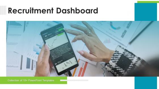
Recruitment Dashboard Powerpoint PPT Template Bundles
-
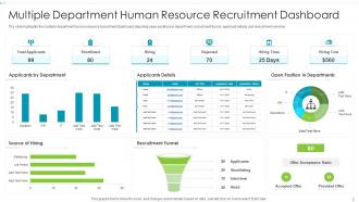
Recruitment Dashboard Powerpoint PPT Template Bundles
-
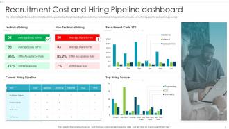
Recruitment Dashboard Powerpoint PPT Template Bundles
-
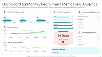
Recruitment Dashboard Powerpoint PPT Template Bundles
-
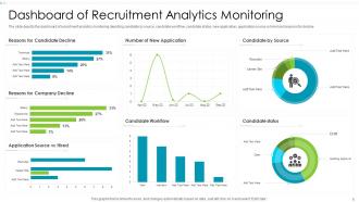
Recruitment Dashboard Powerpoint PPT Template Bundles
-
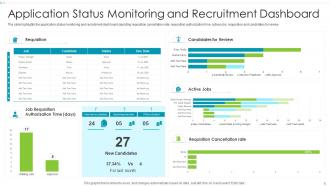
Recruitment Dashboard Powerpoint PPT Template Bundles
-
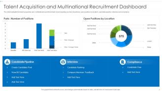
Recruitment Dashboard Powerpoint PPT Template Bundles
-
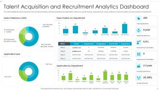
Recruitment Dashboard Powerpoint PPT Template Bundles
-
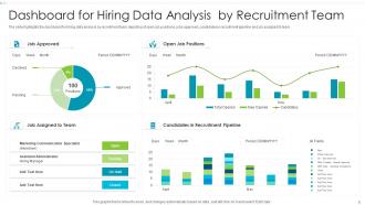
Recruitment Dashboard Powerpoint PPT Template Bundles
-
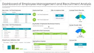
Recruitment Dashboard Powerpoint PPT Template Bundles
-
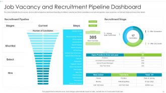
Recruitment Dashboard Powerpoint PPT Template Bundles
-
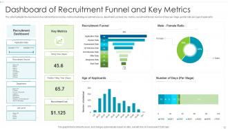
Recruitment Dashboard Powerpoint PPT Template Bundles
-
Recruitment Dashboard Powerpoint PPT Template Bundles
-

Recruitment Dashboard Powerpoint PPT Template Bundles
-

Recruitment Dashboard Powerpoint PPT Template Bundles
-

Recruitment Dashboard Powerpoint PPT Template Bundles
-

Recruitment Dashboard Powerpoint PPT Template Bundles
-

Recruitment Dashboard Powerpoint PPT Template Bundles
FAQs for Recruitment Dashboard Powerpoint
For your recruiting dashboard, definitely track time-to-fill and cost-per-hire first. Source effectiveness is huge too - like which job boards actually work vs just drain your budget. Conversion rates at each stage, offer acceptance rates, and quality of hire scores are solid picks. Oh, and recruiter productivity metrics if you really want to see who's killing it. Candidate experience scores matter more now than they used to. Don't go crazy though - pick maybe 6-8 max or you'll drown in data. Focus on whatever's your biggest headache right now.
Honestly, it's just one place where you can see all your hiring stuff instead of drowning in random spreadsheets. You'll know exactly where each candidate is, which jobs are dragging on forever, and catch problems early. Managing multiple openings becomes way less chaotic. The best part? Your whole team sees the same info - no more awkward "didn't we already talk to this guy?" situations. I'd say figure out what's driving you crazy about hiring right now, then find something that actually fixes those specific headaches. Way better than trying to solve everything at once.
Okay so basically data viz turns those nightmare spreadsheets into charts you can actually read. Like instead of drowning in numbers, you'll see exactly where good candidates come from and which parts of your process are slow as hell. Honestly wish I'd started using it sooner - patterns just jump out at you. Quick example: maybe you think phone screens are fast but the visual shows they're your biggest bottleneck. You can compare how different recruiters perform, spot trends over time. My advice? Pick 3-4 metrics that actually matter to your goals and start there.
Honestly, daily updates are your best bet for recruitment dashboards. Maybe every 2-3 days if you're swamped, but weekly? That's way too slow. Recruitment changes so fast - people bail on interviews, new apps flood in, schedules get flipped around constantly. Using week-old data is like driving with a blindfold on. You'll miss good candidates or accidentally ghost someone because your numbers are outdated. Set up automated daily pulls if you can swing it, or just make it part of your Monday/Wednesday/Friday routine. Trust me, fresh data makes all the difference when you're trying to fill positions quickly.
Honestly, start with whatever you already have access to first. Excel dashboards can be surprisingly good if you set them up right. Google Data Studio is free and handles most recruiting metrics pretty well - I've seen teams get a lot of value from it. Tableau and Power BI are obviously more powerful, but they take forever to learn. If your company already uses an ATS like Workday or Greenhouse, check their built-in reporting first before buying anything new. Figure out which metrics actually matter to your team, then you can always upgrade later. No point getting fancy software if you don't know what you're measuring yet.
Check your dashboard for response times and where people are ghosting you - honestly, the patterns are pretty eye-opening once you see them laid out. Different channels work better for different types of candidates, so start there with your response rates. The automated follow-up reminders are clutch because I always forget otherwise. You'll spot which touchpoints actually get engagement vs. the ones that fall flat. Then just tweak your timing based on what's actually working instead of guessing.
Don't cram everything onto one screen - it's just confusing. Quality matters way more than vanity metrics like "total applications" without conversion rates. I've seen so many dashboards fail because of this. Your data needs to be reliable and actually update regularly, otherwise what's the point? Skip fancy charts if they don't help clarity. Different people need different info too - HR folks want operational stuff while executives care about bigger picture metrics. Honestly, just pick 5-7 key metrics that actually influence hiring decisions and call it a day.
Oh this is actually super useful! So basically it tracks diversity stuff across your whole hiring process - like where diverse candidates are dropping out. The visual data makes patterns way more obvious than just staring at spreadsheets (trust me on this one). You can see gender/ethnicity breakdowns and figure out which job boards actually bring in diverse talent. Plus you can set up alerts when numbers drop below your targets, so you're not scrambling at quarter-end trying to figure out what went wrong. Way better than realizing too late.
So basically you just tweak the metrics and data fields for whatever industry you're in. Tech companies obsess over coding scores and GitHub activity, but healthcare cares way more about certifications and compliance stuff. Manufacturing? They're all about safety records and actual hands-on testing - makes sense when you think about it. You can also mess around with the filters to show job categories, salary ranges, whatever's relevant to your area. Honestly, just ask your hiring managers what their top 5 must-haves are and start there. Way easier than overthinking it.
So basically, recruitment dashboards show you which job posts are actually worth a damn. You'll see stuff like how many applications each role gets, which platforms work best, and how long it takes to fill positions. Like, your Software Engineer post might be killing it on LinkedIn while that Marketing role on Indeed gets zero love. It tracks cost-per-application and conversion rates too - honestly, way better than just blindly posting everywhere and crossing your fingers. You can spot weird patterns, like remote jobs getting way more responses. Then just focus your budget on whatever's actually working and dump the rest.
Tell a story with your numbers instead of just throwing data at people. Lead with the big wins - "we cut time-to-hire by 30% this quarter" - then back it up with details. Your audience matters too: execs want the big picture, managers need team-specific stuff. Honestly, I've made gorgeous charts that nobody cared about because I couldn't explain why they mattered. Don't just email reports and hope for the best - actually sit down with people to review them. Oh, and always throw in 2-3 action items based on what you're seeing in the data.
Dude, real-time analytics are clutch for catching issues before they blow up. You can see which job posts are attracting trash candidates, where your pipeline's getting stuck, and which recruiters are actually doing their job vs. the ones phoning it in. Way better than staring at last month's numbers wondering why everything went sideways. Quick adjustments become possible – shift your sourcing, move budget around, or snag good candidates before they disappear. Though honestly, half the battle is just remembering to actually check the dashboard regularly instead of letting it collect digital dust.
Start with job status, hiring stages, and source channels - those are non-negotiable. Time periods too, obviously. Department and location filters help you slice the data different ways, plus recruiter assignments. The granular stuff is where it gets interesting though - candidate demographics, salary ranges, interview scores. That's how you catch patterns nobody else sees. Oh and definitely set up combo filters so you can dig into weird scenarios like "all the engineering hires we got from LinkedIn last quarter." Honestly just start with the basics and keep adding filters based on whatever your team keeps asking about in meetings.
Honestly, start with the easy stuff - time-to-fill predictions work great once you get your ATS data cleaned up. Machine learning can spot patterns in your hiring history that you'd never catch manually. Like which resume keywords actually lead to good hires, or figuring out the best sourcing channels for different roles. The algorithms get scary accurate at predicting candidate success rates too. I got sidetracked last week reading about this - but anyway, predictive analytics for recruitment is legitimately impressive when you have solid data to work with. Don't overthink it though. Begin simple and build from there.
Honestly, mobile compatibility can make or break your recruitment dashboard. Your recruiters are running around to career fairs, interviews, all that stuff - they can't wait to get back to their desk every time they need to update a candidate status or check someone's profile. I've watched teams get totally stuck because their dashboard only worked properly on desktop. Super frustrating. You'll want something that actually functions well on phones, not just technically loads but is genuinely usable. Otherwise you're creating bottlenecks where everything grinds to a halt until someone finds a computer. Test it thoroughly on mobile before you launch - trust me on this one.
-
Loved the fact that SlideTeam provides clean, high-definition, and professional PowerPoint products.
-
Excellent design and quick turnaround.