


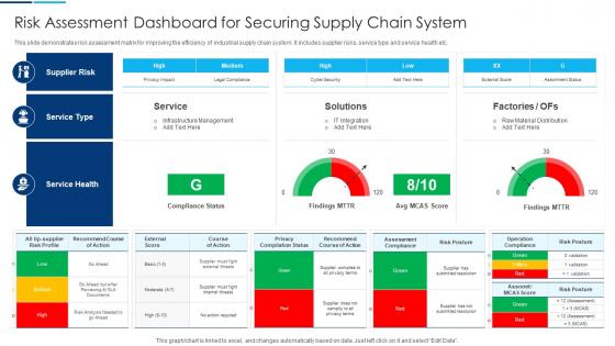
Risk Assessment Dashboard For Securing Supply Chain System




Try Before you Buy Download Free Sample Product
 Impress Your
 Audience
 100%
100% Editable
 Save Hours
 of Time


This slide demonstrates risk assessment matrix for improving the efficiency of industrial supply chain system. It includes supplier risks, service type and service health etc.
People who downloaded this PowerPoint presentation also viewed the following :
Risk Assessment Dashboard For Securing Supply Chain System with all 7 slides:
Use our Risk Assessment Dashboard For Securing Supply Chain System to effectively help you save your valuable time. They are readymade to fit into any presentation structure.





FAQs for Risk Assessment Dashboard For Securing
For your risk dashboard, track these five things: exposure levels by category, probability scores, and impact ratings. Mitigation progress is huge too - I see way too many teams skip this part and then wonder why leadership doesn't trust their risk management. Add trend analysis so you can spot patterns over time. Heat maps work great for quick visual checks. Oh, and real-time updates are non-negotiable. Nothing worse than making decisions off old data when things are moving fast.
So basically, your brain processes visuals crazy fast compared to text - like 60,000 times faster. Color-coded heat maps are perfect for this stuff. Red zones = danger, green = you're good. Traffic lights, arrows showing trends, progress bars - all that works way better than making people dig through boring spreadsheets. Nobody wants to do that anyway. Put your worst risks front and center where people can't miss them. Oh, and stick with the same colors throughout everything so your team doesn't get confused. Honestly, once you see risks laid out visually, going back to text feels ancient.
Honestly, Power BI or Tableau are your best bets if you've got the budget - both are great for risk visualization stuff. Excel works in a pinch (been there), but it gets messy with big datasets real quick. Python with Plotly is amazing if you're into coding and want full control. Google Data Studio's free and decent for basic needs. R with Shiny's solid too but maybe overkill? First thing though - figure out what risk metrics you actually need to track. Then just pick whatever matches your team's skills and wallet. Don't overthink it.
So you'll want to tweak the risk categories and metrics to fit whatever industry you're in. Healthcare folks obsess over patient safety stuff, while manufacturing is all about operational hazards and supply chain nightmares. Most platforms let you build custom risk taxonomies and set your own thresholds. Map out your top 10 industry risks first - that's honestly the best starting point. Then configure your dashboard around those. You can pull in industry-specific data sources too, which is pretty clutch. Really though, just think about what actually stresses out your leadership team and build from there.
Honestly, the color coding thing is huge - red for danger, green for good, you know the drill. Heat maps are perfect for spotting patterns across departments or over time. Just don't cram everything into one view because it gets overwhelming fast. Keep your most important stuff at the top where people actually look. I learned this the hard way - consistent scales are a lifesaver so your team isn't constantly confused about what the numbers mean. Real-time updates are clutch too. Nobody wants to make decisions based on last week's data, right? Progressive disclosure works great for the detailed breakdowns.
Honestly, I'd go with weekly updates as your baseline - that seems to hit the sweet spot for most situations. Daily is better if you're dealing with cybersecurity or finance stuff where things change fast. But weekly works fine for more stable operations. Just whatever you pick, stick with it consistently. Stale data is worse than no data sometimes, trust me on that one. Oh, and definitely set up automated feeds if you can - manually updating dashboards gets old real quick. You can always adjust the frequency later once you see how fast your risks actually shift around.
Dude, you NEED stakeholder feedback or your dashboard will just sit there collecting digital dust. I've watched so many beautiful dashboards get completely ignored because nobody bothered asking users what they actually needed. Get them in regular feedback sessions - find out if your risk metrics make sense, if the visuals are confusing, what's missing for their decisions. They'll tell you which risks to spotlight and help you tweak those alert thresholds. Trust me, their pain points are pure gold for making something people will actually use instead of another pretty but useless tool.
Honestly, risk dashboards are total lifesavers. Instead of drowning in spreadsheets (ugh), you get all your key data visualized in one spot. Real-time risk levels, side-by-side comparisons - it's all there. You'll spot patterns way faster and actually know which fires to put out first versus what can wait. The best part? When you're pitching to leadership, visuals make your case so much stronger. I mean, nobody wants to stare at rows of numbers in a meeting. They cut through that whole "analysis paralysis" thing too, which honestly happens to everyone.
Look at what's actually threatening your business right now. Financial stuff hits hardest - cash flow problems, blown budgets, regulatory fines that'll make your CFO cry. Then tackle operational risks because they snowball fast. Supply chain breaks down? Your whole operation's screwed. Strategic risks are trickier to pin down but don't ignore them - market changes can blindside you. I'd honestly skip the urge to monitor every possible disaster. Pick your top 5-7 in each area, the ones that'd genuinely panic your leadership team. You can always expand later once you've got the big threats covered.
Honestly, most people try to cram way too much info on one screen. Creates total analysis paralysis. Test with real users first - you'll catch weird stuff like using red for something that isn't actually urgent (seriously confusing). Short sentences work better than long ones. Don't assume stakeholders know what "medium risk" means to them specifically - some think it needs immediate action, others think it can wait. Oh, and stick with consistent colors throughout. I've seen too many dashboards that look like a rainbow threw up on them. Keep it simple and you'll be fine.
So predictive analytics switches your risk dashboard from "here's what happened" to "heads up, this might happen soon." You'll see forecasts instead of just current numbers - way more helpful honestly. Historical patterns help it spot emerging problems before they blow up. The system ranks risks by urgency and calculates odds for different scenarios. My advice? Set up alerts for when risks are trending upward. That way you're not scrambling to fix fires, you're preventing them. It's basically having early warning systems that actually work instead of those useless "everything's fine until it's not" dashboards.
Look, you really can't mess around with outdated data when it comes to risk management. Threats pop up constantly, so you need to spot them right when they happen - not hours later when the damage is done. Think of it like this: using old data is basically like trying to drive by only looking in your rearview mirror. Pretty sure that won't end well! With real-time feeds, your dashboard can flag weird stuff immediately and automatically alert you when things cross dangerous thresholds. Actually prevents problems instead of just documenting the mess afterward. I'd start with your biggest risk factors first and get those hooked up to live data sources.
Dude, if people can't figure out your risk dashboard in like 5 seconds, you're screwed. They'll either completely ignore it or make terrible decisions because they're confused. I've literally watched teams build these gorgeous dashboards that nobody used - turns out the red alerts didn't actually mean what anyone thought they meant. Pretty embarrassing honestly. You want the scary stuff to jump out immediately, with super clear navigation that doesn't require a PhD to understand. Test it with real users first though, because what makes sense to you might be total gibberish to everyone else.
GDPR and CCPA are massive - you can't mess around with those when dealing with risk data. Set up solid access controls and audit trails because regulators are obsessed with documentation. SOX applies if you're public, PCI-DSS for payment stuff, HIPAA for healthcare risks obviously. Document how your risk scores work for transparency - sounds boring but it'll save your butt later. Oh and retention policies need to match legal requirements. Honestly, loop in your legal team now rather than scrambling to fix compliance issues down the road.
Honestly, start with baseline numbers before you launch anything - otherwise you're just guessing later. Track response times to see if your team's catching risks faster than before. User adoption is huge too because what's the point if everyone ignores it? I'd also watch whether you're spotting issues earlier in the pipeline and if stakeholders actually make smarter calls with your data. Oh, and don't just check once - compare monthly trends to see what's really working. The dashboard might look amazing but results matter more.
-
Editable, diversified, compatible with MS PPT and Google Slides, and on top of that finest graphics!! I mean in the words of the famous Ross Geller, “What more do you want!”
-
Mesmerized with the fantastic collection! Super sleek, relevant infographics.