


Sales dashboard revenue cross selling strategies ppt pictures





Try Before you Buy Download Free Sample Product
 Impress Your
 Audience
 100%
100% Editable
 Save Hours
 of Time


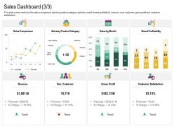
This slide covers metrices like sales comparison, sales by product category, sales by month, brand profitability, revenue, new customer, gross profit and customer satisfaction
People who downloaded this PowerPoint presentation also viewed the following :
Sales dashboard revenue cross selling strategies ppt pictures with all 2 slides:
Use our Sales Dashboard Revenue Cross Selling Strategies Ppt Pictures to effectively help you save your valuable time. They are readymade to fit into any presentation structure.
FAQs for Sales dashboard revenue cross selling
Honestly, just stick to what actually matters for making money. Revenue and conversion rates are obvious ones. Pipeline value and how long your sales cycle takes - those two will save you from nasty surprises. Win/loss ratios show you what's working (or what's completely broken). Average deal size matters too. If you're managing people, track lead sources and individual performance or you'll be flying blind. I used to get caught up in fancy dashboards with 20 different charts, but most of that stuff is just noise. Focus on metrics that help you sell more or catch problems before they get worse.
Honestly, charts and graphs are a game-changer for sales dashboards. Your brain just processes visuals way faster than scanning through endless spreadsheet rows - like, who has time for that? Heat maps show territory performance instantly, and trend lines make monthly patterns super obvious. You'll spot problems and opportunities without having to dig through hundreds of numbers. I started with simple bar charts instead of those massive data tables. Made such a difference. Raw numbers are boring anyway, but when you can see patterns at a glance? That's when dashboards actually become useful instead of just overwhelming.
Don't try to squeeze every metric onto one screen - seriously, less is more here. Put your big KPIs like revenue and conversion rates right at the top. Bar charts and line graphs work way better than those spinning pie charts (honestly, who even likes those?). Make sure the data refreshes often enough to actually matter. Group similar stuff together and stick with the same colors throughout so it doesn't look like a rainbow threw up. Oh, and test it with real users first - you'll catch all the weird stuff that seemed obvious to you but confuses everyone else.
Daily updates are your best bet, though real-time is even better if you can swing it. Most teams I know do it first thing in the morning - makes sense since nobody wants to base decisions on last week's numbers. Weekly is bare minimum but honestly you'll miss way too much. The trick is getting fresh data without driving everyone crazy with constant changes. Oh, and if your system keeps crashing with real-time updates, don't force it. Start daily and see how it goes. You can always dial it back if your team gets overwhelmed.
Honestly, dashboards are game-changers for forecasting. Look at your year-over-year stuff first - that's where the gold is. Then dig into monthly patterns to see what's actually happening with your sales cycle. The charts show you seasonal trends and which lead sources convert (some are total duds, trust me). Pipeline velocity and close rates help predict what's coming down the pipe. Way better than throwing darts at numbers. I'd start there and work backwards - you'll spot trends you never noticed before.
Yeah so it really depends on your industry. SaaS companies obsess over MRR, churn, and how many trials actually convert to paying customers. Manufacturing is totally different - they care about order volume and regional pipeline stuff. Retail's all about inventory turnover and same-store sales since they're dealing with way faster cycles. Real estate tracks lead sources and deal sizes, which honestly makes sense given how long those deals take. The trick is figuring out what KPIs actually matter for your specific business instead of just copying some random template online.
Real-time data makes or breaks a sales dashboard, honestly. You'll catch trends the moment they shift and pounce on hot leads before your competition even knows they exist. Course-correcting becomes automatic instead of reactive - way better than scrambling when things go sideways. Yesterday's pipeline data? Useless when deals move this fast. Your integrations need to be rock-solid though, otherwise you'll spend half your time wondering if the numbers are actually current. Oh, and set up alerts for whatever metrics your team obsesses over most.
Honestly, connecting your CRM to a sales dashboard isn't too bad. Most tools like Tableau or Power BI already have connectors for Salesforce, HubSpot, etc. Just use their APIs or built-in integrations. The best part? Everything syncs automatically so you're not constantly switching between apps - which gets old fast. I'd start by figuring out what metrics actually matter to your team first. Then set up the data flows to pull just those numbers. Way less overwhelming that way. Once it's running, you'll have real-time pipeline data without the manual updating headache.
Honestly, the biggest mistake I see is cramming every metric onto one screen. Total information overload. Focus on what actually matters for decisions - conversion rates, how fast deals move through your pipeline, quota numbers. Skip the vanity metrics that just look pretty but tell you nothing useful. Also make sure your data refreshes regularly (nobody wants last week's numbers). Oh and this might be obvious, but your team should be able to read it without squinting at tiny charts or needing a translator. I swear some dashboards look like they're designed by engineers for other engineers. Keep it clean and actionable.
Honestly, mobile dashboards are a game changer for sales teams. Your reps can check pipeline updates and close deals while they're grabbing coffee between meetings instead of being stuck at their desk all day. Real-time data access means faster decisions - no more "let me get back to you on that" responses. Plus everyone stays on the same page with goals and metrics. I've seen teams get way more competitive when they can track their numbers throughout the day (kind of addictive actually). Start with whatever reports your team pulls up most on desktop and make those mobile-friendly first.
Start with time filters - daily, weekly, monthly views so you can actually see what's trending. Geographic breakdowns are huge too, especially if you've got multiple territories. I'd definitely add product categories and sales rep filters since individual performance matters a lot. Customer segments are another big one - enterprise deals vs small business are totally different animals. Pipeline stages help you figure out where stuff gets stuck (usually happens more than you'd think). The real magic is combining filters - like viewing Q3 enterprise deals by your top rep in the northeast region. That's when the data actually tells a story.
So access control is basically what keeps your sales dashboard secure - it decides who can see what data. You'll want role-based permissions where reps only see their own territories, managers get the team view, and execs see everything. Sales data is super valuable stuff that competitors would kill for, honestly. The sharing features are great for sending dashboards to clients without showing your internal numbers. Oh and definitely audit those permissions regularly - I've seen companies get sloppy with this. Just give people what they need for their actual job, nothing more.
Dude, sales dashboards seriously work wonders for team motivation. Real-time numbers create this natural competition - nobody wants to be stuck at the bottom of the leaderboard. Your team stops guessing where they stand since everything's right there. Managers can catch problems early too, which is huge for coaching. I'd definitely include both individual stats and team goals so people feel responsible but still part of something bigger. Oh, and transparency beats those awkward month-end surprise conversations every time. Trust me on this one.
Definitely share that dashboard with other teams - it'll save you so many headaches. Marketing can finally see what's actually converting (not just clicks), and customer success gets a heads up on accounts going sideways. Finance loves the real-time revenue stuff too, way better than those painful month-end scrambles. Just customize the views so each team sees what matters to them - nobody wants to wade through random sales metrics. Oh, and those monthly review meetings? Total pain to schedule but worth it for keeping everyone on the same page. Seriously breaks down all that weird territorial stuff between departments.
So for sales dashboards, I'd go with Power BI first if you're using Office 365 already. Integrates super well with Excel and your CRM stuff. Tableau makes gorgeous charts but man, it gets expensive quick. Google's Looker Studio works great for basic dashboards and it's free to start - definitely worth testing out. Oh, and don't torture yourself building something in Excel from scratch unless there's literally no other option. I made that mistake once and it was a nightmare to maintain. Start with Power BI or try Looker's free version first.
-
Excellent products for quick understanding.