

Spend Category Analysis And Management Dashboard Procurement Risk Analysis For Supply Chain




Try Before you Buy Download Free Sample Product
 Impress Your
 Audience
 100%
100% Editable
 Save Hours
 of Time


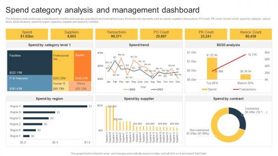
The following slide showcases a dashboard to monitor and evaluate spending in procurement process. It includes key elements such as spend, suppliers, transactions, PO count, PR count, invoice count, spend by category, spend trend, 80 20 analysis, spend by region, spend by supplier and spend by contract.
People who downloaded this PowerPoint presentation also viewed the following :
Spend Category Analysis And Management Dashboard Procurement Risk Analysis For Supply Chain with all 7 slides:
Use our Spend Category Analysis And Management Dashboard Procurement Risk Analysis For Supply Chain to effectively help you save your valuable time. They are readymade to fit into any presentation structure.






FAQs for Spend Category Analysis And Management Dashboard Procurement Risk Analysis
So basically you're trying to find where you can save money, build better relationships with suppliers, and cut down on risks. Pull your spending data from the past year or so first - that's honestly where everything clicks into place. You'll start seeing duplicate suppliers you didn't even realize you had, plus you can bundle purchases to negotiate way better deals. It's like finally cleaning out that junk drawer and realizing you bought the same thing five times! You can also see which supplier categories need your attention right now vs. the ones that are actually working fine. Benchmarking against market rates helps too.
So basically, you group all your spending - office supplies, software, travel, whatever - and look for patterns. Honestly, it's wild what you'll find when you actually dig into 12 months of data. Like, why are we paying three different prices for the same printer paper? You'll spot unused subscriptions, departments buying duplicate stuff, all kinds of waste. Think of it as organizing that junk drawer that's been driving you crazy. Once everything's categorized, you can negotiate better deals or just cut the random stuff nobody needs. The patterns that pop up will genuinely surprise you.
Okay so you'll want all your procurement stuff first - purchase orders, invoices, supplier contracts. Your ERP system has the transaction details you need. Credit card statements matter too, even those random Staples runs (trust me, they add up fast). Pull your budget and GL data to see where you're off track. Oh and clean everything up before you start analyzing - messy data will just waste your time. I'd grab a full year of spend data so you can actually see patterns. Supplier master data helps keep things organized too.
Start with your biggest spending categories - that's where the real money is. Hit your top 10-15 that probably eat up like 70-80% of your budget. But here's the thing - sometimes smaller categories jump the line if they're risky. Single suppliers or contracts about to expire? Those need attention even if the spend isn't huge. Honestly, I'd go after the obvious problems first - stuff that hasn't been touched in forever or categories you know are messy. Make a simple scoring sheet: spend size, risk level, how much work it'll take. Boom, you've got your roadmap.
Most places use procurement platforms like Coupa, Ariba, or Jaggaer. SpendHQ and Zycus are solid for spend analytics - the automated categorization actually works pretty well and saves hours of boring manual work. Excel's still everywhere for random analysis stuff. Some teams do dashboards in Tableau or Power BI. Honestly though, clean data matters way more than whatever fancy tool you pick. I'd check what your finance and procurement folks already have running first. You can probably just build off that instead of convincing someone to buy new software (good luck with that approval process).
Look, spend category analysis is basically your secret weapon for supplier talks. Pull your last 12 months of spending data and group it by category - this gives you real ammunition when negotiating. You'll see exactly where your money's going and which suppliers are getting too cozy with your budget (major red flag). Some patterns will surprise you, trust me. Use what you find to restructure contracts or consolidate suppliers. Maybe strengthen partnerships with the ones actually performing. The whole point is having actual data instead of just winging these conversations.
Look, without market research you're just staring at numbers in a vacuum. Sure, you see $2M going to some category, but is that good or terrible? No clue. You need that external context to benchmark against industry pricing and understand what suppliers are actually out there. Plus it helps you catch trends before they smack your budget in the face – which honestly happens way too often in procurement. The whole thing shifts you from just reacting to problems to actually planning ahead. I'd start simple though – grab your top 3 spend areas and pull some basic market reports to see how you stack up.
Start with clean data governance - get everyone using the same vendor names and category definitions. Inconsistent categorization kills accuracy every time. I've watched companies waste months because IT called something "tech services" while finance labeled it "consulting" or whatever. Set up automated alerts for weird spending patterns and outliers. Monthly reconciliation meetings are clutch - have your key people review classifications before reports go final. Sounds boring but thirty minutes of validation upfront beats spending your weekend fixing messy data later. Trust me on this one.
Honestly, data quality is going to be your biggest nightmare. All your spend info is probably spread across random systems with zero consistency - good luck with that mess. Then you've got suppliers doing everything under the sun, so where do you even put a vendor handling both your IT stuff AND office snacks? Different departments will fight you on categories too since everyone thinks their way is right. Oh, and procurement teams might get defensive if they think you're criticizing how they've been doing things. My advice? Map out where all your data lives first, then hash out those category definitions before you get too deep into it.
Honestly, spend category analysis is a game changer for sourcing decisions. Break down your spending by category and you'll immediately see where you're bleeding money vs where you actually have some negotiating power. I always tell people to start with their top 10 categories - map out how many suppliers you're using against total spend. That combo tells the whole story. You'll spot consolidation opportunities pretty fast, plus see which categories are too fragmented (probably costing you). It also shows seasonal trends and if you're too dependent on certain suppliers. Kind of like creating your own procurement roadmap, you know?
Honestly, I'd track three main things: cost savings percentage, spend visibility, and how well you're consolidating suppliers. The savings metric is what your boss actually cares about - compare what you're spending now vs. before by category. Then look at whether you can actually see where your money's going (like bumping classified spend from 60% to 85%). Supplier consolidation matters too - fewer vendors usually means better deals. Oh, and if you've got preferred supplier programs, definitely track compliance rates there. I'd check these monthly for the first few months, then quarterly once you're not scrambling anymore.
Honestly, quarterly works best but at minimum do it yearly. Your spending changes so much faster than you'd expect - new vendors, different contracts, priorities shifting all over the place. I've watched companies blow huge savings just because they're using ancient category data from like a year ago. Pretty brutal mistake. Monthly reviews make sense if you're growing fast or dealing with crazy supply chain stuff, but focus on your biggest spend categories first. That's where the real money is anyway. Set some calendar reminders or you'll definitely forget.
Honestly, looking at where your money actually goes is a game-changer for budgeting. You'll catch categories that are secretly draining your account and can move money to stuff that actually matters. I swear, everyone has that random "miscellaneous" category that somehow became 15% of their spending without them noticing. Pull your last three months of expenses and group them into categories that make sense. You'll spot patterns you never saw before and find places to cut back. Way better than just winging it with your budget - though I'm guilty of that too sometimes.
Honestly, just stick to pie charts for category breakdowns and horizontal bars when comparing spend amounts - executives can actually read those fast. Waterfall charts are clutch if you're showing period-to-period changes. Don't get tempted by 3D stuff or wild colors, they're just distracting. I always use consistent colors and call out the top 3-5 categories since that's where all the questions come from anyway. Oh, and put your time period and total spend right in the title. Saves everyone from squinting around trying to figure out what they're looking at.
Honestly, you'll get way better results when procurement actually talks to other departments. Finance knows the budget stuff, IT gets all the licensing headaches, and department heads can tell you what they really need vs what's showing up in the data. Otherwise you're just staring at numbers wondering why everyone's blowing money on random stuff. The context makes all the difference. Set up monthly calls with whoever controls the big spending areas - saves you from those awkward "uh, what is this for?" conversations later.
-
Mesmerized with the fantastic collection! Super sleek, relevant infographics.
-
Easy to use and customize templates. Helped me give a last minute presentation.