


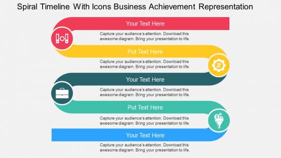
Spiral timeline with icons business achievement representation flat powerpoint design




Try Before you Buy Download Free Sample Product
 Impress Your
 Audience
 100%
100% Editable
 Save Hours
 of Time


It is evident that timeline based presentations are becoming extremely popular in the business world due to their consistency and accuracy, therefore SlideTeam has come up with a spiral timeline with icons enterprise achievement representation flat PPT diagram which has been crafted with modern tools and techniques to provide you and the viewers a great presentation experience. Unlike some monotonous looking slides that make the whole presentation session a bare formality to attend, these templates are equipped with high-quality icons and patterns along with subtle complementary colours to generate interest in the mind of the audience so that the overall process becomes educative and enjoyable. Also, these backgrounds help in keeping the viewers informed about the particular time of an event. Moreover, effective decisions and strategies can also be formed with the help of these timeline illustrations. Hence, keep yourself and your audience up-to-date with these contemporary and performance oriented layouts. No demand is too daunting for our Spiral Timeline With Icons Business Achievement Representation Flat Powerpoint Design. They allow to function fearlessly.
People who downloaded this PowerPoint presentation also viewed the following :
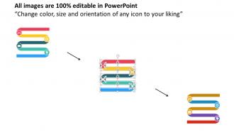
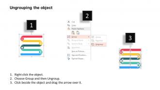
Spiral timeline with icons business achievement representation flat powerpoint design with all 4 slides:
Use our Spiral Timeline With Icons Business Achievement Representation Flat Powerpoint Design like bricks and mortar. Build a strong structure for your thoughts.
FAQs for Spiral timeline with icons business achievement representation
Spiral timeline benefits include enhanced visual engagement, improved information retention, space-efficient design, flexible content organization, and compelling storytelling flow. These presentations streamline complex chronological data by creating memorable visual pathways, enabling clearer milestone tracking, and delivering more impactful narratives, with many organizations finding that spiral formats significantly enhance audience comprehension and presentation effectiveness.
Spiral timelines enhance storytelling by creating visual depth, emphasizing cyclical patterns, and guiding viewers through interconnected narrative phases in a more engaging format than linear presentations. Through curved progression and layered information display, organizations in education, marketing, and project management find that spiral designs improve audience retention, highlight recurring themes, and deliver more compelling visual narratives.
Essential elements for a well-designed spiral timeline include chronological markers, clear data points, visual hierarchy, consistent spacing, and intuitive navigation flow. These components work together by enhancing readability, streamlining information processing, and enabling viewers to follow complex sequences seamlessly, with many organizations finding that strategic visual organization ultimately delivers improved comprehension and more effective stakeholder presentations.
A spiral timeline presents events in a circular, cyclical format that emphasizes recurring patterns and relationships, while traditional chronological timelines display information linearly from left to right or top to bottom. This approach enables organizations to visualize historical cycles, seasonal trends, and recurring business patterns more effectively, with many companies finding that spiral formats enhance strategic planning and reveal cyclical opportunities in market analysis.
Spiral timelines excel when illustrating cyclical processes, recurring patterns, or continuous data flows that repeat over extended periods. They're particularly effective for showcasing seasonal business cycles, product development iterations, financial reporting cycles, and long-term project phases, enabling organizations to visualize recurring trends and dependencies while maintaining chronological clarity for strategic planning decisions.
**INPUT**: What software or tools are recommended for creating spiral timelines? **OUTPUT**: Recommended tools for creating spiral timelines include PowerPoint, Visio, Canva, Adobe Illustrator, and specialized timeline software like Timeline Maker Pro. These platforms streamline visual project planning by offering customizable templates, drag-and-drop functionality, and collaborative features, with many organizations finding that these tools enhance presentation quality and accelerate project communication across teams. [Word count: 54 words]
Color coding in spiral timelines enhances information comprehension by categorizing project phases, distinguishing team responsibilities, highlighting priority levels, indicating status updates, and marking critical milestones. Through strategic color application, organizations streamline project tracking, accelerate decision-making processes, and improve stakeholder communication, with many project managers finding that visual differentiation ultimately delivers clearer oversight and enhanced team coordination.
Common pitfalls include overcrowding events, creating unclear chronological flow, using inconsistent spacing between timeline segments, neglecting visual hierarchy, and failing to maintain readability at different scales. These design challenges can confuse audiences and diminish presentation impact, with many organizations finding that strategic spacing, clear labeling, and consistent formatting ultimately deliver more effective storytelling and enhanced audience comprehension.
Spiral timelines enhance project management presentations by visualizing cyclical phases, iterative development cycles, milestone progression, and stakeholder feedback loops in a dynamic format. Through this approach, project managers can effectively demonstrate agile methodologies, sprint cycles, and continuous improvement processes to executives and teams, ultimately delivering clearer project understanding and enhanced stakeholder engagement.
Spiral timelines excel at representing cyclical historical patterns, evolutionary processes, and recurring themes like economic cycles, political revolutions, technological advancement waves, and social movements. They're particularly effective for showcasing concepts like the rise and fall of civilizations, scientific discovery progressions, and cultural renaissance periods, with many educators finding that students better grasp interconnected historical patterns when visualized through spiral progression rather than linear timelines.
Audience demographics significantly influence spiral timeline design through font size considerations for age groups, color accessibility for visual impairments, cultural reading patterns, and technical complexity preferences. Organizations targeting healthcare professionals use detailed medical terminology spirals, while educational institutions create simplified versions for students, ultimately ensuring information comprehension and engagement across diverse user populations.
Spacing and layout are crucial for spiral timeline clarity, determining visual hierarchy, readability, information density, and logical flow progression. Proper spacing prevents overcrowding while maintaining chronological connections, with many organizations finding that strategic layout choices enhance audience comprehension, streamline complex data presentation, and ultimately deliver more impactful storytelling and decision-making outcomes.
Spiral timelines effectively represent cycles by displaying recurring phases in an ascending or expanding pattern, showing progression while emphasizing repetitive elements like project iterations, product lifecycles, or seasonal business patterns. This visualization enables teams to track cyclical improvements, identify pattern trends, and communicate complex processes clearly, with many organizations finding that spiral formats enhance stakeholder understanding of continuous development cycles, ultimately delivering better project planning and strategic decision-making capabilities.
Creative spiral timeline variations include infographic spirals with visual icons, 3D cylindrical timelines, interactive digital spirals, color-coded categorical spirals, and reverse chronological spirals. These adaptations enhance traditional project management by improving stakeholder engagement, simplifying complex workflows, and enabling better progress visualization, with many organizations finding that customized spiral formats ultimately deliver clearer communication and stronger strategic alignment.
Spiral timelines accommodate multiple layers through strategic visual hierarchy, selective information display, interactive elements, and careful spacing between timeline segments. By using color coding, expandable sections, and progressive disclosure techniques, organizations can present complex project data, milestones, and dependencies in manufacturing, software development, and strategic planning while maintaining clarity and user engagement.
-
Excellent work done on template design and graphics.
-
Unique and attractive product design.