


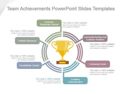
Team achievements powerpoint slides templates





Try Before you Buy Download Free Sample Product
 Impress Your
 Audience
 100%
100% Editable
 Save Hours
 of Time


Cater for fast changing demands with our Team Achievements Powerpoint Slides Templates. Acquire across the board flexibility.
People who downloaded this PowerPoint presentation also viewed the following :
Team achievements powerpoint slides templates with all 7 slides:
Cement the deal with our Team Achievements Powerpoint Slides Templates. Build a firm base for cohesive action.
FAQs for Team achievements
So for your template, definitely throw in the achievement title and dates - basic stuff but necessary. Add who was on the team and what they actually did, because people love getting credit. The challenge you were solving matters too, gives everything context. Here's the thing though - numbers are everything. Put in the percentages, dollar amounts, whatever concrete results you got. Makes it way more believable than just saying "great success" or whatever. Use bullet points so people can scan it quickly. Nobody wants to read a novel about your wins, you know?
Dude, visuals are game-changers for showing your wins. Before/after shots, progress charts, even basic icons - they make people actually *feel* your team's journey instead of just reading bullet points. Short story: nobody remembers boring spreadsheets, but that dramatic comeback graph? Totally unforgettable. Timeline graphics work amazing for this stuff too. Show the struggle, the breakthrough, then boom - victory. Honestly, people get way more invested when they feel like they lived through it with you, not just heard the ending. Make them part of the story.
Don't make it too generic - skip stuff like "great job" and actually say what they did. Also avoid making it crazy complicated because then no one will use it. I'd test it with real examples first, honestly that's the best way to see if it actually works. Keep the format simple so your whole team can fill it out without stress. Oh and tie everything back to actual results when you can - like numbers or how it helped the company goals. The formal corporate language is the worst though. Nobody wants to read that when they're being celebrated.
So basically, you just need to swap out the metrics and language for stuff that actually matters in your industry. Sales teams would track revenue and conversion rates, while healthcare might focus on patient satisfaction or safety incidents. The structure stays pretty much the same though. Honestly, I'd start by figuring out your top 3-5 performance indicators first - that makes everything else way easier. Then just update the visuals and examples to match. Like, don't use manufacturing examples if you're in tech, you know? It's really not as complicated as it sounds once you get going.
Dude, charts and numbers are your best friend when you need to show off what your team accomplished. Executives eat that stuff up! I'd grab like 2-3 metrics that actually matter to the business and turn them into clean visuals. Before/after comparisons work great too. The thing is, anyone can say "we improved things" but when you've got a graph showing 40% faster processing times or whatever, that's hard to argue with. Plus leadership can actually share those visuals in their own meetings - makes you look good by extension. Don't overcomplicate it though, keep the charts simple so the wins are obvious.
Honestly, just tell it like a story - way more engaging than boring bullet points. Start with whatever problem you guys were dealing with (that's your hook). Walk through how you actually solved it, but don't make it sound perfect. Maybe mention a bump in the road or something that didn't go smoothly at first. Those details make it feel real. Structure it super simple: "Here's what was broken, here's what we tried, here's what actually worked." People remember stories way better than lists of accomplishments. Trust me on this one - I've sat through way too many presentations that just drone on with achievements.
Hit them with your biggest win right off the bat - attention spans are brutal these days. I'd go chronological or by impact, whatever flows better for your story. Don't write novels about each thing (1-2 sentences tops). Nobody needs Karen's entire Q3 sales journey, you know? Actually use real numbers instead of that "exceeded expectations" fluff everyone hates. Mix in both team wins and individual stuff so it doesn't look like you're either hogging credit or hiding. Oh, and wrap each section by connecting it to what's coming next - gives people a reason to care about the future too.
Dude, asking your team for feedback is seriously the best thing you can do. People who actually use the template will spot issues you totally missed - like confusing sections or missing info. I learned this the hard way on a project last year. When team members help improve it, they're way more likely to use it right too. Short surveys work great. Just ask what's helpful and what sucks. Do this every few months or after big projects. You'll be shocked at what they catch that seemed obvious to you.
Hey! So for team achievements, I'd go with deep blues and gold accents - super classy combo. Rich greens with white work great too. Clean sans-serif fonts are your best bet here. Montserrat or Open Sans look confident without being too much. Honestly, I've seen too many people use fancy decorative fonts that just kill the professional vibe. Start with your brand colors, then add one accent that shouts "we crushed it!" Oh, and skip anything cutesy - it'll backfire. Keep it simple and let those accomplishments shine.
Yeah, super important actually. Your templates should feel like they belong at YOUR company, not some random workplace. I've seen ones that are totally generic and they just feel fake - like someone copy-pasted from the internet. When you match your company's vibe and mission, people actually care about the recognition. Leadership notices too when achievements tie back to bigger goals. Honestly, I'd start by grabbing phrases straight from your mission statement and working them in naturally. Makes everything feel way more intentional. Your team won't roll their eyes at another hollow "great job" message.
Your template needs different sections - yeah, the obvious wins, but also the quiet stuff like mentoring and problem-solving. Individual achievements AND team assists, because honestly the best work happens when people actually help each other out. Don't use categories that only work for certain personality types - that's just gonna favor the extroverts again. Try rotating who fills it out or do peer nominations so the quieter people get noticed too. I learned this the hard way at my last job. Bottom line: design it so everyone's contributions show up, not just whoever talks the most in meetings.
Honestly, just pick your main format first - digital or print - then work backwards from there. Digital stuff needs bigger fonts (24pt minimum) and high contrast colors since screens can be tricky. Plus you can add hyperlinks to dive deeper into projects, which is pretty cool. Print materials are the opposite - you can get away with smaller text and detailed graphics because people hold them close. Oh, and if you're doing digital presentations, throw in some simple animations. I know it sounds cheesy but movement really does grab attention. Clean layouts with lots of white space work best for print since everything has to pop immediately.
Ditch the PowerPoint, seriously. Interactive timelines are way cooler - Tiki-Toki or TimelineJS let people click through your wins. Notion works great for living dashboards that actually update themselves. Story maps are perfect if you're tracking project stuff. Even basic Canva infographics beat slides every time. Video montages showing before/after? Chef's kiss. Oh, and Miro achievement walls where everyone adds sticky notes are honestly my go-to - though I might be biased since I love anything collaborative. Just pick whatever your team actually uses instead of forcing them into another boring format they'll ignore.
Don't dump all your case studies at the end - that's where presentations go to die. Sprinkle them throughout instead. Open with something compelling that hooks people right away. Then use mini examples for each main point you're making. The formula I like? Problem, what you actually did, then boom - real numbers. Skip the generic "we increased efficiency by 30%" nonsense. Show them exactly how that 30% played out for an actual client. Pick your most impressive win and build around that. Before/after comparisons work great too. Customer quotes hit different than just stating facts.
Dude, you've gotta start thinking interactive - clickable progress bars, real-time metrics, stuff that actually engages people. Mobile-responsive is non-negotiable since everyone's still doing remote presentations. The whole AI personalization thing is blowing up too, where templates auto-adjust based on who you're presenting to. Pretty wild honestly. Static PowerPoint is basically dead at this point. Oh, and accessibility features are becoming mandatory - screen readers, high-contrast modes, all that. Companies are getting serious about it. Start playing around with Figma or Canva's interactive tools now so you're not scrambling later when everyone expects it.
-
Unique research projects to present in meeting.
-
Unique and attractive product design.