


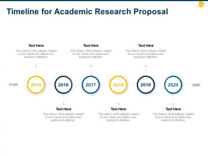
Timeline for academic research proposal ppt powerpoint presentation smartart




Try Before you Buy Download Free Sample Product
 Impress Your
 Audience
 100%
100% Editable
 Save Hours
 of Time


Our Timeline For Academic Research Proposal Ppt Powerpoint Presentation Smartart are topically designed to provide an attractive backdrop to any subject. Use them to look like a presentation pro.
People who downloaded this PowerPoint presentation also viewed the following :
Timeline for academic research proposal ppt powerpoint presentation smartart with all 2 slides:
Use our Timeline For Academic Research Proposal Ppt Powerpoint Presentation Smartart to effectively help you save your valuable time. They are readymade to fit into any presentation structure.
FAQs for Timeline for academic research proposal ppt
Okay so first things first - nail down your start and end dates, then work chronologically. Highlight the big milestones and deliverables but keep descriptions short. I swear, half the timelines I see are such a mess you can't even follow them! Use consistent formatting and throw in some colors or icons to separate different activity types. Dependencies between tasks are huge - don't skip those. Think about who's reading it too. Your boss wants the 30,000-foot view while your team needs all the nitty-gritty details. Oh, and always pad some buffer time because stuff will go wrong. Mark your critical path items clearly since those can totally wreck your timeline if they slip.
Honestly, visuals are a game-changer for timelines. Nobody wants to read through a boring list of dates - your brain just checks out after like three entries. Icons and color-coding help people actually remember stuff. Maps showing how borders changed, portraits of important people, even just using different colors for themes makes everything click better. You'll spot connections between events that you'd totally miss otherwise. Oh, and definitely add at least one visual element per major period or people will zone out. Makes the whole thing feel less like homework, you know?
Honestly, Timeline JS is probably your best bet to start with - it's free and works great with Google Sheets. Just grab their template and you're good to go. Tiki-Toki costs money but the 3D effects are actually pretty slick if you're into that. There's also Sutori and Preceden for more complex stuff, though I haven't used those as much personally. Oh, and if you've got Adobe already, Spark has some decent templates too. I'd mess around with the free Timeline JS first before spending any cash - might be all you need anyway.
Depends on who you're showing it to, honestly. Executives? Go with a clean Gantt chart - they want the big picture fast. Your team needs details though, so interactive ones work better since people can click around. I've watched so many projects get derailed by overly fancy timeline formats that nobody understands. Simple wins every time. Monday or Asana are solid for dependencies and resources. But if you're doing something more story-driven or historical, throw in some visuals. Oh, and here's what actually works - figure out your end goal first, then build backwards from there. Saves tons of headaches later.
Honestly, the worst thing you can do is cram way too much stuff onto one timeline - people's eyes will just glaze over. Make sure your time intervals actually make sense too. I've seen so many where the spacing is all random and it throws off the whole flow. Super annoying when you're trying to follow along. Also, you gotta include real dates! Not just "Phase 1, Phase 2" - like, when did this actually happen? Keep descriptions short and pick one format, then stick with it. My advice? List out your main events first, then worry about making it look good.
Just throw your key milestones on a timeline - way easier than staring at those soul-crushing bullet point lists. Mark your big deadlines and decision points so everyone knows what's coming. Different colors work great for separating teams or workstreams. Oh, and definitely flag dependencies because that's where things usually go sideways. Honestly, I'd start with just the absolute must-haves first. You can always add more detail later once you've got the bones of it down. It becomes this nice visual roadmap that actually makes sense to people.
Dude, timelines are seriously a game-changer for writing. They help you catch plot holes early and track how your characters develop. I'm always spotting cause-and-effect issues I'd miss otherwise. Super helpful for complex stuff with flashbacks or multiple storylines - honestly kept me from screwing up my last story when I had two scenes overlapping that totally shouldn't have. You can see where your pacing drags or rushes too. Even a basic visual timeline (like, nothing fancy) will instantly show you what's working and what isn't. Definitely try it next time you're plotting something out.
So here's the thing - people scan timelines totally differently based on where they're from. Western folks expect left-to-right flow, but Arabic and Hebrew readers? They're going right-to-left, basically reading your timeline backwards. Plus some cultures think in cycles rather than straight lines, which makes our typical timelines feel weird. Colors are tricky too - red screams "danger" to some people but means celebration to others. I'd definitely test your design with friends from different backgrounds first. Maybe offer a few viewing options so everyone can actually follow what you're trying to show them.
Here's my rewrite: Color coding is seriously a game-changer for timelines. Assign different colors to whatever makes sense - departments, project phases, priority levels, you name it. People can instantly understand what they're looking at without reading every single label. The trick is being consistent with your colors throughout. Oh, and don't create a rainbow nightmare! Three to five colors tops. I learned this the hard way when I went color-crazy on a project timeline once. Pick your scheme upfront and throw in a legend so everyone knows what's what.
Yeah, most timeline tools are pretty user-friendly for adding stuff - just drag and drop videos, images, audio, whatever. YouTube links work great, or you can pull from Google Drive. Honestly, short video clips are my favorite because they make boring historical events actually interesting. Photos and document scans work well too. Oh, and if you've got interview recordings, those add a nice personal touch. Just don't go overboard with the multimedia - I'd stick to maybe one or two types per timeline so people don't get distracted. The media should actually help tell your story, not just look pretty.
Honestly, timelines are like your roadmap for the whole school year. Map out your big milestones first - when you're doing major units, tests, all that stuff. Then fill in the smaller details. They're super helpful for pacing lessons and showing kids what's coming up (though yeah, most won't actually check). I always build in buffer time because something always goes sideways - fire drills, snow days, whatever. You can coordinate better with other teachers too. Oh, and don't make it too rigid or you'll stress yourself out when things shift around.
Definitely group your small tasks under the big milestones first. I'd start with those major phases, then sprinkle in just enough detail so people can see what depends on what. Honestly, I used to cram every little subtask in there and it was a disaster - nobody could follow it. Try using bold for your main milestones, then regular text underneath for the key stuff. Save all the nitty-gritty details for a separate doc you can pull out if someone asks. Your timeline should tell the whole story in one look, not make people's brains hurt.
Okay so Nike's "Just Do It" 30th anniversary thing was actually genius - you could scroll through decades of their ads. Spotify does this too with their year-end Wrapped, basically turning your music into a personal story. Airbnb had users click through different travel eras which was pretty cool. Those "evolution of" campaigns are simple but they work. Honestly though? You don't need crazy tech. A good Instagram carousel or LinkedIn series can totally work. The main thing is making it feel like an actual journey instead of just boring dates in a row.
Okay so basically you've gotta match your timeline to whoever's looking at it. Kids need bright colors and simple stuff - like "last week" instead of actual dates, you know? Don't overcomplicate it. But for work people, pack in the details and use proper terminology. I swear I've sat through so many exec presentations that looked like coloring books though lol. Short sentences work great. Then mix in longer ones that actually flow naturally when you're explaining the complex parts. Really think about what level of detail they need to make their decisions. Start there and work backwards.
Okay so chronological works best when timing actually matters - like showing how one thing led to another or tracking project milestones. People can follow the flow super easily. But thematic? That's your go-to when you're comparing different categories or highlighting patterns that don't care about strict time order. Honestly though, I've watched people stress way too much about picking the "perfect" one. Sometimes mixing both approaches just works better - don't overthink it. Just ask yourself: does the when matter most, or the what? That'll tell you which direction to go.
No Reviews