


Venn diagram 4 pieces powerpoint presentation slides
You must be logged in to download this presentation.




Try Before you Buy Download Free Sample Product
 Impress Your
 Audience
 100%
100% Editable
 Save Hours
 of Time


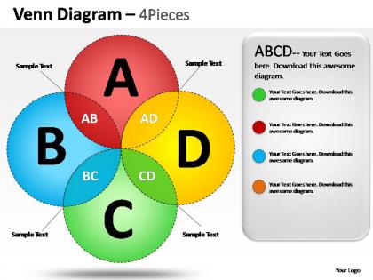
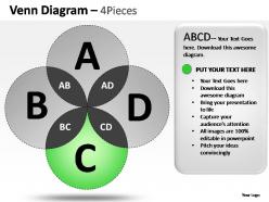
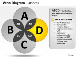
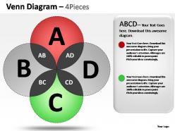
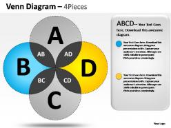
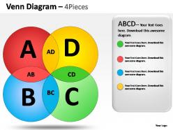
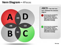
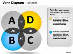
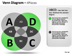
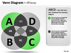
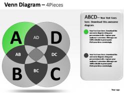
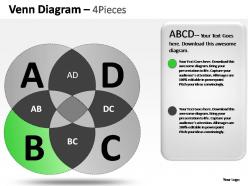
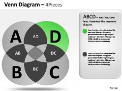
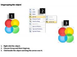
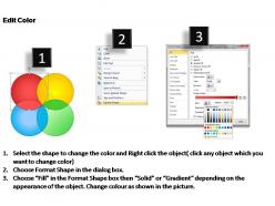
SlideTeam presents "Venn Diagram 4 Pieces Powerpoint Presentation Slides”, PowerPoint slides distinct enough for various business-related presentations, created with the theme of Venn diagrams, this PPT slide is divided into four circular section which is the support system of the process used here and just adjacent to the section is the space provided where you could express your thoughts about that particular process used in the slide. The motive of this PowerPoint slide is to lay down your agenda for expands and growth of the company's business by taking care of its internal or external programs. Our design section stands unique here dividing the circular sections and expressing that there are multiple factors responsible for one process and it is created keeping in mind that the visuals of the presentation must complement this subject. Just one step away is our “Venn Diagram 4 Pieces Powerpoint Presentation Slides" at your service for your business and company’s development related presentations.Our Venn Diagram 4 Pieces Powerpoint Presentation Slides are easy to decipher. They project your thoughts bright and clear.
People who downloaded this PowerPoint presentation also viewed the following :
Venn diagram 4 pieces powerpoint presentation slides with all 19 slides:
Our Venn Diagram 4 Pieces Powerpoint Presentation Slides will decorate your day. Your ideas will get due acclaim.

FAQs for Venn diagram 4 pieces
Honestly, Venn diagrams are clutch for this stuff. People see the overlapping circles and immediately get what you're trying to show - no mental gymnastics required. I use them for literally everything now... market analysis, figuring out team roles, comparing product features. Maybe I'm obsessed but whatever, they work! The cool thing is how they make abstract relationships super concrete. Like when you're explaining how different strategies connect, instead of rambling for 10 minutes you just draw some circles. Boom, done. Your audience actually sees the connections instead of trying to visualize your word soup. Trust me on this one.
Okay so Venn diagrams are amazing because people can actually *see* how things connect instead of trying to picture it in their heads. Most of us are terrible at that anyway, let's be honest. The overlapping circles instantly show what's shared, what's different, and how everything fits together. You can throw in some colors too if you want to highlight certain parts. Works best with maybe 2-4 concepts - any more and it gets messy. But seriously, the difference is night and day when you're explaining complicated stuff. Your audience will get it right away instead of sitting there looking confused.
Ok so biggest thing - don't make your circles tiny! You need actual room for text. Colors are tricky too... avoid anything that makes words disappear or look weird together. Been there, done that with the whole rainbow disaster lol. Keep labels short since space is limited. The overlapping parts should make sense logically - not just random stuff thrown together. Oh and never try squeezing full paragraphs into those little intersection spots. Stand across the room to check if you can read it. Double-check your overlaps actually show what you mean.
Okay so color-coding is honestly a game changer for Venn diagrams. Each circle gets its own color, which means people can immediately see what belongs where instead of hunting around for tiny labels. Our brains process colors way faster than text anyway. The overlap areas automatically blend your colors together - boom, instant visual connection. Though don't go crazy with like 8 different colors or it'll look ridiculous. Keep it to 3-4 max, and maybe check that colorblind people can still tell them apart. Trust me, it makes everything so much cleaner.
You want software that lets you resize and overlap circles easily, plus customize colors and transparency. PowerPoint's SmartArt has Venn templates but they're honestly pretty basic. I'd start with PowerPoint's regular drawing tools instead - way more flexible. Just make sure you can group everything together so it doesn't get messy when you move stuff around. Good color contrast matters too if others will see it. Oh, and check that text placement actually works where you need it. If PowerPoint feels too limiting after trying it, something like Lucidchart gives you way more control for the fancy diagrams.
Honestly, mixing Venn diagrams with other visuals makes such a difference. Start with a flowchart to show your process, then hit them with the Venn to highlight those key overlaps. Bar charts are perfect for backing up whatever data you're showing in those circles – people love seeing the actual numbers. One trick I swear by: show a messy table first, then reveal your clean Venn diagram. It's like magic. You can even animate the circles appearing one by one to build suspense (probably overdoing it but whatever). Just don't go crazy with competing visuals. Stick to consistent colors and fonts so everything flows together nicely.
Honestly, business consulting and market research teams use them all the time - like constantly in strategy presentations for customer segments or competitive stuff. Education's another big one. Healthcare and project management too, but really any field where you're showing how different groups connect or overlap. The thing is, people instantly understand what you're getting at without you having to explain it to death (which is rare for presentation slides, let's be real). Got data with natural intersections? Venn diagram will actually keep people awake during your presentation.
Dude, animated Venn diagrams are honestly a game-changer for presentations. Instead of showing everything at once (which makes people's brains shut off), you reveal each circle separately. Then the overlapping parts come in piece by piece - it's like you're telling a story with data. People actually pay attention because there's movement catching their eye. I learned this the hard way after watching too many audiences zone out during static diagrams. Try entrance animations for each section, then maybe use color changes or those little pulse effects to highlight the important overlaps. Works every time.
Definitely introduce each circle separately first - people get lost otherwise. Make sure your colors work for colorblind folks, and honestly, go way bigger on the text than you think you need. Nobody's squinting to read your slides. Walk through it piece by piece: left circle, right circle, then that sweet spot in the middle where things overlap. Don't cram too much in there or it'll look like a mess. Oh, and use examples people actually care about instead of boring theoretical stuff. Build it step-by-step if you can - dumping everything at once just confuses people.
Honestly, stick to 2-3 circles max. Each one represents whatever you're comparing - could be customer segments, time periods, whatever. I learned this the hard way after making some truly awful 5-circle monstrosities that nobody could read. Three circles? Pretty straightforward. Four gets cluttered fast. Beyond that, you're basically torturing your audience. If you need more than 4, just split it into separate diagrams. Way better than having people squint at overlapping chaos while you're trying to make your point. Trust me on this one.
Your audience's background totally changes how they'll read your Venn diagram. Engineers and marketing people? They expect completely different things from data visuals. You've got to switch up your colors, terms, and examples based on who's looking at it. What clicks for one group will confuse the hell out of the other. Cultural stuff matters too - some people read left to right, others don't. Honestly, I'd test it with a few people from your target group first. Or at least show someone who gets their mindset before you present it.
Pick 2-3 groups from your data that actually connect somehow - that's your starting point. Don't try cramming everything in because messy Venn diagrams honestly make my brain hurt. The magic happens in those overlap sections, so focus on percentages or numbers that show where groups intersect. That's literally the whole point of making one. Keep labels short and consistent across circles. I learned this the hard way, but showing relationships matters way more than dumping every data point you've got. The cleaner it looks, the better people will actually understand what you're trying to show them.
Okay so here's the thing - people zone out when you just throw data at them with those circle diagrams. What actually works is turning it into a story. Like, walk them through discovering that your two totally different customer groups actually want the same thing (plot twist!). Build it up like you're revealing something cool in the overlap section. Nobody's gonna remember another boring chart, but they'll definitely remember that lightbulb moment. Structure it so there's some mystery - what's hiding in that intersection? I swear, once you start treating presentations like mini detective stories, people actually pay attention instead of checking their phones.
Honestly, Venn diagrams are clutch for meetings - just pull one up and let everyone fill it in together. Great for comparing solutions or finding where teams overlap (though sometimes people get weirdly competitive about circle placement lol). The visual aspect hooks people way better than just talking through stuff. Don't create it yourself though - that's the mistake I used to make. Let participants shout out where things belong. Start simple with two circles. Build it as you go. Works especially well when viewpoints seem totally opposite but you need common ground.
Oh totally! Interactive ones are everywhere now - you can click around and see different data points animate in. People are also doing way cleaner, minimal designs with subtle gradients instead of those awful chunky circles from like 2010 (thank god). 3D and isometric styles look pretty slick too. Some folks are getting creative with shapes beyond just circles, which is cool. Honestly I'd just browse Canva or Slidesgo's newer templates to see what's hot right now - saves you from having to reinvent the wheel.
-
Awesome Ppt
-
Wonderful templates design to use in business meetings.
-
Qualitative and comprehensive slides.
-
Superbbb
-
excellent