


 0 Comment
 Customer Reviews

Can looking at your costs really help you run and develop your business?
Cost analysis is one of the most important tools organizations have to keep an eye on their expenditure, make the most of their budgets, and boost their profits. It is important for every business, big or small, to use it to make smart financial choices and stay competitive. Cost management is still a major priority for organizations in 2025, and they are putting a lot of money into tracking and analyzing their spending properly.
Access our “Top 7 Cost Dashboard Samples with Examples and Templates” by clicking on the link provided.
The facts speak for themselves: organizations that keep an eye on their costs can enhance their operational efficiency by up to 30% and cut down on wasteful spending by a lot. This shows that a clear and consistent way to look at costs is necessary for long-term success and growth.
Cost analysis dashboards allow you to see important KPIs, spot patterns, and clearly share your results with stakeholders. These dashboards are a systematic and useful method to present complicated data, whether you're making budgets, reporting to management, or planning future investments.
This blog talks about how important cost analysis is for reaching corporate goals. The samples and templates on this page will help you look at your costs, make better use of your resources, and make better strategic decisions. Use these ready-made PowerPoint templates to improve your reports, support your suggestions, and make presentations that leave a lasting impression.
Get your hands on our “Top 7 Project Cost Dashboard Templates with Samples and Examples” by clicking on the link provided.
Use our Top 10 Cost Analysis Dashboard Templates to make financial analysis easier and make choices that will help your business grow and work better.
Template 1: Comprehensive Cost Savings Dashboard for Strategic Business Analysis PPT Template
This PowerPoint presentation has an organized, multi-panel arrangement that summarizes key performance indicators (KPIs), savings measures, cost-avoidance numbers, procurement ROI, supplier performance, and contract benchmarking. It combines quarterly and yearly cost data from many categories, like direct and indirect expenses, and shows them as bar charts and trend lines for easy comparison. Along with percentage changes, procurement ROI shows users how well they are decreasing costs over time. Interactive supplier analysis shows the vendors that save the most money, and contract-level displays show how much the budget is off. This slide deck may be changed in any way and helps financial teams keep an eye on cost-effectiveness, find ways to save money, and report on strategic outcomes.
[product_image id=1464184]
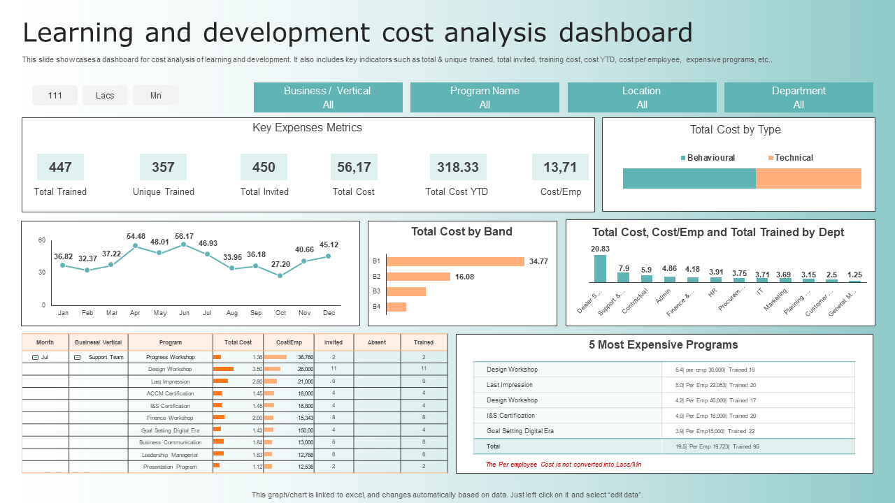
Template 2: Learning And Development Cost Analysis Dashboard
This template shows six important numbers: the total number of people invited, the total number of people trained, the number of people trained who are unique, the cost of training, the cost so far this year, and the cost per employee. It has a list of the most expensive applications and lets you look at the data by business unit, vertical, and region. Visual elements combine these numbers into charts and trend lines that show how spending changes over time. This template gives HR and L&D teams the ability to keep an eye on training costs, compare program prices, and find ways to make things more efficient based on detailed data from all parts of the organization.
Template 3: Supply Chain Management with Cost Analysis Dashboard
This template gives you a multi-panel view of net sales, average cash-to-cash cycle, inventory turnover, procurement ROI, and supplier cost performance. It combines quarterly and yearly cost information from the categories of procurement, warehousing, transportation, and inventory. The template shows the best suppliers based on how much money they save and how much they avoid spending over time. It shows the difference between the budget and the actual costs by comparing the two. All of the charts and tables can be changed and are linked to Excel, so HR and finance teams can change the data points and visualizations. This dashboard helps with strategic cost-efficiency monitoring and making smart choices in supply chain operations.

Template 4: Training Program Cost Analysis Dashboard for Finance Department
This Template gives a clear picture of how much money is being spent on training and how well it is being used. It shows the difference between actual and planned costs, the cost per participant and per training hour, and keeps track of the total number of participants, training hours, and occupancy rates. The dashboard has interactive graphics that show how expenditure has changed over time and per program. This helps finance and L&D teams find programs that cost a lot and keep an eye on the budget. Users can change any part of the data, timelines, and graphics because by linking them to Excel. This template helps businesses plan their budgets, keep track of their performance, and make smart investment choices in corporate training.

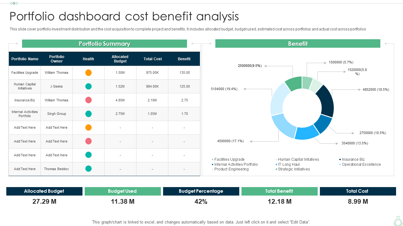
Template 5: Portfolio Dashboard Cost Benefit Analysis
This Template includes important parameters for judging project portfolios. It shows the budget that was set aside, the budget that was used, the expected and actual costs of the project across portfolios. It shows how much money you can save by comparing the costs and benefits of software license and training investments, including budget percentages and cost-effectiveness. You can change the names, figures, charts, and graphs in the slide to fit your needs. It helps with organized financial analysis by showing investment distribution, cost tracking, and benefit insights all in one dashboard style. This lets teams figure out ROI and improve portfolio performance.
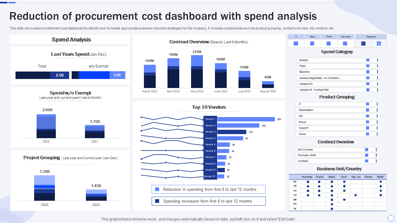
Template 6: Reduction of Procurement Cost Dashboard with Spend Analysis
Here is a Slide that gives you an organized layout that combines tracking containment costs, categorizing procurement spending, and coming up with ways to cut costs. It combines quarterly and yearly expenditure data from all procurement categories, points out the main reasons for costs, and compares budgeted spending to actual spending. The dashboard shows which suppliers are contributing the most to costs and where costs might be cut. You can change any of the charts and tables and attach them to Excel, which lets finance and procurement teams change the data and actions.
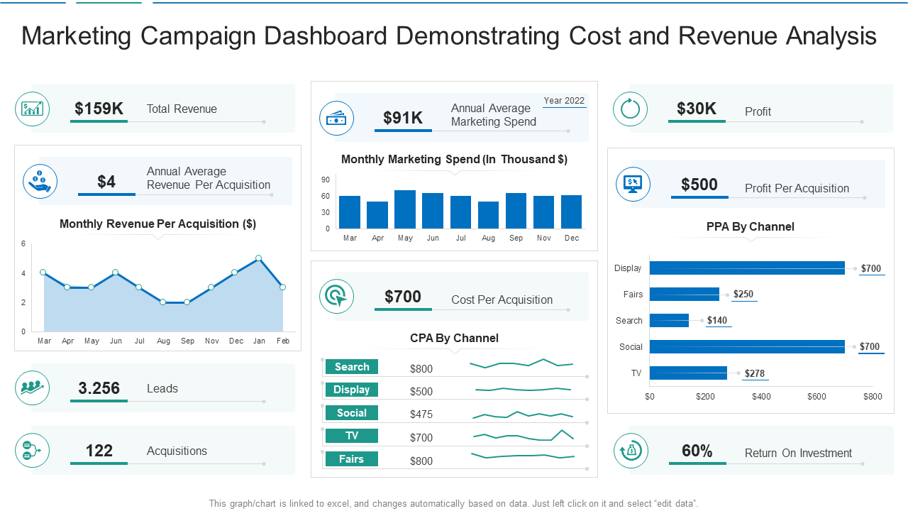
Template 7: Marketing Campaign Dashboard Demonstrating Cost and Revenue Analysis
The ready-made Slide provides you with a single perspective of how well a campaign is doing. It shows how much money was really spent compared to how much was intended, how much revenue was made, how much each lead cost, ROI, and conversion rates across campaigns and channels. Interactive charts let you see trends over time and break them down by target demographic, campaign kind, and time period. You can change the names, costs, income numbers, charts, and pictures on the slide, and it is linked to Excel. This dashboard helps marketing teams keep track of how well they're doing, make better use of their budgets, and make decisions based on facts.
Template 8: Project Forecast Cost Analysis Dashboard Snapshot
This Template gives a clear picture of how much the project is expected to cost compared to how much it actually costs. The slide shows important information such as the estimated cost, the cost analysis of the project by phase, and the organization's financial insights. You can change everything about it, and it has visuals made for slides. This dashboard gives project managers the tools they need to keep an eye on spending trends, compare expected budgets with actual spending, and change projections. This improves financial oversight and helps people make smart choices.

Template 9: Suppliers Return Cost Analysis Dashboard Supplier Risk Management
Here is a Slide that has a structured, multi-panel layout that lets you keep an eye on return costs, supplier performance, and risk considerations. It has parameters like the overall return volume, the cost of returns by category, the average return-rejection rates, and the cost distribution by supplier. Return patterns are shown over time, and risk indicators point out providers that have a high return or a high risk. You can change the names of suppliers, cost parameters, and trend periods in all of the charts and tables. They are all linked to Excel. This dashboard lets procurement and supply chain teams keep track of costs connected to returns, find areas of risk, and use data to make decisions that will improve how they manage suppliers.

Template 10: Customer Acquisition Cost Analysis Dashboard Business Client Capture Guide
This Customer Acquisition Cost Analysis Dashboard template gives you a complete picture of your marketing spending and how well you're getting new clients. It shows the cost per acquisition, the total cost of the campaign, the client capture rate, and the ROI by channel. Interactive charts show trends over time and break them down by campaign, area, and type of client. The presentation is fully editable and linked to Excel, so you may change the measurements, timelines, and graphic components. This dashboard helps marketing and sales teams keep track of how well they're acquiring customers, compare channels, and make decisions about how to spend their money.

Wrapping it Up!
The Top 10 Cost Analysis Dashboard Templates help companies keep track of, analyze, and show cost-related data in a clear way. These dashboards show important data elements like budget vs. actuals, ROI, cost per unit, and savings trends. They cover areas including procurement, training, the supply chain, marketing, and acquiring new customers. Every template comes with charts, tables, and KPIs that you may change to help you make smart choices. These templates can help you keep track of your spending, make the best use of your resources, and make sure your financial plans are in line with your organization's goals.
FAQs on Cost Analysis Dashboard
1. Why is a cost analysis dashboard important for businesses?
A cost analysis dashboard shows all of a business's spending, savings, and budget use in one place, making it easier for them to keep track of their finances in real time. It helps businesses keep expenses down, find areas where they aren't working well, and make sure their expenditure is in line with their strategic goals.
2. What key metrics should be included in a cost analysis dashboard?
Some important measures are the difference between budgeted and actual costs, the cost per unit or employee, the return on investment (ROI), the savings made, the changes in costs over time, and the breakdown of expenses by category. People also often keep track of how well suppliers are doing, how much projects will cost, and how much money they really spend compared to what they planned to spend.
3. How does a cost analysis dashboard help in decision-making?
A cost analysis dashboard shows data in a way that makes it simpler to see patterns, differences, and areas that require work. It helps you make decisions based on data by showing you where to decrease costs, put money into something, or work more efficiently to have better financial results.