


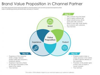
Brand value proposition in channel partner




Try Before you Buy Download Free Sample Product
 Impress Your
 Audience
 100%
100% Editable
 Save Hours
 of Time


This Slide represents brand value proposition in channel partner such as brand, product and experience that helps in identifying products perceived value and ways to market it.
People who downloaded this PowerPoint presentation also viewed the following :
Brand value proposition in channel partner with all 2 slides:
Use our Brand Value Proposition In Channel Partner to effectively help you save your valuable time. They are readymade to fit into any presentation structure.
FAQs for Brand value proposition
Start with one killer sentence that captures what you do differently - that's your foundation. Then build everything around it. You need a clear problem + your solution + what customers actually get out of it. Headlines should scream "the only" or "the first" if you can swing it. Most templates are honestly garbage at this part. Throw in some social proof - testimonials work great. Make sure people's eyes flow where you want them to go. Oh, and talk outcomes, not features. Nobody cares about your fancy dashboard; they care that it saves them 3 hours a week. Keep everything simple and consistent throughout.
Dude, knowing your audience is literally everything for your value prop. Without it, you're just shouting into the void. I always tell people to interview their actual customers first - ask what made them bite in the first place. Then get super specific with your messaging. Don't say "we're innovative" (ugh, everyone says that). Say "we cut your reporting time from 3 hours to 15 minutes." That hits different, you know? The more you nail their exact pain points and speak their language, the more people will actually convert instead of just scrolling past.
Your design is literally doing all the talking before people even read anything. Colors, fonts, layout - they're screaming your brand message whether you realize it or not. Clean, minimal stuff says "we're efficient and no-nonsense." Bright, crazy graphics? "We're the disruptors here." Here's the thing though - sometimes I see brands that totally miss this connection. Their visuals are saying one thing while their copy claims something completely different. Quick fix: write down what your brand actually stands for, then look at your templates with fresh eyes. Do they match up? If not, time to redesign.
Build those unique selling points straight into your template structure - like force people to fill out a "why choose us" slide or competitive advantage section. Most templates are boring as hell and completely skip this part. Add visual callout boxes or icons that literally make presenters highlight what makes your brand different. Oh, and throw in some prompt text as placeholders to guide them toward your key differentiators. The whole point is stopping people from giving those generic presentations that could be about literally any company. You want them to showcase what actually sets you apart, not just ramble through features.
Ugh, don't make it all generic and boring like "innovative solutions" - that stuff makes me want to scroll away immediately. Be super specific about what problem you're actually fixing. I tried targeting everyone once and it was a disaster, so pick your audience. Nobody wants to hear about your 50 slide layouts either. Does it save them time on Sunday night when they're scrambling? Make their pitch deck look less terrible? Help them not bomb that client meeting? Focus on that outcome stuff. And definitely test it with real people first - your friends will lie to you but strangers won't.
Honestly, stories are where it's at for making your value prop memorable. Collect 2-3 solid customer success stories you can tell instead of rattling off features. Our brains just eat that stuff up way more than bullet points. Think of it like your customer's the hero and you're the helpful guide getting them through their mess. Maybe throw in your company's origin story too - people love that behind-the-scenes stuff. Don't just say "we increase efficiency by 40%" or whatever. Tell them about Sarah who used to work weekends and now coaches her kid's soccer team. Way stickier.
Honestly, conversion rates are your best bet - they show if people actually care enough to act on your messaging. Check your landing page performance and email clicks first. Customer acquisition costs matter too since good value props make selling way easier. Net Promoter Score is solid for seeing if customers would recommend you (that's when you know it's really working). Brand awareness surveys help, but I'd probably start with the conversion stuff since it's most direct. Oh, and don't sleep on social sentiment - sometimes you'll catch things there that formal metrics miss.
Honestly, culture changes everything about how people receive your value prop. Your "premium" messaging might sound pretentious in some markets. Colors mean different things too - and don't even get me started on individualistic vs collectivist societies. I've watched companies totally bomb because they just translated their copy without actually rethinking the story. You can't assume what works in the US will work everywhere else. Research the cultural values first, then figure out what pain points really matter to them. One size fits none when it comes to global messaging.
Pick a consistent color scheme and branded fonts first - that's your foundation. Layout templates should guide people to your main message without making them hunt for it. Callout boxes and icons break up text nicely (walls of text are the worst). Animation can highlight key points, but don't go overboard. Honestly, comparison charts and before/after layouts work amazing for showing results. Templates are your friend here. Start with one template family, customize it with your brand stuff, then expand. Visual hierarchy is everything - make the important bits obvious.
Honestly, customer feedback is like a mirror for your value prop - shows you if you're actually hitting the mark. Surveys and reviews are gold mines for this stuff. Social media comments too. You'll often find people love your product for totally different reasons than you expected, which is wild but super common. Look for patterns in how they actually describe what you do versus your marketing speak. Sometimes brands completely flip their messaging after realizing they were way off base. The goal is matching their real language and problems instead of what you assumed they cared about. Then just keep tweaking from there.
Look, competition actually helps you nail down what makes your templates special. Check out what others are doing - their pricing, designs, features - then spot the holes. Maybe everyone's stuck on boring corporate stuff while you could own the creative space? Their weak spots become your goldmine. Plus studying how they talk about their products is huge - if they're all screaming "professional," why not go with something like "effortlessly creative" instead? It's basically free market research that forces you to think harder about your angle. Sometimes you need that external pressure to really figure out what you're bringing to the table.
Think of your value prop as the thread running through everything. All your marketing should tell the same story - messaging, channels, campaigns, the works. Say you're going premium - then your social can't look like it was made on a shoestring budget, you know? Content needs to prove that value, ads should spotlight it, and honestly, your customer experience better actually deliver or people will call BS. The whole thing falls apart if someone sees your slick Instagram ad but then hits a janky website. Consistency is everything here.
Canva crushed it with "Design for everyone" - they basically said "hey, you don't need to be a designer to make cool stuff." Squarespace went all-in on that sleek "beautiful websites" vibe. And Notion? They called themselves the "all-in-one workspace" which honestly was smart because there's like a million productivity apps out there. The thing is, these companies didn't just slap on catchy slogans. Their messaging actually drove how they built their products too. For your templates, I'd figure out what specific problem you're solving that nobody else is tackling, then make that your whole angle.
Officially you should review your value prop every 6-12 months, but that's honestly not enough anymore. I'd check in with customers quarterly and do competitive analysis monthly - markets move crazy fast now. Like, AI basically flipped everything upside down in what, six months? You don't want to get caught with your pants down when some startup comes out of nowhere. Social listening helps too, though I know that's another thing to manage. The real trick is staying connected to your customers so you actually know when their needs shift before your competitors figure it out.
Honestly, personalization is where it's at right now - people want stuff that actually fits their situation, not generic templates. Sustainability messaging is everywhere too (literally every project I touch lately). The bigger shift though? Templates need to handle real-time data and let teams collaborate since remote work stuck around. AI customization is pretty much expected now - not optional anymore. Oh, and interactive storytelling is huge if you can swing it. I'd start by looking at your current templates and see which ones feel stale against these trends. That'll show you exactly what needs updating first.
-
Top Quality presentations that are easily editable.
-
Very unique and reliable designs.
-
Excellent template with unique design.
-
Appreciate the research and its presentable format.