

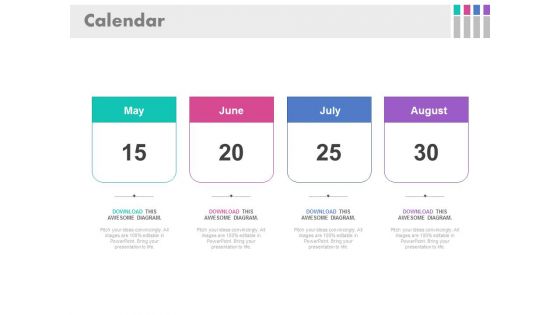
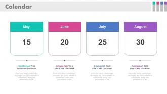
Calendrier avec des mois et des dates spécifiques Slide Powerpoint




Try Before you Buy Download Free Sample Product
 Impress Your
 Audience
 100%
100% Editable
 Save Hours
 of Time


Les calendriers aident les gestionnaires à évaluer le temps futur et à élaborer des stratégies en conséquence. Utilisez donc notre modèle PowerPoint de calendrier avec des mois et des dates spécifiques pour présenter vos informations commerciales d'une manière unique et visuellement attrayante afin de transmettre un message correct à votre public. Vous pouvez utiliser des calendriers de couleurs différentes pour chaque mois en fonction de la quantité d'informations que vous souhaitez afficher à l'aide de notre visuel PPT de calendrier et de date. Les calendriers aident à organiser et à se tenir au courant des événements et des occasions. Il peut être difficile de garder une trace de ce que vous devez faire et quand vous devez le faire. Les calendriers professionnels fonctionnent parfaitement pour les grandes et les petites entreprises, car ils permettent à chaque employé d'avoir son propre calendrier personnel. En incorporant notre diaporama de présentation de calendrier pour garder une trace de vos échéances au sein de votre lieu de travail et également à votre domicile. Cliquez simplement sur cette diapositive au design exceptionnel dès maintenant. Nous vous présentons un modèle PowerPoint contenant des mois et des dates, qui peut être utilisé à diverses fins au bureau, comme la cartographie des dates limites, les dates importantes pour l'organisation et même pour mettre en évidence n'importe quel jour que vous aimez pour une raison quelconque. On est toujours tenu de terminer un travail avant que le client ne demande son produit. Ces délais peuvent parfois créer des tensions dans l'esprit, mais si vous utilisez ce modèle PPT magnifiquement conçu, vous commencerez à aimer les délais. En plus de cela, vous pouvez prendre des notes sous chaque date indiquant la raison de la sélection de la date. Le visuel du calendrier PPT peut être utilisé par les entrepreneurs, les enseignants et les professionnels du marketing et dans les présentations liées aux finances. Un autre aspect de ce graphique est que l'on peut sélectionner une date de priorité sans conserver tout le calendrier. Cela aide à viser les priorités sans informations inutiles. Nous vous offrons l'accès pour personnaliser le PPT. Ne laissez pas les délais vous préoccuper, jouez simplement avec eux, cliquez sur le bouton de téléchargement. L'appréciation est garantie avec notre calendrier avec des mois et des dates spécifiques. Vos efforts généreront de gros applaudissements.
People who downloaded this PowerPoint presentation also viewed the following :
Calendrier avec des mois et des dates spécifiques Diapositive Powerpoint avec les 4 diapositives :
Élargissez votre cercle avec notre calendrier avec une diapositive PowerPoint sur des mois et des dates spécifiques. Il vous sera demandé d'entrer dans le gang.
FAQs for Calender with specific months and
Okay so first thing - map out your timeline with all the big milestones and who's doing what. Don't forget to add buffer time because I swear everything always runs late. Flag any dependencies upfront so you can spot bottlenecks before they bite you. Schedule regular check-ins too, otherwise tasks just vanish into the void. Oh and use different colors for each team or workstream - sounds dumb but it's actually a lifesaver when you're trying to read the damn thing in meetings.
Honestly, visuals are a game-changer for calendar stuff. People can actually see patterns instead of getting lost in endless text blocks. Gantt charts work amazing for project timelines. Color-coding different events? Chef's kiss. Heat maps are clutch if you're showing how busy certain periods get. Icons help too - like little flags for deadlines or whatever. Nobody's got time to decode a wall of dates, you know? Just match your visual to what you're showing. Timelines for sequences, grids when things repeat. Oh, and don't forget legends - people shouldn't have to guess what your colors mean.
Executives and busy teams? Go with visual calendars - colorful blocks they can scan super fast. Detail people love traditional grids where they can scribble notes everywhere. Younger crowds expect interactive digital stuff or they'll literally zone out on static formats (I learned this the hard way). Clean minimal designs work best for client meetings since you don't want to overwhelm them. Really just depends on how your audience thinks - some need visuals, others won't get timing without that structured grid layout. Match the format to their brain, basically.
So for corporate stuff, you gotta hit ROI, deadlines, and how everything ties to their strategy - quarterly goals, project milestones, budget cycles. Education's different though. Focus on learning outcomes and semester schedules instead. Corporate people honestly get impatient with too much detail, so keep it high-level and results-focused. But with educators? You can actually dive deeper into the reasoning behind curriculum choices and learning progressions. They care way more about student development timelines than efficiency metrics. Oh, and match your language to what each group actually wants to achieve - makes a huge difference.
Hey! So first off, don't jam-pack every slide with text - people can't read and listen at the same time. Use big enough fonts that people in the back can actually see (I swear some presenters must have eagle vision or something). Keep it to key dates and milestones only. Color-coding different phases helps a ton - makes everything way easier to follow. Your formatting should stay consistent throughout, and the flow needs to make sense chronologically. Practice beforehand so you don't stumble through it. Oh, and definitely have a backup plan ready because technology loves to fail at the worst moments!
Dude, make it interactive! Add polls where people vote on which dates matter most. Those timeline tools where everyone drags around their own deadlines? Super effective. Oh and definitely do live Q&A - honestly nothing's worse than awkward silence when someone's clearly confused about scheduling conflicts. Break people into small groups to hash out specific timeframes, then have them report back. Interactive beats passive every time. Also those drag-and-drop tools are weirdly satisfying, people actually enjoy messing with them. Bottom line: get them doing stuff instead of just staring at your slides.
Oh my god, yes - color coding will save your life! I assign different colors to teams, project phases, priority levels, whatever makes sense. Your audience can spot patterns and conflicts instantly without squinting at tiny text. Honestly, I've watched people have literal "aha!" moments when a confusing timeline suddenly clicks with the right colors. Stick to maybe 4-6 colors though or it gets chaotic. And definitely add a legend - learned that one the hard way lol. Also test your colors work for colorblind folks, because what's the point if half your audience can't tell red from green?
Think of each quarter like a chapter in a book - what actually happened during Q3? The challenges, weird decisions, surprise wins. Netflix does this brilliantly in their earnings calls (honestly, they make spreadsheets sound dramatic). Connect everything with "because" and "which led to" so people see the real story behind numbers. Your audience needs someone to root for too - maybe it's your scrappy product team or those customers who kept pushing for new features. Oh, and always end with a cliffhanger about next quarter. Makes boring data way more engaging.
Honestly, just go with Canva first - their calendar templates are actually really nice and you won't spend forever figuring it out. PowerPoint works too if you already have it, people don't realize how decent it can look. Google Slides is basically the same thing but free. If you're into design stuff, Figma's pretty cool but might be overkill? Adobe InDesign is like... professional level, probably too much unless you're already familiar with it. Canva's drag-and-drop thing will definitely save you time though, and they have tons of graphics to make it look polished.
Oh man, this stuff gets tricky fast! People scan calendars totally differently depending on where they're from. Like, right-to-left readers will look at your layout completely backwards from what you'd expect. Week starts are all over the place too - Americans love Sunday first, but Europeans start on Monday. Some places use lunar calendars instead, which honestly I never thought about until recently. Color meanings are wild - red screams "danger" here but means good luck in China. My advice? Test with actual people from those cultures and maybe offer different format options. Way better than guessing and getting it wrong.
Honestly, animations can totally save your calendar presentation from being boring as hell. Slide transitions between months look smooth, and hover effects on important dates are clutch. Fade-ins work well for revealing events bit by bit. But seriously - I've watched people go nuts with spinning calendars and it's just... no. Don't do that. Color changes are perfect for status updates, like when pending stuff gets confirmed and turns green. The trick is making animations actually help people follow along, not just adding flashy stuff because you can. Start simple with maybe two effects max.
First thing - grab your big deadlines and milestones, then plot those out chronologically. That's your backbone. After that, you can fill in all the smaller tasks and dependencies around them. Colors are honestly a game-changer here! Different ones for phases, teams, whatever makes sense. I always go way overboard with colors at first but people love being able to scan it quickly. Don't cram everything together though - white space keeps it from looking like a hot mess. Someone should glance at it and instantly get the flow plus critical dates. Oh, and definitely run it by a coworker first before you present!
Color coding is your best friend here - different colors for event types or how important stuff is. Makes scanning super easy. Bar charts work well for showing how long events last, and dots are great for single-day things. Heat maps are actually pretty cool for this (nobody uses them enough) since they show how busy different time periods are. You can also make bigger blocks for longer events or more important ones. Just don't go crazy with colors or it'll look like a unicorn exploded. Stick to maybe 5-7 colors and test it with real data first.
Honestly, get feedback right after each presentation - but actually DO something with it, don't just nod and move on. Ask real questions too, like "Was the timeline confusing?" instead of the useless "thoughts?" Track patterns. Three people saying the same thing? That's what you fix first. I keep a messy little doc of feedback notes... probably overkill but whatever works. Short sentences hit different sometimes. The whole point is making your next calendar walkthrough way less painful for everyone sitting through it.
Definitely share your screen and zoom way in - nobody wants to squint at those tiny calendar numbers. Go with a clean calendar view instead of those cramped monthly grids that make everything look cluttered. Highlight the important dates with colors or whatever so they pop. Oh, and have a backup ready because screen sharing always crashes when you need it most (seriously, why does that happen?). Walk through everything chronologically and keep asking if people can see clearly. Pausing helps too. Your remote teammates will actually thank you for not rushing through the dates.
-
Visually stunning presentation, love the content.
-
Great product with effective design. Helped a lot in our corporate presentations. Easy to edit and stunning visuals.