

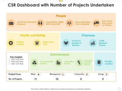
Csr dashboard with number of projects undertaken




Try Before you Buy Download Free Sample Product
 Impress Your
 Audience
 100%
100% Editable
 Save Hours
 of Time


Our CSR dashboard with number of projects undertaken are topically designed to provide an attractive backdrop to any subject. Use them to look like a presentation pro.
People who downloaded this PowerPoint presentation also viewed the following :
Csr dashboard with number of projects undertaken with all 2 slides:
Use our CSR dashboard with number of projects undertaken to effectively help you save your valuable time. They are readymade to fit into any presentation structure.

FAQs for Csr dashboard with number
Track the big three: environmental stuff (carbon footprint, waste, energy), social impact (employee happiness, diversity numbers, community hours), and governance (ethics training, board makeup). Don't go crazy with metrics though - I've watched companies drown in their own dashboards. Maybe 8-12 solid KPIs that your stakeholders actually care about. Also measure both what you're putting in (money/resources) and what's coming out (actual results). Otherwise you can't prove your CSR work is worth anything. The input/output thing is huge for showing ROI.
So first thing - get your team on the same page with how they're measuring stuff. I've seen so many companies mess this up because everyone's doing it differently. Build some automated checks into your dashboard that'll flag weird numbers or missing data before anything goes out. Maybe have someone else double-check the important metrics too? Oh and definitely don't wait until report time to start validating - that's just asking for stress. Set up these checkpoints throughout your whole process so you're catching issues early instead of scrambling later.
Honestly, stakeholder feedback is what drives our whole CSR Dashboard process. Their input shapes everything - which metrics matter most, how we display the data, what features we build first. Pretty wild how much control they actually have over our roadmap. When investors push for clearer ESG scores or community groups want better local impact transparency, we turn that straight into dashboard features. My advice? Document every request you get from stakeholders, even the random ones. Trust me, it makes such a difference when you're building something people will genuinely use instead of just tolerate.
Honestly, visuals are a game-changer for CSR stuff because you can customize them for whoever's looking. Executives want those clean, high-level charts with the big picture metrics. Community folks respond better to infographics - way easier to digest and they actually tell a story. Your internal teams though? They'll want detailed dashboards where they can dig deeper into the data. I swear, some people just love clicking through all the layers. The trick is figuring out what each group actually cares about first, then choosing whatever chart type makes that info stand out. Match the complexity to who you're talking to and you're golden.
Honestly, real-time data is what separates dashboards that actually work from the ones that just sit there looking nice. When sustainability metrics update live, you can catch problems early instead of finding out about them three months later. Stakeholders eat this stuff up too - way more impressive than those boring quarterly PDFs everyone ignores. Your team can pivot strategies immediately when they see what's working (or what isn't). Oh, and the accountability factor is huge. Just figure out which metrics truly need live tracking first, since some things can definitely wait for weekly updates.
So CSR dashboards are pretty clutch - they show you real-time data on how your sustainability stuff is actually doing versus what you promised. Carbon reduction, community programs, employee engagement, all that gets tracked in one spot. Makes it super obvious when there's a disconnect between your goals and reality. Honestly, I've watched companies completely whiff on this when their data's all over the place. The cool thing is you can pivot fast when numbers show you're heading the wrong direction. Oh, and definitely set up alerts for your main KPIs so you're not panicking during quarterly meetings trying to explain why everything's behind.
Power BI or Tableau are your best bets for a solid CSR dashboard - they crush it with ESG data and look professional. Google Data Studio works too if you're watching costs. Honestly? Don't sleep on Excel if you're just starting out. Sure, it gets messy with tons of data, but it's way better than people give it credit for. You'll probably want to connect with something like Salesforce Sustainability Cloud for data collection - though I've heard mixed things about Workiva. Just pick whatever your team actually knows how to use. The coolest dashboard means nothing if Sarah from accounting can't figure out how to update it.
Start with what actually matters to your specific industry - manufacturing? Focus on carbon emissions and supply chain stuff. Tech companies care way more about data privacy and e-waste. Look at what your regulators and investors are breathing down everyone's necks about. Then map those pain points to KPIs in your dashboard. Honestly, benchmarking against competitors is probably your fastest shortcut here - see what metrics they're already tracking and build from there. Every sector's got different stakeholder expectations, so don't just copy some generic template.
Don't cram everything onto one screen - seriously, it gets messy quick. The worst thing you can do is mix vanity metrics with real impact data. Your message just gets lost. And stop making pie charts for everything! Pick the right visual for your data type. Oh, and think about who's actually looking at this stuff. C-suite wants completely different info than your program managers do. Keep your data fresh too - stale numbers will destroy your credibility faster than anything. Honestly, just figure out who your key people are and what they actually need first. That'll save you so much headache later.
So basically, you throw all your sustainability numbers into one dashboard where everyone can actually see what's happening. Carbon emissions, community spending, supplier stuff - whatever matters to your stakeholders. Makes it way harder to just say "we're green!" without backing it up, you know? The real numbers are sitting right there for people to check. You can track if you're hitting targets or totally missing them. Honestly, stakeholders are getting pretty tired of empty promises anyway. Start with the metrics that your people care about most - don't try to track everything at once or you'll go crazy.
So the comparative analytics thing is pretty cool - you can basically see how you stack up against other companies in your industry. I'd start small though, maybe pick 2-3 key metrics and compare those to industry averages first. That's where you'll get the biggest "aha" moments. The dashboard pulls in external data and mixes it with your internal stuff, so you can track things like carbon reduction vs competitors or see which community programs actually give you the best bang for your buck. Honestly, it's wild how much you don't realize until you see the side-by-side comparisons. Super eye-opening for ESG strategy.
You definitely need both for a solid CSR report. Numbers show the concrete stuff - like how much you cut carbon emissions or total volunteer hours. But the stories explain why those numbers matter and how you got there. Honestly, people connect way more with real examples than just data points - though you still need the metrics for credibility. Maybe pair each big stat with an actual story from the field? Like if you report "500 volunteer hours," add what those volunteers actually did. Makes the whole thing way more engaging than just throwing spreadsheets at people.
Quarterly minimum, but monthly's way better if you can manage it. CSR data goes stale super quick - stakeholders don't want to see last year's stuff. Regular updates help you spot problems before they blow up. I've watched so many dashboards just sit there collecting dust because teams only looked at them once a year (such a waste). Your schedule also depends on how fast your initiatives change and your reporting cycle. My advice? Set a calendar reminder and actually stick to it, even if you're just updating the main numbers.
Progress bars work great for CSR goals - like that LinkedIn profile thing but for environmental stuff. Set up leaderboards so departments can compete (people get weirdly competitive about recycling). Badge systems are solid too when teams hit sustainability targets. Point systems where folks earn rewards for volunteering or green initiatives? Chef's kiss. Honestly, the visual element is huge - seeing your progress compared to others just hits different. I'd start with maybe a progress bar and one other thing, see what your team actually uses before building out the whole system.
Yeah so be super careful with personal data in your CSR dashboard - GDPR doesn't care if you call it "just reporting," it's still data processing. Employee demographics, supplier info that could ID people, community stuff? You need proper consent and legal basis for all of it. I've seen companies throw everything in thinking it's fine, but regulators will absolutely come for you. CCPA's got similar rules too. Best move is anonymizing or aggregating whatever you can. Also definitely run it past your privacy team first - learned that one the hard way at my last job.
-
Nice and innovative design.
-
Informative design.
-
Awesome presentation, really professional and easy to edit.
-
Editable templates with innovative design and color combination.