


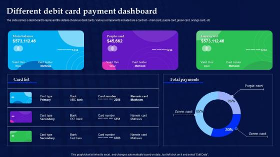
Different Debit Card Payment Dashboard




Try Before you Buy Download Free Sample Product
 Impress Your
 Audience
 100%
100% Editable
 Save Hours
 of Time


The slide carries a dashboard to represent the details of various debit cards. Various components included are a card list main card, purple card, green card, orange card, etc.
People who downloaded this PowerPoint presentation also viewed the following :
Different Debit Card Payment Dashboard with all 7 slides:
Use our Different Debit Card Payment Dashboard to effectively help you save your valuable time. They are readymade to fit into any presentation structure.





FAQs for Different Debit
Start with real-time balance tracking and transaction monitoring - that's what people actually use daily. Spending categories are clutch too, plus search and filtering so users can find stuff quickly. Custom alerts are pretty much mandatory these days. Mobile needs to be lightning fast since everyone's constantly checking their account while waiting in line somewhere. Basic budgeting features are nice but honestly, I'd nail the core dashboard first - balance view and recent transactions. Once that's rock solid, you can add the fancier stuff. Nobody wants to deal with a laggy app when they're trying to see if they can afford lunch!
Dude, real-time monitoring completely changes the game. Your dashboard becomes this live control center instead of just showing old data. Suspicious transactions? You'll catch them instantly and can actually stop fraud before it hits. No more waiting hours to find out someone drained an account - you see velocity spikes, weird merchant stuff, geographic red flags all happening live. Your customers can dispute things right away while they remember what happened (which honestly makes everything easier). Cards get blocked the second something looks off. Oh, and you'll need streaming data pipelines first if you don't have those set up already.
Track your transaction volume, success rates, and average values first - that's the foundation. Authorization declines are huge though, seriously nothing pisses off customers more than cards getting randomly rejected. Processing times matter too, plus you should break things down by location and merchant type to catch weird patterns. Oh and definitely watch your fraud indicators and chargeback rates since those hit your wallet directly. Set up some alerts for decline spikes or processing delays so you're not scrambling later when everything's on fire.
Security needs to be baked into the whole user experience from day one, not just slapped on later. Show people those SSL badges and encryption icons so they actually feel safe. Real-time fraud detection is clutch – just don't make it so aggressive that someone can't buy their morning latte without getting flagged. Multi-factor auth is a must, but keep it smooth. Oh, and please use normal language in your security prompts instead of confusing tech speak. Test everything with real users because what seems obvious to you might be terrible for them.
Honestly, keep it simple with clean fonts and lots of white space - makes everything so much easier to read. Use colors smart, like green for good transactions, red for failed ones. Just don't go crazy or it'll look like Christmas threw up on your screen lol. Make the important stuff like account balances big and obvious. Smaller text for the less critical details. Adding little touches like hover effects is nice but don't overdo it. I'd say nail the basic layout first, then worry about making it pretty later.
So basically you'd feed your transaction history into ML algorithms - stuff like linear regression or decision trees work great. They'll spot patterns in how much you spend, where, and when. Give it about 6 months of data to work with first. The system gets better over time too, which is pretty neat. You can use those predictions for budget alerts or spending forecasts on your dashboard. Start simple with regression before getting fancy with neural networks - honestly those basic models often work just as well for this kind of thing anyway.
Dude, mobile responsiveness is huge for debit card dashboards. People are constantly checking their balance on phones - I probably check mine like 5 times a day tbh. Nobody waits until they get home to see if a payment cleared, especially when you're standing in line somewhere. Most financial stuff happens on mobile anyway. If your dashboard is clunky on phones, users get frustrated fast when they can't quickly pull up transaction history or check balances while shopping. Fast loading is key, and make sure everything works smoothly with thumb navigation.
Set up feedback widgets right after users do stuff like payments or check balances - they're way more likely to respond when it's fresh in their mind. Throw in some pop-ups too, but don't go crazy with them. Monthly user testing sessions are clutch - you can literally watch people struggle with things they'd never mention in a survey. Also add a feedback section somewhere in settings for the people who actually seek that stuff out. Honestly, the trick is just making it super easy for users to give feedback without feeling like you're constantly bugging them. Multiple touchpoints = better data.
Honestly, put transaction history front and center - timestamps, amounts, merchant names, the works. Running balances next to each transaction are a must because everyone wants to see how that purchase hit their account. Good filtering is key too, like sorting by dates or categories without having to click through a bunch of stuff. I'd add visual cues for pending vs completed transactions since that always confuses people. Keep it clean and readable - nobody's got time to squint at tiny text checking if Starbucks charged them twice. Oh, and start simple with a basic table layout. You can always add fancy features later once the core stuff works well.
Honestly, connecting your debit card to budgeting apps is such a game changer. Your dashboard goes from just showing transactions to actually categorizing everything and tracking your budget automatically. When it syncs with something like Mint or YNAB, you'll get alerts before you blow your dining budget - which I definitely need because takeout adds up way too fast. Instead of wondering where your money went, you can see patterns forming in real time. Start with just one app and see how it changes things. The difference is pretty wild once you get used to having all that insight right there.
Definitely encrypt everything - data moving around AND stored data. Set up tight access controls so only the right people can see card details. PCI DSS compliance isn't optional here, trust me the penalties will wreck you. Hide those card numbers in your interface and log every access attempt. Users should get privacy controls to manage what info gets shared. Oh and don't store payment data longer than you actually need it - that's just asking for trouble. I'd start with a privacy impact assessment to spot risks early. Honestly, this stuff can get complicated fast so don't skip the groundwork.
So user segmentation is huge for dashboards - you're basically customizing for how different people actually use their cards. Heavy users want those quick shortcuts and spending breakdowns front and center. Casual users? They need way clearer navigation and more hand-holding. Business folks care about expense tracking while personal users totally ignore that stuff. Oh and age matters too - younger people expect everything mobile-first, older users want bigger fonts on desktop. I'd say figure out your main user types first. Then build different views that match their real habits instead of forcing everyone through the same experience.
Honestly, skip the flashy stuff and make it actually useful. Real-time spending alerts are clutch, plus those expense breakdowns by category so people know where their money's going. Budget tracking that doesn't suck is huge too. Gamification helps - progress bars, savings goals, that kind of thing keeps users engaged. Most banking apps are so boring anyway, so even basic personalization stands out. Push notifications for weird transactions work well. Monthly spending summaries bring people back. The whole point is fixing real money problems, not just making transaction lists look prettier. That's where most apps fail tbh.
So you've gotta show specific data based on what regulators want - real-time monitoring, fraud alerts, dispute workflows, all that stuff. PCI DSS is honestly the worst part because you can't store certain card info, which makes dashboard design way trickier than it should be. Build in audit trails from the start so users can see their transaction history and what actions they took. Oh and don't try adding compliance features later - I've seen that go badly. Just bake it into the UX right away, trust me.
Honestly, I'd go with AI that can actually predict your cash flow from spending patterns - that's way more useful than basic budgeting apps. Real-time alerts that learn how you actually spend money would be clutch. Voice payments could be huge too... just saying "pay rent" and boom, done. Oh, and gamification is underrated - spending challenges or cashback streaks keep people hooked. Maybe throw in easy bill splitting with friends? The whole vibe should feel less like traditional banking and more like having a financial buddy who gets your habits. That's where most apps fall flat tbh.
-
I'm happy to discover your PowerPoint presentations and templates. They met my expectations precisely. Very innovative!
-
Been using SlideTeam for some time now…can’t imagine why I wasted all that time in front of the screen trying to make the perfect presentation.