


Differentiators powerpoint presentation slides




Try Before you Buy Download Free Sample Product
 Impress Your
 Audience
 100%
100% Editable
 Save Hours
 of Time


Create a presentation showcasing your business key differentiators that set you apart from the competitors. Use professionally designed content-ready differentiators PPT presentation templates to jot down major differentiators in your business. Present the unique value that your business offers to the customers with the help of business differentiators PowerPoint presentation slides. These slides will help you to get in the spotlight, increase sales opportunities and drive greater revenue. Get access to the ready-made differentiators PowerPoint presentation slideshow to present how you are better than your competitors. Incorporate this competitor differentiators PowerPoint presentation slide layouts for business and competitor analysis. Show some of your best differentiators that act as a competitive advantage for your business. Make your products look more attractive to the target by adding these ready-to-use product differentiation PowerPoint presentation slides. Develop a position in the eyes of potential customer and give them a chance to see you as a unique brand in the market. Download differentiators PowerPoint presentation slideshow to highlight your unique selling point. Interpret indications with our Differentiators Powerpoint Presentation Slides. Focus on future choices.
People who downloaded this PowerPoint presentation also viewed the following :
Content of this Powerpoint Presentation
Slide 1: This slide introduces Differentiators. State Your Company Name and get started.
Slide 2: This is an Agenda slide. State your agendas here.
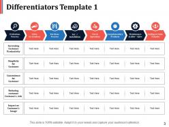
Slide 3: This slide presents the first Differentiators Template with the following points- Evaluation Process, Maintenance & After - Sales, Ending & Value Transfer, Complementary Products, Purchase, Process, Set - / Installation, Use & Operation, Value, Co-Creation, Increasing Customer Productivity, Impact on Customer’s Image, Reducing customer, Customer’s risk, Convenience for Customer, Simplicity for Customer.
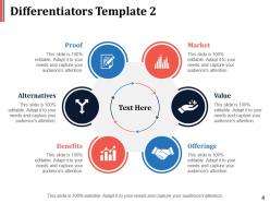
Slide 4: This is a second slide on Differentiators with the following points- Proof, Market, Alternatives, Value, Benefits, Offerings.
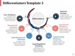
Slide 5: This is the third slide on Differentiators with the following points- User Attributes, Management Attributes, Risk Management Attributes, Legal/Regulatory Attributes, Legal/Strategy Attributes, Operational Attributes.
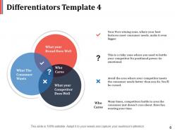
Slide 6: This is the fourth slide on Differentiators with the following points- Who Cares, What your Brand Does Well, What The Consumer Wants, What your Competitor Does Well.
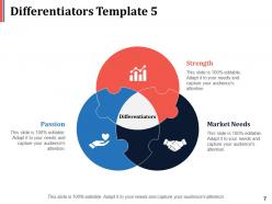
Slide 7: This is the fifth slide on Differentiators with the following points- Strength, Market Needs, Passion.
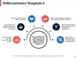
Slide 8: This is the sixth slide on Differentiators with the following points- Review and analysis of the benefits, costs and value that an organization can deliver to its customer, prospective customers within and outside the organization. Which products or service are being offered? What are the benefits the market will derive from the product or service? Value experience or customer experience: what does the market value most? What alternative options does the market have to the product or alternatives? Which market is the value proposition being created? What proof or evidence is there to situation your value proportion?
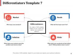
Slide 9: This is the seventh slide on Differentiators with the following points- Needs: What will the buyer use it for? Risks: What does your products do that others don’t? What problem does it solve? Solution: What does your product solve the problem and remove risks? Market: Who buys your product?
Slide 10: This is a Coffee break slide. You can change the slide content as per need.
Slide 11: This is a Differentiators Icons Slide. Use icons as per requirement.
Slide 12: This slide is titled Additional Slides to move forward. You can alter the slide content as per need.
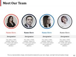
Slide 13: This slide showcases Meet Our Team. Present team structure, specifications with name, designation and image boxes.
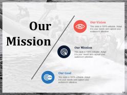
Slide 14: This is Our Mission slide with Our Vision and Our Goals. State them here.
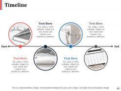
Slide 15: This is a Timeline slide with imagery to show growth, evolution or milestones.
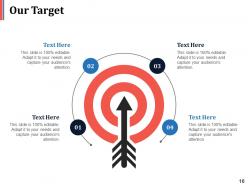
Slide 16: This is Our Target slide. State targets, goals here.
Slide 17: This is Important Notes slide to show important events, reminders etc.
Slide 18: This is a Bulb or Idea image slide to show innovative aspects, information etc.
Slide 19: This is a Puzzle image slide to show sepcifications, information etc.
Slide 20: This slide is titled Charts & Graphs to proceed forward. You may alter the slide content as required.
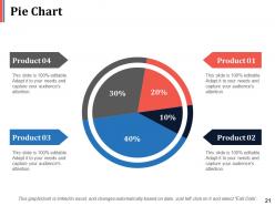
Slide 21: This is a Pie Chart slide to show product/entity comparison, information etc.
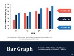
Slide 22: This is a Bar Graph slide to show product/entity comparison, information etc.
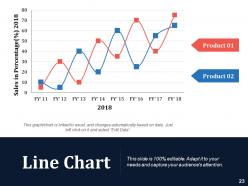
Slide 23: This is a Line Chart slide to show product/entity comparison, information etc.
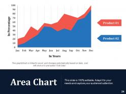
Slide 24: This is an Area Chart slide to show product/entity comparison, information etc.
Slide 25: This is a Thank You slide with Address# Street number, city, state, Contact Numbers, Email Address.
Differentiators powerpoint presentation slides with all 25 slides:
Identify important elements of the doctrine with our Differentiators Powerpoint Presentation Slides. Bring the core concept into clear focus.



FAQs for Differentiators
Honestly, there are three things that really set our templates apart. You can pull live data straight into your slides - no more manual updates every time numbers change. The commenting feature is pretty slick too, way better than just basic sharing. And the brand tools? They'll automatically fix your colors, fonts, logo stuff so everything looks consistent. Most platforms just give you these static templates that look nice but don't actually save you time, which is annoying. I'd mess around with the dynamic features first - that's probably where you'll notice the biggest difference in your workflow.
We actually built these templates by talking to tons of people in different industries - some of those calls were marathon sessions, not gonna lie. Healthcare ones have HIPAA stuff and patient fields already set up. Manufacturing focuses on quality control and safety protocols. Each template comes loaded with the right KPIs and reporting structures for that field. Plus all the regulatory requirements are baked in. Way better than starting from zero - you can just grab one that fits your industry and go. Honestly saves so much time compared to building everything yourself.
Ok so basically our templates work because they guide people's eyes where you want them to look - bold colors, clear fonts, that stuff. The interactive bits are game changers though. Built-in pause points and question prompts actually get people engaged (I was skeptical at first but they really work). We throw in plenty of whitespace so brains don't get fried, and everything's modular so you can swap things around. Definitely start with the poll templates - they get like 40% better participation than regular slides. Worth trying first.
Honestly, just use the drag-and-drop stuff - it's way easier than trying to design from scratch. All the components are already built, so you don't need any actual design skills to make something that looks decent. The visual editors are pretty intuitive too, no coding required. We probably obsess over making the UX smooth more than anything else, if I'm being real. Start with the guided setup thing first though - it'll walk you through everything without dumping a million options on you at once. The templates have good instructions and the defaults actually work well together. Most of the techy language is gone from the interface now.
We update templates quarterly, but the big overhauls happen twice a year. Spring and fall are when you'll notice the biggest changes - honestly, chasing every micro-trend is kind of insane but somehow we keep doing it. In between those major drops, we're tweaking stuff based on what's actually working and what users tell us they want. You'll get pinged through the normal channels when new ones go live. Oh, and bookmark anything you love now because we do axe the old ones pretty regularly to keep things current.
You can totally use the same templates for work stuff and school presentations - just swap the colors and fonts around. We spent way too long figuring out how to make them flexible like that, but it was so worth it. Instead of rebuilding everything from scratch each time, the layouts work for both business meetings and classroom talks. There's professional color schemes for client stuff, plus educational bits like progress bars for training sessions. My advice? Pick one template you like and just customize it for whoever you're presenting to. Way easier than starting over every time, trust me.
So we gather feedback through surveys and support tickets, plus some direct outreach. Then I look for patterns - like if tons of people want better mobile layouts or industry-specific templates. Honestly, I probably spend way too much time digging through user comments, but it's actually super helpful since they come up with ideas we'd never think of internally. Quick wins first though - shows people you're listening. Oh and don't just build what you think they need. Sometimes what users are asking for is totally different from what makes sense on paper. Group the feedback into themes and start there.
Honestly, customization is what sets us apart from other template companies. Most places just give you these rigid designs that you can't really change. We built ours so you can actually adapt everything - colors, fonts, layouts, even how the charts look. And here's the thing: you can do all this without totally breaking the design, which is way harder than people think. The whole idea is making presentations that actually feel like yours, not some random template you downloaded. I'd start with whatever industry template fits your needs, then just mess around with the parts that'll resonate with your specific audience.
Totally! TechFlow used our startup pitch template and landed their Series A - investors loved how the competitor analysis made their edge super obvious. A marketing agency tried our client presentation framework too and got 40% more proposals accepted. The templates basically handle the structure part so you don't have to stress about flow and can just focus on your actual selling points. Oh, and definitely check the case studies section - shows exactly how different companies tweaked the templates for their specific crowds. Way more helpful than me just rambling about it.
So we basically baked the brand stuff right into the template setup. Your color palettes, fonts, layout grids - they're all there automatically pulling from your brand kit. Even if someone's not great at design, they can't really mess up your branding since it's built in. Smart, right? Each template comes with little style guides too, so people actually understand why certain choices were made. Honestly, once you plug in your brand info upfront, the templates handle most of the consistency work for you. Way easier than constantly checking everyone's stuff.
Yeah, so our templates basically work everywhere - iOS, Android, web browsers, desktop apps, the whole deal. We've tested them on everything from crusty old Android phones to shiny new iPhones. Chrome, Safari, Firefox - doesn't matter. The responsive stuff automatically adjusts to different screen sizes, so no weird formatting headaches. Honestly, people still use tablets more than you'd think, so we cover those too. You can design it on your laptop and it'll look solid on someone's phone. Pretty much build once and you're good to go across all platforms.
So we actually build accessibility right into the templates from day one. Proper headings, alt text spots, good color contrast - all that WCAG stuff is already there. Screen reader markup too, plus text that scales well. Honestly, most teams completely forget about this until they have to fix it later (which is a nightmare). You just follow the structure we set up and you're good to go. Works for people with vision issues, motor stuff, whatever they need. It's kinda one of those invisible features that saves your butt.
So we've got tons of stuff to help you actually use these templates instead of just hoarding them like I do with everything else. There are step-by-step videos showing real examples, plus documentation covering best practices and what not to do. The community forum is pretty active too - you can ask questions or see how others tweaked things for their situation. Honestly, the video library has been a lifesaver for me multiple times. Just start with whatever "Quick Setup" guide matches your template. Takes like 15 minutes max and you'll be good to go.
Honestly, basic templates are fine if you just need something that works - you get standard layouts and decent customization. Premium ones though? Way better. You're talking advanced features, cooler design stuff, fancy fonts, smooth animations. Plus they usually throw in support and updates. It's kinda like buying a basic Honda vs a BMW with all the bells and whistles. Both'll get you where you're going, but one's definitely nicer. Where you'll really notice the difference is how much you can tweak things and how professional it looks at the end. I'd say start basic if you're just experimenting, but go premium when you actually need to wow people.
Dude, AI design suggestions are everywhere now, plus those super clean minimal layouts that don't suck on phones. Interactive stuff is huge too - polls, clickable prototypes, all that. Thank god the boring corporate template look is finally dead. Dark mode and accessibility features are becoming standard since we're all still doing remote presentations (honestly didn't think that'd last this long). My advice? Find templates where you can swap in your branding easily but they already look professional. Saves you tons of design headaches.
-
Qualitative and comprehensive slides.
-
Commendable slides with attractive designs. Extremely pleased with the fact that they are easy to modify. Great work!