

Dissertation Presentation Powerpoint Presentation Slides






Try Before you Buy Download Free Sample Product
 Impress Your
 Audience
 100%
100% Editable
 Save Hours
 of Time


Introducing our dissertation presentation PowerPoint presentation slides. Present the introduction to your thesis with the help of this research exhibiting PowerPoint deck. This thesis presentation PPT theme has a slide that contains the literature review. Utilizing this assignment plan PPT layout will help you in displaying the hypothesis of your dissertation. This readymade research analysis PowerPoint design contains slides which help you present the statistical analysis. Assimilating this particular practical representation PPT theme allows you to present your conclusions and findings with charts and diagrams. This project dissertation PowerPoint creative set contains a slide for the list of references. Selection of this research work PowerPoint template helps you showcase your comparative research. This practical project management PPT deck lets you make required variations to icons and colors. Choose this thesis article display PowerPoint design to display organization and assurance. Download our dissertation ppt slides to avail the benefits of perfection.
People who downloaded this PowerPoint presentation also viewed the following :
Content of this Powerpoint Presentation
Slide 1: This slide introduces Dissertation Presentation. State Your company name and begins.
Slide 2: This slide shows Agenda. You can use for your company agenda.
Slide 3: This slide showcases Thesis Presentation Outline with these points- Title Slide, Introduction, Purpose, Methods, Statistical Analysis, Results, Discussion, Conclusions, Reference Slide.
Slide 4: This is an Title Slide with these three important points to consider- Your Name, Degrees/Certification, Thesis Advisor Name.
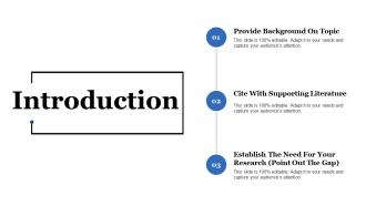
Slide 5: This slide showcases Introduction with these three important feature to write with- Provide Background On Topic, Cite With Supporting Literature, Establish The Need For Your Research (Point Out The Gap).
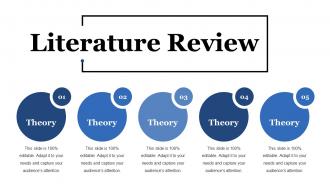
Slide 6: This slide presents Literature Review. You can add the theory in these five steps.
Slide 7: This slide is showing Purpose Statement. You can add the statement.
Slide 8: This slide showcases Hypothesis. You can add the hypothesis in this as per your requirement.
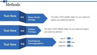
Slide 9: This slide presents Methods with these three main- State Study Design, Define Groups, Participant Demographics.
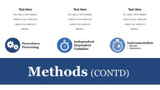
Slide 10: This slide Methods with these three parameters- Procedures Processing, Independent Dependent Variables, Instrumentation.
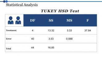
Slide 11: This slide showcases Statistical Analysis with a table called as TUKEY HSD test.
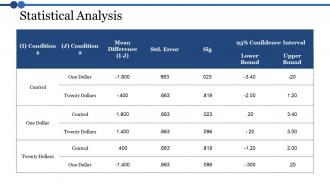
Slide 12: This slide shows Statistical Analysis table. You can add the data or information as per your requirement.
Slide 13: This slide is to show Results. You can presents your results with this slide.
Slide 14: This slide Column Chart with this bar chart comparison you can analyse the various number of years.
Slide 15: This slide shows Bar Diagram with the comparison of the financial years.
Slide 16: This slide presents Pie Chart. You can analyse the product
Slide 17: This slide showcases discussion. You can add the content of your discussion.
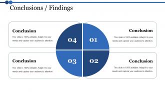
Slide 18: This slide presents conclusion slide. You can add your business conclusions and use it.
Slide 19: This slide showcases Limitations Of Your Study. You can add the limitations and use it as per your need.
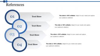
Slide 20: This slide shows References. Add your references in these four steps.
Slide 21: This slide presents Implications For Future Research. You can use it for the research work.
Slide 22: This slide shows for Any Questions. you can put your query.
Slide 23: This slide is titled Additional slides.
Slide 24: This slide contains Our Mission with text boxes.
Slide 25: This slide helps depict Our Team with text boxes.
Slide 26: This slide helps show- About Our Company. The sub headings include- Creative Design, Customer Care, Expand Company .
Slide 27: This slide shows Our Goals for your company.
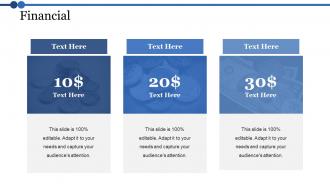
Slide 28: State your Financial score in this slide with relevant imagery and text.
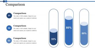
Slide 29: This slide shows Comparison. With this you can compare products.
Slide 30: It’s not just about being better. It’s about being different. You need to give people a reason to choose your business.
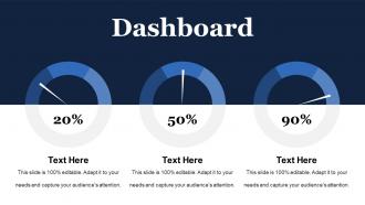
Slide 31: This is a Dashboard slide to show- Strategic System, Success, Goal Process, Sales Review, Communication Study.
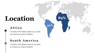
Slide 32: This is a Location slide to show global growth, presence etc. on world map.
Slide 33: This is a Timelines slide to show- Plan, Budget, Schedule, Review.
Slide 34: This is a Post It slide for reminders of Direct Marketing.
Slide 35: This slide is titled Community to show company news, events, highlights etc.
Slide 36: This is a Puzzle slide with the following subheadings- PPC Advertising, Media Marketing, Print Marketing, E-mail Campaigns
Slide 37: This slide displays Our Target with a background image
Slide 38: This is a Circular image slide to show information, specifications etc.
Slide 39: This is a Venn diagram image slide to show information, specifications etc.
Slide 40: This slide shows a Mind map for representing entities
Slide 41: This slide showcases a Matrix with the following content- Development Clients, Dilemna Clients, Star Clients, High Value Clients.
Slide 42: This is a Idea image slide to show information, innovative aspects etc.
Slide 43: This is a Thank You image slide with Address, Email and Contact number.
Dissertation Presentation Powerpoint Presentation Slides with all 43 slides:
Give a big boost to your earnings with our Dissertation Presentation Powerpoint Presentation Slides. They enable you to haul it in.
-
Dissertation Presentation
-
Agenda Slide
-
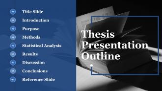
Thesis Presentation Outline
-
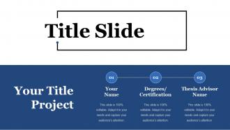
Title Slide
-
Introduction
-
Literature Review
-

Purpose Statement
-
Hypothesis
-
Methods
-
Methods CONTD
-
Statistical Analysis
-
Statistical Analysis
-
Results
-
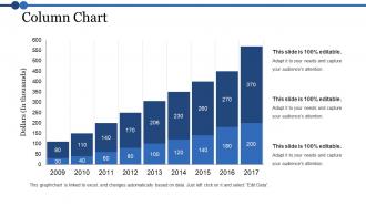
Column Chart
-
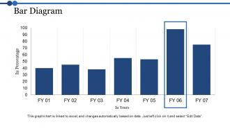
Bar Diagram
-
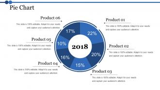
Pie Chart
-
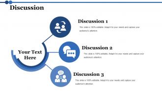
Discussion
-
Conclusions Findings
-

Limitations Of Your Study
-
References
-
Implications For Future Research
-

Dissertation
-
Additional Slides
-
Our Mission
-
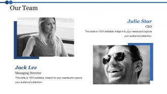
Our Team
-
About Us
-
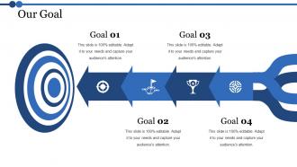
Our Goal
-
Financial
-
Comparison
-

Dissertation
-
Dashboard
-
Location
-
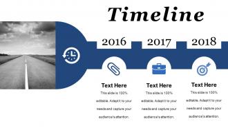
Timeline
-
Post it
-
News Paper
-
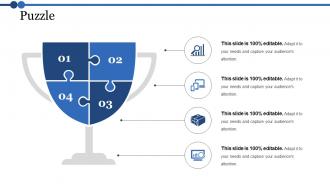
Puzzle
-
Our Target
-
Circular
-
Venn
-
Mind Map
-
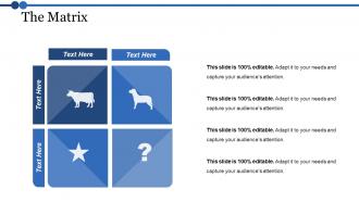
The Matrix
-
Great Idea
-

Thank You
FAQs for Dissertation Presentation
Okay so for your defense slides, start with the basics - title slide, problem statement, lit review highlights, methodology, findings, and conclusions. Throw in an acknowledgments slide too (your advisor will love you for it). Also add limitations and future research stuff. Keep it around 15-20 slides max depending on time. Honestly, less text is better since you'll be talking through everything anyway. Use visuals when you can - way more engaging than bullet points everywhere. Oh and definitely practice with your template first so the flow feels natural. The opening slide is super important too, you want to hook people right away instead of losing them in the first 30 seconds.
Start each slide with your biggest finding right up top. Break down the complicated stuff with bullet points - way easier to follow. Charts and graphs are your best friend here, trust me. Ditch the academic speak and talk like you would to your neighbor. Big fonts only (people squint enough already). Practice actually telling the story behind your data instead of just reading slides word for word. Oh, and one slide = one main point. Your audience will actually stay awake if you make it digestible instead of cramming everything together.
One thing per slide, seriously. Big fonts too - 24pt minimum or people will squint and hate you. I learned this the hard way watching someone's amazing research get ignored because nobody could read their slides from the back row. High contrast colors are your friend. Don't go crazy with bullet points either - maybe 3-5 max per slide. Visuals should actually mean something, not just look pretty. Practice how you'll move between slides so you're not fumbling around. Trust me, smooth transitions let you actually connect with your committee instead of staring at your laptop the whole time.
Honestly, less is more with visuals. Make each chart actually mean something instead of just filling slides. I've sat through so many presentations with tiny, impossible-to-read graphs - it's painful. Go big and clean with your visuals, then walk people through them step by step. Here's what works: tell them what they're about to see first, show it, then give them a second to actually look at it. Oh and definitely practice explaining each one out loud beforehand. You'll sound way smoother when you can guide their eyes to the important stuff naturally.
Dude, stick to like 1 slide per minute - so 20 minutes means roughly 20 slides. Don't be that person who squeezes everything onto 8 impossibly dense slides (my advisor did this once and it was painful). Your slides are there to back you up, not do all the talking. Short bursts work better anyway. Focus on your big findings and key visuals instead of paragraph dumps. Oh and if you're camping on one slide for like 2+ minutes, definitely split it up. People zone out fast during these things, trust me.
Honestly, figure out who you're talking to first - makes all the difference. Experts want the nitty-gritty methodology stuff, but mixed crowds need you to start broad and explain terms as you go. I totally bombed once by jumping straight into statistical analysis... half the room just glazed over. Watch people's faces while you're talking - if they look lost, switch gears and use analogies or something. Non-specialists especially need those comparisons to get complex ideas. Oh, and definitely prep multiple ways to explain your main point. You'll probably need them! Reading the room is everything.
Honestly, just drill it with a timer beforehand - like, obsessively. Map out your chunks (intro gets 5 min, methodology 15, whatever) and actually stick to those limits. Practice those transitions until they're second nature because weird pauses will kill your timing. I always have backup sections I can cut if I'm running behind. Oh, and practice your ending separately! That way even if you mess up earlier, you can still nail the conclusion. Use your slide count to track pace without being obvious about checking the time constantly.
Don't interrupt even when you think you know what they're asking - just listen. Taking a pause before answering is totally normal, and honestly saying "great question, give me a sec to think" buys you time. If you don't know something, just say so. Trust me, trying to bullshit your way through is way worse and they'll catch it immediately. Write down their feedback because you'll probably be too anxious to remember later. I know it feels scary, but they actually want you to pass! Try thinking of it more like a conversation than some brutal interrogation.
Dude, storytelling is a game-changer for dissertation presentations! Don't just dump data on people - tell them the story of your research. Open with the specific moment or problem that got you curious in the first place. Then walk them through your detective work (way less exciting than it sounds, but still). Real examples make abstract stuff click way better than bullet points ever will. Structure it like any good story: problem, journey, discovery. Your audience will actually remember what you found instead of zoning out halfway through. Trust me, even the driest research becomes interesting when there's a narrative holding it together.
Dark text on light backgrounds works best for readability - trust me on this one. Stick to max 2 fonts so you don't look all over the place. I made the mistake once of using this bright neon green that literally hurt people's eyes (oops). But you can totally use color strategically to highlight your main points. Keep it clean and simple. Your research should be the star, not your font choices. Oh, and contractions are fine in most presentations these days - makes you sound less robotic. Clean design just makes everything more professional without trying too hard.
Practice your opening and closing lines until they're second nature - that's when nerves hit hardest. Do a complete run-through with friends beforehand, not just pieces. Your audience genuinely wants you to do well, so they're not sitting there waiting for you to mess up. Show up early to check your tech and get familiar with the room. Keep water handy and don't forget to breathe between sections. Oh, and know your stuff inside out - when anxiety kicks in (and it will), you can cruise on that knowledge alone.
Don't let people guess what's new about your research - spell it out! Lead with the gap you're filling, then hit them with "for the first time" when you present findings. Honestly, nothing bugs me more than buried contributions. Make a whole slide just listing your key points as bullets. Show concrete improvements with real numbers and percentages - way more convincing than vague claims. Also, comparisons to existing work are clutch. Wrap up by explaining why it matters outside academia. What future research does this unlock? People need to walk away knowing exactly what you achieved.
Don't cram everything onto your slides - seriously, less is more. People read way faster than you talk anyway. Practice out loud beforehand (trust me on this one, I bombed a presentation once because I didn't). Use visuals instead of walls of text. Oh, and explain why anyone should care about your research beyond just academia. Connect it to real stuff that matters. Prep for questions too - they'll definitely ask about your methods or what went wrong. Honestly, finishing a few minutes early beats running over every single time. Your committee will thank you for it.
Dude, just pretend you're explaining it to someone who's never heard any of this stuff before. I bomb every time I assume people know what I'm talking about. Use normal words instead of fancy ones - like, if you have to say "algorithm," follow it up with "basically just a set of instructions the computer follows." My mom came to my practice presentation once and I could tell she was totally confused lol. Test it on someone random first. They'll shut down the second something doesn't click. Honestly? If a middle schooler would be lost, you're being too complicated.
Check your grad school's website first - they usually have templates that'll match their formatting rules. PowerPoint and Google Slides both have decent academic ones built in too. Ask other students what they used (don't steal content obvs, just see the layout). Your advisor's probably your best bet though - mine had strong opinions about what looked "professional" vs amateur. SlideModel's got some options if you want something fancier. LaTeX works great if you're into that, but honestly might be overkill for a defense. Start simple and go from there!
-
Awesome use of colors and designs in product templates.
-
Good research work and creative work done on every template.
-
cool