

Example Presentation Master Thesis Powerpoint Presentation Slides





Try Before you Buy Download Free Sample Product
 Impress Your
 Audience
 100%
100% Editable
 Save Hours
 of Time


Present an engaging report on your research and master’s program with our Example Presentation Master Thesis PowerPoint Presentation Slides. With the help of this thesis statement, you can give an overview of your work including your accountabilities and projects. Highlight the important factors such as reviewing the topic, analyzing results, methodologies, conclusions, the context of the literature, etc, using our thesis presentation slide. Master thesis project PPT also helps you to strategize, plan, analyze or segment the topic with clear understanding and apprehension. This exclusive master thesis project deck is here to help you to showcase your bibliography, table of contents, results, introduction, topic sentence, title page, etc, which makes your presentation more attractive. The master theory slideshow includes ready-made PowerPoint templates on the methods, demographics, and statistical analysis, etc. Use professional slide layouts, charts, graphs, and sheets given in the master theory presentation deck to prepare your report in minutes. Download the thesis presentation ppt slides for marking important decisions and covering critical issues.
People who downloaded this PowerPoint presentation also viewed the following :
Content of this Powerpoint Presentation
Preparing a thesis at the end of academics is one of the critical components of your academic career. Don’t you want to present your thesis in a way that leaves a mark? Well, we all want.
A thesis is not just a work of study, it is a work of the mind. But getting the right thesis prepared at the right time meeting your audience needs is quite a task. There is no doubt it is difficult to engage your audience with the thesis presentation that goes beyond competence. But don’t worry, we are here to help you!
Our Master Thesis PowerPoint Presentation Slides is your helping hand of transition to the world of perception, offering amazing accuracy and ease that captures the attention of the viewer. Featured with high-quality graphics, dynamic bar graphs, clearflow charts, a mess of stunning photos, the slides are transparent and professional, which consistently and succinctly bring clarity and engagement to your presentation.
A Quick Summarization - Besides being clear and well-structured, Example Presentation Master Thesis Example and PowerPoint presentation Slides have several advantages. Charts, graphs, and images available can add richness and variety to the presentations while supporting arguments and emphasizing a conclusion. This slide can help to increase your reputation as a researcher and create an impression on your audience that can last a lifetime.
Let us go on this voyage together and learn how to perfect our thesis presentations.
Also, look out for our blog on Research Proposal for Thesis PowerPoint Templates to enhance your thesis efficacy.
Template 1 - Methods
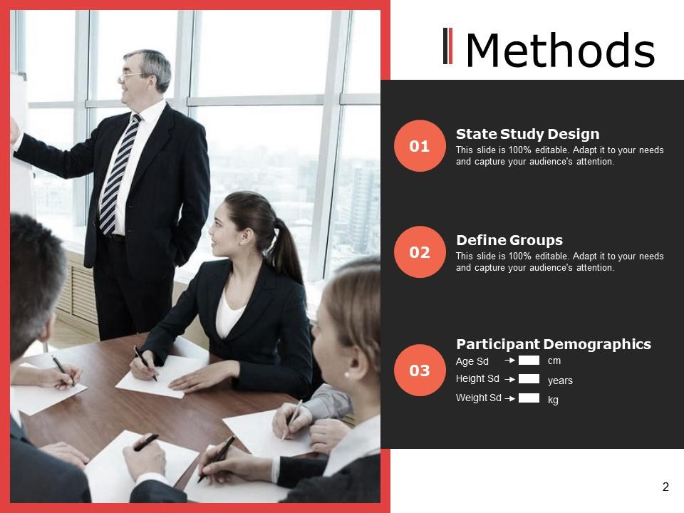
This PPT Slide is a valuable resource for explaining how research was conducted. It defines research design by describing the data collection methods used, which may include surveys, experiments, interviews, or other methods. Also, this template describes all groups or categories that participate in research, allowing for unambiguous comparisons and incorporating participant information such as age, gender, and education level. Presenters can help their audiences understand the research process by including this "Methods" slide, which shows which methodologies were used and how the results were obtained.
Template 2 - Methods Continued
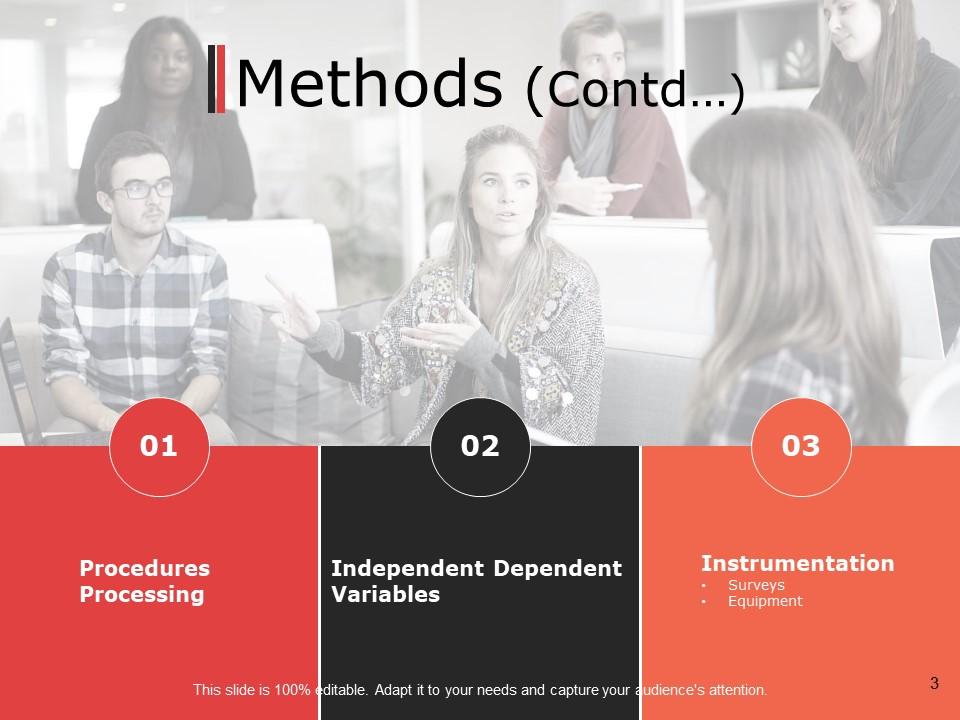
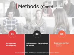
This slide in a presentation discusses how one did one's research project or thesis. It allows you to build on what has previously been addressed in prior slides that describe your methodologies and research methods. It might comprise particular processes you followed, objects examined or quantified (also known as independent and dependent variables), and instruments or equipment you used during the study (instrumentation). This slide will help you keep your presentation structured and enable your audience to understand how you did your research. Also, it enables you to divide complex material into digestible bits for better comprehension by both presenters and listeners.
Template 3 - Statistical Analysis
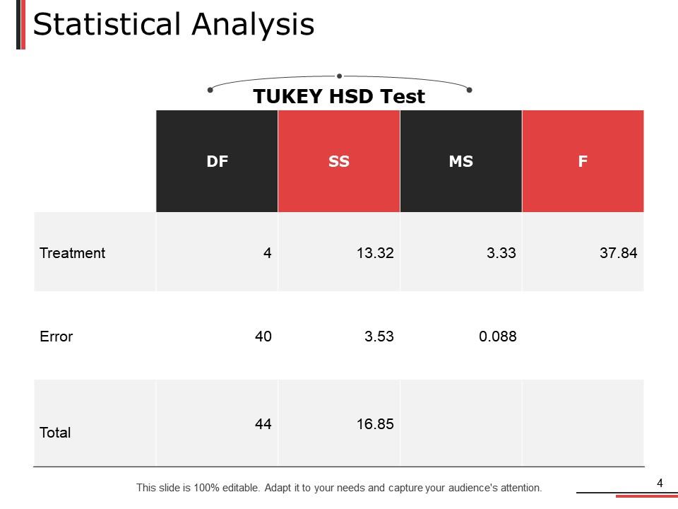
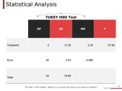
This slide shows how the data is examined to obtain meaningful results; it is a critical part of any statistical analysis in a PowerPoint Master’s Thesis presentation. Also, Tukey’s Honestly Significant Difference test is often used to ensure that observed differences between groups are indeed real, not just a matter of chance. In addition, data variability analysis splits variance into three components: treatment error rate, total variation, and total data variance. The term “treatment” refers to the differences between the groups under investigation, such as the effectiveness of teaching methods. The term “error” covers the random fluctuations in data unrelated to the treatments, and it might provide a hint of how well two sets of results compare; finally, “Total” stands for the total amount of data variance. By selecting the “Statistical Analysis” template, the presenters can extrovert their data analysis methods systematically to their audience.
Template 4 - 2nd Statistical Analysis
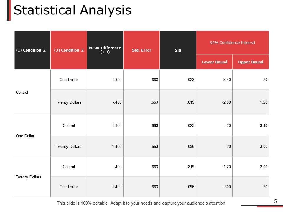
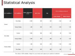
This slide may assist in breaking down complicated data into clearly comprehensible conclusions. They often entail comparing situations and determining the mean differences and standard errors between them. For example, in an experiment comparing monetary prizes (control, one dollar, and twenty dollars), this slide would determine how each condition affects results. It compares average differences across circumstances to determine which stands out, with a standard error indicating the reliability of these differences. It simply compares how various variables influence outcomes. Using this slide, presenters may readily demonstrate which circumstances had the most impact on outcomes, allowing their audience to absorb significant results from research swiftly.
Get an insight into our blog on Sample Thesis Proposal Templates to craft compelling proposals.
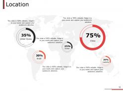
Template 5 - Location
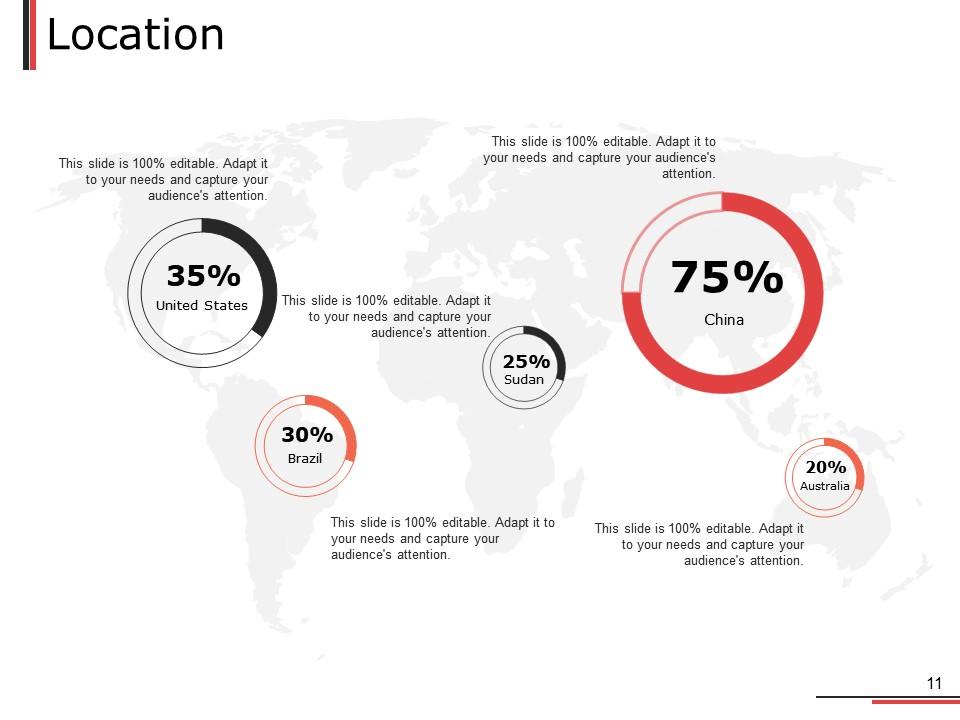
This slide arranges data or results by place. For example, if your research focuses on renewable energy adoption rates in nations such as Brazil, the United States, Sudan, and China, your template would display the percentages or proportions of adoption in each place. By graphically portraying data in this manner, readers might obtain an understanding of how patterns or occurrences differ across locations. Also, this format provides insights into regional variances and how cultural, economic, and policy impact results.
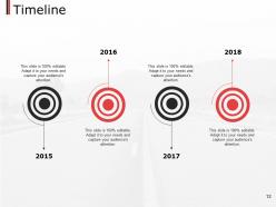
Template 6 - Timeline
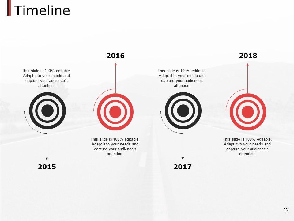
This PPT Slide uses a timeline view to show how events or data points have changed over time. For example, if your study focuses on the evolution of renewable energy regulations between 2015 and 2018, you can use it to highlight significant milestones or policy changes from 2015 to 2018. Visual representations assist viewers in comprehending the sequence of events and how things have developed over time. Breaking material down into small portions based on years allows an audience to follow better your study or the subject being presented. In essence, timeline templates provide a realistic picture of temporal patterns to help readers grasp the historical context and evolution of any issue being discussed.
Template 7 - Circular

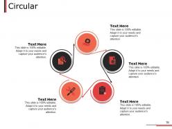
This circular presentation, used for the Master’s theses among other types, is designed to present material in an organized and clear manner. That is to say that its material is organized around some organizing theme: the master concept or subject matter and the subtopics or points most closely related to it are put right in the middle, and the next rings of the target feature the topics that are successively less central. This template can help you organize and present vast material in a compact and visual way in order to show how various pieces of your work are centered around the whole of the thesis and generally related to it, making your work easier to follow and remember.
Template 8 - Venn
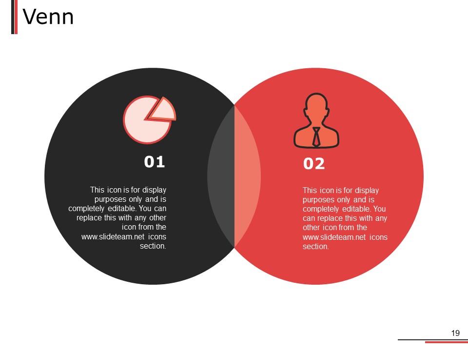
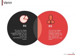
This Venn diagram slide is an illustrative tool that is widely used in PowerPoint presentations. It contains many intersecting circles or shapes, representing distinct groups or ideas. Data or information from two groups is placed in the intersection points to stress their similarities and differences. If you are conducting a comparison of two ideas, use this template to show the differences between each idea in separate circles while simultaneously focusing on the similarities in an overlapping part. Text bubbles provide additional explanations or any other information to highlight a segment, making it easier for the audience to understand the complicated connections or ideas illustrated in a graphic way.
Make a lasting impression on your audience!
Creating a good PowerPoint presentation for your master's thesis is critical for effectively communicating its findings and conclusions. You can effectively communicate the importance and relevance of your study to your audience by employing a variety of presentation techniques, including clear organization, compelling images, concise writing, and effective delivery.
Include these examples on your presentation slides to help visitors understand and remember the information better. When creating content, consider your target audience's level of expertise and strike a balance between simplicity and complexity. With careful organization and attention to detail, your thesis presentation can leave a lasting impression while effectively highlighting its contents - the culmination of years of academic work.
Check out our blog on Sample Presentations for Thesis Powerpoint Presentation to know more.
Example Presentation Master Thesis Powerpoint Presentation Slides with all 20 slides:
Use our Example Presentation Master Thesis Powerpoint Presentation Slides to effectively help you save your valuable time. They are readymade to fit into any presentation structure.


FAQs for Example Presentation Master Thesis
Your presentation needs a solid problem statement, your research methods, main findings, and what it all means. Give everyone context upfront so they're not lost. Walk them through how you did the research and what you found. Be honest about limitations - seriously, no one's expecting groundbreaking perfect work here. Connect everything back to why this actually matters in the real world. Definitely practice timing since profs are brutal about going over. Oh, and end strong with 2-3 specific next steps or recommendations they can actually use.
Honestly, visuals are a lifesaver when you're explaining complicated stuff. People can actually *see* what you mean instead of just trying to follow along with words. Charts and diagrams help show patterns that would sound like gibberish otherwise - and let's be real, nobody wants to listen to someone rattle off data for twenty minutes. Your brain needs those visual breaks too. Plus you'll remember way more when you're processing things both ways at once. Oh, and here's what works: figure out your trickiest points first, then think about what kind of visual would make each one click for people.
Aim for 15-20 minutes plus Q&A time. Trust me, nobody wants to sit through a marathon presentation - I've been there and it's painful for everyone. You'll want to hit your research question, methods, main results, and what it all means. Short and punchy beats long and boring every time. The whole point is showing you can take months of work and boil it down to what actually matters. Practice with a timer beforehand so you're not frantically speed-talking through your conclusions at the end. Your committee will appreciate you respecting their time.
Hook them right away with your most surprising result or why anyone should care. I like the storytelling approach way better than just throwing data at people - it actually keeps them awake. Structure's pretty standard: quick background, your question, how you did it, main findings, what it all means. Honestly, less is more with slides. Pick your top three findings instead of cramming everything in there. Practice those transitions between sections or you'll sound choppy. Oh, and when you wrap up, don't just go "any questions?" Ask for something specific - gets way better discussion going.
Get some practice runs in with your lab mates first - they're brutal but in a good way. I'd go through each chapter and jot down where someone might poke holes or want more details. The classics always come up too: why you picked that method, what the limitations are, stuff like that. You can't prep for everything though, which is honestly fine. Having good answers for your main findings helps, plus being comfortable with "great question, let me think on that" goes further than you'd expect. Oh, and keep some backup slides handy with extra data. Trust me on that one.
Okay so first thing - define any jargon right when you say it. Like "machine learning, which is basically computers finding patterns in data." Use comparisons people actually get, you know? Neural networks work kinda like how our brains process stuff. I bombed my first practice because everyone looked totally confused lol. Start simple, then get more detailed. Check if they're still with you every now and then. Oh and prep multiple ways to explain the same thing - some explanations just click better for different people. Trust me on that one.
Dude, just tell your research like a story - seriously makes all the difference. People zone out when you dump data on them, but everyone follows a good narrative. You've already got the pieces: problem you tackled, roadblocks you hit, what you discovered. Start with the human issue your research fixes, then walk through how you cracked it. Your methodology becomes the "here's what I tried" part. Findings are your big moment. We're programmed for stories since we were kids, so use that! Way better than just rattling off results. Trust me on this one.
Honestly, just pick 3-4 main things and tell a story with them. Don't try cramming everything in - people won't remember 15 random details anyway. Skip the jargon even if your committee knows it. I'd practice your transitions so you're not standing there like "um, next slide..." Think of it like explaining your work to a smart friend over coffee, not proving you're the world's expert. Time yourself when you practice! If you're running long, cut stuff ruthlessly. The whole thing should flow naturally from one point to the next.
Ugh, don't cram a million words on each slide - people read way faster than you talk anyway. Short bullet points work better. Visuals are your friend for explaining research stuff. Skip the crazy animations unless you want people focusing on spinning text instead of your actual content. Make your font big enough so the person in the back row isn't squinting. Also test everything beforehand if you can - nothing worse than your slides looking weird on their projector. One main point per slide is plenty, and practice enough that you're not just staring at the screen the whole time.
Honestly, just mirror what your field does. STEM folks want loads of data and super clear methodology - no fluff. Humanities people love the storytelling approach with theoretical context (which is way more fun imo). Social sciences get to do both, lucky them. Business presentations? All about practical stuff and money impact. My advice: watch other thesis defenses in your program first - you'll pick up the vibe real quick. Also bug your advisor about what the committee wants. I sat through like three defenses before mine and it helped tons. Each department has its own weird quirks you won't know otherwise.
Honestly, just go with PowerPoint. Yeah it's boring but it works every time and you won't have any weird tech issues during your defense. If you want something prettier, Canva has some solid templates that don't look totally basic. Google Slides is clutch if you're working with your advisor or might need to present from a different computer. I'd skip Prezi though - that spinning camera thing gets old fast and some people literally get motion sick from it. My roommate used it once and half the committee looked nauseous lol. Pick whatever feels easiest and spend your time perfecting the actual presentation instead.
Honestly, practicing out loud is a game changer - it literally moves your content from "shit I hope I remember" to stuff that just flows naturally. After about 3-4 full run-throughs, those awkward pauses and "wait, what's next?" moments just vanish. Your voice gets stronger, body language improves. You'll actually start looking forward to questions instead of panicking about them. I always practice with my mirror first (yeah, it's weird but works). Then grab a friend if you can. Trust me, you'll catch all the clunky phrasing before it matters.
Honestly? Just practice the hell out of it until you could do it in your sleep. Get your lab mates to grill you with the worst possible questions - seriously, the nastier the better during practice. When you're actually presenting and start freaking out, focus on your breathing. Sounds dumb but it works. Oh and test your tech setup early because nothing's worse than fumbling with slides while everyone watches. Keep water handy too. Your committee isn't there to destroy you, even though it feels that way. You know this stuff better than anyone else in the room, so trust that.
Right off the bat, explain the real problem you're tackling and why people should actually care. Nobody wants to wade through methodology first - honestly, it's painful to read. Use specific numbers like "saves hospitals $2M yearly" instead of boring academic fluff. Show how your findings challenge what we already know or fill an obvious gap. Don't just claim your work matters - prove it by connecting to bigger implications. What doors does this open? I'd weave this significance throughout each section too, not just dump it at the end. Makes it way stickier.
Okay so definitely do anonymous surveys for your committee - ask specific stuff about pacing and how clear everything was. Recording yourself practicing is super awkward but you'll notice weird habits you never knew you had. Also grab your advisor for a debrief within like a week while it's all still fresh. Don't forget about peers who came too, they usually catch totally different things than faculty. Oh and ask targeted questions instead of just "how'd I do?" - that generic stuff doesn't help much. The recording thing honestly made the biggest difference for me.
-
Visually stunning presentation, love the content.