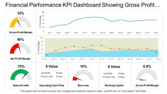
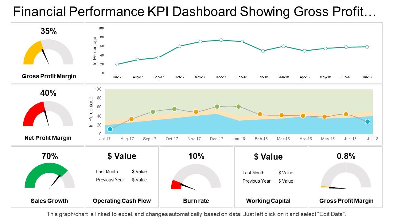
Financial performance kpi dashboard showing gross profit margin sales growth operating cash flow
Try Before you Buy Download Free Sample Product
Audience
Editable
of Time
Be delightfully captivating with our Financial Performance Kpi Dashboard Showing Gross Profit Margin Sales Growth Operating Cash Flow. You will be at your charming best.
People who downloaded this PowerPoint presentation also viewed the following :
Financial performance kpi dashboard showing gross profit margin sales growth operating cash flow with all 6 slides:
Identify areas where folks have been complacent with our Financial Performance Kpi Dashboard Showing Gross Profit Margin Sales Growth Operating Cash Flow. Halt any further deterioration.
FAQs for Financial performance kpi dashboard showing gross profit margin sales growth
Honestly, start with the basics - revenue growth, profit margins, cash flow, and expense ratios. Those tell you if you're actually making money or just playing pretend. Accounts receivable turnover is clutch too (nobody talks about this enough). Debt-to-equity ratio will save your ass before problems get ugly. If you're growing fast, customer acquisition cost and lifetime value are non-negotiable. Working capital matters if cash is tight. Don't go crazy though - pick like 6-8 metrics tops. Your team will hate you if the dashboard looks like a NASA control panel.
Dude, real-time data integration is seriously worth it. You can actually catch problems while they're happening instead of getting blindsided weeks later. Your dashboard pulls live info from sales, expenses, cash flow - everything updates constantly. Way better than those old Excel reports we used to sit around waiting for (ugh, remember those?). Budget going over? You'll know right away. Revenue stream tanking? Fix it before it kills your quarter. Honestly just start with your most critical data sources first. Don't try to connect everything at once or you'll go crazy.
Focus on clean visual hierarchy first - put your biggest KPIs like revenue right at the top where people will actually see them. Use consistent colors for positive/negative numbers (green/red is fine, don't overthink it). White space is your friend here. I swear, some dashboards look like they threw every possible chart at the wall. Keep fonts readable and let users drill down into details if they want more. Oh, and progressive disclosure works great - start with the executive view, then they can explore deeper stuff. Basically avoid the Christmas tree effect at all costs.
Dude, spreadsheets are death for most people - their eyes just glaze over. Charts and graphs let everyone spot trends immediately instead of digging through endless rows. You can actually tell a story with the numbers, like showing how marketing spend bumped up revenue last quarter. Interactive dashboards keep meetings way more engaging too. Non-finance people finally get what's happening with the business. Oh, and color coding for performance stuff? Total game changer - makes status updates super quick. I honestly wish more teams would just ditch the boring tables already.
Set up automated validation rules first - they'll catch weird data before anyone notices. Pull everything from one source of truth (learned this the hard way). Document your transformations so future you doesn't hate current you. Build in approval workflows for manual changes and alerts for sketchy variances. Honestly, the biggest thing is assigning someone to own the data quality. Without that person being accountable, your dashboard becomes another pretty but useless report that sits in everyone's bookmarks gathering digital dust. Regular reconciliation between your dashboard and source systems is clutch too.
So first thing - figure out what metrics your execs actually care about daily. Like 5-7 max. Then most platforms let you drag and drop custom widgets for your industry stuff. Retail gets same-store sales, hotels track occupancy rates, banks need their capital ratios, you know the drill. The interfaces are pretty slick now, honestly way easier than they used to be. Oh and definitely connect your data feeds automatically - POS systems, reservation platforms, whatever you're using. Otherwise you'll be manually updating everything like it's 2015. Start simple and add more widgets later once people actually start using the thing.
So predictive analytics is pretty cool - it flips your financial dashboard from just showing what happened into actually forecasting what's coming. Uses all your old data to predict cash flow, spot risks before they smack you, stuff like that. Revenue forecasting is huge for this. The algorithms learn as they go too, which is neat. I'd say start with whatever KPIs matter most to your business first. Don't go crazy trying to predict everything right away. Once you see it working on the important stuff, then you can expand it out to other areas.
Dude, dashboards are game-changers for spotting trends fast. Like you'll instantly see if revenue drops every third month or expenses randomly spike - way better than squinting at boring spreadsheets. Honestly took me forever to realize how much time I was wasting without one. Short sentences really pop when something's wrong. Set up alerts for your key metrics so you get pinged when numbers go weird. Oh and compare your current stuff against old data plus what competitors are doing - that's how you catch problems before they totally mess you up.
Honestly, the worst thing you can do is stuff everything onto one screen. Pick 5-7 metrics that actually matter for decisions - your finance team will want to show you 20 different numbers but ignore them lol. Don't use pie charts unless things add up to 100% (drives me crazy when people mess this up). Make sure your data sources stay consistent and update at the same speed. Oh, and label your time periods clearly if you're mixing them. Start by figuring out what 3 questions your audience really needs answered, then build around those.
Honestly, financial dashboards are game-changers for seeing what's actually happening with your money in real time. No more digging through endless spreadsheets when you need quick answers. You can spot revenue patterns, track expenses, and figure out if you're profitable way faster. The forecasting gets so much better too - like, you'll actually know what to expect next quarter instead of just guessing. I love how you can test different scenarios and see if your goals are realistic. Set up some alerts for important stuff so nothing sneaks up on you. When something's clearly not working, you can pivot fast instead of wasting months.
Honestly? Tableau and Power BI are probably your best bets for financial dashboards - both handle data connections really well. Don't sleep on Excel though, it's way more capable than people give it credit for and your finance team probably already lives in it anyway. Google Data Studio's decent if you're on Google Workspace (plus it's free, which is nice). Qlik Sense works too if you need fancy analytics stuff. But here's the thing - just start with whatever your team actually knows how to use. You can get all sophisticated later once you've shown everyone how useful dashboards actually are.
Honestly, just start basic - revenue, expenses, cash flow. Don't overthink it yet. Once things get chaotic (and they will), then you can add the fancy stuff like customer acquisition costs and lifetime value metrics. Right now focus on runway and how fast you're growing. Later when you have actual departments, break out those P&Ls. I spent way too much time early on tracking metrics that felt important but didn't actually help me decide anything. Build around whatever's making you lose sleep financially first. Everything else can wait.
Track user adoption rates and how fast people actually find what they need (time-to-insight). Data accuracy scores matter too. Load times are huge - slow dashboards kill engagement, honestly. Check if people are using specific reports regularly. Are they making better decisions based on what they see? That's the real test. Regular feedback surveys help since even great dashboards flop if they're confusing to use. Oh, and dashboard performance metrics - because waiting 30 seconds for a chart to load is painful. Start simple with these basics, then add more tracking as you go.
Honestly, just throw a feedback widget right in your dashboard - people actually use those when they're already logged in. Track what charts get exported vs totally ignored, that's pure gold. Do user interviews maybe quarterly? Your power users will roast you in the best way possible and catch stuff you'd never see. Oh and usage analytics obviously, but don't get lost in the data rabbit hole. When someone suggests something and you build it, tell them! I've seen so many teams forget this step and users think they're shouting into the void. Quick surveys work too but keep them short or people bail.
Honestly, you can't afford to have your team stuck at their desks for financial decisions. Markets move fast, and when someone needs approval or wants to check last quarter's numbers during a random meeting, mobile access is a lifesaver. I've seen too many people scramble with their phones trying to pull up data that just won't load properly. Your dashboard needs to work smoothly on phones - quick loading times are non-negotiable. Remote work isn't going anywhere, so whether your team's traveling or just working from the couch, they need real-time access to KPIs and financial data.
-
Colors used are bright and distinctive.
-
Attractive design and informative presentation.