


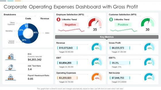
Corporate Operating Expenses Dashboard Snapshot With Gross Profit




Try Before you Buy Download Free Sample Product
 Impress Your
 Audience
 100%
100% Editable
 Save Hours
 of Time


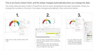
This graph or chart is linked to excel, and changes automatically based on data. Just left click on it and select edit data.
People who downloaded this PowerPoint presentation also viewed the following :
Corporate Operating Expenses Dashboard Snapshot With Gross Profit with all 7 slides:
Use our Corporate Operating Expenses Dashboard Snapshot With Gross Profit to effectively help you save your valuable time. They are readymade to fit into any presentation structure.





FAQs for Corporate Operating Expenses Dashboard Snapshot
Start with expense-to-revenue ratios and budget vs actual - those are your bread and butter. Monthly burn rate's huge too. Break everything down by department so you're not staring at useless "miscellaneous" line items that tell you nothing. Year-over-year trends help spot patterns, and cost per employee gives good context. Honestly, executives just want to see problem areas fast and dig deeper when something looks off. Maybe add headcount changes since that usually signals bigger spending shifts coming. Get these basics locked down first, then worry about fancy industry stuff later.
Honestly, dashboards are so much better than scrolling through endless spreadsheet rows - the visual charts make weird patterns pop right out at you. You'll catch things like seasonal dips or sudden expense spikes way faster. The cool part is setting up automated alerts for big variances, like if office supplies jump 20% or marketing spend drops unexpectedly. I mean, who has time to manually check everything? Just set threshold alerts and let the dashboard do the heavy lifting while you focus on actually fixing problems instead of hunting for them.
Waterfall charts are clutch for showing how different expense categories add up to your total spend. Bar charts work well when you're comparing departments or different time periods. Pie charts can show breakdowns too, but honestly they get annoying with more than like 5-6 categories. For tracking trends over time, line charts are perfect - especially if you want to catch seasonal stuff or see where you're going over budget. Oh, and definitely use color coding to highlight anything that's way off from your budget targets. I'd start with a waterfall for the big picture, then break it down with bars or lines for the details.
Dude, real-time data is a total game changer - you can catch problems as they're happening instead of finding out weeks later when you're already screwed. Like if a vendor suddenly charges you double or a department goes crazy with spending, you'll know immediately. Way better than those useless monthly reports that just tell you what already happened. Focus on the expense categories that bounce around the most - payroll's pretty stable but travel costs? Those can get wild fast. Honestly once you see expenses updating live, you'll wonder how you ever managed budgets without it.
Think of benchmarking as your sanity check - are you spending way too much or actually doing okay? Compare your costs to industry averages, companies your size, or just look at your own past numbers. If office supplies are somehow 3x what competitors pay, something's definitely wrong there. The dashboard lets you see benchmark data right alongside your actual spending, which is pretty convenient. Focus on your biggest expense buckets first since that's where you'll actually find worthwhile savings. No point obsessing over the small stuff when rent might be killing you.
Honestly, dashboards are game-changers for this stuff. You can instantly see where money's going across departments and vendors - like, the visual breakdowns will shock you sometimes. I always tell people to check their top 5 expense categories first since that's where the big wins usually hide. Look for departments with weird spikes or vendors whose costs have slowly crept up (happens more than you'd think). Recurring expenses that seem bloated are red flags too. It's crazy how obvious the problem areas become once you can actually see the patterns instead of just staring at spreadsheet rows.
Update it monthly at minimum, but weekly's ideal if you have time. Get automated feeds from your accounting system - manually entering data is soul-crushing after like two weeks. I'd set up some basic validation to catch weird numbers before they mess everything up. Keep your expense categories consistent over time, and write down any changes you make to your process. Otherwise you'll forget why you did something six months later. Oh, and actually schedule regular check-ins with whoever uses this thing - dashboards that sit untouched are basically expensive digital art.
So basically, every department has their own budget that rolls up to your main dashboard - HR salaries, IT software costs, marketing campaigns, all that stuff. Sales and Operations usually eat up the biggest chunks since they're your heavy hitters. Your finance team probably made this way more complex than needed (they always do), but department managers submit budgets and you track actual spending against them. Click on any slice and you can see what's actually driving those numbers. Super helpful for catching budget issues before they blow up on you.
Honestly, go with Tableau or Power BI for corporate stuff - they're built for handling big datasets and won't crash when you're pulling from your ERP. Excel's tempting since everyone knows it, but you'll hit a wall quick when your boss wants real-time numbers. Looker's pretty decent too, especially if your finance people are SQL-savvy (which, let's be real, half of them aren't). The main thing is making sure whatever you pick plays nice with your current systems. Oh, and definitely start small - pick your top expense categories for a pilot dashboard first. Trust me on that one.
Honestly, just ask them directly - surveys work but those little "helpful?" buttons are way better since people click when they're annoyed. I'd set up regular check-ins with whoever actually uses the thing daily. Ask specific stuff like what's confusing to navigate or what data they're missing. Multiple ways to complain is key here (trust me on this one). Monthly reviews help you spot patterns in what people want. Oh, and focus on what they actually need vs. what you think looks important - there's usually a big gap there.
Biggest mistake? Cramming way too much stuff on one screen. Executives don't want to dig through 20 expense categories - they just need the big picture trends. Always show context too, like compared to last month or budget, because random numbers by themselves are pretty useless. Static dashboards are the worst. Make sure your data refreshes when people actually use it, not just whenever IT feels like updating things. I've seen so many dashboards fail because they're built for the wrong audience. Keep it simple and make sure people can actually act on what they're seeing.
Honestly, dashboards are game-changers for this stuff. No more of those awkward "wait, which spreadsheet are we looking at?" moments in meetings. Finance and ops can both see the same real-time numbers, so nobody's working off outdated data. What's cool is operational teams start seeing how their choices actually hit the budget, while finance finally gets why certain costs spiked. You can drop comments and set alerts right in there too. I'd say pull up the dashboard first thing in your next cross-team meeting - seriously cuts down on all that back-and-forth alignment nonsense by like half.
Start with your ERP - that's where most expense stuff lives anyway. Then hit up your accounting software, procurement systems, and HR for payroll/benefits data. Travel platforms like Concur are massive too (seriously, T&E spending is wild when you actually track it). Credit card feeds are clutch. Don't skip facilities management for rent and utilities, plus your CRM if it's tracking acquisition costs. The whole point is connecting everything so you're not hunting down expenses scattered across random systems later.
Dude, predictive analytics basically turns your expense dashboard into a crystal ball. It'll spot patterns you'd miss - seasonal spikes, vendor price creeps, whatever. Instead of just seeing "oh crap, we overspent last month," you get warnings before departments blow their budgets. Pretty cool actually. The algorithms catch subtle trends that static charts won't show you. You'll see which teams are heading toward overruns plus get suggestions for cutting costs. Most dashboard tools already have forecasting built in, so just flip those features on. Way better than playing catch-up after the damage is done.
Yeah, seasonality messes with expense dashboards big time. Q4 retail gets crazy, summer energy bills spike, marketing jumps before launches - it all looks scary until you realize it's just normal patterns. Don't compare month-to-month or you'll panic every time. Year-over-year for the same periods is way better. Add some trend lines to your dashboard so you can tell seasonal stuff from actual problems. Honestly, I learned this the hard way when I freaked out over July AC costs that were totally predictable.
-
Qualitative and comprehensive slides.
-
Excellent products for quick understanding.