

Kpi Dashboard To Track Digital Transformation Initiatives Guide To Creating A Successful Digital Strategy




Try Before you Buy Download Free Sample Product
 Impress Your
 Audience
 100%
100% Editable
 Save Hours
 of Time


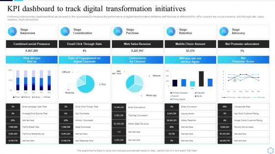
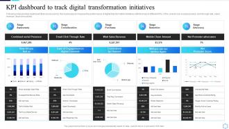
Following slide provides dashboard that can be used by the businesses to measure the performance of digital transformation initiatives with the help of different KPIs. KPIs covered are social presence, click through rate, sales revenue, churn amount etc.
People who downloaded this PowerPoint presentation also viewed the following :
Kpi Dashboard To Track Digital Transformation Initiatives Guide To Creating A Successful Digital Strategy with all 7 slides:
Use our Kpi Dashboard To Track Digital Transformation Initiatives Guide To Creating A Successful Digital Strategy to effectively help you save your valuable time. They are readymade to fit into any presentation structure.





FAQs for Kpi Dashboard To Track Digital Transformation Initiatives Guide To Creating A
You need metrics that actually connect to your business goals - real-time data works best. Make the visuals super intuitive so trends jump out immediately. Drill-down features are clutch for when people want details. Context matters too - add targets, benchmarks, historical stuff for comparison. Here's the thing though: resist cramming everything in there. I swear, some dashboards look like someone threw data at a wall and called it a day. Focus on what decision-makers genuinely care about. Test it with real users first! They'll tell you if it answers their actual questions or just what you assumed they needed.
Figure out what actually moves the needle for your business first - those are your non-negotiables. Pick metrics that'll help you make real decisions, not just pretty numbers for presentations. Honestly, most dashboards I see are way too cluttered! Stick to maybe 5-7 key things so people don't get overwhelmed. Your CEO needs different info than your daily ops team, obviously. Here's a good test: ask stakeholders "if this metric went up or down, what would you actually do about it?" No clear answer? Ditch it. Less is definitely more here.
Don't overcomplicate it - pick your top 3-5 KPIs that actually connect to business goals and put those front and center. Colors should be consistent, and honestly, ditch anything that's just visual noise. Your data better be fresh and accurate too, because outdated numbers make you look like you don't know what you're doing. Group similar stuff together so it makes sense. Always add context like benchmarks - otherwise people won't know if 47% is amazing or terrible. Oh, and test it with real users first! They'll spot the weird things you'd never notice.
Look, spreadsheets full of numbers are just painful to stare at. Your brain isn't built for that. Charts and graphs? Way better - you'll spot trends and weird outliers instantly instead of hunting through rows of data. Plus dashboards make comparing stuff across different months or teams super easy. I always go with the classic green/red color system (good performance vs needs help) because it's honestly foolproof. The whole point is seeing what's actually working and what's not without squinting at a million cells. Trust me, once you visualize your KPIs properly, decision-making gets so much faster.
Real-time data is clutch for dashboards - you'll catch problems the second they happen instead of finding out way too late. Monthly revenue doesn't need constant updates, obviously. But stuff like website traffic or system uptime? That's where real-time makes all the difference. You can jump on trends immediately and actually fix things before they spiral. I learned this the hard way when our conversion rate tanked for three hours before anyone noticed. Now I set up alerts for the critical metrics so I'm not glued to my screen constantly. It turns your dashboard into something that actually helps you manage, not just report on yesterday's news.
Here's how I'd tackle it - figure out what each group actually needs to see. C-suite folks want the big picture stuff they can glance at quickly. Department heads need the nitty-gritty for their teams. Sales obviously wants pipeline numbers, but why would HR care about that? They're focused on headcount and who's leaving. Set up different views so people only see what matters to them. I learned this the hard way when I dumped everything on one dashboard and nobody used it. Just ask each team what decisions they're making every day, then build around that.
So for KPI dashboards, there's a bunch of good options. Tableau and Power BI are the big names - super powerful but yeah, they take time to learn. Google Data Studio is actually pretty decent and it's free, especially if you're already using Google stuff. I mean, you could even build something in Excel if you're desperate, though it won't handle live data well. Klipfolio and Geckoboard are way easier to use if you don't want the headache. My advice? Figure out which KPIs you actually care about first, then just pick whatever connects best to where your data lives.
Honestly, it's all about what your team can handle and how fast you need to react. Daily updates work great for the day-to-day stuff you're tracking. Weekly or monthly makes more sense for bigger picture metrics. Real-time sounds cool but it's usually way too much unless something's on fire. Here's the thing though - don't update more often than you can actually do something about it. Like, why refresh every hour if you only look at performance once a week? I'd start simple with whatever doesn't stress your team out, then tweak it based on how often people actually check the thing.
Don't cram everything onto one screen - it's a mess and nobody can focus. Pick 5-7 metrics that actually matter to your business, not just stuff that sounds cool. Like, who cares about total page views if they're not buying anything? Make sure your data refreshes often enough to be useful. I learned this the hard way when I was looking at week-old numbers thinking they were current. Here's my test: for every metric, ask "so what?" If you can't explain how it helps you make decisions, ditch it. Your dashboard should drive action, not just look pretty.
Honestly, garbage in equals garbage out - so nail down your data sources first. Start with validation rules that catch weird outliers or missing stuff, then set up automated checks so you're not doing this manually forever. Pick someone to own each metric because otherwise things get messy fast. Document how you calculate everything too, saves arguments later. Oh and audit regularly - data has this annoying habit of drifting over time. I'd focus on your top 3 KPIs first and get those rock solid before adding more. Way easier than trying to fix everything at once.
Honestly, just focus on the big four first: revenue, profit margins, cash flow, and expenses. That'll show you if you're actually healthy or just pretending to be. I'd definitely add burn rate too - can't believe how many people skip that one when it's literally life or death for most businesses. Accounts receivable aging is clutch if you have clients who pay slow (and who doesn't?). Debt-to-equity rounds it out nicely. Don't go crazy adding a million other things though. Start there and see what your team actually looks at each week.
So basically track if people actually log in and use the thing regularly. Check which metrics they're clicking on most. But honestly? Usage numbers don't tell the whole story - you gotta ask users directly if they're making different decisions because of it. I'd survey the team every few months about whether it's actually helpful. The real victory is when people start randomly bringing up dashboard data in meetings without you having to remind them. That's when you know it's working. Also watch if the actual metrics you're tracking improve over time.
Dude, KPI dashboards are game-changers for making quick decisions. Instead of digging through endless spreadsheets (ugh), you see everything important in one spot. Trends jump out at you instantly, and real-time data means you're not working off old numbers. When something looks weird, you can dive deeper right away. Your team actually knows what to focus on too. Oh, and definitely set up alerts for your biggest metrics – catches problems before they blow up. It's honestly like having superpowers for your data.
Honestly, mobile accessibility will totally kill your dashboard if you mess it up. People expect to check their KPIs on phones now - it's just how we work. I've watched so many teams build these gorgeous desktop dashboards that turn into unreadable garbage on mobile. Tiny text everywhere, charts you can't read, buttons that are impossible to tap. Super frustrating. Your dashboard needs to automatically resize for different screens and actually be usable with your thumbs. Oh, and definitely test it on real phones before you launch - the preview mode in browsers lies sometimes. Trust me on that one.
Dude, connecting your KPI dashboard to other BI tools is seriously worth it. You'll pull data from everywhere automatically instead of doing it manually like some kind of caveman. Real-time syncing means better accuracy too. The best part? You can actually dig into WHY your numbers look weird, not just see that they do. Oh and your team can stick with whatever tools they already know - way less pushback that way. Honestly, just figure out what everyone's using daily first. That'll show you which connections are gonna make the biggest difference right off the bat.
-
SlideTeam offers so many variations of designs and topics. It’s unbelievable! Easy to create such stunning presentations now.
-
Wow! The design and quality of templates on SlideTeam are simply the best.