


Organizational chart for water supply authority ppt file brochure




Try Before you Buy Download Free Sample Product
 Impress Your
 Audience
 100%
100% Editable
 Save Hours
 of Time


Our Organizational Chart For Water Supply Authority Ppt File Brochure are topically designed to provide an attractive backdrop to any subject. Use them to look like a presentation pro.
People who downloaded this PowerPoint presentation also viewed the following :
Content of this Powerpoint Presentation
Description:
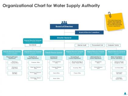
The image is a PowerPoint slide showing an organizational chart for a Water Supply Authority. It outlines the structure of the organization, with the Board of Directors at the top, followed by the Director General and various Deputy Director Generals overseeing different departments such as Planning & Project, Production & Supply, Commercial, Accounting & Finance, Administration & Human, and Water & Sanitation Service Subsidiary. Each department is further divided into specialized offices like the Technical & Project Office, Customer Relations, Human Resources Office, etc.
Use Cases:
Industries where such slides can be effectively utilized:
1. Public Utilities:
Use: Displaying company hierarchy.
Presenter: HR Manager.
Audience: New Employees.
2. Government Agencies:
Use: Explaining departmental functions.
Presenter: Agency Director.
Audience: Inter-departmental Staff.
3. Environmental Engineering:
Use: Showcasing project management structure.
Presenter: Chief Engineer.
Audience: Engineering Teams.
4. Urban Planning:
Use: Discussing water supply and sanitation management.
Presenter: Urban Planner.
Audience: City Council.
5. Non-Profit Organizations:
Use: Outlining organizational roles for water-related initiatives.
Presenter: Non-Profit Director.
Audience: Donors and Stakeholders.
6. Education:
Use: Teaching about management structures in public services.
Presenter: Academic Lecturer.
Audience: Students.
7. Corporate Training:
Use: Training on corporate structure in utility companies.
Presenter: Corporate Trainer.
Audience: Trainee Managers.
Organizational chart for water supply authority ppt file brochure with all 2 slides:
Use our Organizational Chart For Water Supply Authority Ppt File Brochure to effectively help you save your valuable time. They are readymade to fit into any presentation structure.
FAQs for Organizational chart for water supply authority
You need clear reporting lines and defined roles/titles - that's the foundation. Contact info helps too, plus department groupings if you're dealing with a bigger company. Make the visual flow obvious so people instantly get who reports to whom. Consistent job titles are crucial. Don't use random abbreviations that'll confuse new people walking in the door. And please, for the love of all that's holy, actually update it when people move around! I've seen too many org charts that are basically corporate fan fiction because nobody bothered maintaining them. Short sentences work. Longer ones should flow naturally without sounding robotic.
Honestly, your org chart totally controls how info moves around. Those old-school hierarchical setups? They're bottleneck central - everything crawls up and down through managers. Flat structures let people talk directly, which is way better, but then nobody knows who's actually calling the shots. It gets messy fast. Here's what I'd do: look at how your team already communicates naturally. Like, who do they actually go to when they need stuff done? Then see if your current setup matches that or if you're forcing people into weird communication boxes that don't make sense.
Oh man, creating org charts is so much easier now than it used to be. No more drawing those awful boxes by hand! I'd go with something like Lucidchart or Visio - they pull data straight from your HR system and update automatically. Pretty neat stuff. You can have multiple people working on it at once too, which saves tons of time. The real game-changer though? Pick something that plays nice with whatever systems you're already using. Trust me, you don't want to be manually updating employee info every time someone gets promoted or quits.
Honestly, you've gotta update that thing right when stuff happens - new people, promotions, someone leaves, whatever. I get it, feels tedious as hell. But seriously, when your org chart's wrong, nobody knows who to bug for approvals or who's actually running what. Monthly check-ins work pretty well - have HR and department heads scan through everything. Then give someone the job of fixing it within like 48 hours of any change. Oh, and definitely add it to your onboarding checklist so you don't forget when things get crazy.
Don't overcomplicate it - nobody wants an org chart that looks like spaghetti! Keep reporting lines super clear and cut out any unnecessary management layers. This is actually your chance to fix stuff that's been bugging you about your current structure, so don't just copy what you have if it sucks. Stay consistent with titles across departments (seriously, having three different names for the same role is confusing). Oh, and I can't tell you how many times I've seen remote people completely left off these things. Update it regularly too - treat it like a living doc that grows with your team.
So tech companies are super flat - product managers, engineers, everyone just collaborates directly without tons of bosses in between. Healthcare? Completely different story. They're crazy hierarchical because you literally can't mess around when someone's life depends on clear authority. Medical staff, admin, support services - all separated with strict lines. Plus healthcare has all these compliance roles that tech doesn't deal with. I mean, makes sense right? Tech wants to move fast and try new stuff. Healthcare prioritizes not killing people, which is probably smart. Just think about what your industry actually needs when you're mapping this out.
Colors are your best friend for grouping stuff - try blue for IT, green for finance, whatever makes sense. Darker shades work well for senior people too. But seriously, don't go crazy with like 10 different colors or it'll look ridiculous. Symbols are perfect for employment types - circles for full-time, squares for contractors, that sort of thing. You'll definitely need a legend though since people won't guess what your random shapes mean. Oh, and pick your system and stick with it throughout the whole chart. Nothing's more confusing than when the same color means different things in different sections.
Yeah, org charts are honestly a game-changer for new people. Walking them through it in their first week shows them exactly where they sit and who they'll be reporting to. Plus it helps them see how all the departments actually connect - like, the bigger picture stuff that's not always obvious. New hires feel way more confident when they can visualize their team structure instead of just guessing who does what. I'd definitely keep a digital version handy too since people forget names pretty quickly. Trust me, it saves everyone from those awkward "wait, who's my manager again?" moments later on.
Org charts are seriously helpful - your team can see who reports to whom without playing guessing games. New hires especially love them since they're not wandering around lost trying to figure out the hierarchy. They're great for spotting weird stuff too, like when Bob somehow ended up managing 15 people (poor Bob). Stakeholders get the team structure instantly instead of needing a 20-minute explanation. You'll catch overlapping roles easier. Honestly, just start basic with boxes and lines - don't overthink it. The fancy formatting can wait until later when you're bored.
So hierarchical setups are super formal - everything goes top-down, lots of processes, clear roles but also tons of bureaucracy. Flat orgs? Way more collaborative. Decisions happen faster, less red tape, people innovate more freely. Though I've seen flat structures turn into total chaos when nobody knows who's actually responsible for what (learned that one the hard way). Your structure basically dictates how your team talks and makes choices every day. If you're questioning your current setup, just check if info flows well and whether people actually feel comfortable pitching ideas up the chain.
Honestly, just use whatever you already have first. Visio's amazing if your company pays for it, but it's probably overkill. I'm obsessed with Lucidchart - it's web-based and actually makes org charts kinda fun? Google Drawings works fine for basic stuff and won't cost you anything. There's also OrgChartJS and Creately if you want something more specialized. Hell, I've seen people make decent ones in PowerPoint when they're in a rush. Start simple, then upgrade later if you need fancier features. Don't overthink it!
Honestly, org charts are game-changers for project management. You can see who reports to who without awkwardly asking around mid-project (been there!). Makes delegation way smoother since you know exactly who handles what and who can actually approve stuff. I used to just guess at hierarchies and it was a mess. The chart also spots bottlenecks - like when one manager has twelve direct reports and becomes your project's slowest link. Pull it up before you start planning. Sounds boring but it'll save you tons of headaches later when you're trying to get things moving.
Start with HR records - they've got the most up-to-date org charts and job titles. HRIS systems are usually pretty solid too. But here's the thing: don't trust paperwork completely because it's often wrong or missing those weird informal reporting lines that actually run the place. Talk to department heads directly to double-check everything. I'd also scan recent company emails for promotions and new hires since that stuff changes constantly. Oh, and definitely cross-reference what you find because there's always discrepancies. Confirm the final version with HR before you call it done.
Ugh, outdated org charts are the worst! People waste so much time hunting down approvals from someone who quit months ago. New hires get totally confused trying to match reality with whatever ancient chart they were given. Short sentences kill momentum though. You miss out on working with teams that've been reshuffled or grown since the last update. Honestly, I'd check yours every quarter and fix it right when people move around - otherwise everyone's just stumbling around asking "wait, who's actually in charge of this now?"
Honestly, just ask your people what's actually happening day-to-day. Regular surveys work, but I'd also do one-on-ones and maybe throw up some anonymous suggestion boxes. Your employees see all the bottlenecks and communication disasters that you probably miss from your office. I worked somewhere once where everyone was constantly bypassing their "official" managers to actually get stuff done - wild, right? Ask specific questions about workflow, how fast decisions get made, who they really collaborate with. Then use what you learn to fix the reporting structure, maybe create some cross-functional roles, or just cut out the layers that are slowing everyone down.
-
Excellent Designs.