


Production Plant Maintenance Management Dashboard To Monitor Production Plant Shift Efficiency




Try Before you Buy Download Free Sample Product
 Impress Your
 Audience
 100%
100% Editable
 Save Hours
 of Time


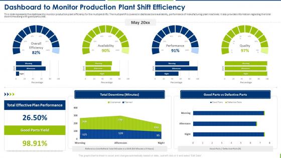
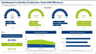
This slide represents the dashboard to monitor production plant efficiency for the multiple shifts. The multiple KPIs covered in dashboard are availability, performance of manufacturing plant machines. It also provides information regarding the total downtime along with good parts yield.
People who downloaded this PowerPoint presentation also viewed the following :
Production Plant Maintenance Management Dashboard To Monitor Production Plant Shift Efficiency with all 7 slides:
Use our Production Plant Maintenance Management Dashboard To Monitor Production Plant Shift Efficiency to effectively help you save your valuable time. They are readymade to fit into any presentation structure.





FAQs for Production Plant Maintenance Management Dashboard To Monitor Production
Start with the basics - uptime/downtime tracking, MTBF, and MTTR. Work order completion rates matter too. Planned vs unplanned maintenance ratios tell you if you're being proactive or just putting out fires constantly. Don't forget spare parts inventory levels because honestly, there's nothing more frustrating than a whole line down waiting for some tiny component that costs nothing. OEE is your friend since it rolls availability, performance, and quality into one clean number. Maintenance costs per asset round out the essentials. Once you've got these down, add whatever your specific plant struggles with most.
So basically it shows you what's happening with all your equipment in real-time. You can see which machines are acting up before they totally break down on you. Way better than scrambling around fixing stuff after it's already busted. Your team can actually plan when to do maintenance instead of everything being an emergency. Plus you'll start noticing patterns - like oh, this motor always gets weird right before it fails. Focus on your most important machines first, don't try to connect everything at once. Honestly the time savings alone make it worth it.
Power BI and Tableau are probably your best bets - they connect to pretty much any CMMS and handle the fancy visualizations. Google Data Studio's decent if you're watching the budget, just not as robust. Honestly? I've seen teams crush it with basic Excel dashboards when that's what they had to work with. The real trick is finding something your people will actually open every day instead of letting it collect digital dust. I'd grab the Power BI free trial first since it plays well with most plant systems. See how it feels before committing to anything bigger.
So basically, real-time data helps you catch problems before they turn into expensive disasters. You can watch equipment performance drop and schedule maintenance ahead of time instead of dealing with sudden breakdowns. The analytics do all the heavy lifting - they spot weird patterns and predict when stuff might fail. Pretty neat actually. Instead of scrambling when things break, you're planning ahead strategically. Saves you a fortune on emergency repairs and downtime too. I'd start with your most critical equipment first, then expand from there once you get the hang of it.
So predictive maintenance is where you use sensor data to catch problems before your machines actually break down. Way better than just waiting for stuff to fail, honestly. Your dashboard shows things like vibration patterns, temperature changes, performance dips - all the warning signs. Then you can plan maintenance during scheduled downtime instead of dealing with random breakdowns. The trick is setting up good alerts so you'll know when to order replacement parts ahead of time. I mean, it beats scrambling around at 2am trying to fix something that could've been prevented.
Look, good design cuts through all the noise and helps your team make faster decisions. Clear icons and consistent colors let technicians spot problems instantly instead of digging through messy screens. Group similar stuff together and hide detailed info until they need it. Most important alerts? Put those front and center. I swear, some dashboards look like they were designed by engineers who hate people - total information overload. Test it with your actual users first. You'll be surprised where they get stuck. The whole point is making complicated maintenance data feel dead simple to work with.
Dude, IoT sensors are seriously worth it for equipment monitoring. You get live data streaming right to your dashboard - temperature, vibration, all that stuff. Honestly beats waiting around for things to just break on you. When you see weird patterns or spikes happening, you can actually plan maintenance instead of scrambling during emergency shutdowns. The historical data thing is pretty cool too since you start seeing trends over time. I'd focus on your most expensive equipment first though - one prevented breakdown and you've basically paid for the whole system.
Honestly, dashboards are a game-changer for safety stuff. You can track all the important metrics in real-time - overdue inspections, equipment certs, training status, whatever. Set up alerts so you don't get blindsided by expired certifications (been there, not fun). The visual layout makes it obvious when certain equipment or areas keep falling behind. I'd start small though - pick your top 3-5 safety requirements and build widgets for those first. Way better than scrambling through spreadsheets trying to figure out what's overdue.
So the dashboard is pretty flexible - you can drag widgets around to rearrange everything, which honestly works better than I expected. Filter by equipment types, dates, whatever you need to see. Alert settings are adjustable too, so if you want different temperature warnings or vibration limits, just change them. There are separate views for operators vs managers, which makes sense. Oh and the filtering thing - you can get really specific with maintenance types and stuff. I'd probably mess with the widget layout first since it's the most obvious change visually.
Data integration is probably your biggest pain point - PLCs, CMMS, and ERP systems basically hate each other. Good luck getting those to play nice. Then you've got the fun part: convincing people to actually use the thing instead of their beloved Excel sheets (seriously, some folks will fight you on this). Focus on metrics that actually move the needle, not just what looks flashy in board meetings. Oh, and change management will eat up way more time than you think. My advice? Pick one small area first, nail it, then expand. Quick wins keep everyone happy.
Dude, charts and heat maps will change your life - seriously wish I'd figured this out years ago. Spreadsheets hide everything, but visual stuff makes problems pop right out. You'll start noticing which equipment keeps breaking, when maintenance gets crazy busy (usually seasonal), and if certain shifts or operators have more issues. The patterns become super obvious once you can actually see them. Plus it's way easier to convince your boss you need more help when you can literally show them the problem areas instead of just complaining about it.
Alright so first thing - set up automated feeds from your SCADA and production systems because trust me, manual updates are the worst and people always forget when it gets crazy busy. Daily updates for the critical stuff, weekly for trends, monthly for the big picture reviews. I'd train two people minimum on how to maintain everything so you're not screwed if someone's on vacation. Oh and definitely audit your current setup first to see what data you're missing. Check accuracy weekly. Honestly, most dashboards end up cluttered with metrics nobody actually looks at, so be ruthless about what KPIs you really need.
Your dashboard is basically a goldmine for figuring out what's broken in your maintenance routine. Look at which machines keep dying on you, where you're hemorrhaging money on repairs, and whether your preventive maintenance is actually preventing anything (spoiler: sometimes it's not). MTBF and repair frequency will show you the real troublemakers. I'd start with monthly reports - find your biggest headaches first. Once you spot the patterns, you can decide what's worth fixing: maybe that one machine needs replacing, or you need to tweak your PM schedule. Focus on changes that'll actually make a difference.
Look at both the obvious stuff and the behind-the-scenes metrics. Equipment downtime, how fast repairs happen (MTTR), planned vs emergency maintenance - all that matters. But here's the thing nobody talks about enough: are people actually opening the dashboard every day? I've seen so many fancy setups just collect digital dust. Track your cost savings from breakdowns you prevented, plus how quickly techs can find what they need. Oh, and definitely get your baseline numbers right now before you change anything. Then check monthly to see what's really making a difference.
Dude, mobile access is huge for field techs. They can check equipment status, work orders, all that maintenance history stuff right from their phone while they're actually working. Photos of problems? Done instantly. Job updates? Same thing. No more walking back to some computer every five minutes - honestly that alone probably saves like 30 minutes per job. Plus they've got troubleshooting guides and manuals right there when something weird comes up. Your response times will get way better once everyone's using it properly.
-
The best and engaging collection of PPTs I’ve seen so far. Great work!
-
I have just started downloading templates for my presentations and I must say this is a great design. It helped accelerate my presentation design process and made it more visually appealing.