


Profit and loss waterfall chart ppt infographic template





Try Before you Buy Download Free Sample Product
 Impress Your
 Audience
 100%
100% Editable
 Save Hours
 of Time


In case you are looking for a well designed PPT layout for a data driven Profit And Loss Waterfall Chart PPT Infographic Template, then this one is for you. This profit and loss waterfall graphic chart is linked to excel sheet. This flying bricks chart PowerPoint slide can be used for analytical purposes to show changes in revenue or profit between two time periods. You can also use this bridge or cascade chart image for different types of qualitative analysis like inventory analysis and performance analysis. This template can be used in varied industries where you need to analyze a value over time like annual sales, total profit or inventory balance. This predesigned PPT template will not only save your time but also give your presentation a professional look. So, go ahead and ace your presentation with this awesome design at the click of a button. Focus on exemplary contributions with our Profit And Loss Waterfall Chart Ppt Infographic Template. Commemorate iconic individuals.
People who downloaded this PowerPoint presentation also viewed the following :
Content of this Powerpoint Presentation
Description:
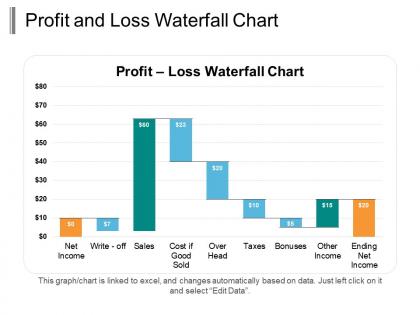
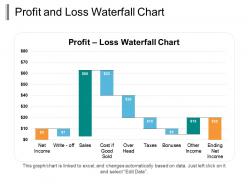
The image depicts a "Profit and Loss Waterfall Chart" used to visualize the step-wise progression from a company's net income to its ending net income after accounting for various financial components. The chart starts with 'Net Income' at the base, which is shown as $0 in this particular graph. From there, it moves up with 'Sales' at $60, which is typically the primary revenue source. The next item shows 'Cost of Goods Sold' at $23 as a deduction, followed by 'Overhead' at $20, which represents ongoing operational expenses.
'Taxes' are shown as another deduction of $10, continuing the downward step flow of the chart. 'Bonuses' at $5 are then deducted, which are typically employee incentive payments. Afterward, 'Other Income' at $15 is an addition, which could symbolize miscellaneous or non-operating income. Finally, the chart reaches 'Ending Net Income' at $20, which represents the company's profit after all additions and subtractions.
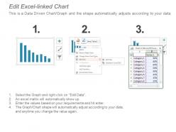
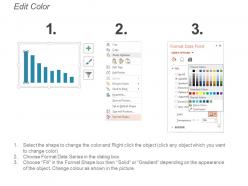
The chart is interactive, indicating that it is linked to an Excel datasheet and can be updated automatically with data changes. Instructions for editing the data suggest you can simply "left-click on it and select 'Edit Data'".
Use Cases:
Here are seven industries where these slides can be used along with their potential uses, presenters, and audiences.
1. Retail:
Use: Tracking sales, costs, and net income.
Presenter: Financial Analyst.
Audience: Retail Management Team.
2. Manufacturing:
Use: Visualizing production costs against revenue and profit.
Presenter: Plant Controller.
Audience: Company Executives.
3. Technology:
Use: Displaying the impact of R&D and operational expenses on profits.
Presenter: CFO or Finance Manager.
Audience: Investors.
4. Healthcare:
Use: Analyzing various costs such as pharmaceuticals, services, and insurance reimbursements.
Presenter: Healthcare Administrator.
Audience: Hospital Stakeholders.
5. Real Estate:
Use: Illustrating property sales, management costs, and investment income.
Presenter: Real Estate Financial Consultant.
Audience: Real Estate Investors.
6. Financial Services:
Use: Presenting different financial products' performances and associated costs.
Presenter: Product Manager.
Audience: Shareholders.
7. Food and Beverage:
Use: Overview of costs related to production, distribution, and sales to determine profit.
Presenter: Business Operations Analyst.
Audience: Food and Beverage Company Directors.
Profit and loss waterfall chart ppt infographic template with all 5 slides:
Broadcast the judgement with our Profit And Loss Waterfall Chart Ppt Infographic Template. Ensure every effected individual is informed.

FAQs for Profit and loss waterfall chart
So basically, a P&L waterfall chart shows your revenue flowing down to profit step by step. Each expense category creates this visual "waterfall" where you actually see the money getting chipped away - first by COGS, then operating costs, then taxes. Way better than those boring bar charts that just sit there. What's cool is you can literally watch where your money disappears. Makes it super obvious which expenses are the real profit killers. I built one last month and immediately spotted stuff I'd totally missed in regular reports. Honestly beats staring at spreadsheet rows any day - the visual just clicks, you know?
So basically, a waterfall chart shows you step-by-step what changed your profit between two periods. Start with your opening number, then each bar represents something specific - maybe revenue went up or expenses killed you. Way better than comparing boring spreadsheets if you ask me. The bars flow left to right, good stuff goes up, bad stuff goes down. Eventually you land at your final profit. Honestly, just try making one for your quarterly numbers and you'll instantly see what's actually moving the needle for your business.
So basically start with your revenue on the left side, then break down each major piece - revenue bumps, cost of goods, operating expenses, taxes, whatever. Use green for stuff that adds money, red for what takes it away. The trick is grouping similar things together so it doesn't look like a complete mess (I've seen some truly hideous ones lol). Put your final profit on the right. Oh and definitely slap the actual dollar amounts on each bar - people need to see the numbers or they'll just stare at it confused. Label everything clearly too.
First thing - grab all your P&L data from whatever accounting system you're using. Revenue, COGS, operating expenses, the whole deal. I still throw everything into Excel first (yeah, I'm that person) then clean it up from there. Sort it chronologically if you're showing changes over time, or by category if you're breaking down profit components. The key part is making sure your numbers actually add up - all your positive and negative changes should equal your net change. Also double-check you're comparing the same time periods. Once your data's clean and reconciled, then you can build the waterfall chart without second-guessing yourself.
For P&L waterfalls? Excel's got built-in charts that work fine, though the formatting can be annoying as hell. Power BI and Tableau are way better if you want something that actually looks professional and interactive. Google Sheets works too for quick stuff. Honestly, if you're gonna be making these regularly, just bite the bullet and learn Power BI or Tableau. I spent way too much time fighting with Excel's weird quirks before I switched. The styling options alone make it worth it.
Honestly, P&L waterfalls are a lifesaver when you're presenting to execs or investors and need to show what actually moved the needle. Way better than just throwing two numbers at people and hoping they get it. Use them during board meetings, budget reviews, or whenever your results look funky compared to last quarter - trust me, someone's gonna ask "what the hell happened?" The visual breakdown tells the whole story instead of making people guess. Oh, and they're perfect for those moments when stakeholders want context, not just raw data. Makes you look like you actually know what you're talking about.
Waterfall charts are perfect for this - they show stakeholders exactly how you went from starting revenue to final profit. Way clearer than dumping a bunch of numbers on them. Each piece gets broken down visually: revenue growth, cost increases, random one-time expenses. People actually understand what's happening instead of staring blankly at your spreadsheet. I swear these charts save me every time in board meetings. Everyone just gets it immediately. Keep your categories simple though, and call out the big changes. Seriously, build one for last quarter and watch your next presentation go so much smoother.
Don't start your bars from zero - that kills the whole waterfall flow. Color coding trips people up constantly, so just use green for ups and red for downs. Way too many people cram tiny line items together and it looks messy as hell. Your starting and ending points need clear labels or nobody will get it. Oh, and double-check your math actually works before you show anyone - sounds obvious but you'd be surprised. I always test mine on a coworker first to see if they can follow along without me explaining every step.
Start with the colors - swap those awful default blues for your actual brand colors. Makes such a huge difference! Most tools let you change fonts and throw your logo on there too. I honestly can't stand when people use generic chart colors in big presentations, it looks so lazy. After colors, mess around with the fonts and spacing. Oh and don't forget you can customize labels and backgrounds too. The whole point is making everything look like it actually belongs together with your other stuff.
Honestly, you can't skip color coding if you want people to actually understand your waterfall chart. Green for gains, red for losses - basically the same logic as a stoplight. Most people use gray or blue for the starting/ending bars. Trust me, without colors your audience will be sitting there trying to decode every single bar instead of seeing the big picture. Oh, and whatever color scheme you pick, stick with it across all your charts. Nothing's more annoying than having to figure out a new system every slide. Makes the whole thing way more intuitive.
Yeah totally! Waterfall charts work great for forecasting - just swap out historical numbers for your projected revenue and costs. They're honestly one of the best ways to show how different factors will hit your bottom line. You can even do scenario planning with best/worst case stuff. The tricky part is your forecast assumptions need to be pretty solid since garbage in, garbage out, you know? I'd start with whatever projections you feel most confident about and build out from there. Way clearer than staring at spreadsheet rows.
Start with revenue on the left, then watch each cost slice away at your profits as you move right. Marketing costs showing up as a huge downward bar? That's probably murdering your margins. The waterfall basically shows where all your money disappears (honestly, sometimes it's painful to look at). Those big negative bars are what you want to tackle first - they're the real profit killers. The rightmost bar is what you're left with after everything gets deducted. Focus on fixing the biggest drops first since that's where you'll see the most impact.
Looking at P&L waterfalls over time is honestly a game-changer - you'll start seeing what's actually moving the needle on profits, not just the final number. Revenue trends become super obvious, and you can tell if cost spikes are temporary or here to stay. I learned this the hard way after missing a pattern in our Q3 marketing spend that didn't pay off until Q4. Those recurring expense creeps? You'll catch them way earlier. Short answer: it's probably the best tool for spotting trouble before it hits and building forecasts that don't suck.
Dude, P&L waterfall charts are a game changer. Instead of squinting at boring spreadsheets, you can actually see where your money's flowing in and bleeding out. It's like finally getting glasses after being half-blind, you know? The visual makes it so obvious which revenue streams are killing it and which costs are just... ouch. Way easier to spot what needs fixing first. Plus when you need to explain stuff to your team, they'll actually get it instead of glazing over. Focus on the biggest wins and biggest drains - that's where the real impact is.
Oh man, P&L waterfalls are everywhere in consulting - McKinsey and Bain throw them at clients constantly to show where revenue tanked or costs exploded. Retail companies always break out these charts during quarterly reviews for same-store sales changes and margin stuff. Tech firms love showing SaaS metric shifts to investors (makes boring numbers way less painful honestly). Manufacturing uses them for tracking raw material costs and labor changes too. If you're presenting to anyone who isn't finance, definitely build one - they actually make variance analysis understandable instead of just confusing spreadsheet hell.
-
Unique research projects to present in meeting.
-
Innovative and Colorful designs.