


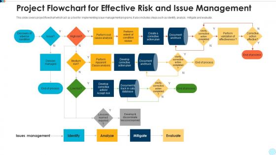
Project flowchart for effective risk and issue management




Try Before you Buy Download Free Sample Product
 Impress Your
 Audience
 100%
100% Editable
 Save Hours
 of Time


Our Project Flowchart For Effective Risk And Issue Management are topically designed to provide an attractive backdrop to any subject. Use them to look like a presentation pro.
People who downloaded this PowerPoint presentation also viewed the following :
Project flowchart for effective risk and issue management with all 9 slides:
Use our Project Flowchart For Effective Risk And Issue Management to effectively help you save your valuable time. They are readymade to fit into any presentation structure.








FAQs for Project flowchart for effective risk
Start with the basics: identify risks, assess them, then figure out if they're within your comfort zone. Map out your response options - avoid, reduce, transfer to someone else, or just live with it. Honestly, the monitoring part is where most people drop the ball, but risks change constantly so you need that feedback loop. Show clear decision points in your flowchart and assign ownership at each step. Communication touchpoints are crucial too - nobody likes surprises. Keep it simple at first, then layer on industry-specific stuff later if needed.
Think of it like having a roadmap when things get messy at work. Your team won't be scrambling around wondering what to do next - you've already mapped out the steps. Spot risks early, figure out how bad they could be, then have your game plan ready. Everyone follows the same playbook instead of making it up as they go. Honestly, the visual part is clutch because people actually get it at a glance. You'll start noticing patterns too, which helps you get better at this stuff. I'd say begin with whatever scenarios pop up most for your team.
Oh man, where do I even start? Cash flow issues and late payments are probably the biggest headaches you'll deal with. Then there's operational stuff - losing key people or supply chain going haywire. Cyber attacks are scary real now too. Market shifts can blindside you, like when demand drops overnight or some new competitor shows up. Don't forget legal headaches and basic property risks like fires or break-ins. The whole list gets crazy long honestly! My advice? Pick your top 5 most realistic threats first. You can't prepare for everything right away anyway.
So basically, just use a probability vs impact grid - plot everything on there and you'll see what needs attention first. High prob + high impact stuff? Deal with those immediately. Medium ones get regular check-ups, and honestly the low-low stuff you can pretty much ignore unless you're in banking or something crazy regulated. Don't let people blow things out of proportion though - I've seen folks call minor annoyances "catastrophic risks" which is just... no. Be realistic about what'll actually hurt vs what's just irritating. Once you've ranked them, tackle the scary high-priority ones first and work your way down.
You definitely want to get stakeholders involved early - they know where stuff actually breaks down, not just what the manual says. Run some quick workshops with people from each department. They'll catch risks you'd never think of sitting at your computer. Plus you need their buy-in or they'll just ignore whatever system you build anyway (learned that the hard way). Ask them how things really work day-to-day. Document what they tell you. Then loop back and make sure your flowchart actually makes sense to them before you call it done.
Honestly, the tech route is a game changer for this stuff. Your flowchart becomes alive - it'll update automatically when things shift and ping you if something hits your warning levels. No more manually entering data every week (thank god). The AI pattern detection is actually scary good at catching things you'd totally miss. I'd probably just digitize what you have first though, then mess around with the fancy automation once you're not pulling your hair out. Oh, and the dashboard thing? Super clutch for those quick status checks. You can pull reports in seconds instead of spending hours on spreadsheets.
Honestly, just stick to basic shapes - rectangles for steps, diamonds when there's a decision to make. Flow should go top to bottom or left to right, whatever feels natural. Write short action phrases like "Check inventory" instead of long explanations. I swear, some people make these things way too complicated! Group similar steps with the same colors, and give your yes/no paths clear labels. Don't cram everything together - white space is your friend. Oh, and test it on someone fresh. If they get confused, you'll know where to fix it.
Honestly, risk management flowcharts are kind of a lifesaver when dealing with auditors and regulators. They show you've got a real system for spotting and handling risks instead of just making it up as you go. Each step can connect directly to whatever regulations you're dealing with, which makes those compliance reviews so much less painful. The visual aspect helps your team stay consistent too - everyone follows the same protocols. When regulators show up, you've already got that audit trail proving you did your homework. I'd start by sketching out what you're already doing, then figure out which regulations each piece covers.
Honestly, if your company already has Microsoft Visio, just use that - it's basically what everyone expects for this stuff. Lucidchart works really well for collaborating though, especially when you're stuck editing with a bunch of people at once. Draw.io is free and actually pretty decent if budget's tight (I think they renamed it to diagrams.net or something). OmniGraffle's nice if you're on Mac but costs more. My advice? Don't overthink it. Pick whatever your team can access easily since you can always export files later if you need to switch.
Look, annually is the absolute minimum - but don't just stick to that. Big changes hit? New regulations drop? Something goes sideways? Review it immediately. Quarterly check-ins are honestly where it's at for catching the small stuff. Your industry probably has its own rules too (check those). The whole point is being ahead of problems, not scrambling after. Set a calendar reminder right now and make someone actually responsible for it. Otherwise you'll keep saying "next quarter" until something bad happens. Trust me on this one.
You know how pilots run through those pre-flight checklists? Same concept works for business risks. Hospitals do it for patient safety, banks have them for fraud detection - honestly, financial people are obsessed with flowcharts but it actually makes sense. The key is making them super visual and step-by-step so nobody has to guess what to do when stuff hits the fan. Include who's responsible for what and when to escalate things up the chain. Start with your biggest risks first, then test it out with a few people before you roll it everywhere.
Look, just map your risk flowcharts to whatever checkpoints you're already using in your current framework. Agile sprints, waterfall gates - doesn't matter. Drop the flowchart right into those existing decision points. Some teams overcomplicate this stuff but keep it simple. Update your project templates so they trigger risk assessments at key milestones. Train everyone to actually follow the flowchart when they hit those spots. Oh, and definitely pilot it on one project first - learned that the hard way. See how it works before you mess with all your other projects.
Okay so first thing - use the same shapes and symbols throughout, otherwise people get lost. I like doing red for high risk, yellow for medium, green for low risk stuff. Makes it super obvious at a glance. Don't just rely on symbols though, add little descriptions too because honestly some people are terrible at reading flowcharts. Your flow needs to go in order that actually makes sense - start to finish without jumping around. Oh and keep the text short but clear enough that someone could understand it without asking you twenty questions. Test it on a couple people first. If they look confused, you probably need to simplify more.
So basically, a flowchart shows you the actual steps - like what to do when you spot a risk, how to handle it, all that stuff. A matrix is just plotting risks on a graph by how likely they are and how bad they'd be. Way different purposes. The matrix helps you figure out which fires to put out first, then you use the flowchart to actually walk through handling them. I always thought they were the same thing until I had to use both at work - they're actually pretty useful together though.
Honestly, the hardest part isn't the tech stuff - it's getting people on board. Your team will probably push back because it feels like more red tape. Can't really blame them if you make it too complicated. People hate following flowcharts consistently too, they'd rather take shortcuts. Oh and good luck keeping it updated when things change (which they always do). Training new hires on the process is another headache. Start simple though - get your team leads excited about it first. Just make sure you're actually fixing real problems instead of doing busy work.
-
Use of different colors is good. It's simple and attractive.