


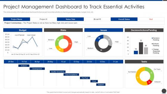
Project Management Dashboard To Track Project Scope Administration Playbook




Try Before you Buy Download Free Sample Product
 Impress Your
 Audience
 100%
100% Editable
 Save Hours
 of Time


This slide provides information about dashboard to track project essential activities by tracking project schedule, budget, risks, etc.
People who downloaded this PowerPoint presentation also viewed the following :
Project Management Dashboard To Track Project Scope Administration Playbook with all 7 slides:
Use our Project Management Dashboard To Track Project Scope Administration Playbook to effectively help you save your valuable time. They are readymade to fit into any presentation structure.





FAQs for Project Management Dashboard To Track Project
You'll want timeline/milestones, budget tracking, and task progress as your core stuff. Team workload distribution is huge too - nobody wants to be that PM who accidentally overloads Sarah while Jake's twiddling his thumbs. Risk indicators and project-specific metrics matter, but honestly don't go overboard or your dashboard becomes a hot mess. Stakeholder communication logs are annoying to maintain but save your butt later. Color coding and charts help you catch problems fast. Oh, and deadlines - always include upcoming deadlines since that's literally what everyone asks about. Start basic, then add whatever you keep getting pestered about.
Honestly, good visuals are a total game changer for dashboards. You'll actually understand your data instead of drowning in spreadsheet hell. Gantt charts work great for timelines, burndown charts show sprint progress, and color coding gives you instant health checks. Heat maps? They're amazing for catching resource bottlenecks - seriously wish I'd discovered those sooner. Pick the right chart type though. Bar charts for comparing stuff, pie charts for budget splits, progress bars for completion rates. Figure out what decisions you're making every day, then choose visuals that answer those questions immediately. Way better than squinting at numbers all morning.
Honestly, just track the big three first - how much you've done vs what you planned, money spent vs budget, and whether your team's actually available when you need them. Those will tell you if you're screwed or not lol. Red flags like blockers and risks are huge too - way more useful than some complicated scorecard nobody looks at. Quality stuff matters but don't go crazy with every metric under the sun. You want something quick to check during meetings. Start there, then maybe add other things if you're actually using them to make real decisions.
So basically your dashboard stays current automatically instead of showing stale data from yesterday. Everything syncs up instantly from all your different tools - no more manually checking if those budget numbers are actually right. Honestly, it's pretty sweet for catching problems early. Like if you're going over budget or missing deadlines, you'll know right when it happens instead of waiting for your weekly meeting. Oh, and definitely set up some alerts for the big stuff so you don't have to constantly monitor everything yourself.
Honestly, customization makes or breaks a dashboard. If you can't tailor it to your actual work, nobody's gonna use it. Like, why would a developer want the same view as a PM? Makes no sense. Look for something where you can drag widgets around and filter by what actually matters to your day-to-day stuff. I'd start simple though - pick your top 3-5 metrics first, then build around those. Otherwise you'll just end up with analysis paralysis (been there). The whole point is making data decisions easier, not creating another thing to ignore.
Honestly, dashboards are lifesavers - they give your whole team one place to see what's actually happening instead of digging through a million emails. Remote teams especially love them (learned this the hard way during COVID). Everyone can check task progress, hit up teammates with comments, and spot blockers before they become disasters. Your stakeholders stop pestering you for updates too since they can just look themselves. Set up automated status reports first - seriously, it'll save you hours every week of manually updating people. No more "hey, what's the status on that thing" messages cluttering your inbox.
So for interactive dashboards, I'd go with Power BI, Tableau, or Smartsheet. Power BI's solid if you're already in the Microsoft ecosystem. Tableau has way better visualization stuff, but honestly it can be overkill sometimes. Smartsheet's nice because it does both project management AND dashboards - saves you from switching between apps all the time. Monday.com and Asana work too if you want something simpler. I'd just grab free trials of Power BI and Smartsheet first, see what feels right for how you work.
Make your dashboard modular - that way you can switch widgets depending on what methodology you're using. Agile teams need sprint burndowns and velocity charts, stuff like that. Waterfall is totally different though - more Gantt charts and milestone tracking. Most dashboard tools these days let you save templates, which honestly saves so much time later. Oh and definitely add view filters so stakeholders can see either high-level stuff or drill down into details. Just start by figuring out what each methodology actually cares about, then build your widgets around that.
Don't cram everything onto one screen - people just shut down when there's too much to process. Vanity metrics are another trap I see constantly. Like, who cares if your chart looks pretty if it doesn't help anyone make decisions? Update frequency matters too. Stale data is useless data. Figure out who's actually using this thing day-to-day before you build it. Honestly, I'd test with real users early - saves you from rebuilding later. Oh, and simpler wins almost every time. People want answers, not eye candy.
Honestly, automate whatever you can first - hook your dashboard straight into project management tools and time tracking stuff so you're not constantly entering data by hand. Trust me, I wasted so many hours fixing old info before I figured this out! Give different team members specific sections to update weekly. Makes it less overwhelming that way. Build quick dashboard check-ins into your regular meetings so it becomes second nature. Oh, and set yourself monthly calendar reminders to scan for any weird gaps or outdated numbers. Way better than scrambling to fix everything last minute.
Dashboard risk indicators are like your project's early warning system - they catch problems before they explode in your face. Way better than scrambling after everything's already gone to hell. You'll want to focus on the metrics that actually matter for your type of project (don't get lost tracking everything). Set up alerts for your biggest risk areas so you're not glued to your screen 24/7. Honestly, it's kinda like having weather radar - gives you time to grab an umbrella instead of getting soaked. The trick is picking indicators that give you enough lead time to fix things.
Your dashboard layout depends entirely on who's using it. Executives want high-level stuff, project managers need task details, team members just want their assignments. Navigation gets weird when everyone sees different content though. I've watched so many dashboards crash and burn because they tried shoving everything into one messy view. Design separate landing pages for each role instead. Auto-filter the data based on permissions. Oh, and map out what each person actually checks daily before you build anything - trust me, it'll prevent you from redoing everything three times later.
Dude, mobile dashboards are seriously clutch - I can't imagine managing projects without them anymore. Quick status checks during my commute? Done. Need to approve something urgent while I'm grabbing coffee? No problem. Your team won't get stuck waiting for you to get back to your desk, which honestly saves everyone's sanity. I always catch little issues early just by popping in between meetings. Oh, and definitely turn on push notifications for the important stuff - learned that one the hard way when I missed a client emergency because I wasn't checking regularly enough.
Honestly, your team's feedback is everything. They're the ones actually clicking around in there every day, so they'll catch stuff you missed - like metrics being impossible to find or those widgets nobody even looks at. I'd set up monthly check-ins to hear their complaints (trust me, there will be some). Short sentences work better than long explanations when you're asking what sucks. Listen to what slows them down and fix that first. You'll be surprised how much more people actually use the dashboard when it doesn't fight them constantly.
Schedule quarterly check-ins with stakeholders to make sure your dashboard still makes sense for business goals. Set up automated data quality checks - trust me, catching errors early beats angry user emails every time. Analytics will show you which widgets actually get used, so dump the dead weight. I know it's tempting to build every feature request, but prioritize by impact, not by whoever yells loudest. Oh, and assign one person as the dashboard owner. When everyone's responsible, nobody is, and things just fall apart.
-
Great designs, really helpful.
-
Thank you for offering such fantastic custom design services. The team is really helpful and innovative. In a very short time, I received my personalized template.