


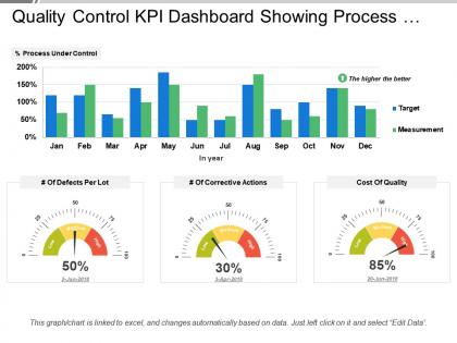
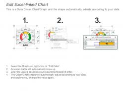
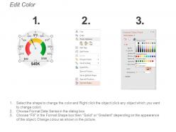
Quality control kpi dashboard showing process under control and cost of quality




Try Before you Buy Download Free Sample Product
 Impress Your
 Audience
 100%
100% Editable
 Save Hours
 of Time


Do away with any anxieties. Certify your thoughts with our Quality Control Kpi Dashboard Showing Process Under Control And Cost Of Quality.
People who downloaded this PowerPoint presentation also viewed the following :
Quality control kpi dashboard showing process under control and cost of quality with all 6 slides:
Join the club with our Quality Control Kpi Dashboard Showing Process Under Control And Cost Of Quality. Become a think tank member.
FAQs for Quality control kpi dashboard showing process under control and
Defect rate and first-pass yield are your bread and butter metrics. Customer complaints too - that one's obvious. Cost of quality is huge but some companies weirdly ignore it. Also track inspection accuracy and how long it takes to fix problems when they pop up. Supplier ratings matter if you're dealing with vendors. Manufacturing dashboards are totally different from software ones btw, so don't copy someone else's setup blindly. Honestly though? Start with maybe 4 KPIs tops. I've seen way too many dashboards that are just walls of numbers nobody looks at.
Honestly, just think about what could totally screw over your business if it went wrong. Manufacturing companies obsess over defect rates and first-pass yields. Healthcare? They're all about patient safety incidents and compliance scores - makes sense. Food service tracks contamination and temp logs because nobody wants to poison customers, right? First figure out your industry's biggest quality nightmares and what regulators actually care about. Then build your KPIs around those specific pain points. You want metrics that'll give you a heads up before things go sideways, not just tell you after you're already in trouble.
Honestly, dashboards are a lifesaver - no more drowning in Excel sheets for basic info. Problems jump out at you instantly, so you're not scrambling to fix disasters that could've been caught weeks ago. The visual stuff makes explaining issues to management actually bearable (they get pie charts way better than raw numbers). Real-time alerts will change your life - seriously. I'd start with whatever metrics keep you up at night, then expand. Oh, and don't overthink the setup initially. You can always tweak it later once you see what actually matters day-to-day.
Honestly, daily updates are the minimum you want - real-time is even better if your system can swing it. Hourly works great for most places because you catch problems fast without drowning your team in constant refreshes. Weekly? Way too slow, trust me. Defect rates can blow up in like two days if you're not watching. I'd set up automated feeds so your dashboard syncs with morning standups - that way everyone sees the same current numbers. The whole game is spotting issues before they get messy, so don't wait around on stale data.
Honestly, Tableau and Power BI are gonna be your go-to options here - they handle complex quality metrics really well. Qlik Sense is solid too. Microsoft ecosystem already? Power BI's a no-brainer since it works great with Excel. Google Data Studio surprised me though, it's actually decent for basic stuff if money's tight. Just make sure whatever you pick connects easily to your quality management system. Nobody wants to wrestle with complicated updates every week. I'd say start small with a pilot dashboard first - see what your team actually likes using before committing to anything big.
Honestly, start with making it look clean - consistent colors, readable fonts, nothing too cluttered. Put your most important metrics right up front where people will actually see them. Navigation should feel obvious, not like solving a puzzle every time someone wants to filter data. Also throw in some accessibility stuff - decent contrast, alt text for charts. I learned this the hard way when our VP couldn't read half our dashboard on his laptop screen. Test it with real users before you launch. They'll spot weird things you missed.
Look, benchmarking and historical data are basically your sanity check for quality KPIs. They show you if your performance is actually decent or if you're kidding yourself. Compare your defect rates to industry standards or track them against last year's numbers - that's how you spot real trends. Historical data reveals patterns too. Like, was that complaint surge last month just bad luck or are you looking at a bigger mess? I'd say grab at least 6 months of your own data first. Then hunt down some industry benchmarks so you know where you actually stand compared to everyone else.
Honestly, those dashboards work because they put everyone's numbers out there for the whole team to see. Real-time stuff like defect rates and how long fixes take. Nobody wants to be the person with the worst stats, you know? It's basically peer pressure but in a good way. Plus when issues come up, there's no arguing about who did what - the data's right there. I'd start small though, maybe just 3 or 4 metrics that actually matter to your team. Don't go overboard with fancy charts and stuff at first.
Okay so first thing - pick like 5-7 key metrics max for your main screen. Defect rates, yield percentages, the stuff that actually matters. Don't try cramming everything on there at once. Build drill-down features so people can dig deeper if they want, but honestly most won't need to. I'd set up different views for different roles too - operators don't need the same data as managers, you know? And definitely use alerts for when things go wrong instead of making everyone stare at numbers all day. Trust me, those crazy cockpit-style dashboards just end up ignored.
Dude, real-time data integration is a total game-changer for quality control. You'll catch defects as they happen instead of finding out hours later when you've already made 500 bad units. Your dashboard becomes an early warning system rather than just telling you what already went wrong. Teams can jump on quality issues immediately and tweak processes on the spot - no more waiting around. Honestly, those "oh shit" moments become way less frequent. I'd start with your most critical metrics first and get those feeding in real-time before expanding.
Oh man, the biggest thing is cramming way too many metrics on one dashboard - people just shut down when there's too much. Start with like 3-5 things your team actually looks at every day. Skip the vanity stuff that looks cool but doesn't help anyone make real decisions (I'm so guilty of this lol). Your KPIs need to connect to actual business results, not just busy work metrics. Data quality matters too - crappy data = crappy insights. And honestly? Don't refresh things every 5 minutes if the underlying data only updates once a day. Build based on what people actually use, not what sounds impressive.
Okay so here's the thing - you've got to tie your quality KPIs straight to what actually matters to the business. Revenue, customer happiness, costs. Don't just track defect rates in isolation. Show how they connect to customer churn or warranty costs. If your company's pushing into new markets, focus on compliance metrics for those regions. I swear, half the dashboards I see look fancy but tell leadership absolutely nothing useful. Start by asking your stakeholders what's stressing them out most. Then work backwards to find quality metrics that predict those problems. The connection needs to be obvious in your dashboard design.
Dude, you absolutely have to get your stakeholders involved early or you're basically building something nobody will touch. QC managers want different stuff than executives, right? So talk to them first - like actually sit down and ask what's driving them crazy day-to-day. I've watched so many dashboards just die because some developer thought they knew what people needed (spoiler: they didn't). Short interviews work great for this. Once people feel heard, they'll actually promote your tool instead of ignoring it. Trust me, buy-in from the actual users is everything.
Track your defect costs, rework expenses, and complaint resolution costs first. Compare those against what you're spending on QC. The real money comes from avoided disasters - I've seen companies dodge million-dollar recalls just by catching issues early. Set up a dashboard showing cost of quality vs revenue, defect reduction rates, warranty claims. Customer retention matters too since happy customers stick around. Honestly, the automated month-over-month reports are what'll actually convince your boss this stuff works. Track inspection efficiency and time saved from prevention efforts. Those numbers tell the whole story.
Honestly, skip the big overwhelming presentations and just focus on what each team actually needs to know. Show them their specific metrics first - like what good numbers look like vs when things are going sideways. The hands-on stuff works way better than slides anyway. I'd set up those regular check-ins where people can ask questions without feeling dumb about it. You want them thinking "oh this actually helps me do my job better" instead of just another box to tick. Once they see how it connects to their daily work, they'll actually start caring about the data.
-
Perfect template with attractive color combination.
-
Unique research projects to present in meeting.