


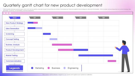
Quarterly Gantt Chart For New Product Development




Try Before you Buy Download Free Sample Product
 Impress Your
 Audience
 100%
100% Editable
 Save Hours
 of Time


Following slide illustrates quarterly gantt chart which can be used by corporate houses for launching new product. Businesses can frame successful product strategy by referring to this template which includes various phases like new product strategy, idea generation, screening, concept testing, business analysis etc.
People who downloaded this PowerPoint presentation also viewed the following :
Quarterly Gantt Chart For New Product Development with all 6 slides:
Use our Quarterly Gantt Chart For New Product Development to effectively help you save your valuable time. They are readymade to fit into any presentation structure.





FAQs for Quarterly Gantt Chart For
So a Gantt chart is just a bar chart turned sideways that maps out your project timeline. Each task gets its own bar showing start/end dates. The cool thing is you can see everything at once - overlapping tasks, dependencies, whether you're falling behind. I swear project managers are obsessed with these things, but honestly they work. Spotting bottlenecks becomes way easier when it's all visual like that. Plus explaining timelines to your boss or team is actually manageable instead of confusing. Excel works fine for basic ones, or grab any project management app.
Okay so you start with your project kickoff date, then just work forward from there. Task A takes 3 days starting Monday? It wraps Wednesday, which means Task B can't begin until Thursday. Dependencies are honestly such a pain to figure out at first - I always mess those up initially. Don't forget about holidays and when your team's actually available to work. Oh, and if you have any hard deadlines, you might need to work backwards from those instead. Most Gantt software does the math automatically once you plug in your durations and connect everything. Definitely pad your timeline though because stuff always takes longer than you think it will.
So basically you've got tasks running down the left side, then those horizontal bars show how long each thing takes. Dependencies are huge - they're the arrows connecting stuff, showing what has to be done before you can start something else. Learned that one the hard way when my last project imploded! Milestones look like little diamonds for big deadlines. Resources tell you who's doing what. Honestly, just nail these basics first before getting fancy with it. Your team will thank you for keeping it simple at the start.
Okay so basically you're looking for tasks that go past their planned dates - they'll stick out beyond the original bars on your chart. The critical path is where things get scary though (that's your longest chain of connected tasks). If anything there gets delayed, your whole project shifts back. Watch for spots where multiple work streams come together - total bottleneck zones. I usually update mine weekly because catching this stuff early saves you from wanting to throw your laptop out the window later. You can shuffle resources around or tweak timelines before small hiccups turn into disasters.
Honestly, Microsoft Project is still the best if you need all the bells and whistles, but it's way too much for most people. I'd go with Asana or Monday.com first - they're actually fun to use and have decent Gantt charts. Smartsheet's solid too. TeamGantt is cheaper if budget's tight. Excel works but gets annoying real quick with bigger projects (trust me on that one). Lucidchart's nice for quick visual stuff. Just pick whatever your team will actually open and use. The best tool is the one people don't ignore.
Honestly, Gantt charts are a lifesaver for figuring out who's doing what. You'll instantly see when someone like Sarah is double-booked across three projects - nightmare situation. Empty spots become obvious too, so you can shift work around better. Way easier than digging through tons of spreadsheets when you're planning new stuff. Oh, and definitely color-code by person or team - makes those overlaps jump out at you immediately. I learned that one the hard way after missing a major conflict last year.
Honestly, the worst thing you can do is make it way too complicated right off the bat. People always think they need to map out every tiny detail, but just focus on the big stuff first. Timeline-wise? Don't be that person who sets crazy deadlines because they look clean on paper - I've seen too many teams burn out that way. Dependencies will absolutely wreck you if you ignore them, so pay attention to what needs to happen before other things can start. Oh, and actually update the damn thing regularly or it becomes totally pointless. Start basic, be real about how long stuff takes, then build from there.
Honestly, I just update mine whenever something major shifts - usually weekly but sometimes daily if things are moving fast. Most PM tools let you drag the bars around to adjust dates or mark stuff complete. The trick is keeping those progress percentages current so you can catch delays before they blow up your timeline. Also update the actual vs planned dates - that's where you'll spot trouble brewing. Oh, and definitely tell your team when you make big changes. I learned that the hard way when everyone was working off old timelines and chaos ensued.
Yeah totally! Lots of teams mix Gantt charts with Agile stuff. Great for showing sprint timelines or tracking how your epics are moving along. Honestly, they're a lifesaver when you've got those stakeholders who just *need* to see everything in that classic project timeline format - you know the type. Tools like Jira and ClickUp make it pretty easy to set up. Just keep updating it as your sprints change and don't let it box you in. The whole point of Agile is staying flexible, so your Gantt chart should bend with you, not against you.
So Gantt charts are timeline-focused - you'll see start/end dates and how tasks connect to each other. Kanban boards are more about workflow status, like moving stuff from "to do" through "in progress" to "done." Way more visual than that sounds though. Use Gantt when timing matters and you've got dependencies to track. Kanban's perfect for ongoing work where priorities shift constantly. My old team actually used both - Gantt for the big picture planning, then Kanban for day-to-day stuff. Worked pretty well, even if it felt like overkill sometimes.
Honestly, Gantt charts are lifesavers for keeping everyone on the same page. Instead of drowning in endless email threads about project updates, you just show people the chart. They can see what's happening, when stuff's due, and who's doing what - no technical jargon needed. Your team will actually thank you because they can spot problems before they blow up and see how their work connects to everyone else's. Stakeholders get it immediately too. I've started just sharing my Gantt chart in meetings instead of making yet another slide deck (which nobody reads anyway). Way less prep work for you.
Honestly, Gantt charts suck when everything's constantly changing. Like if you're doing agile development or creative stuff where requirements shift every week? You'll waste more time updating that stupid chart than actually getting work done. They're built for predictable, step-by-step projects. Also pretty useless for super simple tasks - why overcomplicate things, right? And forget about it if your team works collaboratively where everyone's doing stuff at the same time. Just use Kanban boards or basic task lists instead. Way less headache.
So with Gantt charts, I usually look at schedule variance first - basically are you on time or not. Task completion rates matter too. Critical path stuff is huge because that's what'll actually delay your whole project. Oh, and resource utilization - I've seen so many teams crash and burn because they didn't watch this one closely enough. Milestone tracking is pretty straightforward, plus budget burn if your software does that. The cool thing about Gantt charts? You can spot bottlenecks and trends really fast just by looking. I'd check weekly though, not daily - nobody likes being micromanaged.
There's tons you can do! Timeline views are super flexible - switch between daily, weekly, or monthly depending on what you need. Color-coding is honestly my favorite part, you can organize by team, status, whatever makes sense. Most tools let you hide weekends (thank god), add milestones, and draw those dependency arrows between tasks. Custom fields work great for tracking budgets or priorities too. You can also mess with column widths, add progress bars, filter by team members. My advice? Start simple with just the basics, then add more features once everyone's used to it. Otherwise it gets overwhelming fast.
Start with the big picture - show your timeline overview first, then get into the weedy details. Colors are your friend for highlighting critical stuff or different teams, but honestly, those rainbow charts just give everyone a headache. Make your text big enough that people don't need to squint (why do people always make task names microscopic?). Throw in a legend if you're using multiple colors. Walk through everything chronologically and actually pause for questions - don't just flash it up there for like 30 seconds and move on.
-
Great work on designing the presentation. I just loved it!
-
Definitely recommend SlideTeam to all who need help with PowerPoint presentations. Their design team can create anything you need.