


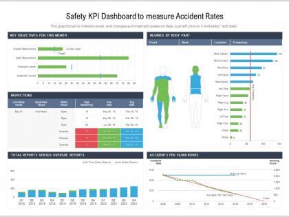
Safety kpi dashboard to measure accident rates




Try Before you Buy Download Free Sample Product
 Impress Your
 Audience
 100%
100% Editable
 Save Hours
 of Time


Our Safety KPI Dashboard To Measure Accident Rates are topically designed to provide an attractive backdrop to any subject. Use them to look like a presentation pro.
People who downloaded this PowerPoint presentation also viewed the following :
Safety kpi dashboard to measure accident rates with all 2 slides:
Use our Safety KPI Dashboard To Measure Accident Rates to effectively help you save your valuable time. They are readymade to fit into any presentation structure.

FAQs for Safety kpi dashboard to
You'll want to track TRIR and LTIR for sure - those are your basics. Near miss frequency too. But honestly? Focus more on the leading stuff like training completion rates and how many hazards people are actually reporting. That's where you catch problems before someone gets hurt. Days since last incident is good for morale I guess. PPE compliance percentages and audit scores are solid if you're doing regular walkthroughs. Just make sure whatever dashboard you're using updates daily at minimum. Nobody's got time for week-old safety data when you're trying to prevent the next accident.
Look, real-time data integration is what separates useful dashboards from fancy paperweights. Instead of waiting weeks for someone to update Excel (ugh), incidents and safety metrics flow in automatically. You can actually catch sketchy patterns as they develop - like noticing more slips happening during night shifts before someone gets seriously hurt. The magic happens when you connect incident reports, sensors, and inspection tools straight to your dashboard. No more manual data entry nonsense. Honestly, it's the difference between reacting to problems and preventing them entirely.
Yeah, training completion rates are actually super useful as a leading indicator - way smarter than just waiting to see injury numbers after something bad happens. You can spot the gaps before accidents occur, which honestly makes so much more sense. Track your overall completion percentages but also drill down to see which departments are lagging behind. I'd flag anyone over 30 days overdue for immediate follow-up. Oh, and set realistic deadlines from the start - nobody likes impossible timelines. It's basically about being proactive instead of reactive.
Definitely go with trend lines and heat maps - they're perfect for spotting patterns over time. Monthly line charts work well for totals, and heat maps show you which departments or shifts are trouble spots. Honestly, executives eat up that red/yellow/green color coding thing, so lean into it. Track both near misses (leading indicators) and actual incidents (lagging ones). Keep it visual though - nobody wants to stare at a wall of numbers. Start simple with your most critical metrics first. You can always add more complexity once people are actually using it regularly instead of ignoring it.
Hey! So for safety compliance stuff, definitely go with those color-coded gauges and traffic light indicators. Super obvious when things are good or bad. Heat maps are clutch for spotting patterns across teams or over time. Honestly though? Trend lines are where it's at - way better than just seeing today's numbers because you can actually tell if you're getting better or worse. Skip the messy bar charts with a million categories, nobody has time for that. Keep it clean and visual so anyone can glance at your dashboard and instantly know what needs fixing.
Honestly, just show people what they can actually do something about. Executives need the big picture stuff - compliance rates, incident costs, trends that help with budget decisions. Your frontline folks want real-time alerts and team metrics they control daily. Middle managers fall somewhere between - department trends plus enough detail to coach people. I'd skip the "show everyone everything" approach because it's just noise. Ask each group what decisions they're making weekly, then build around that. Way too many companies mess this up by overthinking it.
Set up daily updates for incidents, weekly for most metrics, monthly for trends. Automate the data feeds or you'll hate your life manually entering everything. Critical thresholds need alerts, and someone has to own each KPI - otherwise stuff just disappears into the void. Honestly, half the dashboards I see are just expensive wallpaper that nobody looks at. Review quarterly to ditch useless metrics and add relevant ones. Your team needs to actually make decisions with this data, not just admire how colorful the charts look.
Here's what's worked for me - connect your safety numbers to stuff executives actually give a damn about. Money talks, right? Show them how fewer accidents = less downtime and cheaper insurance. Employee retention too. Those basic accident rate dashboards? Total waste of time. Nobody looks at them. Pick maybe 2-3 safety metrics that tie directly to productivity or costs. Make the connections super obvious on your dashboard - like visually obvious. When leadership sees that investing in safety culture actually boosts their bottom line, they'll start caring real quick. The trick is making those dollar impacts impossible to ignore.
Don't cram everything onto one screen - it's just visual chaos and people ignore it. Focus on maybe 5-6 metrics your team can actually control. Skip the vanity stuff like "meetings held" - who cares? Track things that matter, like hazards identified and fixed. Keep your data fresh because stale dashboards are worse than no dashboard, honestly. Clear visuals help a ton. Oh, and context is huge - raw numbers without backstory don't tell anyone what to do next. Start basic first, then build up once people are actually using the thing.
So basically, leading KPIs are like your crystal ball - they catch problems before they blow up. Stuff like training completion rates, near-miss reports, how many hazard inspections you're doing. Lagging KPIs? That's the aftermath. Injury rates, comp claims, lost work days. Here's the thing though - most companies get obsessed with counting the damage after it happens instead of preventing it. It's backwards if you ask me. You wouldn't drive staring at your rearview mirror, right? Focus on those leading indicators and you'll actually stop accidents instead of just tallying them up later.
So you'll need three types of benchmarks for safety KPIs. Start with your own historical data - like year-over-year trends. That's usually the most telling stuff anyway. Then grab industry standards from OSHA or your trade association, though honestly those can be a pain to track down sometimes. Peer comparisons are gold if you can get them. Oh, and don't just focus on incident rates. Near-miss reports and training completion rates tell you way more about what's actually happening. You'll want at least 12-24 months of baseline data to make any of this meaningful.
So you'd basically train ML models on your past safety data - near-misses, weather conditions, how people behave on the job, that stuff. They get surprisingly good at spotting where accidents might happen next. Then just add prediction widgets to your dashboard showing risk zones and probability scores. Oh, and don't forget early warning alerts. The trick is making predictions actually useful though - like if it flags a high-risk area, tell people what to DO about it. Otherwise you're just giving them scary numbers with no action plan.
Track stuff like how many safety suggestions people submit, response times, and what percentage actually get implemented. Regular pulse surveys work great too - ask about safety concerns and whether people feel comfortable reporting near-misses. Some dashboards have this whole "voice of employee" section that's honestly pretty smart. Meeting participation and training feedback scores are good options as well. The trick is making feedback countable so it sits next to your regular metrics. Oh, and don't go crazy adding everything at once - pick one feedback metric first, then build from there. Your dashboard will thank you later.
Honestly, Power BI and Tableau are your best bet - they connect to everything and look super professional. Google Data Studio is solid too if you don't want to spend money (and it's surprisingly good). Excel works but gets messy fast with bigger datasets, trust me on that one. I'd figure out your data sources first, then see what integrates well with what you already have. Budget-wise, you really can't beat Google's free option to start. Who needs access to this thing? That might help narrow it down too.
Honestly, these dashboards are game-changers because your management can actually see what's happening in real-time instead of waiting for those monthly reports that nobody reads anyway. You'll catch stuff like near-misses piling up in certain departments or figure out if that expensive safety training is even working. Way better than staring at endless spreadsheets - my eyes glaze over with those things. Once you've got clear data showing where problems cluster, you can throw resources at the right spots and act fast when something's off. Just pick your top 3-5 metrics that actually matter first, then build everything around those.
-
Unique and attractive product design.
-
Design layout is very impressive.
-
Understandable and informative presentation.
-
Awesome presentation, really professional and easy to edit.